
Font Pairing Mistakes in Thumbnails and Fixes
Bad font choices - like using too many fonts, overly decorative styles, or poor contrast - can make your thumbnail unreadable and hurt your click-through rate. These are just a few of the thumbnail mistakes to avoid if you want to grow your channel. To fix this:
- Limit fonts to 1-2: Use one bold font for the main message and a simpler font for supporting text.
- Focus on readability: Avoid thin or decorative fonts that blur on small screens.
- Ensure strong contrast: Text should stand out clearly against the background.
- Test on mobile: Check how your thumbnail looks at small sizes to catch any issues.
For an easy solution, tools like ThumbnailCreator can help you pair fonts and test designs quickly. The right font pairing can make your thumbnails clear, professional, and more likely to grab attention.
Best Thumbnail Fonts to Use in Canva | Improve Thumbnail Templates
sbb-itb-b59debf
Common Font Pairing Mistakes
Even seasoned designers can make errors when pairing fonts. These missteps aren't just about style - they can hurt your click-through rate by making text hard to read or understand in the fleeting moments a viewer spends scanning their feed.
Here’s a closer look at some of the most frequent mistakes that can ruin thumbnail readability.
Using Too Many Different Fonts
Overloading a thumbnail with three, four, or even five fonts creates visual chaos. Instead of enhancing the design, it muddles the message and makes it harder for viewers to focus on what’s important. This cluttered approach can come across as unpolished and disorganized. The solution? Stick to no more than two fonts: one bold, eye-catching typeface for your main message, and a simpler, complementary font for any supporting text.
Choosing Overly Decorative Fonts
Fonts that look stylish on larger screens - like script styles, handwriting designs, or thin-weight typefaces - often fail when scaled down for thumbnails.
Most creators use fonts that are too thin or too decorative. At thumbnail scale, your text needs to be readable at roughly 50 pixels tall - the size it appears on mobile screens.
Ornate details and fine lines tend to disappear when thumbnails shrink to sizes like 320x180 pixels on mobile or 168x94 pixels in sidebars. Similarly, serif fonts with their decorative "feet" can add unnecessary clutter, reducing clarity at smaller sizes.
Poor Contrast and Readability Issues
Low contrast between text and background is a quick way to lose engagement. Combinations like light gray text on a white background or dark blue on black may seem sleek but often blend into the thumbnail or YouTube’s interface. Without strong contrast, your message can easily get lost - especially on mobile devices where brightness varies. Additionally, pairing fonts with similar weights can blur the visual hierarchy, making it difficult for viewers to immediately grasp the key message.
Incorrect Font Sizing and Hierarchy
Designing at full resolution without checking how text looks at actual display sizes often leads to text that's too small to read. On the flip side, overly large, bold text can dominate the thumbnail and overwhelm the viewer, turning your design into a wall of words.
The difference between a 3% and a 7% click-through rate isn't luck - it's design.
Without a clear hierarchy - where one text element stands out as the primary focus and supporting details are smaller and less prominent - viewers may struggle to quickly understand your video’s purpose. A well-structured hierarchy ensures your message is both clear and compelling. Up next, we’ll explore how to tackle these issues effectively.
How to Fix Font Pairing Mistakes
Now that you understand what can go wrong with font pairing, let's focus on how to fix it. The good news? You can resolve most font pairing issues with a few simple tweaks that make your thumbnails clearer, more polished, and more likely to grab attention. Here's how to refine your font choices for better results. If you're just starting out, our YouTube thumbnail beginners guide covers the fundamentals of effective design.
Stick to 1-2 Complementary Fonts
Limit your thumbnails to one or two fonts at most. This keeps the design cohesive and avoids the cluttered look that drives viewers away. When using two fonts, choose ones that contrast but still work well together. For instance, pair a bold sans-serif like Montserrat for your headline with a clean serif like Roboto for supporting text. This creates a balance between contrast and unity, making your message easy to digest in seconds.
Another tip? Keep your text short. Use 3–5 words maximum to ensure readability, especially on mobile screens. Shorter text allows you to make it larger and bolder, which directly improves visibility where it matters most - on smaller devices.
Ensure Strong Contrast and Readability
Once you've chosen your fonts, make sure they stand out by maintaining high contrast. Your text should pop against the background with at least a 5:1 contrast ratio for readability across all devices. For example, pair bold, large fonts with light backgrounds, and avoid hard-to-read combinations like red-on-blue. Poor contrast can make your thumbnails nearly unreadable, especially on mobile devices.
Always test your designs with mobile thumbnail optimization before publishing. What looks crisp on your desktop might be hard to read when scaled down to a smartphone screen. Preview your thumbnail at its actual size to catch any readability problems early.
Use ThumbnailCreator for Better Font Pairing
If you're struggling with font pairing, ThumbnailCreator can simplify the process. This tool uses AI-powered text editing and pre-designed templates to suggest and apply matching font combinations automatically. It pairs bold sans-serif headlines with complementary fonts, allowing you to preview balanced designs without the guesswork.
With ThumbnailCreator, you can tweak text, swap elements, and see exactly how your thumbnail will look before publishing. It ensures you achieve the right visual hierarchy and maintain a 5:1+ contrast ratio effortlessly. By automating font pairing, this tool helps you create professional, attention-grabbing thumbnails in just minutes, saving you hours of trial and error while boosting click-through rates.
Recommended Font Pairings Comparison
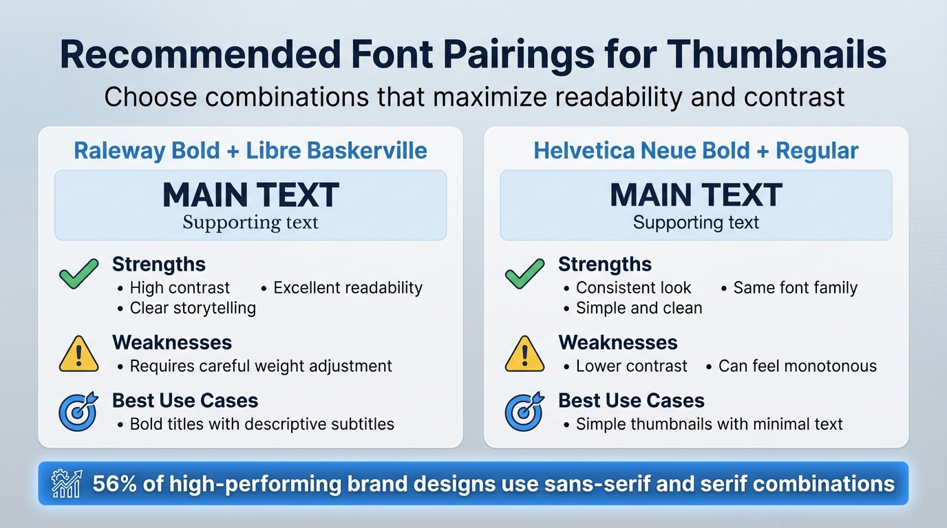
Font Pairing Comparison for Thumbnail Design
To create clear and mobile-friendly thumbnails, consider using these recommended font pairings. They emphasize strong contrast and hierarchy, aligning with the fixes mentioned earlier. These combinations are practical examples of how thoughtful font choices can make your design more effective.
Each pairing strikes a balance between contrast and harmony, ensuring the text is bold and easy to prioritize.
| Font Pairing | Strengths | Weaknesses | Best Use Cases |
|---|---|---|---|
| Raleway Bold + Libre Baskerville | Offers high contrast and excellent readability, making it ideal for clear storytelling. | Requires careful adjustment of font weights to avoid imbalance. | Thumbnails that need a bold title paired with a descriptive subtitle |
| Helvetica Neue Bold + Regular | Maintains a consistent look by staying within the same font family. | Lower contrast can make the design feel monotonous. | Best for simple thumbnails with minimal text |
Interestingly, sans-serif and serif combinations are used in 56% of high-performing brand designs. This makes them a dependable choice for thumbnails that aim to appear professional while catching attention. You can also browse trending YouTube thumbnails to see these principles in action. When working in ThumbnailCreator, you can select your headline font from the text editing options and pair it with a complementary subtitle font. The tool’s preview feature allows you to test contrast and visual balance instantly, ensuring your design is polished before publishing.
Experimenting with bold and italic styles can further help fine-tune the weight balance. These pairings demonstrate how deliberate font choices can elevate your thumbnail design.
Conclusion
Font pairing in thumbnails isn't just about making things look nice - it plays a big role in whether people click on your content. Mistakes like using too many fonts, weak contrast, or poor hierarchy can quietly hurt your click-through rates. The solution? Stick to 1-2 complementary fonts and focus on readability, especially for small mobile screens. Overloading your design with multiple fonts creates visual clutter, while consistent and well-thought-out font choices make your thumbnails instantly recognizable and easy to read at a glance.
If you're looking for an easier way to get it right, ThumbnailCreator has you covered. With AI-powered font pairing and pre-designed templates, it removes the guesswork. Its user-friendly text editing tools let you fine-tune contrast and font balance, helping you avoid common pitfalls like font overuse or poor readability - even if you're not a design expert.
FAQs
How do I know if my thumbnail fonts are readable on mobile?
To make sure your thumbnail fonts are easy to read on mobile devices, shrink your design to a smaller size - 168x94 pixels is a good benchmark. Stick to bold, sans-serif fonts with high contrast, like yellow text on a black background, to grab attention. Keep your message brief, ideally between 3 and 5 words. Adding outlines or shadows to the text can also boost visibility, helping your thumbnail pop on smaller screens and across different mobile devices.
What makes two fonts “complementary” in a thumbnail?
When two fonts are complementary in a thumbnail, they strike a balance in contrast, style, and readability. This harmony not only improves the visual appeal but also ensures the text remains clear, even on smaller screens like mobile devices. Choosing the right font pairing can make your thumbnail more engaging and help communicate your message effectively.
How can I improve font contrast without changing my background?
To make your text easier to read without changing the background, consider options like adding outlines, applying shadows, or opting for bold sans-serif fonts. These tweaks can significantly improve clarity, especially on smaller screens. Another effective approach is using high-contrast color pairings - think bright text on dark backgrounds, such as yellow on black. This ensures your text pops without needing to adjust the background itself.