
How to Choose Fonts for Readable Thumbnails
Choosing the right font for your YouTube thumbnails can make or break your video's success. Here's what you need to know:
- Legibility is key: Thumbnails shrink to as small as 168x94 pixels on mobile devices, so bold, sans-serif fonts like Montserrat or Bebas Neue are ideal.
- Match the tone: Fonts should reflect your content’s style. For example, bold fonts like Anton work well for gaming, while clean options like Roboto suit educational videos.
- Limit to 2 fonts: Overloading fonts creates visual clutter. Avoiding common thumbnail mistakes like this keeps your design professional. Stick to one for headlines and another for supporting text.
- Use high contrast: Ensure text stands out with strong color contrast and techniques like outlines or shadows.
- Test readability: Shrink your thumbnail to mobile size and ensure the text is still clear.
These strategies can improve click-through rates and help your video stand out in crowded feeds.
Core Principles for Selecting Readable Fonts
Choose Fonts That Remain Legible at Small Sizes
Your thumbnail's font needs to stay clear and readable, even on mobile screens. When thumbnails shrink to as small as 168×94 pixels, intricate details in fonts can disappear entirely. That’s why heavy sans-serif fonts are a go-to choice - they have thick strokes and clean lines that hold up well after compression. On the other hand, fonts with thin lines or ornate details tend to blur, making them hard to read.
Try the 5% Zoom Test: shrink your thumbnail to about 1 inch wide on your screen. If the text becomes unclear, you may need a bolder font or fewer words. For optimal readability, primary headlines should be 150–200 pixels tall when designing at a 1280×720 resolution. These headlines should take up roughly 20–30% of the thumbnail's height for maximum impact. Fonts with tall x-heights or slightly condensed shapes, like Bebas Neue, are also great for fitting larger text into tight horizontal spaces.
Once you’ve ensured legibility, the next step is aligning your font style with the tone of your content.
Select Fonts That Fit Your Content and Viewers
The font you choose does more than display text - it sets the mood. For example:
- Gaming content often pairs well with bold fonts like Bangers or Anton.
- Educational videos benefit from clean options like Montserrat or Roboto.
- Lifestyle vlogs feel approachable with fonts like Raleway or Poppins.
- Commentary channels thrive with authoritative choices such as Playfair Display or Bebas Neue.
Your goal is to match your font to your video's tone. A bold serif like Playfair Display Black exudes sophistication and authority, making it perfect for editorial-style content. On the other hand, script fonts like Pacifico can add personality but are harder to read at smaller sizes, so they’re better suited for accent text. Ultimately, your font should reflect your content’s vibe - whether it’s fun, professional, or casual - so viewers immediately know what to expect.
Use No More Than 2 Fonts Per Thumbnail
Overloading your thumbnail with multiple fonts can create visual chaos and slow down comprehension. Since thumbnails have just seconds to grab attention, clarity is key. Bogdan Sandu sums it up perfectly:
"Mix it up, but don't turn it into a typographic salad. Font pairing is a delicate art; two's company, three's a crowd."
Stick to one bold font for your main headline and, if needed, a simpler font for any supporting text. This approach establishes a clear visual hierarchy - your headline grabs attention, while secondary text adds context. Using consistent fonts across your thumbnails can also strengthen brand recognition, helping viewers quickly identify your content in a busy feed. Plus, with over 70% of YouTube views happening on mobile devices, limiting your fonts ensures your message remains clear and easy to read.
sbb-itb-b59debf
A Simple Way for You to Pick Easy-to-Read Thumbnail Fonts
For a step-by-step walkthrough on placement and styling, see our typography guide for YouTube thumbnails.
Top Font Types for Maximum Readability
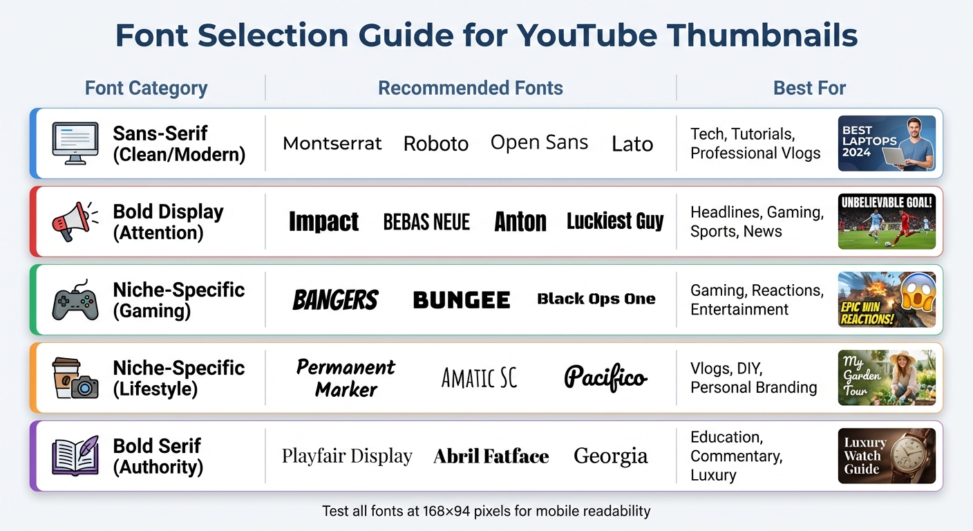
YouTube Thumbnail Font Selection Guide by Content Type
Sans-Serif Fonts for Clean, Modern Looks
When it comes to keeping text legible at smaller sizes, sans-serif fonts offer a sleek and modern aesthetic. Fonts like Montserrat, Roboto, Open Sans, and Lato maintain their clarity even at dimensions as small as 168×94 pixels . These fonts are particularly effective for tech tutorials, educational materials, and professional vlogs, as they provide a polished appearance without unnecessary distractions.
For better visibility, especially against busy backgrounds, opt for bold or extra-bold weights like Roboto Black or Montserrat ExtraBold. The best part? These fonts are free on Google Fonts, so you can test different options without any cost. Their adaptability makes them a solid choice for scaling across various designs while keeping the focus on your content.
Bold Display Fonts for Attention-Grabbing Text
When you need your headline to pop, bold display fonts are your go-to. Fonts such as Impact, Bebas Neue, Anton, and Luckiest Guy are designed to grab attention instantly. For instance, Impact is ultra-bold and condensed, making it ideal for headlines in tight spaces, though it’s often associated with memes. Bebas Neue, on the other hand, offers a more polished, all-caps design that conveys authority without feeling overdone.
These fonts are a hit for gaming channels, reaction videos, sports highlights, and breaking-news thumbnails. In one case study, simply changing the thumbnail font led to a 23% increase in click-through rates. However, to keep text readable on mobile devices, stick to short, punchy headlines - ideally 3–5 words .
Niche-Specific Fonts for Targeted Content
Choosing a font that matches your content's tone can make your thumbnails even more effective. For high-energy gaming and entertainment channels, fonts like Bangers, Bungee, and Black Ops One are perfect. Meanwhile, lifestyle vlogs and DIY content benefit from the approachable, handwritten feel of fonts such as Permanent Marker, Amatic SC, and Pacifico.
For content that demands authority and sophistication, bold serif fonts like Playfair Display or Abril Fatface are excellent choices. These fonts add a touch of elegance and help differentiate your design from the more common sans-serif options. However, keep in mind that serif fonts can lose sharpness at very small sizes, so always test them at 168×94 pixels to ensure clarity.
| Font Category | Recommended Fonts | Best For |
|---|---|---|
| Sans-Serif (Clean/Modern) | Montserrat, Roboto, Open Sans, Lato | Tech, Tutorials, Professional Vlogs |
| Bold Display (Attention) | Impact, Bebas Neue, Anton, Luckiest Guy | Headlines, Gaming, Sports, News |
| Niche-Specific (Gaming) | Bangers, Bungee, Black Ops One | Gaming, Reactions, Entertainment |
| Niche-Specific (Lifestyle) | Permanent Marker, Amatic SC, Pacifico | Vlogs, DIY, Personal Branding |
| Bold Serif (Authority) | Playfair Display, Abril Fatface, Georgia | Education, Commentary, Luxury |
These font options provide a strong foundation for designing text that stands out while remaining easy to read.
Design Methods to Improve Text Visibility
Apply High Contrast Between Text and Background
When it comes to making text easy to read, contrast is everything. Studies show that text should be readable within 1/10th of a second, so ensuring strong contrast between text and the background is essential. A minimum contrast ratio of 4.5:1 is recommended to keep your content clear, even on tiny thumbnail images like 168×94 pixels.
Some tried-and-true combinations include white text with a black stroke, which is a dependable choice for most designs. If you're aiming for something bolder, yellow on black delivers striking contrast and grabs attention instantly. On the flip side, avoid combinations like red on green, blue on purple, or light gray on white, as these can be hard to read and may pose challenges for colorblind viewers.
| Text Color | Background Color | Contrast Level | Best Use Case |
|---|---|---|---|
| White | Dark / Black | Excellent | Universal / Clean |
| Yellow | Black / Dark | Excellent | Attention / Warnings |
| Black | White / Light | Excellent | Minimalist / Modern |
| Red | White / Yellow | Good | Urgency / Drama |
| Cyan / Blue | Dark | Good | Tech / Gaming |
Add Shadows and Outlines for Better Separation
Shadows and outlines are lifesavers when placing text over busy or complex backgrounds. A 4–8px outline offers strong contrast, while 8–12px outlines create a bolder, more dramatic effect. Drop shadows are another great tool - set them at 40–60% opacity with a 4–8px offset for a subtle lift, or crank up the opacity to 80–100% for a more pronounced effect.
If the background is especially busy, consider duplicating your text layer to make it stand out even more. Another trick is to add a dark overlay to your background image and adjust its opacity. This makes white text pop while still keeping the image visible. As Natsumi Nishizumi, a Brand Clarity & Design Specialist, explains:
"Remember, your audience doesn't want to work hard to read your post. When the text is less crowded and easy-to-read, your audience will pay attention to your message".
Keep Fonts Consistent Across All Thumbnails
Consistency in font choice is key to building brand recognition. When viewers scroll through a crowded feed, they should be able to identify your content at a glance. Many top YouTube creators use this technique to maintain a recognizable visual identity. Plus, sticking to the same fonts simplifies your design process, saving time and reducing decision fatigue.
To create a cohesive look, select one primary font for headlines (like Impact or Anton) and a secondary font for accents (such as Roboto or Open Sans). Limit yourself to no more than two fonts per thumbnail and standardize your outline and shadow settings by following YouTube thumbnail guides. For example, always use a 4–8px black outline for white text. This approach ensures your thumbnails are legible, even on smaller screens.
Looking for an easier way to streamline font choices? Tools like ThumbnailCreator can simplify the process and help you maintain a polished, consistent design.
How ThumbnailCreator Makes Font Selection Easier
ThumbnailCreator simplifies the process of choosing fonts with its AI-driven tools and pre-made templates, making it easy to create professional-looking thumbnails. These features align with established design principles, ensuring your thumbnails are both effective and visually appealing.
Get AI-Powered Font Recommendations
ThumbnailCreator's AI takes the guesswork out of font selection by analyzing your text prompts and suggesting styles that fit your content's theme. Whether you're aiming for a "minimal" vibe or a "high-energy gaming" look, the platform provides tailored font options. It even lets you tweak details like weight, width, and positioning for maximum clarity. This ensures your text remains the focal point of your design.
Use Templates with Pre-Selected Professional Fonts
On top of smart recommendations, ThumbnailCreator offers templates designed for specific niches like Gaming, Vlogs, Beauty, Tech, Food, Education, and Fitness. For instance:
- Gaming and Sports: Bold, impactful fonts like Bebas Neue or Anton emphasize energy.
- Lifestyle and Fashion: Sleek and stylish fonts such as Raleway create a polished look.
- Education and Health: Fonts like Lexend, with wide spacing, prioritize readability and reduce visual strain.
These templates also include "safe zones" to ensure text isn't obscured by overlays like video timestamps, keeping your design functional and clean.
Edit Text Directly Within Your Thumbnails
After selecting a template or generating a design with AI, you can refine your text directly in ThumbnailCreator's editor. Adjust font styles, sizes, and effects like strokes or drop shadows, and experiment with color combinations - all without needing additional tools. This integrated editing experience not only saves time but also ensures your text stays crisp and readable across devices, especially for mobile viewers. By focusing on readability, ThumbnailCreator helps improve click-through rates and makes your thumbnails stand out.
Conclusion
Picking the right fonts for your YouTube thumbnails boils down to three key principles: use bold sans-serif fonts that stay legible even at small sizes, keep your text concise with 3–5 words for mobile clarity, and ensure high contrast with 4–8px outlines to separate text from busy backgrounds. With over 70% of YouTube views happening on mobile devices, where thumbnails shrink to just 168×94 pixels, your font choices play a huge role in catching a viewer's attention.
To complement these basics, pay attention to technical details. Your main headline should measure between 150–200px on a 1280×720 canvas and take up about 20–30% of the thumbnail's height. While creativity is important, readability should always come first. Fonts like Impact, Bebas Neue, and Montserrat Extra Bold are popular for a reason - they’re easy to read and work well on screens of all sizes.
If you’re looking to simplify the process, tools like ThumbnailCreator can make things easier. With AI-powered font suggestions and professionally designed templates tailored to these principles, you can skip the trial-and-error phase. It even includes an integrated editor, so you can tweak text directly to ensure clarity and boost click-through rates.
Finally, don’t forget the 168×94 test. Shrink your thumbnail to mobile size to check if your text remains sharp and readable. If it looks blurry or hard to read, increase the font weight or reduce the word count. For more data-driven results, consider A/B testing your thumbnails to see which font styles actually drive more clicks. This small step ensures your thumbnail grabs attention on the devices where most viewers are watching.
FAQs
How do I pick a font that still reads on a phone?
Choose bold, sans-serif fonts like Montserrat or Bebas Neue to improve readability on smaller screens. Opt for high-contrast color combinations, such as yellow on black, and consider adding outlines or shadows to make the text stand out. Keep your message concise, ideally between 3–5 words, and always test your design at smaller sizes (like 168x94 pixels) to ensure it remains clear and visually appealing on mobile devices.
What’s the best font size for thumbnail text at 1280×720?
For a 1280×720 thumbnail, the recommended font size for headlines is usually between 150 and 200 pixels. This range ensures the text stays sharp and easy to read, even on smaller screens like mobile devices - where the majority of YouTube views happen. To make sure your text is readable on all devices, try shrinking the thumbnail to 168×94 pixels and check its clarity.
When should I use outlines vs drop shadows for text?
Outlines are a great way to make text pop, especially on busy or colorful backgrounds. They create high contrast, ensuring the text remains easy to read - even on smaller screens like mobile devices.
On the other hand, drop shadows offer a softer touch. They add subtle depth and help separate the text from the background without being overly bold. While they’re excellent for creating a gentle contrast, they don’t match outlines when it comes to maximizing readability.