

Ultimate Guide to Audience-Based Thumbnail Design
The short answer: the best thumbnail is the one your viewer understands in one second. If I want more clicks, I should stop designing for my own taste and start designing for the person most likely to watch.
Here’s the core idea in plain English:
- Entertainment viewers click on feeling: big expressions, bold contrast, short hook text
- Education and tech viewers click on clear results: simple layouts, direct wording, obvious outcomes
- Business viewers click on trust and ROI: clean design, polished visuals, result-focused copy
- Kids and family viewers click on simple story cues: bright colors, easy shapes, little or no text
- Mobile viewers need large subjects and short text because small details disappear fast
- Search traffic often needs answer-first thumbnails, while browse and suggested traffic often react more to novelty and emotion
- Testing one change at a time matters, because CTR alone can mislead if watch time drops
A few numbers stand out. The article says viewer intent and content relevance explain about 68% of CTR variance. It also notes that thumbnails for mobile should stay readable at around 200 × 100 pixels, and one documented thumbnail swap moved CTR from 3.1% to 4.4%, a 42% relative lift.
If I had to sum up the whole piece in one rule, it would be this: match the thumbnail to the audience’s goal, screen, and traffic source - then test small changes with data.
This guide breaks that process into a simple system I can use again and again.
Build an Audience Profile Before You Design
Before you open Canva, Photoshop, or anything else, get clear on who this thumbnail is for.
A thumbnail brief should answer four things: who the viewer is, what they want, what style they expect, and the one promise the thumbnail makes. Once that’s clear, you can decide the layout, text length, and imagery before you design.
That step matters more than a lot of people think. Viewer intent and content relevance drive about 68% of CTR variance, which is more than polish by itself.
Use Demographic, Psychographic, and Behavioral Segments
Use three data layers: demographic, psychographic, and behavioral. Each one changes a different part of the thumbnail.
Start with the viewer segment, then turn it into visual rules. Demographic data tells you who the viewer is: age, gender, location, and language. That shapes basic readability rules and sets boundaries for references and imagery. Viewers ages 13–24 see a 16% higher CTR when thumbnails include emojis. But business, finance, and educational thumbnails see a 9% CTR drop when emojis are used.
Psychographic data tells you why they care. This covers values, interests, goals, and lifestyle. And this is where things get interesting: two viewers can look the same on paper and still react to totally different thumbnails.
A viewer focused on financial security may want calm, literal imagery and copy such as Avoid these 3 tax mistakes. A viewer chasing fast growth may click more often on bold colors, transformation imagery, and copy like From $0 to $10k/month. Same demographic. Different mindset. Different thumbnail.
Behavioral data shows how people act. It helps you decide how much text to use, how big the main subject should be, and how busy the layout can get. Device type, traffic source, and click behavior all shape the final design.
| Segmentation Type | Data You Need | Biggest Influence on Thumbnail Design |
|---|---|---|
| Demographic | Age brackets, gender mix, top countries/regions, language | Font size, references, color intensity, representation in imagery |
| Psychographic | Interests, goals, values, lifestyle | Overall tone (calm vs. hyped), symbols used, credibility vs. hype |
| Behavioral | Device type, CTR by traffic source, face vs. no-face performance | Word count, subject size, facial emotion vs. clean objects, series branding |
Turn Audience Data Into Design Rules
Don’t leave the data sitting in a spreadsheet. Turn it into design rules before you start.
For mobile audiences, stick with 3–5 words, one large subject, and thick, high-contrast type. Thumbnail text needs to stay readable at about 200×100 pixels on a phone screen. At that size, packed layouts fall apart fast.
If your audience leans toward business, finance, or educational content, cut informal visual accents and keep the palette restrained. Even one emoji can lead to a 9% CTR drop in those categories.
A short internal brief, written before each design session, helps you stay on track when time gets tight. It should include:
- the core audience segment
- the viewer’s main intent in one sentence
- the single promise the thumbnail makes
- visual style rules
- limits based on your behavioral data
For a grocery savings video aimed at U.S. adults ages 25–44 on mobile, that brief might say: Save $300/Month, creator holding a grocery bag, large text, no small coupon details.
That kind of brief keeps guesswork out of the process and sets up the thumbnail choices in the next section.
sbb-itb-b59debf
Core Thumbnail Rules That Work Across All Audiences
These are the baseline rules for thumbnails that stay readable and clickable everywhere YouTube displays them. Once you know the audience, start with the same technical setup and then adjust the style for the niche. Think of these rules as the floor, not the ceiling. The next section applies them to each audience type.
Technical Specs and Mobile-First Layouts
YouTube recommends thumbnails at 1,280 × 720 pixels, a 16:9 aspect ratio, a minimum width of 640 pixels, and a maximum file size of 2 MB. That setup helps text and visual details stay sharp on phones, tablets, and TVs. If you design at a smaller size - like 640 × 360 - text often turns blurry after YouTube compresses the image, and that problem stands out even more on big screens.
A simple gut check helps here: zoom out until the thumbnail is about 150 to 200 pixels wide. If the main subject doesn’t stand out right away, strip the design back. Test every thumbnail at phone size too. If the text, face, or main object starts falling apart, simplify it. The goal is a clean, mobile-first frame that still works when the screen gets tiny.
Once the frame reads well, the next move is picking the focal element that communicates the promise fastest.
Choose Faces, Text, or Objects Based on Message Clarity
Pick the focal element that explains the video as fast as possible. The audience profile helps you decide what earns the click: emotion, clarity, or curiosity. Faces work best when emotion or personality leads the decision to click, like reaction videos, commentary, lifestyle content, or tutorials where the creator is part of the brand. Object-first thumbnails make more sense when the value is visual and concrete, such as a product review, a finished recipe, or a home project. Text-first designs fit when the idea is hard to show with visuals alone, like "5 Passive Income Myths" or "Photoshop Crash Course."
| Best Element | Use When | Limit | Best-Fit Audiences |
|---|---|---|---|
| Face (close-up) | Emotion or personality drives the click | Weak when gameplay or product detail is the draw | Lifestyle, commentary, finance/business |
| Object / Scene | The visual result is the value | Needs strong composition to avoid feeling flat | Gaming, cooking, tech reviews, DIY |
| Text block | The idea is too abstract for visuals alone | Needs very short copy; can look flat without support | Education, news, finance, productivity |
Most strong thumbnails mix two elements, but only one should lead. Use faces when they add trust or emotion. Leave them out when the gameplay, product, or result is the main reason someone would click.
These rules keep the thumbnail clear. The next step is matching that clarity to each audience type.
Thumbnail Design for the Main YouTube Audience Types
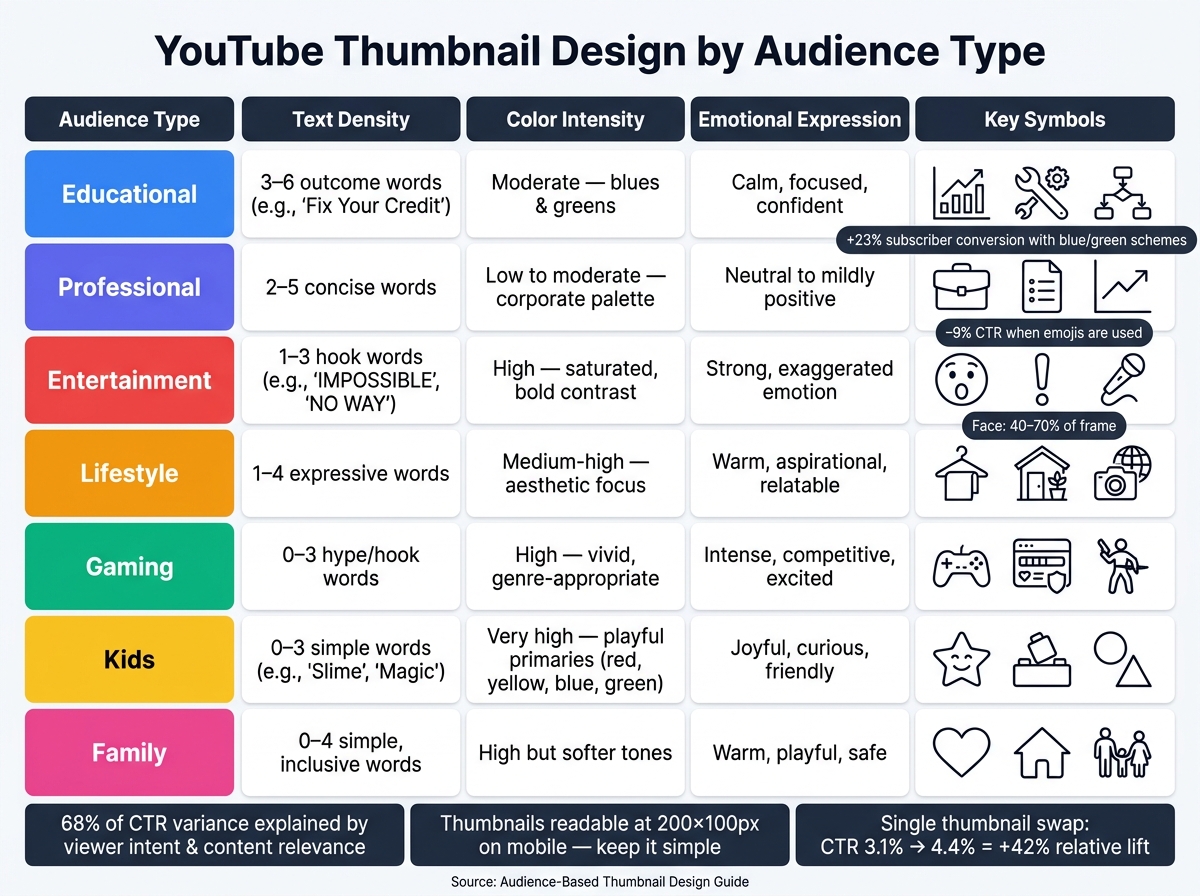
YouTube Thumbnail Design by Audience Type: Quick Reference Guide
Take the audience profile you built earlier and match it to one of the three patterns below. The goal is simple: pick the row that fits your viewer, then use it as your starting point.
Educational and Professional Audiences
These viewers usually come to YouTube with a job to do. They search for a clear answer with queries like "how to automate Excel reports" or "resume tips for product managers." They want the option that feels most reliable and efficient. So your thumbnail should signal skill first, not hype.
Stick with 2–3 blue or green tones, a clean sans-serif font, and 3–6 outcome-driven words like "Fix Your Credit", "Master Pivot Tables," or "Land the Job." Clear verbs and specific nouns tend to work better than fuzzy promises. Educational thumbnails that use blue and green color schemes see 23% higher subscriber conversion.
Skip stock photos when you can. In this kind of content, custom diagrams or illustrations tend to do more heavy lifting. A simple chart, timeline, or annotated screenshot can make the video feel trustworthy at a glance. In educational settings, custom visuals get 31% more clicks than generic stock imagery. If you add your face, keep the expression calm and self-assured. Showing the instructor's face in educational thumbnails increases repeat viewer retention by 26%.
Entertainment, Lifestyle, and Gaming Audiences
These viewers often browse Home, Subscriptions, or Suggested looking for novelty, emotion, and personality. Your thumbnail doesn't just need to describe the video. It needs to stop the scroll.
Close-up faces tend to work well here. Let a face take up 40–70% of the frame, with an expression people can read in a split second: shock, joy, competitive tension, or pure hype. Eye direction helps too. If the person in the thumbnail is looking at a word, object, or visual cue, viewers often follow that gaze without thinking about it.
Keep text short: 1–3 words is usually enough. The job of the text is to heighten the feeling, not explain the full story. Think "IMPOSSIBLE", "We FAILED," or "NO WAY." Use bold fonts with thick outlines so the words stay readable even when the background gets busy.
The visual cues should match the niche. For gaming, bring in things viewers know at once, like UI elements, controller imagery, or character art. For lifestyle content, use cues that set the scene right away, such as outfits, home interiors, travel shots, or close-ups of food.
Kids and Family Audiences
Young viewers react fast to bright color, simple shapes, known characters, and easy-to-read story setups. Reading matters less here, especially for younger kids, so the thumbnail has to tell the story almost by itself.
Use bright, saturated primaries like strong reds, yellows, blues, and greens. Make sure the main characters or objects stand out clearly from the background. Keep text to 0–3 very simple words like "Slime", "vs," or "Magic," or leave text out altogether for very young viewers.
The story should be obvious in one frame. Two characters facing each other signals a challenge. A wide-eyed child next to a giant toy signals an unboxing. A messy-to-clean split signals a before-and-after change. Keep expressions warm and safe, and avoid visuals that feel scary or harsh.
Use the table below as a quick side-by-side guide:
| Audience | Text Density | Color Intensity | Emotional Expression | Symbol Use |
|---|---|---|---|---|
| Educational | 3–6 outcome words | Moderate; blues and greens | Calm, focused, confident | Charts, tools, diagrams |
| Professional | 2–5 concise words | Low to moderate; corporate feel | Neutral to mildly positive | Briefcase, resume, graphs |
| Entertainment | 1–3 hook words | High, saturated, bold contrast | Strong, exaggerated emotion | Reaction symbols, props |
| Lifestyle | 1–4 expressive words | Medium-high; aesthetic focus | Warm, aspirational, relatable | Outfits, home interiors, travel |
| Gaming | 0–3 hype/hook words | High, vivid, genre-appropriate | Intense, competitive, excited | Game UI, controllers, character art |
| Kids | 0–3 simple words | Very high, playful primaries | Joyful, curious, friendly | Simple shapes, toys, characters |
| Family | 0–4 simple, inclusive words | High but softer tones | Warm, playful, safe | Hearts, home, group silhouettes |
Use these rows as baseline variants for each audience segment, then test them against CTR.
Test, Improve, and Scale Your Thumbnail Workflow
Measure CTR by Audience Segment and Video Type
Once your audience-based baseline is live, measure performance by segment. Don’t stop at overall CTR—use advanced thumbnail optimization techniques to find what works. Break it down by traffic source (Home, Search, Suggested) and audience segment (age group, device type, geography). Each traffic source points to a different kind of intent, so lumping everything together can blur what’s happening.
Use 48-hour data for early signals and 7-day data for decisions. Early numbers can get skewed by subscriber notifications, so a fast spike doesn’t always tell the full story.
If CTR drops below your usual range for a given audience segment, get a second variant ready. The rule here is simple: change one variable at a time. Swap the headline text, the facial expression, or the main object, but don’t change all three at once. If you do, you won’t know what actually moved the needle. That keeps each test tied to one clear audience reaction.
CTR also needs context. Pair it with average view duration or % viewed. A thumbnail that pushes clicks from 5% to 7% but cuts watch time is pulling in the wrong viewers. That’s bad news for educational and professional content, where people expect the video to deliver exactly what the thumbnail promised.
A documented case makes this clear:
A video stuck at 3.1% CTR jumped to 4.4% - a 42% relative lift - after a single thumbnail swap with no title change; within 30 days, both impressions and watch time roughly doubled.
Use ThumbnailCreator to Test Variants Faster
ThumbnailCreator can help you make multiple audience-specific variants fast. Use AI generation to create face-, text-, or object-led layouts for your target audience. Then apply a template built for that video type. The templates handle composition and mobile readability, so you don’t have to rebuild the basics each time. This ensures your designs follow mobile thumbnail optimization standards automatically.
When you need to test a single variable, face swapping and object swapping make that much easier. You can isolate one change without remaking the whole thumbnail. Swap in a more expressive face for an entertainment version, or replace a generic laptop with a resume graphic for a job-search video. Everything else stays locked.
Text editing works the same way. You can test "Negotiate Your Salary" against "Get a $10,000 Raise" while keeping the layout exactly the same.
To keep tests organized, use a simple internal log like this:
| Video Title | Version | Audience Segment | Design Change | CTR (48 hrs) | CTR (7 days) | Average View Duration (% viewed) | Traffic Source |
|---|---|---|---|---|---|---|---|
| How to Negotiate Salary | A | US professionals 25–44 | Text: "Negotiate Your Salary" | 5.1% | 5.4% | 48% | Search |
| How to Negotiate Salary | B | US professionals 25–44 | Text: "Get a $10,000 Raise" | 6.8% | 7.2% | 55% | Search |
| Family Slime Challenge | A | Parents with kids 5–10 | Object: generic slime tub | 4.2% | 4.5% | 61% | Browse |
| Family Slime Challenge | B | Parents with kids 5–10 | Object: giant slime explosion | 6.1% | 6.7% | 63% | Browse |
Over time, this log becomes a set of audience-specific design rules you can use on every new upload. That means less guesswork and faster testing with each round.
Conclusion: The Best Thumbnails Match the Right Audience, Not Just Best Practices
These tests turn audience signals into repeatable rules. Start with the audience, then test one variable at a time. Over time, those tests become a repeatable thumbnail system that attracts the right viewers.
FAQs
How do I know which audience segment to design for?
Start with YouTube Analytics, mainly the Reach and Audience tabs. That’s where you can see your viewers’ age, gender, and location. Since thumbnail preferences change a lot by niche and by who’s watching, this should be your main guide.
From there, go a bit deeper. Check which videos your audience already watches, test parts like faces, colors, or text hooks, and compare CTR by traffic source. ThumbnailCreator can help you make and test audience-specific versions fast.
What should I test first if my thumbnail CTR is low?
First, check whether your video has a high average view duration. If CTR is low but watch time is high, that usually points to a packaging problem: the content works, but the thumbnail isn't getting the click.
Start by testing one high-impact element at a time. Good places to start include:
- Background color (18% to 25%)
- Facial expressions (12% to 18%)
Skip small layout tweaks. They usually don't move the needle in any meaningful way.
Should I make different thumbnails for Search and Browse traffic?
Yes. Viewer intent changes based on where the view comes from.
Search usually means someone is actively looking for a specific topic. Browse is different. That traffic often comes from people scrolling the Home feed more casually.
Because of that, a thumbnail that works in Search might not do as well on Home. Check your CTR by traffic source in YouTube Analytics, then test different thumbnail versions to better match each type of intent.