

Ultimate Guide to Emotional Thumbnails
Most YouTube thumbnail clicks happen in a split second, and faces still help a lot - but only when the emotion is clear and the video pays it off.
If I had to sum up the whole guide in a few lines, it would be this:
- Use a face people can read fast on mobile
- Match the expression to the video type
- Keep the face large and the layout clean
- Test emotion with CTR and watch time, not CTR alone
A few numbers make the point fast:
- Thumbnails with faces can get 38% to 40% more clicks
- Faces that fill more of the frame can do 44% better
- Fear-based thumbnails can lift clicks by 29%
- But if the video does not match that mood, average view duration can drop by 22%
So the goal is not just more clicks. The goal is better clicks.
Here’s what matters most:
- Shock fits reactions, challenges, and big reveals
- Joy fits wins, vlogs, and positive outcomes
- Concern fits warnings, fixes, and problem-solving
- Confidence fits tutorials and expert-led videos
- Skepticism fits reviews and commentary
Design matters too. I’d keep the face around 30% to 40% of the frame, put the eyes near the upper third, limit text to 1 to 5 words, and use a plain background so the expression does not get lost.
And when I test thumbnails, I would not stop at click-through rate. I would also check:
- Average view duration
- Early retention drops
- Whether the thumbnail set the right expectation
In short: clear face, clear feeling, clear promise. That’s the whole system.
Now let’s get into the full guide.
Best Facial Expressions To Use on Thumbnails
Why Emotional Faces Drive More Clicks on YouTube
Faces are often the first thing people notice in a YouTube feed. And in a crowded feed, that matters a lot.
A thumbnail with a clear facial expression has an edge right away. If someone looks shocked, thrilled, worried, or stunned, viewers can pick up that feeling almost at once. It gives them a tiny piece of a story. That small emotional cue sparks curiosity and can lead to the click.
The data backs this up. Thumbnails with faces get 38% to 40% more clicks than thumbnails without faces, and strong expressions beat neutral ones.
How Viewers Read Faces and Emotions in a Split Second
On mobile, people usually only make out the eyes, brows, and mouth. That means subtle expressions often get lost.
A simple test helps: shrink the thumbnail to phone size. If the emotion fades or feels hard to read, make the face larger or push the expression further. In many cases, faces that fill 30% to 50% of the frame do better. In fact, they perform 44% better than smaller faces.
When Emotional Thumbnails Help and When They Hurt
A face does not always make a thumbnail better.
For technical videos, product-led content, or search-driven topics, a face can sometimes distract from the main idea. In those cases, the thumbnail needs to explain the topic fast. If the face helps do that, great. If not, it may just add clutter.
The main danger is mismatch. Say a thumbnail shows an over-the-top shocked face for a basic tutorial. That thumbnail hints at drama the video never delivers. It may boost CTR for a while, but it can also hurt retention. And YouTube does not look at clicks alone. Its recommendation system also looks at whether those clicks turn into meaningful viewing behavior.
The next step is choosing the right emotion for the video type.
Which Emotions and Facial Expressions Work Best in Thumbnails
Not every emotion works the same in a thumbnail. Some make people stop scrolling right away. Others barely show up, especially on a phone screen. The trick is simple: use expressions that read fast and stay clear even when the image gets small.
Here are the most common thumbnail emotions and where they tend to work best:
| Emotion | Key Visual Cues | Best Use Case |
|---|---|---|
| Surprise / Shock | Wide eyes, raised brows, open mouth | Entertainment, reactions, challenges |
| Urgency / Excitement | Open mouth, raised brows, forward lean | Product reveals, breaking news, time-sensitive content |
| Joy / Happiness | Wide smile, crinkled eyes | Vlogs, success stories, positive reveals |
| Curiosity / Thoughtful | Tilted head, squinted eyes, hand on chin | Educational, analytical, what-if content |
| Confidence | Direct gaze, relaxed posture, calm expression | Tutorials and authority-driven explainers |
| Concern / Frustration | Furrowed brows, tightened lips, downward mouth | Problem-solving, warnings, troubleshooting |
| Skepticism | One raised brow, slight squint, sideways glance | Reviews, commentary, whether-it's-worth-it videos |
Matching Emotions to Different Video Types
The best thumbnails line up with what the video actually gives the viewer. If the thumbnail promises one feeling and the video delivers another, people notice.
Surprise and shock fit reactions, challenges, and unexpected outcomes. Curiosity works well for what-if ideas, discovery videos, and educational breakdowns. Concern and frustration signal pressure, so they make sense for problem-solving, warnings, and troubleshooting. Joy supports before-and-after stories, wins, and positive outcomes. Confidence fits tutorials and authority-driven explainers, where trust matters. And skepticism is a strong match for reviews, commentary, and whether-it's-worth-it videos.
How to Make Expressions Readable Without Looking Staged
This is where a lot of thumbnails miss the mark. Small expressions often vanish on mobile. A tiny smirk or mild concern can just look blank. But going too far has its own cost. If the face looks forced, people may trust it less.
A 2026 trend showed that 73% of viewers prefer natural-looking expressions over exaggerated reaction styles.
A good rule of thumb: start with a real reaction, then push it just a bit. On screen, that slight extra emphasis helps the expression stay clear without turning it into a cartoon. A shocked face should feel like actual surprise. A skeptical look should feel controlled, not silly. The eyes, brows, and mouth all need to work together.
If you're unsure, take several shots and compare them at small size. What looks obvious at full size can fall flat once it's compressed.
Once the emotion is set, the next move is picking a frame that reads in a split second.
How to Shoot Thumbnail Faces That Actually Work
Treat thumbnail shots as part of filming, not something you scramble to do at the end. Before you hit record, come up with one scenario that would honestly spark the emotion you want, like: "I found a $1,000 mistake in my budget." Sit with it for a minute, practice a few takes, then shoot a batch of thumbnail expressions either right before or right after recording.
Don’t stop at one version. Shoot a few takes for each emotion and change the angle, where you’re looking, your mouth shape, and how strong the expression is. A small shift can make a big difference. It also helps to record short clips and pull stills from them later. In most cases, those frames feel less stiff and more natural. Once you get the right expression, light it and frame it so someone can read the feeling in a split second.
Camera, Lighting, and Framing for Clear Emotional Close-Ups
Soft light from one main direction makes facial expressions easier to read. Face a large window with indirect daylight, or use a diffused LED panel or softbox. Turn off harsh overhead lights. They can hide your brows and make the expression look flat. If one side of your face gets too dark, place a white foam board across from the window to bounce some light back without washing everything out.
You also want a bright reflection in the eyes. A simple way to get that is to place your main light a little above you and slightly in front. That tiny catchlight helps the face look more alive.
For framing, go with a tight head-and-shoulders shot. Keep the top of your head close to the top of the frame and your shoulders close to the bottom. If you’re using a smartphone, stick with the standard lens or the 2x lens, then move closer instead of using digital zoom. After cropping, the face should take up about 20% to 40% of the final thumbnail so it still reads well on mobile.
After you crop, check the parts that carry most of the emotion:
- Eyes
- Brows
- Mouth
If those details start to blur or feel hard to read, move the camera closer and shoot again. Once the face reads cleanly, pick the strongest image and build the rest of the layout around it.
Choosing Between Your Own Face, Collaborators, Gestures, or Objects
Your own face is often the best pick if your channel is driven by personality, like vlogs, commentary, reviews, or education. Over time, viewers start to recognize your expressions fast, and that helps.
A collaborator or guest can also work well if that person is known and clearly tied to the video. Just make sure you get written permission before using a collaborator's face.
Gestures and objects can help, but they usually work best as support, not as the main signal. A hand over the mouth can push shock a bit further. Pointing at a broken gadget can add context to frustration. But the face should still be the clearest thing in the frame. If a prop covers the eyes or brows, simplify the shot so the emotion stays easy to read. Once you’ve picked the right image, you can move on to layout testing and face placement.
Using ThumbnailCreator to Speed Up Face Selection and Layout Prep
Use ThumbnailCreator to test face crops, swap backgrounds or objects, and compare expression strength before publishing.
sbb-itb-b59debf
How to Design Thumbnails Around Faces for Higher CTR
Once you've picked a strong face shot, the next job is layout. A good expression alone isn't enough. The layout has to make that feeling obvious right away, before anyone reads a single word.
Face Placement, Eye Direction, and Visual Hierarchy
A good rule is to let the face take up 30% to 40% of the thumbnail frame. That size keeps the expression easy to read on mobile. If the face gets much smaller than that, people can miss the emotional detail in a split second scroll.
Put the eyes in the upper third of the frame and slightly off-center. That gives the image a clear focal point and leaves space for text or another visual cue. This kind of off-center framing, based on the rule of thirds, drives 16% more engagement than perfectly centered faces.
Eye direction matters too. It should match what the video is selling.
- Direct eye contact works best when the hook is personal: your reaction, your take, your story. It creates an instant human connection and can increase CTR by 22% compared to faces looking away.
- Directional gaze works better when the thumbnail needs to steer attention toward a product, result, or text. In that case, let the eyes do the pointing.
The face should stay the largest, highest-contrast element in the frame. Text, props, and background details should back it up, not fight for attention.
Text, Color, and Background Choices That Reinforce the Emotion
Busy backgrounds are a problem. Thumbnails get compressed at small sizes, and visual clutter makes facial expressions harder to notice. Solid colors, soft gradients, or blurred environments usually work better behind the face. If the original background feels distracting, it's often worth removing or blurring it.
Color contrast matters for the same reason. You want clear separation between the face and the background. Pairs like blue/orange or purple/yellow work well because they create a strong visual split without a lot of editing. Text should hit a contrast ratio of around 4.5:1 or higher against its background so it stays readable in YouTube's feed and on dim phone screens. In most cases, white or yellow text on a dark background, with a thin stroke or drop shadow, does the job.
Keep text short: one to five words. Place it away from the eyes and mouth. The lower third or the side opposite the face is usually the safest spot. Short, result-driven lines like "$10,000 LOST" or "NAILED IT" work well with emotional expressions because they give viewers a fast clue about what happened without giving away the whole story.
These two layout patterns are a good starting point for test versions:
| Layout Type | Advantages | Drawbacks | Best Use Cases |
|---|---|---|---|
| Face-centric | Strong emotional impact; clear focal point; excellent mobile readability; easy to keep consistent | Less context about the video topic; can feel repetitive if overused | Reaction videos, commentary, vlogs, opinion pieces, personal storytelling |
| Hybrid | Balances emotion with topic context; gaze can guide the eye to the object or text | Requires careful spacing to avoid clutter; the face can become too small | Tutorials, reviews, how-tos, challenges, transformations where the subject matter matters |
Use face-centric layouts when the reaction itself is the hook. Use hybrid layouts when the thumbnail needs to show both emotion and subject matter.
Once the layout reads clearly, test which version gets the strongest response.
How to Test Emotional Thumbnail Styles and Read the Results
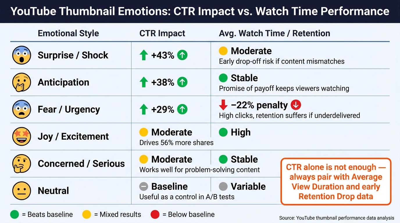
YouTube Thumbnail Emotions: CTR Impact vs. Retention Performance
Treat emotion as its own test variable. Once your face, layout, and general thumbnail structure are locked in, start testing the expression itself. The cleanest way to do this is to group similar videos together, then log each upload in a spreadsheet with the emotion used, publish date, and results. Track each test over the first 7 or 28 days so you're judging performance across the same window, not mixing early data with older, more mature results.
What to Measure Beyond Click-Through Rate
CTR tells you who clicked. It doesn't tell you whether the thumbnail set the right expectation.
That’s why you need to judge each version on more than clicks alone. The two metrics that matter most alongside CTR are average view duration and the audience retention curve. If you see a sharp drop in the first 30 seconds, that’s usually a sign the thumbnail promised more than the video delivered. If retention stays fairly flat or declines gently through the first half, that’s a much better sign. It means the thumbnail and the opening of the video matched.
Here’s how different emotional styles tend to perform across those three areas:
| Emotional Style | CTR Impact | Avg. View Duration | Retention Notes |
|---|---|---|---|
| Surprise / Shock | +43% | Moderate | Can cause early drop-off if content doesn't match intensity |
| Anticipation | +38% | Stable | Promise of payoff keeps viewers watching |
| Fear / Urgency | +29% | −22% penalty | High initial interest; retention suffers if content underdelivers |
| Joy / Excitement | Moderate | High | Drives 56% more shares |
| Concerned / Serious | Moderate | Stable | Works well for problem-solving and analysis |
| Neutral | Baseline | Variable | Lower click interest; useful as a control in tests |
A simple color system makes this easier to scan later:
- Green when both CTR and watch time beat your baseline
- Yellow when CTR goes up but retention drops
- Red when both metrics trail your baseline
Building a Repeatable Emotional Thumbnail System
After a few rounds of testing, turn the winners into templates. Patterns usually start to show up pretty fast. One format may keep doing better with a concerned or relieved face than a shocked one. Another may get more clicks from outrage, but more watch time from a thoughtful look. In that case, the lower-CTR option may still be the better long-term pick for serious topics.
From there, build a simple system around what you learn. Match your main video formats to the emotional styles that have done best. Set 2–3 standard templates for each format, including face placement, eye direction, text style, and background treatment. Then decide how often you’ll test a new emotion. Every third upload is a solid rhythm.
The key is to keep the template structure the same and swap ONLY the expression. ThumbnailCreator helps with that by keeping typography and layout steady across variants while making it easy to switch facial expressions. That way, emotion stays the only variable.
Conclusion: Core Rules for Better Emotional Thumbnails
After the shooting, design work, and testing, it all comes back to three basics: emotional thumbnails work when the expression is easy to read on a phone screen, fits the video, and keeps the face as the main focal point.
High-energy expressions tend to fit entertainment and reaction content. Curious or thoughtful faces usually work better for educational and analytical videos. The emotion matters, but the layout is what helps people understand it at a glance.
Keep the face large, the text short, and the background clean. If the emotion fades away at mobile size, the thumbnail isn’t ready yet.
Use ThumbnailCreator to keep layout and typography consistent while swapping expressions, so you can test emotion without changing other variables.
FAQs
How do I know if a thumbnail emotion is too exaggerated?
A thumbnail emotion goes too far when it doesn't line up with what the video actually delivers. Big expressions can work well. In fact, they often need a bit more intensity to show up on mobile screens. But they still need to feel honest.
When an expression looks forced, fake, or misleading, people notice. And once that trust slips, long-term retention can take a hit. ThumbnailCreator helps you test different expressions while keeping the emotion believable and easy to read.
Should every YouTube thumbnail include a face?
No. A face can lift click-through rates by 30% to 47%, but that doesn't mean every thumbnail needs one.
It comes down to your niche. Gaming, lifestyle, and vlog content often do well with faces because emotion helps sell the click. On the other hand, tech reviews, product demos, and some business topics may do better with a large, high-contrast hero object that tells viewers what the video is about at a glance.
The best move? Test both with your audience and see what gets the stronger response.
How long should I test a thumbnail before changing it?
Run A/B tests for at least 48 hours so you have enough data to spot a clear winner. And test one change at a time. If you change multiple things at once, it gets messy fast, and you won't know what your audience responded to.
Put your energy into changes that can move the needle, like:
- Background color
- Brightness
- Facial expressions
- Very different text angles
Skip tiny edits like minor layout shifts or small shade changes. Those usually don't tell you much.