
Ultimate Guide to Blur and Focus in Thumbnails
Most viewers judge a thumbnail in under 2 seconds, so blur and focus need to make the subject obvious at a glance. I’d keep the formula simple: one main subject, one short text hook, one soft background, then test it at small mobile size before publishing.
Here’s the core idea in plain English:
- Blur the background so the subject stands out fast
- Keep the key detail sharp like eyes, a face, a product, or the main action
- Use contrast so the subject is at least easier to see than the background
- Match the blur style to the thumbnail type:
- face thumbnails: soft background blur
- tutorials/products: sharp result, simple context
- gaming/action: heavier cleanup, light motion blur only if needed
- Check readability at small size, like 320 px or even 120 px for face-led thumbnails
- Export at 1,280 × 720 in 16:9 and keep the file under 2 MB
A few numbers stand out. More than 80% of YouTube traffic comes from mobile, thumbnails with clear emotional faces can lift CTR by 20–30%, and strong subject-to-background contrast can improve CTR by 33%. That tells me the job of blur isn’t style. It’s fast visual order.
I’d sum up the article like this: use blur to remove noise, use sharpness to set priority, and cut anything that slows down the first glance.
Core Blur and Focus Techniques That Improve CTR
Start with separation. Then tighten focus. Add motion only when it helps the click.
Background Blur for Subject Separation
Use blur to push the background back so the subject reads right away. The goal is simple: make the main subject easy to spot at a glance.
Pick the blur method based on the kind of content you're making. A subject cutout with blur gives the strongest isolation, which works well for vlogs and personal brand channels. But if the cutout is messy, you'll often see halos or rough edges around the subject. Bokeh blur leaves a soft trace of the setting, like a kitchen, a studio, or a travel spot, so the image still has context without feeling busy. A basic Gaussian blur is a good fast fix for cluttered scenes, though too much of it can wipe out the setting.
- Subject Cutout + Blur - Best for vlogs and personal brands. Gives maximum subject isolation. Watch for halos or rough edges around the cutout.
- Bokeh Blur - Best for travel, food, and lifestyle. Keeps context without heavy distraction. Avoid pushing it too far, or the image can look messy.
- Basic Gaussian Blur - Best for busy or cluttered scenes. Cleans up the background fast. Don’t remove so much detail that the setting stops making sense.
Your subject should be at least 30% brighter or darker than the background. That contrast gap helps the subject stay readable when the thumbnail shrinks to 168 × 94 pixels in mobile card feeds. You can also add a subtle dark vignette at 20–30% intensity around the edges to strengthen that separation.
Once the subject stands out, the next job is guiding the viewer’s eye with effective thumbnail composition.
Depth of Field, Layered Focus, and Sharpening
Think of the thumbnail in three layers: foreground, mid-ground, and background. The foreground subject should be the sharpest part of the image. The mid-ground can hold text or support elements. The background should stay soft or blurred so it doesn’t fight for attention.
This is where a lot of creators miss clicks. Instead of sharpening the whole image, sharpen only the details that matter most, like eyes, facial features, or product edges. That small change can make the subject feel clearer without making the entire thumbnail look harsh. A clipped Curves adjustment on the face or main subject can also help it stand out against a darker, blurred background.
Use motion blur only when the image needs to suggest speed, action, or urgency.
Motion Blur for Speed and Action
Motion blur can make a thumbnail feel fast by blurring the background or a moving object in one direction while keeping the main subject sharp. Used well, it hints at movement in a single glance.
Keep it as an accent, not the whole look. Too much motion blur makes the scene harder to read at small sizes, and if the background turns into a smear, the thumbnail can feel rough or unfinished.
sbb-itb-b59debf
Blur and Focus Settings for Different Thumbnail Types
The right blur move depends on what the thumbnail needs to say at a glance. A vlogger’s face, a finished dish, and a gaming moment don’t need the same treatment. If you want the image to read at mobile size, match the blur strength to the kind of click you’re trying to earn.
Face-Driven Thumbnails for Vlogs, Reactions, and Personal Brands
The goal is to make the click target obvious in one glance. With face-led thumbnails, put expression first, eyes second, and keep the cutout edges clean from start to finish.
Use a Curves adjustment layer to lift the midtones on the face so it becomes the brightest part of the image. Then use Select Subject with a Refine Edge brush to keep hair and shoulders sharp against the blurred background. Messy cutout edges kill the professional feel.
Don’t over-smooth skin. What matters most is whether people can read the expression right away. Thumbnails with human faces showing clear, expressive emotion boost CTR by 20–30%, and that gain comes from readable emotion, not airbrushed skin.
Check the thumbnail at 120 px wide. If the expression doesn’t register right away, increase the contrast between the face and the background or strip the background back even more.
If the subject isn’t a face, put the sharpest focus on the result or the tool instead.
### Tutorial, Education, and Product Thumbnails
The goal is to make the click target obvious in one glance. Use blur only when it protects the value cue. Pick one focal point: the result, the tool, or the text. Not all three.
For how-to content, a softly blurred context layer, like a kitchen counter or workshop bench, can add trust without adding clutter. For education and finance channels, a solid or gradient background often works better than blur because the focal point is usually bold text or an authority figure. Never blur the result, the finished product, or the answer to the viewer’s question.
Keep the frame limited to:
- the subject
- short text
- the background
Gaming thumbnails need that same clarity, just with much harder background cleanup.
Gaming and Fast-Paced Content With Busy Visuals
The goal is to make the click target obvious in one glance. Gaming thumbnails need harder cleanup because UI elements and visual effects crowd the frame fast.
Apply a Gaussian blur to background layers to cut down environmental noise. Then use AI Select Subject tools to isolate focal elements cleanly. A subtle vignette at 20–30% opacity around the edges helps pull the eye toward the center.
There’s a good reason to be ruthless here: thumbnails with more than three distinct visual elements see a 23% lower CTR on average. So don’t try to keep every UI detail on screen.
Keep the main action or focal object sharp, and let everything else fall back.
A Step-by-Step Workflow for Editing, Testing, and Refining Thumbnails
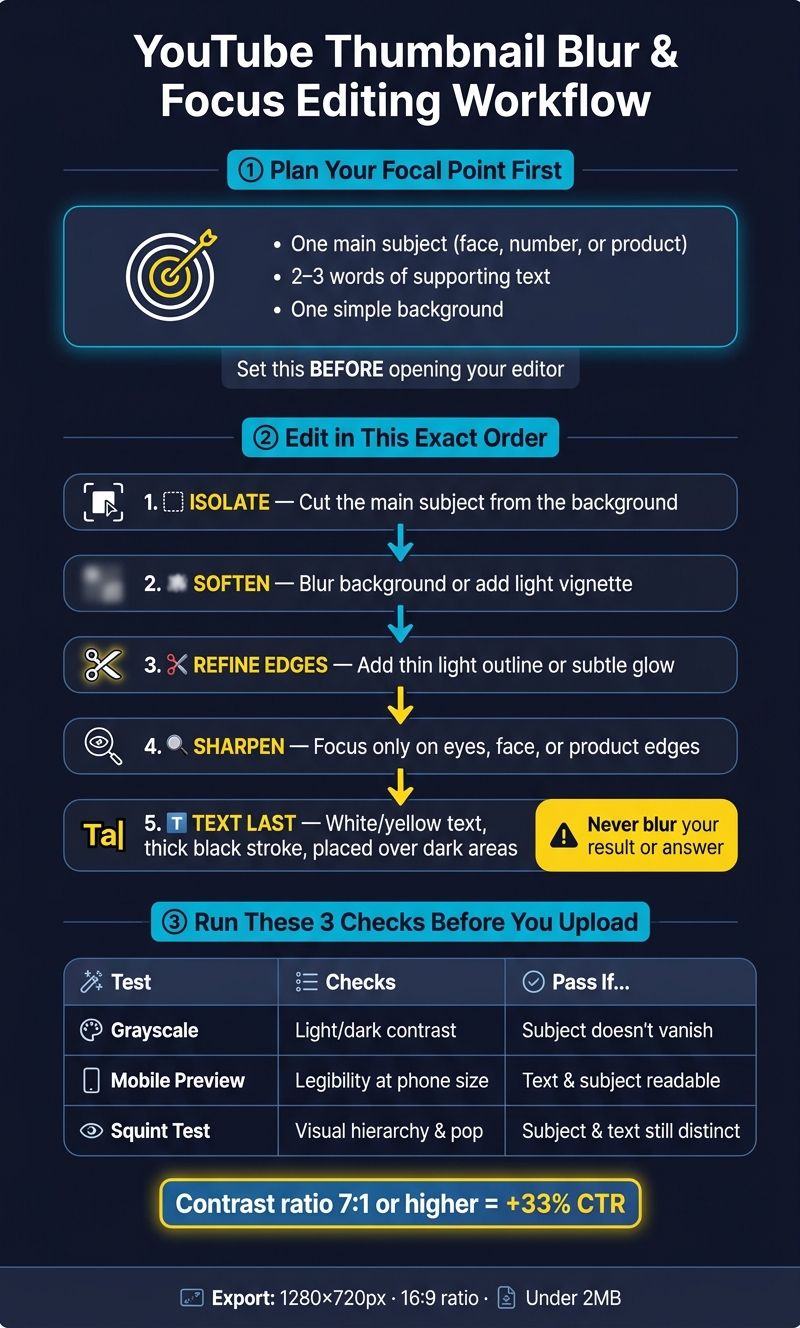
YouTube Thumbnail Blur & Focus Editing Workflow
After you pick the right blur style, use a clean workflow to apply it and check the result.
Plan the Focal Point Before You Start Editing
Start by choosing one focal point before you even open your editing app. That focal point might be a face with a strong expression, a bold number, or one product placed in the visual center. Everything else on the thumbnail should point back to that one thing.
Keep the layout tight: one main subject, 2–3 words of supporting text, and a simple background. That gives you a clear target before you add blur or sharpening.
Edit in the Right Order for Cleaner Results
The order of your edits matters more than most people think. Get the sequence wrong, and you can end up with halo edges, muddy backgrounds, and text that falls apart at small sizes.
Follow this sequence:
- Isolate the main subject from the background.
- Soften the background with blur or a light vignette.
- Refine the subject edges by adding a thin light outline or subtle glow to create edge separation from the blurred background.
- Sharpen the focal point.
- Place text last, using white or yellow text on dark, with a thick black stroke to prevent blending into the background.
After that, do your final readability checks before export. Export at 1280×720 pixels with a 16:9 aspect ratio, and keep the file under 2 MB.
Run Clarity, Contrast, and Glance Tests Before Publishing
Before you upload, run three fast checks or A/B test your thumbnails for better results.
First, convert the thumbnail to grayscale. If the subject disappears into the background once color is gone, your contrast is too weak. Thumbnails with a contrast ratio of 7:1 or higher between the subject and background get a 33% increase in CTR.
Second, check the thumbnail at phone size. Something that looks fine on a big screen can fall apart on mobile. Tiny text, soft expressions, or weak outlines often show their problems here.
Third, do the squint test. Lean back and blur your eyes a bit. If the subject shape and main text still read as separate elements, your visual hierarchy is doing its job.
| Test | What It Checks | Pass Condition |
|---|---|---|
| Grayscale | Light/dark value contrast | Subject doesn't blend into the background |
| Mobile Preview | Real-world legibility at phone size | Text and subject are readable without straining |
| Squint Test | Overall visual hierarchy and "pop" | Subject shape and main text remain identifiable |
Fix halo edges, muddy blur, and other common thumbnail mistakes before export.
Conclusion: Blur and Focus Rules Worth Keeping
Blur and focus are readability tools, not decoration. Every effect you add should help the thumbnail read at a glance, not just look better inside the editor. If you're just starting out, you can use free thumbnail tools to apply these effects.
After the editing and testing workflow, the rule is pretty simple: blur removes distractions, sharpness sets priority, and contrast separates the subject. Keep the frame to one subject, one short text hook, and one simple background.
Match the blur to the format. Use soft background blur for faces, motion blur for action, and masking only when you're making a reveal thumbnail. Go too far, and the thumbnail starts to look muddy. If it still reads clearly, you're in good shape.
Before you publish, do one last size check. Shrink the thumbnail to mobile scale and make sure the subject and hook still stand out. If they don't, simplify. Cut clutter instead of piling on more. The less work a viewer has to do, the easier the thumbnail is to read and the more likely it is to earn the click.
FAQs
How much blur is too much for a thumbnail?
Blur becomes too heavy when it cuts clarity and makes key elements hard to tell apart. That can hurt viewer engagement.
A handy test is a 16-pixel Gaussian blur. If the main elements still lead the composition, your visual hierarchy is in good shape. If the subject or text starts to disappear, the blur has gone too far.
Should I use blur if my thumbnail is mostly text?
Usually, no. If your thumbnail is mostly text, blur tends to hurt clarity and makes the words harder to read, especially on mobile where thumbnails show up small.
A better move is to use bold, high-contrast text with a simple background so people can grasp the message right away.
What should I fix first if my thumbnail looks muddy on mobile?
First, make sure your faces, text, and key visuals sit inside the safe zone and still look clear on mobile. Shrink the thumbnail in preview to check that it stays readable and doesn’t get covered or cut off by UI elements like timestamps.
If it still looks muddy, simplify the design. Use bold fonts, high-contrast colors, and short text. Then check it on an actual mobile device.