

Ultimate Guide to Text and Visual Balance in Thumbnails
Most viewers decide in under a second. So if I want more clicks, I need one clear subject, 3–5 words max, strong contrast, and text placed away from YouTube’s bottom-right timestamp.
Here’s the short version: a good thumbnail works when the image and text split the job. The image shows the topic. The text adds the angle. I keep the subject large - about 50%–60% of the frame - limit text to about 20% of the image, and leave 30%–40% open space so the design does not feel packed. On mobile, this matters even more, since about 70% of YouTube watch time comes from mobile devices.
If I had to boil the whole guide down, it would be this:
- Pick one focal point people can spot in 0.5 seconds
- Keep text short: 3–5 words tends to do best
- Put text in the upper-left area, not the bottom-right
- Use bold sans-serif text with strong contrast
- Blur or darken busy backgrounds
- Check the thumbnail at small size before publishing
- Keep the template structure fixed, and swap only the content
A few numbers stand out:
- Thumbnails with 3–5 words beat other text lengths by 28%
- After 7 words, each extra word can cut CTR by about 8%
- Bottom-right text can take up to a 45% readability hit
- The timestamp overlay covers about 8% of thumbnail pixels
This guide is about making fast layout choices that help people get the message at a glance - especially on a phone screen.
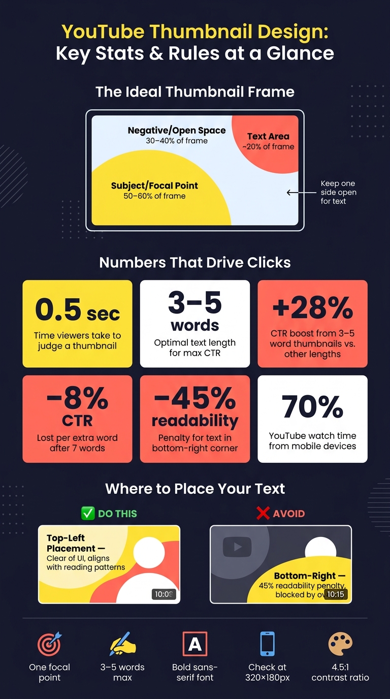
YouTube Thumbnail Design: Key Stats & Rules at a Glance
The perfect amount of text for thumbnails
Build a clear visual hierarchy
Visual hierarchy tells viewers what to notice first, second, and third. In a thumbnail, one thing should lead. Everything else should back it up.
This gets tricky with templates. Fixed text boxes and preset layouts can steal attention from the main subject. A better way is to start with the subject first, then add text only if it supports that choice.
Choose one focal point
Every thumbnail needs one main element that answers a simple question: what is this video about?
That main element might be:
- a face for vlogs and reactions
- a tool or end result for tutorials
- the product for reviews
Here’s the practical test: if someone sees your thumbnail for 0.5 seconds, what one thing must they notice? That’s your focal point.
Once you know it, make every other part of the design work for it. Text, icons, and the background should support the subject, not fight with it. Then use size and contrast so the subject stands out right away.
Use size and contrast to guide attention
After you pick the focal point, make it dominant. The main subject should take up about 50% to 60% of the frame so it still reads at small sizes. Tight cropping usually helps because it adds punch without piling on clutter.
Then contrast does the heavy lifting. Keep the background muted or dark, and let the subject hold the brightest, most saturated colors. For text, aim for at least a 3:1 to 4.5:1 contrast ratio between the text and its background. A white or light yellow word on a dark semi-transparent shape is a solid baseline.
Text gets too big when it starts competing with the subject or covering key details. Try to keep text to no more than about 20% of the image area, so the visual still leads.
Analyses of high-CTR thumbnails reported that 80% used one expressive face, high contrast, minimal text (3–5 words), and a clear focal point.
Once the hierarchy is in place, put the text where it can be read the fastest.
Match text to the visual message
Text should add what the image can’t show on its own: tension, context, or a quick hook. It shouldn’t just say what the viewer can already see.
Think of it like this: the image shows the subject, and the text supplies the angle. So "ONE HP LEFT" works better than "Boss Fight." And "NOT WORTH $999" says more than just the phone model name.
When the image and text each do a different job, they work together better. That makes the whole thumbnail easier to read in a split second.
Place text for readability
Once your hierarchy is set, the next job is placement. Put text where people can read it FAST.
Keep text short and easy to scan
The goal is simple: someone should understand your thumbnail hook at a glance. Keep the hook to 3–5 words max.
Short hooks like "Don't Do This" or "5-Minute Fix" spark curiosity without cramming the frame. If the image already tells the story, hits an emotion, or shows something people know right away, you may not need text at all. In those cases, no text can make the thumbnail look cleaner and stronger.
Place text in safe, visible areas
YouTube's timestamp overlay sits in the bottom-right timestamp area, so don't put key words there. Text in that corner is harder to read, with a 45% readability penalty, and the overlay hides about 8% of the total thumbnail pixels.
Put your main text in the top-left or upper-left area instead. That spot is easier to scan than other placements. If your subject takes up one side of the image, place text in the open space next to them. That gives you clean separation and helps the text stand out instead of fighting the subject for attention.
| Feature | Top Placement | Bottom-Right Placement |
|---|---|---|
| UI interference | Clear of the timestamp overlay | Blocked by the runtime overlay |
| Readability | Aligns with natural reading patterns | Up to 45% readability penalty |
| Best use case | Open upper space or a subject on the right | Avoid for important text |
Then make sure the text still holds up on mobile.
Improve legibility with font weight and contrast
Use a bold sans-serif font. Thin or decorative fonts tend to blur at mobile size.
If the background is busy or photo-heavy, add a 2–3 px outline in a contrasting color or use a soft drop shadow. That helps the letters stay readable without making the design feel bulky. Then shrink the thumbnail to 160×90 pixels and check whether the text can be read in one second.
sbb-itb-b59debf
Use composition and spacing
Once the text is easy to read, composition decides if it stays easy to read. The way you spread elements across the frame shapes whether a thumbnail feels open and lively or tight and cluttered. At thumbnail size, that difference shows up fast. Mobile screens are even less forgiving, so spacing needs to stay clean when everything shrinks down.
Use negative space to separate elements
Negative space gives both the subject and the text room to breathe. Design guides suggest leaving 30%–40% of the frame open to avoid a cramped layout. Each main element - your subject and your text block - needs a clear buffer, with as little visual noise nearby as possible.
If the subject and background blend together on first glance, add more separation. A simple way to do that is to leave one side of the frame open as a clean text area. Then keep the subject clearly apart from the background so it stays the main focal point.
Place subjects off-center to leave room for text
In fixed templates, moving the subject off-center is often the fastest way to make space for text. Placing the subject near one of the vertical third lines - using a rule-of-thirds setup - creates a natural open area on the other side for a short text block. It also tends to feel more dynamic than putting everything dead center.
The goal is simple: one strong subject and one tight text block. If the subject is large, bright, and high-contrast on the left, a bold but compact text block on the right can balance the frame without fighting for attention. Place the text near the opposite vertical third, avoid covering facial features, and the layout will feel deliberate instead of random.
Simplify busy backgrounds
A busy background steals attention from both the subject and the text. Blur it. Darken it. Pull some color out of it. If a detail doesn't help the message, tone it down.
A good gut-check is this: does the background help tell the story? A camera in a YouTube setup thumbnail belongs there. A random item on a shelf in the corner usually doesn't. Remove or soften anything that doesn't support the story, and the main message comes through much faster - especially on mobile thumbnail sizes. That keeps the layout balanced without forcing you to rebuild the template.
Customize templates without losing balance
Once your layout rules are in place, treat them like the frame for every thumbnail. A good template keeps the layout steady and changes only the content.
Keep the core template structure consistent
Break the template into fixed parts and editable parts. Fixed elements like the text block position, subject position, brand colors, core font, and logo placement help stop text and visuals from crashing into each other from one upload to the next. Editable elements like the headline, main image, facial expression, background, and object emphasis let you change the story without moving the structure around.
A simple check is to drop 9–12 recent thumbnails into a grid. If they feel like one set at a glance, but each still gets across a different idea, the structure is doing its job.
Change the right elements for each video
Keep anything tied to the focal point or mobile readability fixed, and change only the content. ThumbnailCreator can swap faces, objects, text, and backgrounds while keeping the layout in place.
Run a final thumbnail quality check
After you swap in new content, do one last mobile-size pass. Before you publish, shrink the thumbnail to 320×180 and check the balance. At that size, look at these five points:
- Is there one clear focal point that your eye goes to right away?
- Is the main text readable without squinting? Aim for at least 60–80 pt for primary text at 1280×720 resolution.
- Is there strong contrast between the text and background? A 4.5:1 ratio helps keep it legible.
- Is there enough space around both the subject and the text so nothing feels cramped?
- Do the text and image tell one story together?
If any answer is no, fix that single issue first. Most of the time, the problem is text that runs too long, a background with too much going on, or a subject that has drifted too close to the text block. Clean up that one part, and the balance usually comes back fast.
Conclusion
Strong thumbnails tend to follow a few simple rules. Use one clear focal point. Keep text short. Put that text where it stays visible and doesn’t fight with the main subject. Those small decisions are what make a thumbnail feel balanced.
Clean thumbnails are easier to read and easier to click, especially on phones.
That’s where locked templates help. ThumbnailCreator lets you swap faces, text, objects, and backgrounds without changing the layout underneath. It speeds up production because you’re swapping content, not rebuilding the structure every time.
Before each upload, check the thumbnail at mobile size. If something feels off, fix the one element causing crowding, weak contrast, or clutter. If people can understand it instantly on a phone screen, it’s ready.
FAQs
When should a thumbnail use no text at all?
Skip text when the image says everything on its own. Text-free thumbnails can be a gamble, but they can work when the visual is clear enough that people get the point right away.
If the thumbnail needs a bit more context, let the video title do that job. Or use ThumbnailCreator to build a balanced layout that keeps the image front and center.
How do I test if my thumbnail works on mobile?
Shrink your thumbnail down to how it shows up on phones, usually 168x94 pixels or even just 120 pixels wide.
At that size, there’s no room for clutter. If the text or main subject isn’t clear right away, simplify it. Cut extra words. Use a bolder font. Make the main idea easy to spot in a split second.
You can also run two quick checks:
- Grayscale test: View the thumbnail in black and white to see if the contrast still holds up.
- 5% zoom test: Look at the thumbnail at about 1 inch wide on your screen and see if it still makes sense.
If it falls apart at that size, it’ll probably get ignored on mobile.
What should I fix first if my thumbnail feels cluttered?
Start with one main focal point. Stick to just two or three visual elements. Anything more can make the thumbnail feel cluttered and harder to read at a glance.
Then scale it down to 100–120 pixels. If the main subject still doesn’t stand out, cut extra details like logos or secondary text. Keep text to 3–5 words, and use spacing to make your main hook stand apart.