
Ultimate Guide to Thumbnail Focal Points
Your thumbnail usually has about 300 milliseconds to stop the scroll. If I make the main subject obvious right away, the image has a much better shot at getting clicked.
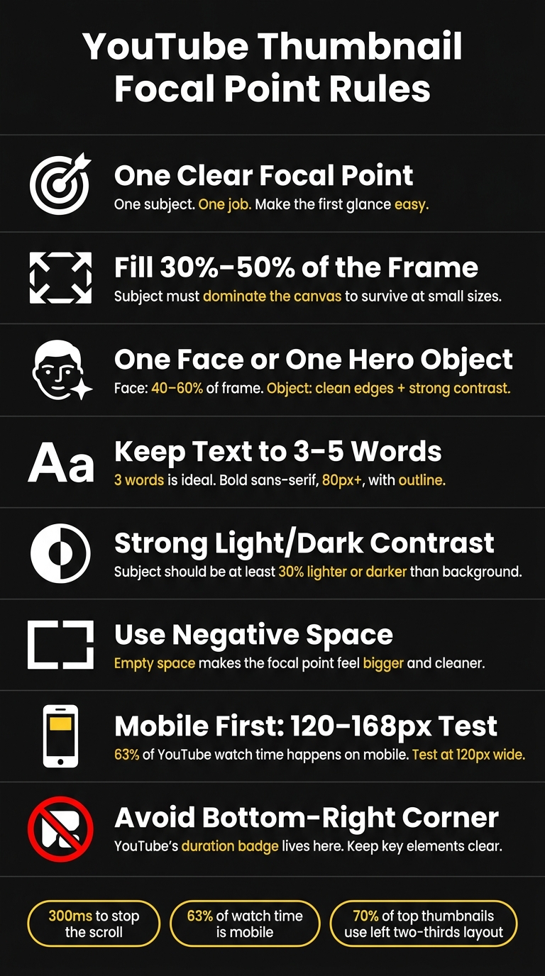
Here’s the short version: one clear subject wins. I keep that subject large, place it where the eye lands fast, use short text, leave space around it, and test the thumbnail at small mobile sizes like 120–168 px wide. I also avoid the bottom-right corner because YouTube puts the time badge there.
If I had to boil the whole article down, it would be this:
- Use one main focal point
- Make it fill about 30%–50% of the frame
- Use one face or one hero object
- Keep text to 3–5 words
- Use strong light/dark contrast
- Leave empty space so the subject stands out
- Check mobile first, since about 63% of watch time happens there
- Keep key elements out of the bottom-right area
A thumbnail doesn’t fail because it lacks flair. It fails because the eye can’t tell where to look first. So when I build a thumbnail, I focus on one job: make the first glance easy.
This guide covers the core parts that matter most: placement, scale, spacing, eye direction, faces vs. objects, text limits, mobile checks, and simple testing rules.
YouTube Thumbnail Focal Point Rules: Quick Reference Guide
YouTube Thumbnail Design Tip: The Rule Of Thirds
sbb-itb-b59debf
Build a Strong Focal Point with Composition and Hierarchy
Start with layout. Placement, size, and spacing decide whether your focal point hits right away or gets lost.
Use Placement, Scale, and Spacing to Control Attention
For 16:9 thumbnails, begin by comparing centered vs rule of thirds layouts. Place the subject on one of the four grid intersections. Those spots match how people tend to scan an image, especially in a Z-pattern from top-left to bottom-right, so the eye gets to the subject fast.
Size matters just as much as placement. Your main subject should fill 30% to 50% of the total frame. That range helps it stay readable when the thumbnail shrinks to about 120 pixels wide on mobile, where 63% of YouTube watch time happens.
Negative space helps cut visual noise and makes the focal point feel bigger. A face on the left third with open space on the right is much easier to process at a glance than a frame stuffed from edge to edge.
Centered composition also works well in the right situations. It's a smart fit for product demos, before-and-after reveals, and minimalist tutorials. The upside is instant focus. The catch? It can feel flat if you don't support it with strong contrast or a clear idea.
Guide the Eye with Leading Lines and Directional Cues
Once the subject is locked into place, use direction to guide the next glance.
If there's a face in the thumbnail, eye direction matters. When the subject looks toward the right side of the frame, viewers tend to look there too. That's a good place for a short text hook.
Gestures and object edges can pull attention in the same way. A hand pointing at a product, a forearm angled toward text, or the diagonal edge of a laptop screen can all work as leading lines. The key is restraint. One clear cue usually does the job.
Never put key text or main visual elements in the bottom-right corner. YouTube's duration badge sits there and can cover that area.
Comparison Table: Composition Methods for Thumbnail Focal Points
Use one composition method per thumbnail. If you pile on too many, the focal point usually gets weaker.
| Composition Method | How It Strengthens the Focal Point | Best Use Case | Main Drawback |
|---|---|---|---|
| Rule of Thirds | Aligns the subject with natural eye-landing points and adds visual tension | Vlogs, storytelling, reaction videos | Can feel unbalanced if negative space isn't handled with care |
| Centered Composition | Creates immediate, high-impact focus on one subject | Product demos, tutorials, and "before and after" reveals | Can feel flat or generic without a supporting story |
| Leading Lines | Uses arms, edges, or gaze to create a clear eye path | How-to videos, tutorials with tools or products | Can add visual noise if the lines are too literal or if there are too many |
| Framing | Uses background elements to box in the subject and separate it from noise | Cinematic content and high-production storytelling | Needs careful lighting so the subject doesn't blend into the frame |
Choose Focal Elements That Stay Clear at Small Sizes
Once your layout is set, pick a subject that still makes sense when the thumbnail gets tiny. On mobile, simple focal elements with strong contrast hold up best. Visual hierarchy only works if the main subject is still easy to spot at thumbnail size.
Use Faces, Emotion, and Objects to Stay Recognizable at Small Size
Faces work well because people read them fast and react to them right away. Stick with one face, crop in close, and choose a clear expression instead of an over-the-top shocked look. The crop should be tight enough that the emotion reads in a split second. As a rule of thumb, one face should take up about 40–60% of the frame, and one face usually beats several smaller faces.
For product reviews, tech unboxings, food content, or DIY tutorials, a large hero object can beat a face. In those cases, the object itself does the heavy lifting. It needs clean edges, strong contrast, and enough size to read at a glance.
Make Color and Text Support the Main Subject
Once the subject is clear, use color contrast and text to guide the next glance. Aim for a subject that is at least 30% lighter or darker than the background. High contrast makes the thumbnail easier to see.
Text should only fill in missing meaning. Keep it to 3–5 words, and 3 is ideal. Use bold sans-serif fonts at 80 pixels or larger, and add an outline so the words read faster. Also, keep text away from the bottom-right badge area.
Comparison Table: Faces, Objects, Text, and Icons as Focal Elements
Use one focal-element strategy per thumbnail. Pick the element that stays clearest at the smallest size.
| Focal Element | Attention Strength | Best Use Case | Main Benefit | Limitation |
|---|---|---|---|---|
| Faces | Very High | Vlogs, storytelling, commentary | Creates instant emotional connection and trust | Can lose impact if the expression feels fake or overused |
| Objects | High | Product reviews, tutorials, food content | Focuses attention on the result or product | Requires strong internal contrast to avoid blending into the background |
| Short Text | Medium | Educational, news, listicles | Clarifies the value proposition quickly | Becomes unreadable on mobile if longer than 3–5 words |
| Icons | Medium | Tech, gaming, finance | Leverages existing brand or platform recognition | Weak as the only focal point on mobile |
Design for Mobile, Desktop, and YouTube Interface Constraints
A strong subject can still flop if YouTube shrinks it down or covers part of it. Once your focal point is clear, the next step is simple: make sure it still reads across YouTube's different viewing surfaces.
Test Focal Point Clarity at Reduced Thumbnail Sizes
Shrink your thumbnail to 120 pixels wide and see if the main subject is obvious at a glance. If you have to study it for even a second, the design is probably too busy.
Small sizes wipe out detail first. Thin fonts fade. Low contrast gets muddy. Subtle facial expressions stop reading. Text-heavy vs minimal text designs that look fine at full size can turn unreadable at 168×94 pixels, which is the rendered size for YouTube Search and Suggested Videos on mobile - an 87% reduction from the original canvas.
The lesson is pretty plain: less detail, bigger subject, stronger contrast.
Avoid Placements That Clash with Timestamps and UI Overlays
After the size check, look at where YouTube's interface lands on top of the image.
YouTube puts the duration badge in the bottom-right corner of thumbnails across Home, Search, and Suggested placements. On mobile, that overlay can block part of anything sitting in that area.
"The bottom-right corner needs to stay clear too - that's where YouTube's video-duration overlay lands." - Thumby
A safer move is to keep faces, key text, and main objects in the left two-thirds of the frame. About 70% of top-performing thumbnails already use this layout pattern. If your focal point sits too close to a corner, it can get clipped or hidden. Thumbnails appear in many different contexts, and a lot of those views involve cropping.
If your subject is dark, add a bright outline or use a high-contrast color pair so it doesn't disappear in dark mode.
Comparison Table: Mobile vs. Desktop Focal Point Considerations
Use the rules that match the device your viewers are most likely to use.
| Factor | Mobile | Desktop |
|---|---|---|
| On-Screen Size | ~120–168px wide | ~360px wide and up |
| Subject Scale | Must fill 30–50% of frame | 30%+ preferred, more flexibility |
| Text Behavior | 3–5 bold words | Slightly more tolerant, but brevity still wins |
| Detail Tolerance | Low - fine lines and thin fonts disappear | High - textures and subtle details are visible |
| UI Overlays | Duration badge, "New" badge, progress bar | Duration badge along the right edge |
| Common Failure | Cluttered background; subject too small | Over-symmetrical or over-detailed layouts |
Refine Focal Points with ThumbnailCreator and Key Rules to Remember
Use ThumbnailCreator to Test Layouts, Faces, Text, and Object Emphasis
Once your layout rules are in place, use ThumbnailCreator to test them faster. It helps you compare layout options, face emphasis, text balance, and object hierarchy in minutes.
AI generation can place the subject on a Rule of Thirds intersection. Face swapping lets you test different emotional hooks on the same layout. Text editing helps keep copy short and secondary to the subject. Object swapping makes it easier to isolate one hero element at a mobile-friendly size. A/B test one variable at a time so you can see what improves CTR.
Comparison Table: ThumbnailCreator Features That Support Focal Points
These features connect directly to the focal-point choices that matter most.
| Feature | Focal Point Benefit | Best Use Case |
|---|---|---|
| AI Generation | Places the subject on a Rule of Thirds intersection | Starting a new design from scratch |
| Face Swapping | Tests different emotional hooks on the same layout | Reaction videos or personality-driven content |
| Text Editing | Keeps text short and secondary to the subject | Tutorials or listicles needing a brief hook |
| Object Swapping | Isolates one hero element and removes background clutter | Product reviews or before-and-after transformations |
| Templates | Gives you a proven starting point for spacing and hierarchy | Creators without a design background |
Conclusion: Core Rules for Thumbnails That Direct Attention Fast
After testing a few versions, keep the one with the clearest single focus. Use ThumbnailCreator to apply these rules fast: one clear subject, strong contrast, short text, and clean placement.
If the thumbnail reads instantly at a small size, publish it. If not, strip it back.
Strong thumbnails are edited for clarity, not decorated for attention.
FAQs
How do I choose the best focal point for my thumbnail?
Pick one standout element before you edit. That could be an expressive face, the main product, or a bold text hook. Aim for it to take up about 30% to 50% of the frame so it stays clear on mobile.
Place that element in the top-left or center of the image. Skip the bottom-right corner because YouTube’s duration badge sits there and can cover part of your thumbnail.
Then make that main element pop. Use contrast, size, and lighting so it’s the first thing people notice. A simple final check: do the squint test. If the main subject still stands out when you squint, you’re in good shape.
Should I use a face or an object as the main subject?
A face often works best because people notice faces fast. That can help lift click-through rate. For the strongest effect, use one expressive face that takes up about 30% to 50% of the frame.
That said, don’t jam it in if it doesn’t fit. In niches like product reviews or food channels, a strong product or object shot can beat a face. Either way, stick to one clear focal point.
How can I tell if my thumbnail works on mobile?
Shrink your thumbnail to 120 pixels wide, then do the squint test. If your eye doesn’t move from the subject to the text in a smooth, natural way, tweak the layout.
Also check the basics:
- Keep the main subject sharp and high-contrast
- Limit text to 3 to 5 words
- Don’t place anything important in the bottom-right corner, where YouTube’s timestamp can cover it