
Ultimate Guide to Niche-Based Thumbnail Templates
Thumbnails can make or break your YouTube success. Why? They’re the first thing viewers notice, directly influencing click-through rates (CTR) and how YouTube promotes your content. For example:
- Gaming thumbnails hit an 8.5% CTR with bold colors and dramatic visuals.
- Beauty thumbnails featuring close-up faces achieve 6–12% CTR.
- Generic designs? Often below 2% CTR.
A niche-based thumbnail template is a pre-made design tailored to specific content types (e.g., gaming, cooking, finance). These templates save time (15–20 minutes vs. 45–60 minutes) and align with audience expectations for better performance. Tools like ThumbnailCreator simplify this process with AI-powered designs for over 16 niches, ensuring your thumbnails look professional and grab attention.
Key tips for effective thumbnails:
- Focus on one subject to avoid clutter.
- Use 2–3 core colors aligned with your niche (e.g., red for gaming, blue for education).
- Keep text minimal (3–5 words) and place it strategically to avoid blocking key visuals.
- Test designs at small sizes to ensure clarity on mobile devices.
Whether it’s reaction-driven faces, before-and-after transformations, or curiosity-based designs, matching your thumbnail to your niche is critical for growth. Ready to boost your CTR? Start with niche-specific templates that resonate with your audience.
Key Elements of Effective Niche-Based Thumbnails
Clarity and Visual Hierarchy
Thumbnails need to grab attention instantly - viewers often decide whether to click in less than a second. The secret? Focus on one clear subject: a face, product, or object that immediately communicates the video’s topic.
Position this focal point using the rule of thirds or centered compositions, ideally in the left two-thirds of the frame, to avoid interference from YouTube’s timestamp overlay on the bottom-right. Adding a subtle drop shadow or outline around the subject can help it stand out against the background, creating depth without adding clutter.
Keep it simple. Thumbnails with more than three visual elements experience a 23% drop in click-through rates (CTR) due to visual overload. By reducing distractions, you guide the viewer’s eye exactly where you want it.
Color also plays a big role in reinforcing viewer perception and grabbing attention.
Contrast and Color Psychology
Colors don’t just make thumbnails pop - they set the tone and connect with specific audiences. Each niche has its own color "language", and aligning with those expectations can make your content instantly recognizable.
For example, red and orange accents are known to drive a 67% higher CTR in competitive feeds, which explains their popularity among gaming channels. Blue tones, on the other hand, foster trust, boosting the “trust factor” by 18%, making them ideal for education and finance content. High contrast alone can increase impressions by 37%.
| Niche | Dominant Colors | Psychological Association |
|---|---|---|
| Gaming | Neon Green, Electric Blue, Red | Energy, excitement, action |
| Education | Blue, White, Teal | Trust, expertise, professionalism |
| Food/Cooking | Gold, Orange, Red | Appetite, warmth, craving |
| Finance | Dark Green, Navy, Gold | Wealth, growth, authority |
| Tech Reviews | Black, Dark Blue, Neon accents | Premium, sleek, high-quality |
Stick to 2–3 core colors per thumbnail. Using more can create visual chaos and weaken your brand’s identity over time.
Text Placement and Readability
Text on thumbnails isn’t just decoration - it’s a tool to clarify and amplify the message. Thumbnails with 3–5 words perform 28% better than those overloaded with text. The shift to mobile-first viewing has also driven creators to reduce word counts by 40% between 2020 and 2025.
Place text in the upper-middle or top-left area to avoid overlap with YouTube’s timestamp in the bottom-right corner. Enhancing text with an outline or drop shadow can improve readability by 40%, while positioning it in the top-left boosts clarity by 34%. For fonts, bold sans-serif options like Impact, Bebas Neue, or Montserrat Black are ideal for maintaining legibility at smaller sizes.
"Thumbnail text is packaging for the first decision. It should clarify the tension, result, mistake, or payoff that the image already suggests." - GrabThumbs Editorial Team
Always test your thumbnail by shrinking it to 120 pixels wide - roughly the size it appears in mobile feeds. If the text isn’t legible at a glance, simplify it further.
sbb-itb-b59debf
How I make my YouTube thumbnails for the 2026 algorithm
Common Thumbnail Patterns Across Popular Niches
Some thumbnail designs consistently grab attention because they align with how viewers process visuals. Recognizing these patterns can help you choose the right approach for your niche, avoiding the trial-and-error method. Let’s dive into how elements like emotional reactions and transformation visuals can drive engagement.
Reaction and Emotion-Driven Thumbnails
Facial expressions are powerful - they grab attention faster than text or color. A strong reaction thumbnail can boost clicks by 42.3%. Among the most successful creators, surprised and happy expressions dominate, accounting for 26.95% and 26.65% of top-performing thumbnails, respectively. Even more striking, a shocked expression can increase click-through rates (CTR) by 45%.
However, trends are evolving. By 2026, many creators are moving away from exaggerated "YouTube face" expressions to more natural micro-expressions that better reflect the video's content. A study by TubeBuddy highlighted this shift:
"Performative expressions that do not match the video's actual content increase CTR but decrease average view duration, which hurts algorithmic distribution." - TubeBuddy Study
For mobile users, ensure the face occupies at least 30% of the frame for clarity. This tactic is particularly effective for gaming and commentary channels, where gaming content boasts an 8.5% organic CTR, the highest among niches.
Before-and-After and Transformation Thumbnails
This type of thumbnail thrives by showcasing a clear contrast - problem on one side, solution on the other. Popular in fitness, beauty, cooking, and DIY content, this format uses visual cues like dark, desaturated tones for the "before" and bright, saturated tones for the "after" to emphasize the transformation, even in small sizes.
For instance, cooking channels might display raw ingredients on one side and the final dish on the other. Similarly, tech or coding channels often use "messy vs. clean" interface comparisons to spark curiosity. These visuals work well when paired with concise text or question-based designs to further entice viewers.
Question-Based and How-To Thumbnails
Thumbnails that tap into the curiosity gap - offering just enough information to intrigue but not satisfy - are highly effective. This strategy is often debated as curiosity gap vs direct value thumbnails. For educational content, this approach can increase CTR by 54%. The key is specificity. A thumbnail with text like "5 Excel Formulas" tends to outperform generic titles like "Excel Tutorial" because it promises a clear, measurable takeaway.
In finance content, including precise figures like "$11,437" can heighten curiosity and engagement. Additionally, positioning the subject’s eyes to direct attention toward the text or key imagery creates a natural visual flow that guides the viewer.
Choosing the Right Template for Your Niche
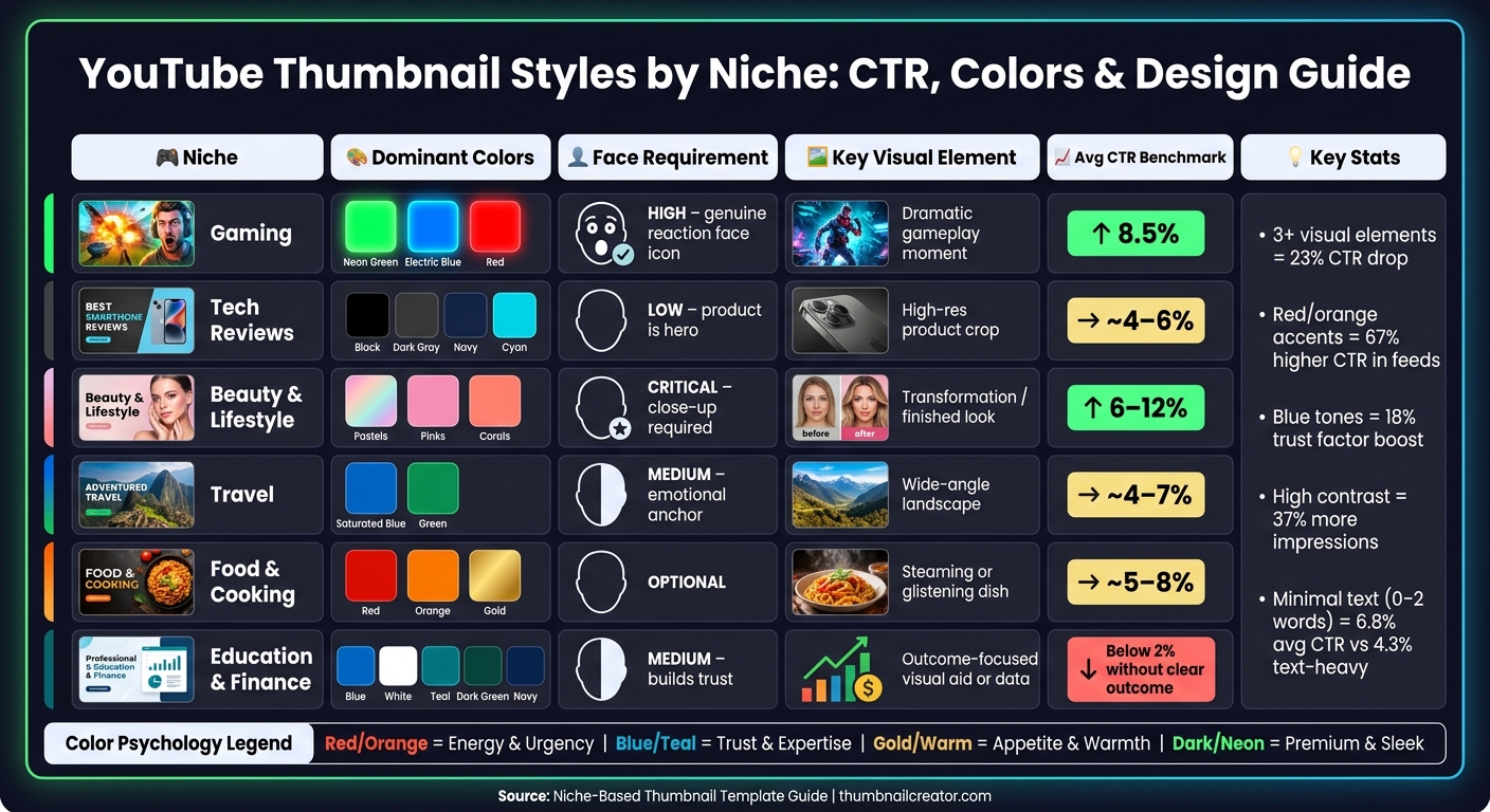
YouTube Thumbnail Styles by Niche: CTR, Colors & Design Guide
Every niche has its own visual style - a kind of design shorthand that viewers instantly recognize. When your thumbnail matches these expectations, it sends a clear message: this content is exactly what you're looking for. Stray too far from these norms, and you risk losing clicks. Below, we’ll break down the essentials for gaming, tech, beauty, lifestyle, travel, and food channels.
Gaming and Tech Channels
Gaming thumbnails are all about bold energy and contrast. A winning formula here often involves splitting the frame: about 40% should feature a reaction face, while the remaining 60% highlights a dramatic gameplay moment. Pairing dark backgrounds with neon accents helps your thumbnail stand out in a crowded feed and instantly signals "gaming" to your audience.
Tech thumbnails take a different approach. In this niche, the product is the star. A clean, high-resolution image of the product, centered against a dark background - think black, navy, or charcoal gray - creates a sleek, premium look. Faces, if included, are secondary and not always necessary.
Beauty and Lifestyle Channels
For beauty and lifestyle channels, the face is everything. A close-up shot with clear, even lighting is non-negotiable. Soft color palettes - like pastels, pinks, and corals - enhance the polished aesthetic that viewers expect. Thumbnails that focus on faces often achieve click-through rates (CTR) in the range of 6–12%.
"The difference between a mediocre thumbnail and a niche-optimized one is often the difference between algorithmic growth and stagnation." - ThumbMentor
Transformation visuals are another major draw. Whether it’s a makeup look, a styled outfit, or a home décor makeover, the "after" result should be unmistakable, even when viewed at thumbnail size. High contrast between the "before" and "after" makes the transformation pop and gives viewers a strong reason to click.
Travel and Food Channels
Travel and food thumbnails each have their own distinct focus. For travel content, wide-angle shots that showcase sweeping landscapes work best. Saturated blues and greens evoke a sense of adventure and wanderlust. Including a person in the frame can add an emotional connection, but the landscape remains the main attraction.
Food thumbnails, on the other hand, thrive on delicious details. Shooting at a 30–45° angle mimics the perspective of someone sitting at a table, making the dish feel more inviting. Warm colors - like reds, oranges, and golds - are especially effective because they naturally trigger appetite cues. Here, the dish is the focal point, and faces are optional.
| Niche | Dominant Colors | Face Requirement | Key Visual Element |
|---|---|---|---|
| Gaming | Neon Green/Blue/Red | High (genuine reaction) | Dramatic gameplay moment |
| Tech | Black/Dark Gray/Navy | Low (product is hero) | High-res product crop |
| Beauty | Pastels/Pinks/Corals | Critical (close-up) | Transformation/finished look |
| Travel | Saturated Blue/Green | Medium (emotional anchor) | Wide-angle landscape |
| Food | Red/Orange/Gold | Optional | Steaming or glistening dish |
Customizing Templates with ThumbnailCreator
ThumbnailCreator simplifies the thumbnail creation process, making it accessible even for those without design expertise. With tools designed to take you from idea to finished product quickly, it's no wonder over 15,000 YouTube creators rely on it. The platform's approach centers on starting with proven templates and then personalizing them to fit your unique style.
Using AI to Generate Niche-Specific Thumbnails
ThumbnailCreator's template gallery is categorized by niches like Gaming, Tutorial, Vlog, Tech, Fitness, and Business. Once you pick a niche-specific template, the "Remix with AI" feature steps in. By providing a short prompt that describes your video's topic, mood, and niche, the AI generates a range of design options. For example, gaming thumbnails might feature bold, dark visuals with neon highlights, while beauty thumbnails lean toward clean, bright layouts with product-focused framing. These AI-generated layouts align with the visual language of your chosen niche, giving you a strong starting point. From there, you can tweak colors, text, and image placement to reflect your channel's branding, helping improve click-through rates (CTR) by matching audience expectations.
Editing Text, Images, and Objects
Once you've chosen or generated a template, it's time to make it specific to your video. Start by customizing the text. Stick to 3–5 impactful words, use bold sans-serif fonts with outlines for better readability, and position text in the top-left corner - a placement shown to improve readability by 34%.
Next, use ThumbnailCreator's tools to swap faces, objects, or backgrounds while maintaining the template's layout. For instance, a travel vlogger might replace a generic background with a landmark, while a food creator could highlight a close-up of a dish's texture and warm tones. These adjustments let you personalize the thumbnail without losing the proven structure that drives engagement. By aligning visuals with niche-specific expectations, you can directly boost CTR. However, even with a great template, it's easy to make thumbnail mistakes that can hurt your performance.
After making these edits, ensure your design works seamlessly across devices.
Making Thumbnails Work on Mobile and Desktop
With over 70% of YouTube watch time coming from mobile devices, thumbnails need to look great even on small screens. Preview your design at reduced sizes - if text or faces aren’t immediately clear, simplify further. ThumbnailCreator's Design Rules feature helps by reserving the lower-right corner of each thumbnail, ensuring key visuals aren’t covered by YouTube’s video duration timestamp. High-contrast colors are also essential for maintaining clarity on mobile screens, so your thumbnail remains effective whether viewers are scrolling on their phone or browsing on a desktop.
Comparing Thumbnail Template Styles
Choosing the right thumbnail template is crucial since what works for one niche might flop in another. For example, a gaming thumbnail layout probably won’t resonate with a finance audience. Evaluating a template before committing can save you time and safeguard your click-through rate.
How to Evaluate a Thumbnail Template
Start with the Squint Test: shrink the thumbnail down to roughly 120×68 pixels to check if the main subject still stands out clearly.
Next, use a three-phase evaluation process:
- Phase 1: Look for high contrast and a clear focal point that grabs attention immediately.
- Phase 2: Ensure the thumbnail sparks curiosity through either an information gap or a compelling expression.
- Phase 3: Confirm the thumbnail aligns with the video title, ideally within 1.5 seconds of viewing.
If a template fails any of these phases, it might not perform as well as expected.
Additionally, make sure the template can fit 3–5 impactful words without looking cluttered. Check that critical elements aren’t blocked by YouTube’s timestamp. Finally, use colors intentionally: for instance, blue works well for educational or finance content because it conveys trust, while red and orange create urgency, making them ideal for gaming or commentary.
This evaluation process sets the stage for comparing various thumbnail styles and their performance across different niches.
Comparison Table of Thumbnail Styles
Below is a breakdown of popular thumbnail styles, showing how each aligns with the evaluation criteria and which niches they suit best:
| Thumbnail Style | Visual Composition | Text Strategy | Color Palette | Best Fit Niches |
|---|---|---|---|---|
| Reaction/Emotion | Large face (40–60%) with a dramatic expression in the "emotion zone" | 1–3 words with neon or glow effects | Energetic: Red, Orange, Neon | Gaming, Commentary, Vlogs |
| Product Showcase | Product takes up ~60% of the frame, minimal or no face | 2–3 bold words conveying a verdict | Dark/premium: Black, Navy, Cyan | Tech, Gear Reviews, Unboxing |
| Before-and-After | Split-screen with striking visual contrast | Result-focused (e.g., "–30 lbs") | High-contrast with bright lighting | Fitness, Beauty, Home Decor |
| How-To/Education | Face on the left, looking toward a visual aid on the right | 3–4 outcome-focused words | Trust-based: Blue, White, Green | Tutorials, Finance, Science |
| Curiosity Gap | Partially hidden object or blurred reveal | Incomplete phrase creating tension | High-contrast, directional arrows | Mystery, Investigative, Entertainment |
| Lifestyle/Vlog | Wide-angle location shot with a prominent face | Contextual phrase (e.g., "Day 1") | Natural, warm tones | Travel, Vlogs, Daily Life |
As highlighted earlier, the role of faces in thumbnails varies by niche. For finance, fitness, and beauty, a face can build trust and convey transformation. On the other hand, for tech and food channels, focusing on the product or dish often yields better results, as adding a face might dilute the impact.
Conclusion and Key Takeaways
Why Tailored Thumbnails Drive Better Results
Thumbnails designed with a specific audience in mind are more than just visually appealing - they directly impact performance. For instance, gaming thumbnails often achieve an average organic CTR of 8.5%, while educational thumbnails may dip below 2% if they fail to clearly communicate an outcome. The difference isn't about flashy production but about how well the design aligns with audience expectations. When your thumbnail visually "speaks" to your viewers, clicks follow naturally.
Simple design choices can make a big difference. Thumbnails featuring a well-positioned face with an authentic expression can increase CTR by 38% to 62%. Designs with minimal text - just 0–2 words - average a 6.8% CTR, compared to 4.3% for text-heavy designs. Efficiency also matters: using templates can cut creation time from 90 minutes down to just 15–20 minutes. For creators posting three videos a week, this adds up to saving around 182 hours annually. These results underscore the importance of intentional, niche-focused thumbnail design, as discussed in this guide.
By applying these strategies, you can streamline your process and achieve better outcomes.
Getting Started with ThumbnailCreator
Put these strategies into action with ThumbnailCreator, a tool designed to take you from idea to finished thumbnail in under 30 seconds. Its AI-powered generator creates thumbnails tailored to your niche, and its organized template library - covering Gaming, Tutorials, Fitness, Tech, Vlogs, and more - ensures you’re never starting from scratch.
A smart first step is to choose 2–3 templates that match your channel's aesthetic and rotate them to establish visual consistency. This can increase CTR among your existing subscribers by 15–20%. To refine your approach, use ThumbnailCreator's "Test & Compare" feature alongside YouTube's built-in A/B testing. Creators often see CTR improvements of 3–7% through this method. With a 4.8/5 rating and over 15,000 satisfied YouTube creators, ThumbnailCreator users report an average 73% boost in click-through rates.
You can try it for free and see the results for yourself - no upfront commitment required.
FAQs
How do I choose the right thumbnail template for my niche?
Take a look at your best-performing thumbnails to spot patterns in layouts, colors, and designs that resonate with your viewers. Once you’ve identified what works, select 3–5 templates that match your content style - whether it’s gaming, tutorials, or something else entirely.
After that, use ThumbnailCreator to make these templates your own. Add your images, text, and brand colors, but stick to the tried-and-true structure that’s already proven to grab attention. This way, you can stay consistent while maximizing your visual impact.
What should I A/B test first to raise my CTR?
To improve your click-through rate (CTR), focus on testing elements that make a noticeable difference. Start with background color, as it can influence performance by 18–25%. Then, experiment with facial expressions, which have been shown to affect engagement by 12–18%. Tools like ThumbnailCreator make it easy to swap and test these features efficiently. Skip minor layout changes - they typically result in less than a 3% impact, making them less worth your time.
How can I make my thumbnails readable on mobile?
To make sure your thumbnails are easy to read on mobile devices, follow these practical tips:
- Use bold, sans-serif fonts like Impact or Bebas Neue. Keep the font size between 75–200 pixels for maximum visibility.
- Keep text short - stick to 3–5 words to avoid clutter.
- Add a 3–8 pixel stroke or shadow around text to improve contrast and readability.
- Choose high-contrast color combinations, such as yellow text on a black background, to make the design pop.
- Avoid placing important details in the bottom-right corner - YouTube's timestamp will obscure this area.
- Always preview your thumbnail at smaller sizes to ensure it remains clear and readable.
These steps can help your thumbnails grab attention, even on smaller screens.