

Ultimate Guide to Social Media Thumbnail Optimization
My thumbnail rule: show one clear promise, then check it at 120–160 pixels wide. I use one main subject, strong contrast, and a few words only when they help explain the video.
The goal isn’t just more clicks. It’s getting the right viewers to click - and keep watching. Here’s the approach I follow:
- Fit the placement: Check dimensions, file limits, and crops for YouTube, Facebook, Instagram, and TikTok. In autoplay feeds, I give the opening seconds priority over the cover.
- Check every asset: I review image quality, licenses, likeness permissions, and AI-generated details.
- Save each version: I keep editable files and labeled exports so I know what changed.
- Test one change: I keep the title steady during thumbnail tests and compare clicks with watch time and retention.
<u>A thumbnail should promise only what the video delivers.</u> That’s the standard I use from the first draft to the next test.
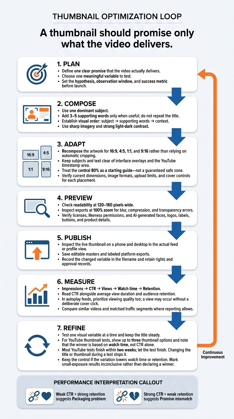
Social Media Thumbnail Optimization Workflow
6 Thumbnail Tricks Every Creator Should Know
sbb-itb-b59debf
Platform Requirements and Crop-Safe Layouts
Turn the core message into a separate export for each placement. Adjust the layout so the thumbnail stays readable across crops and makes the topic clear before the click.
| Platform or placement | Recommended format and dimensions | Crop-safe guidance | File requirements or limits | Publishing notes |
|---|---|---|---|---|
| YouTube standard video | 16:9; 3,840 × 2,160 px | Keep key details within roughly the central 80%; leave the bottom-right timestamp area clear | Minimum width: 640 px. JPG, GIF, or PNG. Mobile limit: 2 MB; desktop: 50 MB. | Upload custom thumbnails in YouTube Studio |
| YouTube Shorts | 9:16; 2,160 × 3,840 px | Keep key details clear of top and bottom overlays | Minimum height: 640 px; desktop upload limit: 50 MB. | Desktop Studio: custom uploads; mobile: frame selection where available. |
| Facebook feed and in-stream | Feed: 1,080 × 1,350 px at 4:5, or square. Horizontal in-stream: 1,920 × 1,080 px at 16:9 | Check feed crops and horizontal playback separately | These are working sizes, not universal thumbnail limits; requirements vary by publishing interface. | Upload or select a frame where supported; the source-video ratio is preserved. |
| Facebook Reels and Stories | 9:16; 1,080 × 1,920 px | Leave room for top and bottom interface elements | Follow image requirements in the composer - not video-upload limits | Meta Business Suite Reels: frame selection or thumbnail upload. |
| Instagram Reels | 9:16; 1,080 × 1,920 px | Check the profile-grid crop; keep key details away from top, bottom, and right-side controls | Recommended working size, not a universal cover-file requirement | Check cover and profile previews in the Reel composer. |
| TikTok covers | 9:16; 1,080 × 1,920 px | Keep text and subjects central; check profile framing | Check current cover controls and specifications in the app | Frame selection, image uploads, and post-publication editing depend on availability |
### YouTube Video Thumbnails and Shorts Covers
Start with high-resolution artwork rather than enlarging a small screenshot. For Shorts, confirm the upload path before designing a custom cover.
Facebook Thumbnails, Instagram Reels, and TikTok Covers
Don't default to 1.91:1 for Facebook. On Instagram, check the profile crop as well as full-screen playback. For TikTok, verify the current cover controls before building your workflow around them.
Mobile Previews and File Checks
Set guides for 16:9, 4:5, 1:1, and 9:16, then reposition the artwork and export each version. Use the central 80% as a starting guide - not a guaranteed safe zone.
Inspect each export at 100% zoom for blur, compression, and transparency errors. Confirm the pixel dimensions, file type, and image-upload limit - not the video limit. Before moving into design variations, check the published thumbnail on a phone and desktop in the actual feed or profile view to make sure it stays readable.
Thumbnail Design and Production
Once crop rules are set, focus on the message, visual order, and clarity within each frame.
Subjects, Text, and Visual Hierarchy
Write the video’s promise in one sentence. Then choose one dominant subject that supports it. Put the subject first, followed by 3–5 supporting words, then context. Don’t repeat the title. Use sharp images and light-dark contrast to make the subject stand out.
| Design choice | Best use | Main risk | Practical safeguard |
|---|---|---|---|
| Close-up framing | Face, product detail, or emotional reaction | Cropping or visual clutter | Leave breathing room around the subject |
| Wide framing | Demonstrations, settings, or before-and-after context | Subject looks too small or unclear | Enlarge the key object and simplify the background |
| Text-led layout | Specific step, benefit, or question | Viewers may miss the image or take too long to read | Use a short phrase and strong typographic contrast (see text-heavy vs minimal text thumbnails) |
| Image-led layout | Product result, recognizable object, or reaction | Meaning may be unclear | Add one visual cue to clarify the message |
| Contrast | Making subjects clear across visual styles | Details disappear on mobile, or saturated colors distract | Check in grayscale; strengthen outlines, increase scale, or separate the subject from the background as needed |
| Expressive imagery | Tutorials with an emotional payoff or problem/solution framing | May feel exaggerated or misleading | Match the expression to the actual video |
| Neutral imagery | Professional software, finance, or instructional topics | May look flat or interchangeable | Show a clear action, result, or recognizable product detail |
Start with one source image, then rearrange the subject, text, and context for each platform crop.
Use draft generation to test composition and wording - not to decide the plan.
Create Variations With ThumbnailCreator
ThumbnailCreator is an AI-powered tool for creators who want fast thumbnail drafts. Use AI generation to test more concepts quickly and text editing to refine the supporting copy. Start with one accurate base concept, then change one major variable, such as framing or copy, between test versions. The outputs are drafts, not performance guarantees.
Check every generated image against the source, including faces, logos, labels, buttons, and product details. Get documented permission before using an identifiable person’s likeness, especially for face swaps. Also confirm that stock images, logos, screenshots, fonts, icons, and product artwork have the required licenses. Reject edits that suggest an endorsement, feature, or result the video doesn’t support.
Build and Document Platform Versions
After the master design is approved, save the master file and export platform-specific versions. Document each export and what changed. Use a recognizable type family, logo treatment, subject cutout style, or recurring framing rule. Keep series cues consistent while giving each video its own look. Record the changed variable in the filename.
Example:
invoice-reminders_16x9_copy-auto-reminders_v03.png
Follow this workflow to carry the same promise across every version.
| Production stage | Platform decision | Quality check |
|---|---|---|
| Define promise | Identify the single claim shared across platforms | Claim matches the video and avoids unsupported results |
| Select source image | Choose a face, product, frame, or illustration | Image is sharp, licensed, and representative |
| Build master | Create the 16:9 version first | Visual order works at mobile preview size |
| Recompose vertical | Adjust for Shorts, Reels, TikTok, or other vertical contexts | Subject and text remain visible after cropping |
| Export | Apply platform-specific dimensions, format, and file-size rules | No clipping, artifacts, or unexpected color shift |
| Publish inspection | Check the live post or video listing | Thumbnail appears as intended across devices |
| Archive | Save the editable master and final exports | Naming, date, rights, and approval are documented |
Thumbnail Testing and Performance
Once each version goes live, use performance data to see which thumbnail drew clicks - and whether viewers kept watching.
Measure Clicks and Viewing Quality
Follow the path from impressions to retention: impressions, CTR, views, watch time, and retention. YouTube’s impressions CTR measures how often viewers watched after a counted thumbnail impression. It excludes some views from external websites, end screens, notifications, and other surfaces where impressions aren’t registered. In autoplay-driven feeds, a view can happen without a deliberate cover click, so check watch time and retention too.
Compare each exported version with recent videos that match its topic, format, audience, traffic source, age, and distribution. Where reporting allows, break results down by traffic source, device, geography, new versus returning viewers, and topic.
Read CTR alongside average view duration and audience retention. A higher CTR followed by a steep early drop can mean the thumbnail promised something the video didn’t deliver. YouTube’s typical-retention report lets you compare performance against your 10 latest videos of similar length.
Run Controlled Thumbnail Tests
Use your baseline data to test one visual variable at a time. Keep the title steady. Before starting, check eligibility, supported video types, upload limits, access, and reporting in YouTube Studio.
YouTube’s Test & Compare can test up to three thumbnail or title options. It chooses the winner based on watch time, not CTR alone. Let the test finish: YouTube says most tests end within two weeks, and changing the title or thumbnail during a test stops it.
Set your observation window and success metric before launch, with CTR as a secondary diagnostic metric. There’s no universal cutoff. Small samples and minor CTR differences may leave the result inconclusive.
If you test versions one after another, compare matched time windows. Record any changes in recommendations, audience mix, seasonality, or promotion - these shifts can make a version look like a winner when it isn’t.
Log Results and Update Older Thumbnails
Link each log entry to its saved filename and platform version. In the table, name the documented exports used as the control and variation. Not recorded means the data hasn’t been entered; N/A means the platform doesn’t provide it. Include exact dates, titles, test methods, traffic segments, and unusual events.
Update thumbnails that are inaccurate, look dated, or consistently underperform comparable videos. Weak CTR with strong retention suggests a packaging problem. Strong CTR with weak retention suggests a promise mismatch.
- Keep the control if the variation lowers watch time or retention.
- Adopt the variation if it improves CTR and watch time versus the channel baseline.
- Revise and test again if CTR climbs but retention falls.
- Mark the result inconclusive if exposure is too small.
Use repeated findings to update platform-specific templates at scale.
| Test date | Platform/version | Control filename | Variation filename | Changed element | Impressions | CTR | Views | Watch-time indicator | Decision |
|---|---|---|---|---|---|---|---|---|---|
| Not recorded | YouTube / Not recorded | Not recorded | Not recorded | Not recorded | Not recorded | Not recorded | Not recorded | Watch time / average view duration | Pending |
| Not recorded | Instagram Reels / Not recorded | Not recorded | Not recorded | Not recorded | N/A | N/A | Not recorded | Average watch-through or retention metric | Pending |
| Not recorded | TikTok / Not recorded | Not recorded | Not recorded | Not recorded | N/A | N/A | Not recorded | Completion rate or watch-time metric | Pending |
Conclusion: Thumbnail Checklist and Next Steps
Before publishing, check four things: the thumbnail’s promise, crop, asset rights, and performance plan.
Check Accuracy, Rights, and File Requirements
Start with the promise: the thumbnail should match the video’s topic and payoff, hold up across platform crops, and earn its place through performance. Preview it at mobile size to check the subject, text, contrast, sharpness, and restrained branding. Keep faces, products, and key text inside crop-safe areas.
Check the platform’s aspect ratio, resolution, file format, and upload limit. Verify ownership or licensing for every asset, along with any required likeness permissions - especially for face swaps. Review each platform’s rules on restricted imagery before publishing.
Once the file passes review, archive it so the next test starts from a clean baseline.
Save Versions and Plan the Next Test
Save editable source files and final exports with their dimensions, version names, publish dates, video links, and permission records. Connect each saved version to its baseline data and testing history so the next comparison has a clear starting point.
Test one meaningful variation to see how data-driven changes compare to intuition. Before publishing, write a hypothesis that explains how the change should improve performance, then define the success metric. Assess results using both clicks and viewing quality, and let the data guide the next change.
Follow the same testing loop: Plan → Compose → Adapt → Preview → Publish → Measure → Refine.
FAQs
How can I test thumbnails with a small audience?
Start with a stamp test: shrink your thumbnail to 120–160 pixels or view it on a phone. Check that the subject and 3–5 words of text are still easy to make out.
Use YouTube’s Test & Compare to run variants at the same time, changing just one major element per test. Aim for at least 1,000 impressions per variant over 7–14 days, so the test includes weekend traffic. Give watch-time share more weight than click-through rate.
When should I skip thumbnail text?
Skip thumbnail text when the image alone makes the video’s topic or result clear - even at a small size. Try hiding the title and description. If viewers can still identify the main subject, setting, or result, you may not need text.
ThumbnailCreator’s AI-powered features can help fine-tune your visuals, keeping them clear and professional without extra text.
How can I tell if my thumbnail needs updating?
A click-through rate (CTR) below the 2%–5% range is a strong sign that your thumbnail needs an update. Check watch time, too. High CTR paired with low watch time may mean the thumbnail promises more than the video delivers. Low CTR with solid average view duration suggests a redesign could help.
View your thumbnail at a small size. If the text is hard to read, the subject isn’t clear, or the layout looks cluttered, simplify it.