

Ultimate Guide to Tech Review Thumbnail Design
A tech review thumbnail should show the product and its main takeaway at a glance. Start with one clear product image, add 1–5 words if needed, and check that both remain easy to read at phone size.
The goal isn’t to fit the whole review into one image. It’s to make a clear promise the video delivers.
- Match the layout to the video: A single product suits a review; two balanced products suit a comparison. Add a face only when it supports a personal verdict.
- Keep the design simple: Use clear contrast, restrained branding, and accurate product details. Show only prices, results, and features the video supports.
- Build, check, and test: Use tech thumbnail templates, export in 16:9, and check current upload requirements. Test one change at a time, then review advanced thumbnail optimization metrics like CTR, watch time, and retention together - not clicks alone.
Make the Product the Main Focus
Build the thumbnail around one product and one supporting cue. Add text only when it helps explain the review angle. The product should draw attention first, before layout or branding, while the cue reinforces the review’s focus.
Choose Product Angles, Lighting, and Crops
Match the crop to what the video promises.
Use a three-quarter angle for standard reviews, profile or close crops for thinness and details, in-hand shots for ergonomics, overhead shots for unboxings, and internal views for teardowns.
Crop tightly, but leave identifying details and recognizable features in view.
Start with a sharp product image, clean lighting, and a simple background that keeps the device separate without hiding details. Remove glare, clutter, fingerprints, and distracting reflections. Keep the product’s color and shape accurate, and use shadow, rim light, or blur only to separate it from the background.
Decide When to Include a Face
Include a face only when the video centers on a personal verdict or reaction. Pick a natural expression that conveys that verdict. When it helps guide attention, direct the eyes toward the product or text. Match the lighting on the face and product, and keep both separate from the background.
Use faces for opinion-led videos, not comparisons, camera tests, or teardowns. If the face pulls attention away from the device, leave it out.
Make Text and Contrast Work on Mobile
Text should support the product, not compete with it. Put one short message in open space, away from key product details and the frame’s edges. Use large, clear lettering. Add an outline, shadow, or panel only if the text needs it.
Create light-dark separation first, then add a small set of accent colors. Use color only for emphasis. Check the thumbnail using mobile thumbnail optimization principles: if the text blurs or the product loses its shape, simplify.
With the product, face, and text in place, match the layout to the video type.
sbb-itb-b59debf
Choose Layouts for Tech Niches and Video Types
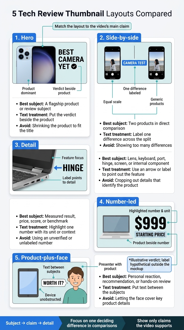
5 Tech Review Thumbnail Layouts Compared
Build the layout around the video’s main claim, not the space available. Give viewers a clear reading order: subject → claim → detail. A comparison needs two easy-to-see subjects. A feature-focused video may need just one enlarged detail.
Compare Common Thumbnail Layouts
| Layout | Best subject | Text treatment | Common mistake |
|---|---|---|---|
| Hero | A flagship product or review subject | Put the verdict beside the product | Shrinking the product to fit the title |
| Side-by-side | Two products in direct comparison | Label one difference across the split | Showing too many differences |
| Detail | Lens, keyboard, port, hinge, screen, or internal component | Use an arrow or label to point out the feature | Cropping out details that identify the product |
| Number-led | Measured result, price, score, or benchmark | Highlight one number with its unit or context | Using an unverified or unlabeled number |
| Product-plus-face | Personal reaction, recommendation, or hands-on review | Put text between the subjects | Letting the face cover key product details |
For comparisons, give both products equal scale, lighting, and placement. Use one divider and focus on one deciding difference. Clearly label prices or measured results.
With the layout in place, choose the feature viewers should notice first.
Choose Focal Points for Each Tech Niche
Treat these concepts as starting points. Use them only when the footage supports the claim.
Niche Focal point Concept Smartphone cameras or folds Camera module, hinge, or open display Open foldable across the frame; “FOLD?” beside the hinge. Laptops Display, keyboard, or chassis Screen dominates; “$999 OLED?” in adjacent open space. Cameras Camera body and genuine sample Body beside one image labeled “LOW LIGHT.” Gaming performance GPU, console, or game frame GPU beside a game frame; “4K?” poses the central question. Audio Fit, earcups, or noise-cancellation context Headphones on one side; “QUIET?” on the other. Smart home Device in its actual setting Doorbell at a front door; “RELIABLE?” nearby. PC compatibility or temperatures Connection, motherboard, or measured component GPU close-up with “72°C” only if documented. Accessories One accessory or genuine collection One USB-C hub for a review; grouped accessories only for a roundup.
Write prices as $999, rather than spelling out the currency. Include cents only when needed, as in $999.99. Give technical labels context: fps means frames per second, Hz means refresh cycles per second, and dB means decibels. Keep PC temperatures in °C and name the test workload.
Hypothetical annotated $999 laptop review: Place the laptop on the right third of the frame at a 45-degree angle, showing its keyboard and profile. Put “$999” at upper left and “PERFECT?” below it. Intended reading order: 1. Price ($999) → 2. Product (Laptop) → 3. Verdict (PERFECT?). Use the price only if it matches the reviewed configuration.
Next, match the thumbnail to the video’s exact format.
Match the Thumbnail to the Video Format
| Video format | Layout | Promise and guardrail |
|---|---|---|
| Review | Hero product plus verdict | Match the video’s actual verdict. |
| Unboxing | Packaging and product reveal | Promise a reveal, not testing. |
| Comparison | Balanced products with divider | Compare one defined difference fairly. |
| Buying guide | Ranked picks or highlighted winner | Show a curated selection. |
| Long-term review | Product plus time or wear cue | Show the actual ownership duration and wear. |
| Durability test | Product plus damage detail | Show only recorded damage. |
| Benchmark | Hardware plus verified result | Label the metric and explain test conditions in the video. |
| Teardown | Device plus internal detail | Use images from the actual teardown. |
| First look | Product plus restrained launch cue | Signal impressions, not full testing. |
Hypothetical annotated comparison: Put one phone on the far left and one on the far right, both facing forward. Place a large “VS” in the exact center and “CAMERA TEST” centered at the bottom. Intended reading order: 1. Center (VS) → 2. Left/Right (the phones) → 3. Bottom (context). Include camera samples only if the video actually evaluates them.
Build a Design and Publishing Workflow
Turn the layout rules above into a repeatable workflow for consistent, reusable thumbnails you can test.
Create Branded Templates With ThumbnailCreator
Stick to one or two typefaces, two or three accent colors, consistent padding, and a small channel mark. Save templates for reviews, comparisons, and unboxings so every upload starts with a proven layout. Keep the product and verdict dominant in each template.
Use ThumbnailCreator for AI concept drafts, templates, text editing, and face and object swapping. Check lens shapes, ports, logos, proportions, and screen content against your source photos. Get permission to use images and likenesses. Your edits must not suggest features, results, or prices the video doesn’t support.
Check Thumbnail Size and Export Settings
Build in 16:9, then check YouTube’s current thumbnail guidance before exporting. YouTube recommends 3,840 × 2,160 pixels, a 640-pixel minimum width, and JPG or PNG files. Upload limits are 2 MB on mobile and 50 MB on desktop.
Use JPG for photos and PNG for graphics or sharp text. Check the exported file for soft text, halos, clipping, color shifts, and overlap with interface elements. Once it looks right, move on to testing. If you are just starting out, follow a YouTube thumbnail beginners guide to master the basics.
Test Thumbnails and Review Results
Write one hypothesis and test one thumbnail decision at a time. Keep the title and other design elements unchanged.
YouTube’s native testing supports up to three variants for eligible channels with advanced features enabled. Check YouTube Studio for current video eligibility and testing options. YouTube evaluates watch time, not clicks alone, so let the test finish before choosing a winner.
Review impressions, CTR, watch time, and retention together. There is no universal winning CTR. Swapping thumbnails in sequence isn’t the same as testing them at the same time: audience mix, video age, and recommendations can change between periods.
Record the variants, dates, hypothesis, metrics, and final result. An inconclusive test means it found no clear winner - not that thumbnails don’t matter.
Run the Final Thumbnail Checklist
Before uploading, check the thumbnail against the finished video:
- The product is visible, and the focal point is clear.
- Text is legible after export, and the crop is clean, without clipping or interface overlap.
- Branding stays restrained.
- Exported dimensions, format, and file size are correct.
- The video supports every product, feature, price, result, comparison claim, and implied reaction.
Conclusion: Keep Thumbnails Clear and Accurate
Stick to one product, one message, and one focal point. Crop without losing key details, or use a side-by-side layout for comparisons. Include a face only if it supports the verdict. Keep text short and contrast high enough to read on mobile.
Then test the layout. Start with one branded design, changing only the product angle, wording, and focal point. Let CTR, watch time, and retention guide small adjustments - not clicks alone.
Clear thumbnails get attention; accurate thumbnails keep it.
FAQs
How should my thumbnail complement my video title?
Your title and thumbnail should work as a pair. The title names the topic; the thumbnail shows the result or verdict at a glance. Keep thumbnail text to two to five words that add to the title’s message instead of repeating it. If the image makes the topic clear, you can skip the text. Both should match what’s in the video to avoid a drop in watch time.
Why is my CTR high but watch time low?
A high click-through rate (CTR) with low watch time may mean your thumbnail promises more than the video delivers or sets the wrong expectations. When viewers don’t get what they expected, they may leave early.
Make sure your thumbnail matches what your review covers and what viewers will get from watching. Try a simpler design, and use YouTube’s Test & Compare feature to test versions that better reflect the video.
When should I update an older video's thumbnail?
Update an older video’s thumbnail if its click-through rate (CTR) drops below the 2% to 5% range. Replace it if CTR is high but watch time is low - the design may be misleading viewers. Dates, results, or other outdated information are also reasons to make a change.
After updating the thumbnail, track results for 24 to 72 hours to see how the change affects performance.