

Ultimate Guide to Travel Thumbnail Design
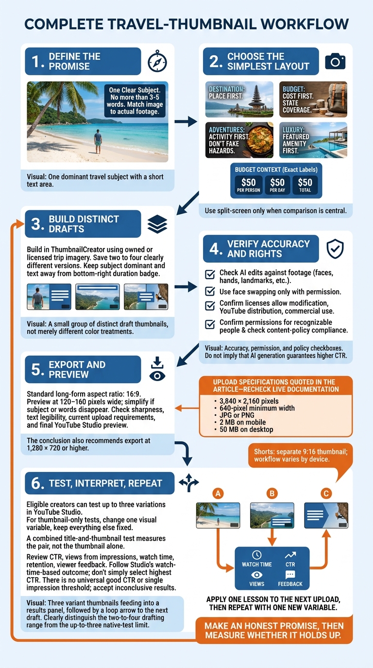
I start every travel thumbnail with one clear subject and no more than 3–5 words. Your viewer should see what the trip offers - and your footage should deliver on that promise.
Here’s my approach:
- Match the image to the video. Put the destination, price, activity, dish, or hotel feature first.
- Keep the layout simple. Make the subject easy to see on a phone, with text that adds context rather than repeats the title.
- Build drafts in ThumbnailCreator. Use your trip photos, check AI edits, and confirm image rights and permissions.
- Check before uploading. Review YouTube’s current file requirements, content rules, and the final Studio preview.
- Test for more than clicks. Compare up to three versions when eligible, then review watch time, retention, and CTR together.
My rule: <u>make an honest promise, then measure whether it holds up</u>. A thumbnail needs to earn the click and match what viewers came to watch.
Travel Thumbnail Design: From Promise to Performance
2. Match Images and Layouts to Your Video
Match what the thumbnail shows to what the video promises.
Choose Travel Images and Creator Portraits
Pick a sharp, well-lit image with recognizable surroundings. Leave a clean area for labels or price text.
The image should prove the video’s main claim, not just decorate it. Include your portrait when it adds scale, reaction, or a recommendation. Otherwise, use that space for the destination, dish, vehicle, or property feature.
Give food enough room to show its texture. For an accommodation review, make the feature you’re evaluating easy to inspect. Your face should add context - not cover the subject.
Choose a Layout by Video Type
With your main subject in place, choose the simplest layout that makes the premise clear.
- Destination guides: Put the place first. Let the landmark or landscape dominate.
- Budget trips: Put the cost first. Pair the setting with a price that clearly states what it covers.
- Adventures: Put the activity first. Show the action and enough terrain to explain what’s happening. Don’t fake hazards.
- Food travel: Put the dish first and make it the largest subject.
- Luxury stays: Put the featured amenity first, whether you’re reviewing the room, pool, or view.
For budget thumbnails, the price needs context:
$50 per person, $50 per day, and $50 total mean different things.
For itineraries, show a simple route or a small group of destinations instead of a crowded collage. For challenges, make both the task and its constraint visible. Use these labels only when the footage proves them:
“24 HOURS”
“500 MILES”
Use split-screen vs single image layouts only when comparison is central to the video. Otherwise, a single image gives the subject more room.
Make Text, Color, and Composition Clear
Place text over open sky, water, or wall space. Slight brightening, a subtle shadow, or an outline can help separate the subject from its background. Keep key details away from YouTube’s bottom-right duration badge.
Preview the thumbnail at phone size. Remove anything that makes the location, action, or price harder to understand. YouTube recommends thumbnails that remain effective when scaled up or down.
Choose the treatment that explains this video’s premise; audience testing comes later. Use the matrix below to find the least cluttered layout that still tells viewers what the video is about.
| Design choice | Strength | Risk | Best use |
|---|---|---|---|
| Portrait-led | Shows emotion | Can hide the destination | Personal reviews |
| Destination-led | Establishes the place | May lack human connection | Destination guides |
| Single image | Creates a clear focal point | Limits comparison | Hotel reviews |
| Split-screen | Shows contrast | Makes each image smaller | Comparisons |
| Minimal text | Keeps the image clear | May leave the premise unclear | Recognizable scenes |
| More text | Adds context | Creates clutter | Budget videos |
| Natural color treatment | Keeps the scene looking true to life | May look less dramatic | Accuracy-sensitive reviews |
| Strong color treatment | Helps the subject stand out | Can misrepresent scenery | Subject emphasis |
sbb-itb-b59debf
3. Create and Export Thumbnails With ThumbnailCreator
Build a Draft From Your Video’s Premise
With your layout set, write the video’s promise in one sentence. Choose a travel photo you own or have licensed that matches that promise.
In ThumbnailCreator, use AI generation or a template to sketch out the composition. Then replace generic AI details with real trip imagery, remove distractions, and avoid common thumbnail mistakes by enlarging the main subject. Test a clearer line with the text editor, and save two to four clearly different versions - not just the same design in different colors.
AI can cut manual work, but it doesn’t guarantee higher click-through rates. Check your edits and image rights before exporting.
Check AI Edits and Image Rights
Use face swapping only with permission. For object swaps, make sure the edited image still matches the trip. Before export, compare faces, hands, landmarks, food, signs, reflections, and perspective with your footage. Replace anything you can’t verify.
Reuse your channel’s fonts and colors, but keep each destination true to how it looks.
Confirm that image licenses allow modification, YouTube distribution, and commercial use when applicable. Get permission for recognizable people, especially children or anyone featured prominently. Store source files, licenses, permissions, and edited versions together so you can answer rights questions or replace an image quickly. Once the file is cleared, export it in the correct format.
Check YouTube Thumbnail Upload Requirements
For standard long-form videos, export in 16:9. YouTube currently lists 3,840 × 2,160 pixels, a 640-pixel minimum width, JPG or PNG files, and upload limits of 2 MB on mobile and 50 MB on desktop. Recheck the live documentation and upload screen before publishing. Pixel dimensions and file size are separate checks.
Open the exported file and check sharpness, color, text legibility, and readability at a small size. Then review the YouTube Studio preview. Shorts need a separate 9:16 thumbnail, and the upload workflow can vary by device.
Check YouTube’s Community Guidelines covering misleading thumbnails, nudity, hateful content, graphic violence, and harmful or dangerous material. AI edits don’t make prohibited content acceptable.
4. Test Thumbnails and Review Results
After export, check whether the thumbnail’s promise matches viewers’ responses.
Review CTR, views from impressions, watch time, retention, and viewer feedback together. There’s no universal “good” CTR. Compare similar audiences and traffic sources: CTR can fall as reach grows, even while watch time increases. High CTR paired with weak retention usually points to an overpromising thumbnail. Check early drop-offs and comments before blaming the design. If people click but leave fast, revise the promise before changing the video.
Let performance data - not guesswork - guide your judgment.
Run Controlled Tests in YouTube Studio
Check your eligibility in desktop YouTube Studio first. Eligible creators can test up to three variations, using thumbnail-only, title-only, or combined tests. For a thumbnail-only test, change just one visual variable and keep everything else fixed. A combined title-and-thumbnail test measures the pair, not the thumbnail alone.
Let Studio collect data across the video’s normal traffic cycle. Then follow its reported outcome, which is based on watch time, rather than picking the highest CTR. No single impression threshold fits every test, and an inconclusive result is better than forcing a winner.
Simply replacing thumbnails isn’t a controlled test. Audience mix, traffic sources, seasonality, recommendation momentum, and video age can all change too. If native testing isn’t available, treat the comparison as rough evidence. Record the dates, impressions, traffic sources, and any other changes.
Use a Thumbnail Publishing and Testing Checklist
Check the file before testing so a preventable flaw doesn’t skew the results.
Before publishing, confirm that the thumbnail has one dominant subject, strong contrast, and a clear destination or experience. Recheck accuracy, permissions, policy compliance, export settings, and the Studio preview.
Keep a test log that includes:
- Video and test details: Video title, upload date, test dates, impression volume, each variation, and the single main variable changed.
- Traffic and audience: Traffic sources, audience mix, and the audience and destination context.
- Results: CTR, views from impressions, watch time from impressions, average view duration, retention, and the final Studio outcome.
A bold face-led design that works for a personal New York City story may not suit a quiet national-park guide.
5. Conclusion: Repeat the Thumbnail Design Process
Build a thumbnail draft around your video’s clear promise in ThumbnailCreator, then check any AI edits. Once the draft is ready, export it and review.
Check the thumbnail at 120–160 pixels wide. If the subject or words disappear, simplify the design. Export at 1,280 × 720 or higher, keep the file within YouTube’s size and format limits, and check the final thumbnail in Studio.
For your next video, create two or three versions. Change one main visual element, such as trying different thumbnail styles, but keep the promise the same. After the file passes review, test it when eligible. Use the results to apply one lesson to your next upload, then repeat with one new variable.
FAQs
How can I make lesser-known destinations look appealing?
Use high-quality, wide-angle shots to show off one-of-a-kind scenery. Saturated greens and blues set an adventurous mood, while a prominent, expressive face helps viewers connect with the experience.
Use ThumbnailCreator to swap objects or backgrounds and fine-tune colors or lighting for a cinematic look. Add 3 to 5 words that hint at a “secret” or highlight a payoff, sparking curiosity and giving viewers a reason to click.
Should I update thumbnails on older travel videos?
Yes - consider updating older travel thumbnails if your click-through rate falls below the 2%–5% range. An update may help restore performance, but check audience retention, too. A high click-through rate paired with low watch time could mean the thumbnail is misleading.
Track results for 24–72 hours after the update. Use ThumbnailCreator to generate and test layouts, expressions, and text options that better connect with your audience.
What should I do if thumbnail tests are inconclusive?
Don’t count a “Preferred” or “None” result as a win. Retest your hypothesis with one clear, major design change.
Give YouTube Studio Test & Compare enough time to collect reliable data. Aim for at least 72 hours - up to 7 days for lower-traffic videos - and at least 1,000 impressions per variation.
Before you retest, check how the design reads on mobile. Simplify text and faces, and remove clutter where needed.