
What Makes a Good YouTube Thumbnail? 12 Examples
A great YouTube thumbnail grabs attention, boosts clicks, and sets clear expectations for your video. Here’s what works:
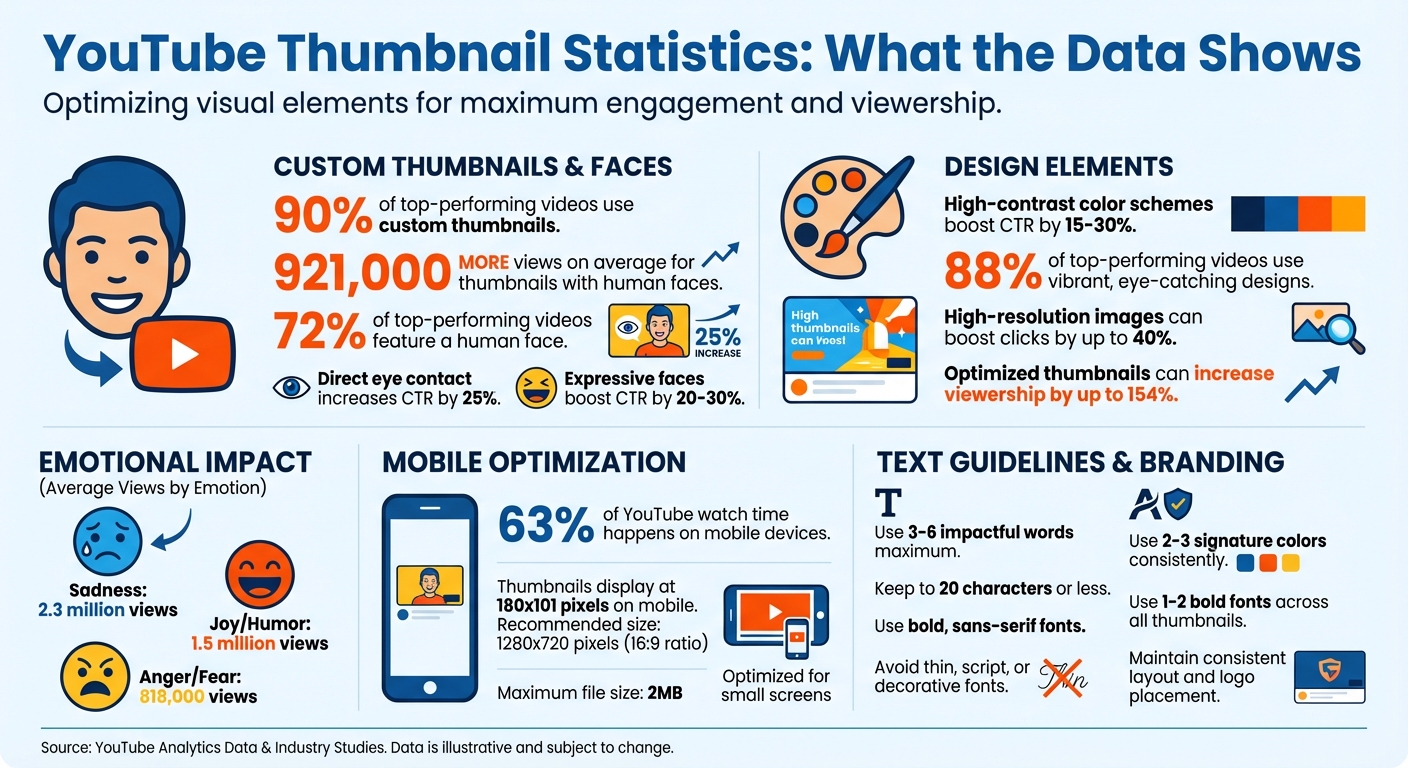
- Custom Thumbnails: 90% of top-performing videos use them.
- Emotional Faces: Thumbnails with human faces get 921,000 more views on average.
- Readable Text: Use bold, sans-serif fonts with 3–6 impactful words.
- High Contrast: Bright subjects on dark backgrounds stand out.
- Consistent Branding: Stick to a signature style with colors, fonts, and layout.
- Mobile Optimization: Ensure clarity at 150 pixels for small screens.
- Honest Design: Avoid misleading elements to build trust.
Want to improve your thumbnails? Focus on simplicity, bold visuals, and clear messaging to stop the scroll and earn the click.
YouTube Thumbnail Statistics: Impact on Views and Click-Through Rates
2025 Guide to Making YouTube Thumbnails - 15 Top Questions Answered
What Makes a Good YouTube Thumbnail?
Creating a standout YouTube thumbnail boils down to four key principles: high contrast, clear focus, emotional appeal, and consistent branding. These elements work together to grab attention in a crowded feed and persuade people to click in mere seconds.
High contrast is essential for making your thumbnail stand out against YouTube's white, gray, or dark backgrounds. This often involves placing bright subjects against darker or blurred backgrounds. It's especially important on mobile devices, where thumbnails are smaller, and image compression can impact clarity.
Clear focus means sticking to the "one idea" rule. The best thumbnails highlight a single, dominant focal point that viewers can grasp instantly. As YouTuber Isaac Carlton explains:
A good thumbnail is simple and speaks for itself. Almost so clear that the video doesn't even need a title.
Research backs this up - an analysis of 740 top-performing videos found that 72% featured a human face, showing how simplicity and human elements boost engagement.
Emotional appeal taps into our natural draw to faces. Thumbnails showcasing emotions like shock, joy, or sadness create a "curiosity gap" that entices viewers to click. Interestingly, videos with thumbnails conveying sadness had the highest average view count at 2.3 million, followed by joy and humor at 1.5 million.
Finally, consistent branding ties everything together. By using the same color palette, fonts, and layout across your videos, you make your content instantly recognizable to loyal viewers. As Chucky Appleby from MrBeast's creative team explains:
If you trusted Jimmy on the last video that he uploaded, and he delivered on the content, then the next video you see his face, and you'd be like, 'Oh, that's the guy that delivered on the last video I enjoyed so I'm going to click on this video as well'.
The upcoming examples will show how these principles come to life in thumbnail designs that attract clicks and drive views.
1. High-Contrast Expressive Face
A close-up of a human face showing clear emotion can be one of the most powerful elements in thumbnail design. Our brains are wired to process facial expressions faster than text, making this approach especially effective for grabbing attention. Pairing a brightly lit face with a dark or blurred background creates a high-contrast look that helps the subject pop, even on smaller mobile screens. This visual strategy has been linked to noticeable increases in engagement.
Thumbnails featuring expressive faces can boost click-through rates (CTR) by 20–30%. Research also shows that videos with human faces average 921,000 more views compared to those without. What's more, thumbnails where the subject makes direct eye contact can increase CTR by as much as 25%.
Take Senior Product Designer Alicja Suska, for example. She transformed her channel's thumbnails by switching from simple photos with dark backgrounds to images that highlighted clear emotions like shock or happiness. This change resulted in her newer designs receiving ten times more views.
To make the most of this approach, exaggerate facial expressions so they remain clear and impactful on small screens. Crop the face to fill the frame, and position the eyes along the top third of the image for a natural visual flow. Align your expression with the content: surprised or shocked faces work well for listicles and unexpected reveals, thoughtful or confused looks suit tutorials, and happy or smiling faces are ideal for success stories.
2. Bold Text That Sparks Curiosity
When done right, bold thumbnail text can be a game-changer. The trick? Keep it short - just 3 to 6 words that enhance your video title rather than mirror it. Think of your thumbnail text as a mini-advertisement, offering context or a hook that pulls viewers in.
"Use thumbnail text that differs from your title. Think of thumbnails as advertisements for your videos!"
- Jade Beason, Creator and Marketing Consultant
The best bold text creates a curiosity gap, nudging people to click. Phrases like "I did not expect this" or "Big Mistake!" tap into emotions and drive engagement. YouTube creator Paul O'Malley puts it perfectly: "A few words that pique curiosity and give viewers a reason to click. Ideally, I try to keep this to six words or less but still interest the audience".
Since 63% of YouTube watch time happens on mobile devices, your text needs to stand out even at smaller sizes. Bold, sans-serif fonts paired with high-contrast colors - like bright yellow or white on dark backgrounds - are ideal. Avoid thin, script, or decorative fonts, which can become unreadable when scaled down. Always preview your thumbnail at 150 pixels to ensure it's legible on smartphones.
Be mindful of YouTube's timestamp, which sits in the bottom-right corner. Avoid placing key text in that area to prevent overlap. Also, keep your text concise - 20 characters or less is a good rule of thumb. The goal is to create a seamless design where the text and imagery work together to maximize clicks.
3. Single Clear Focal Point
Your thumbnail has less than a second to grab attention, so it needs to communicate one clear idea. Overloading it with too many elements - like a face, a product, text, and a busy background - forces viewers to piece together the message. This confusion often leads them to scroll past without a second thought.
"A good thumbnail is simple and speaks for itself. Almost so clear that the video doesn't even need a title."
- Isaac Carlton, YouTuber and Content Creator
The most effective thumbnails feature one dominant visual element that takes up most of the frame. This could be an expressive face, a striking product image, or a dramatic before-and-after shot. Ali Tomek, Lead Visual Designer at Storyblocks, explains, "It seems from our conclusive tests that 1 large image that fills the entire screen and has a clear/interesting focal point works better than multiple, smaller images."
To make your main element stand out, keep the design simple. Use a clean or blurred background to create separation and ensure the subject pops. A bright subject on a dark background, for instance, naturally draws attention - even when scaled down for mobile devices. On smaller screens, your focal point must remain recognizable at just 150 pixels wide. As Chucky Appleby from MrBeast's creative team says, "If they have to spend 10 or 20 seconds to try to understand what's going on in your thumbnail, they're probably not going to be that invested, and they're going to keep scrolling."
A quick way to test your thumbnail’s clarity is the squint test: if the main subject doesn’t stand out when you squint, make adjustments. Enlarge the focal point, darken or blur the background, and remove unnecessary details. These tweaks can boost click-through rates by 15% to 30%.
4. Bright Color Combinations
After establishing clear focal points and an emotional connection, color choices play a key role in making your thumbnail stand out.
Colors grab attention faster than text or facial expressions. In a crowded feed, bold, saturated, and contrasting colors can immediately catch the eye. As design expert AWISEE puts it:
"Color is not decoration. Color is communication."
One effective strategy is using complementary colors - those directly opposite each other on the color wheel. For instance, pairing blue with orange creates a vibrant, energetic look, while yellow and purple add visibility and a creative touch. Yellow combined with black is especially striking, often used in nature and warning signs to demand attention. These combinations naturally create contrast, helping your thumbnail stand out in a sea of content.
To avoid overwhelming your design, stick to 2–3 main colors. For example, gaming channels often lean toward neon greens and electric blues against dark backgrounds, while tech creators might prefer blues and grays with pops of orange or red. Educational channels benefit from clean white or blue backdrops, accented with yellow for clarity.
It's also wise to steer clear of YouTube's default red, white, and black palette as your main scheme. Using these colors may cause your thumbnail to blend into the platform's interface. Instead, try a darkened or blurred background with bold foreground elements to make your text and subjects pop. A quick "squint test" can help: if your thumbnail's main subject isn't clear when you squint, it likely needs stronger contrast.
Thumbnails with high-contrast color schemes can boost click-through rates (CTR) by 15–30%, and 88% of top-performing videos feature vibrant, eye-catching designs. The right color choices can convey urgency, excitement, or curiosity in just a split second, making all the difference in grabbing a viewer's attention.
5. Consistent Brand Elements
Once you've nailed your color choices, the next step is maintaining consistent branding to solidify your channel's identity. Picture this: a viewer scrolling through a sea of video suggestions instantly spots your content because of your signature style. That’s the power of consistency - using specific fonts, color schemes, and logo placement to create a visual "fingerprint" for your channel.
Katie Steckly, a content creator, explains her strategy:
"I definitely like to keep a consistent style, using all the same fonts on my thumbnails, and I color grade them all with the same Lightroom preset. I want people to see my thumbnails and immediately know that it's one of my videos".
This approach not only looks polished but also reassures viewers of the quality they’ve come to expect from your channel. By combining these branding elements with your design basics, you create a stronger, more recognizable identity.
Here’s how to start: build a brand kit. Choose 2–3 signature colors and 1–2 bold fonts (like Impact or Bebas Neue) that reflect your channel’s vibe. Stick to a consistent layout - placing your logo in the same corner each time, such as the top-left or bottom-right. Keep the logo subtle, so it doesn’t overpower the main focus of your thumbnail. If you’re an on-camera creator, take a variety of "thumbnail poses" to maintain a consistent look while keeping things visually interesting.
The results? They speak for themselves. A cohesive brand style can make your content instantly recognizable, and optimized thumbnails have even been shown to boost viewership by up to 154%. As TubeBuddy puts it:
"Consistency builds familiarity, builds trust, and reduces hesitation".
When viewers recognize your style, they’re more likely to click - and that familiarity fosters trust.
That said, it’s important to strike a balance. While your core branding elements should remain consistent, refreshing your imagery and topics keeps things engaging. This way, loyal subscribers immediately recognize your videos, but new viewers still find them appealing and fresh. By blending consistency with a touch of novelty, you’ll keep your audience coming back for more while attracting new viewers along the way.
6. Emotional Human Connection
Once you’ve nailed down brand consistency, it’s time to tap into something even more powerful: human emotion. Our brains are naturally drawn to faces, especially when they display strong emotions. Here’s a compelling fact: thumbnails with human faces get an average of 921,000 more views than those without them. Why? Because emotional expressions grab attention and instantly build trust.
Think about it: a single expression can tell a story before anyone even reads the title. For example, in October 2025, creator Linda Sun used a thumbnail for her vlog titled "It Happened, I Got Injured". The raw pain on her face immediately communicated the intensity of her story, sparking curiosity and drawing viewers in.
The data doesn’t lie. Thumbnails that feature faces with strong emotions can boost click-through rates by 20–30%. But not all emotions perform equally. Sadness tends to average 2.3 million views, joy and humor hover around 1.5 million, while anger or fear bring in about 818,000 views. The trick is to align the emotion with your content and keep it authentic. Using stills from your video or photos taken during filming ensures the expressions feel real, not staged.
Here are a few tips to make emotional thumbnails work for you:
- Shoot close and crop tightly: This ensures facial expressions remain clear, even on small screens.
- Direct eye contact matters: Thumbnails with eye contact can increase click-through rates by up to 25%.
- Amplify expressions: Exaggerate emotions slightly so they’re easier to read at a glance.
- Experiment with poses: Try different angles and expressions to see what resonates best with your audience.
When done right, emotional thumbnails don’t just grab attention - they create a connection that makes people want to click and watch.
sbb-itb-b59debf
7. Negative Space for Clarity
Once you've nailed down the emotional cues, the next step is to simplify your layout by embracing negative space. This refers to the empty areas surrounding your main elements, and it’s what separates a polished, professional thumbnail from a chaotic one. Negative space helps focus attention and works hand-in-hand with the emotional cues you’ve already established.
Overloading a thumbnail with too many images, text, or graphics creates visual clutter, making it difficult for viewers to identify the main point.
Shannon Craig from Custom Thumbnails sums it up perfectly:
"Incorporating strategic white space within your thumbnails... will help your thumbnail to look more clean and organized."
Negative space isn't just about aesthetics; it’s also about functionality, especially on mobile screens. With 63% of all YouTube watch time happening on mobile devices, thumbnails that look sharp on a desktop can turn into an unreadable mess on a smartphone. Keep in mind that thumbnails often shrink to just 180x101 pixels on mobile, so clarity is critical.
By keeping your design simple and uncluttered, you allow your main message to stand out. Negative space naturally guides the viewer’s eye to the most important element - whether that’s a bold headline, an expressive face, or a featured product - by removing unnecessary distractions.
To make this work, try limiting your text to 3–5 words and using a blurred or darkened background. Position your subject off-center using the rule of thirds, which creates natural room for text or other supporting elements. Above all, stick to the "one idea per thumbnail" rule. Overloading a thumbnail with too much information can bury your key message under a pile of visual noise.
8. Readable Text at Small Sizes
Your thumbnail might look sharp on a desktop, but here’s the catch: a huge chunk of YouTube watch time happens on mobile devices. On smaller screens, your design shrinks to a tiny icon, and at that size, text either works or it doesn’t - there’s no in-between. Just like your visuals need to grab attention, your text has to stay readable when scaled down.
The key? Use bold, sans-serif fonts. As AWISEE perfectly sums it up:
"If text fails at small sizes, it fails completely. That means: Thin fonts fail, Script fonts fail, Decorative fonts fail. Bold always wins."
Sans-serif fonts are clean, modern, and easy to read even at smaller sizes, while decorative or script fonts tend to blur into an unreadable mess.
Keep your text short and snappy - ideally 3–5 words. YouTube creator Paul O'Malley shares this tip:
"Ideally, I try to keep this to six words or less but still interest the audience. More than that tends to result in a font that is too small to read easily."
Some experts go even further, suggesting a maximum of 20 characters. The goal isn’t to oversimplify your message but to make sure it’s instantly clear, especially when viewers are scrolling quickly.
Contrast is another big deal. Use thick outlines, drop shadows, or glows to make your text stand out against busy backgrounds. If your text sits on a detailed image, darken or blur the area behind it to improve contrast without ruining the overall look. A quick trick? Apply the "1/10th rule" - shrink your design to one-tenth its original size to mimic how it’ll appear in a mobile feed. If it’s hard to read, it’s time to tweak.
And don’t waste space by simply repeating your video title. Instead, go for a punchy phrase in bold, clear text. Your thumbnail and title should complement each other, not fight for attention. Once your text is readable, focus on creating a design flow that naturally guides viewers’ eyes to the next key element.
9. Directional Gaze and Visual Flow
Once you've nailed down a clean layout and clear text, the next step is to use natural eye behavior to guide attention. Humans are naturally drawn to where others are looking. If the subject in your thumbnail makes direct eye contact, it immediately grabs attention. But if their gaze is directed elsewhere, it creates a path for viewers to follow. Matt Gielen, Director of Programming and Audience Development at Frederator, explains this phenomenon:
"Humans have evolved to detect eye contact, making thumbnails with eye contact more eye-catching, especially if the whites of the eyes are visible."
This instinct can be used to craft a deliberate flow within your thumbnail.
To make the most of this, position your subject so their gaze leads viewers to key elements. For example, if you're showcasing a product, have the subject look at it. If the text is the main hook, angle their eyes toward the words. This technique creates what Photoroom refers to as a "visual roadmap":
"Think of your thumbnail as a visual map. You want your viewers' eyes to land on the most important part first... and then naturally move to supporting details."
This approach ties back to the idea of having a single, clear focal point. Place your subject at one of the intersections of a 3x3 grid to guide viewers naturally from the focal point to other supporting elements. Close-up shots are especially effective, as they ensure the subject's eye direction remains clear, even on smaller screens like mobile devices.
One important tip: avoid putting crucial elements in the lower right corner. YouTube's timestamp overlay will obscure this area, disrupting your carefully designed visual flow. Instead, focus on placing key elements in the upper portions or the left side of the frame, aligning with how Western audiences tend to scan visuals.
When executed well, directional gaze transforms your thumbnail into more than just an image - it becomes a guided experience that captures attention and communicates your message in seconds.
10. High-Resolution Sharp Images
High-resolution images are a must for creating professional-looking thumbnails. They build on essential design elements like contrast and focus, ensuring your thumbnail catches the viewer's eye. On the flip side, blurry or pixelated thumbnails scream low-quality content and can instantly harm your credibility. Kirsti Lang, Senior Content Writer at Buffer, sums it up perfectly:
"There's nothing that says, 'I don't know what I'm doing on YouTube,' like a pixelated, stretched, or black-bordered thumbnail."
To avoid this, stick to the recommended technical specs: upload thumbnails at 1280 x 720 pixels with a 16:9 aspect ratio, and keep the file size under 2MB. This ensures your thumbnail looks sharp whether it’s a tiny icon on a smartphone or displayed in YouTube’s "next watch" suggestions. Considering that 63% of YouTube watch time happens on mobile devices, your thumbnail must stay clear even at smaller sizes like 180 x 101 pixels. Meeting these standards guarantees your thumbnail looks professional across all devices.
Why does resolution matter so much? Sharp images do more than just meet technical requirements - they inspire trust and increase clicks. Neil Patel, Co-Founder of NP Digital, emphasizes this point:
"Low-resolution images appear blurry online, and they look unprofessional."
In fact, 90% of top-performing YouTube videos use custom thumbnails, and high-resolution images can boost clicks by up to 40% compared to low-quality alternatives. A crisp, professional thumbnail signals to viewers that your content is worth their time.
Avoid using a still frame from your video as your thumbnail. Instead, take high-quality photos specifically for this purpose during your shoot. Video stills often lack the sharpness needed to stand out and don’t handle YouTube’s compression process as well as dedicated photos.
Finally, test your thumbnail on mobile devices. If it looks blurry or key elements become unreadable when scaled down, tweak the design. Poor clarity on mobile can cost you clicks and even limit your video's reach within YouTube’s algorithm.
11. Edge Outlines and Glows
Edge outlines and glow effects are like the finishing touch for your thumbnail design. These techniques help define your subject clearly, no matter the screen size. Whether it's a person, product, or object, these effects ensure your subject stands out from the background - even when your thumbnail is reduced to a tiny icon on a smartphone. This is especially important since YouTube thumbnails often undergo compression, which can blur boundaries and reduce visual clarity.
The trick lies in adding a high-contrast border around your subject. This border not only ensures your subject stays sharp but also makes it pop against the background. For instance, a simple white outline or a soft glow can create separation that naturally draws attention.
Here’s how you can apply these effects effectively:
- Use a 2–4 pixel contrasting outline: Choose white for dark subjects and dark for lighter ones.
- Add a soft drop shadow behind the outline to create a polished, three-dimensional look. This layering not only adds depth but also gives your thumbnail a more professional and dynamic feel.
Effects and Their Best Uses
| Effect | Purpose | Best Use Case |
|---|---|---|
| Solid Outline | Creates strong contrast around the subject | Great for high-energy videos, branding, and ensuring visibility on mobile devices |
| Glow Effect | Adds depth and an "aura" | Perfect for tech reviews, highlighting specific items, or giving a premium vibe |
| Drop Shadow | Adds 3D depth | Ideal for separating text or subjects from slightly busy backgrounds |
| Edge Glow | Subtle visibility boost | Works well for professional vlogs, offering a natural yet distinct appearance |
Since 63% of YouTube watch time happens on mobile devices, it’s crucial to test these effects at smaller sizes. Outlines that look perfect on a desktop might disappear on a phone screen. The key is to strike a balance - make the outline thick enough to remain visible when scaled down, but not so bold that it overwhelms your subject or looks unpolished.
12. Composition That Delivers on Promise
Your thumbnail does more than just grab attention - it sets expectations and builds trust with your audience. When your thumbnail accurately reflects your content, it strengthens this trust. On the flip side, using misleading imagery might spike clicks temporarily but often leads to low watch time. This signals poor content quality to YouTube's algorithm, which can hurt your video's performance in the long run. As YouTube explains:
"Great thumbnails don't just get viewers to click. They also help viewers understand what the video is about, so they can make informed decisions about what to watch."
This makes it clear: effective thumbnails are about clarity, not deception.
The key difference between a strong thumbnail and clickbait lies in how they handle curiosity. A well-crafted thumbnail uses a curiosity gap to tease information that the video actually delivers. For instance, Library of a Viking's October 2025 thumbnail with the question "Was It A Mistake?" perfectly ties into the video about purchasing Cosmere leatherbound books. This kind of intrigue is honest and directly tied to the content. In contrast, clickbait often relies on exaggerated or fake elements - like photoshopped objects or unrealistic scenarios - that never show up in the video. Misleading tactics like these erode trust with your audience.
When your thumbnails truthfully represent your content, you create a sense of reliability that keeps viewers coming back. Custom thumbnails should clearly reflect what your video offers, helping viewers quickly decide if it’s worth their time. Aim for a design that communicates your video's value in under two seconds. Use 2–4 bold words that reinforce your title's main idea, and make sure to deliver on that promise early in your video.
Key Takeaways on Thumbnail Design
Creating thumbnails that grab attention boils down to three main ideas: clarity, emotional connection, and consistency. These elements shape every design choice and ensure your thumbnail communicates its message in less than a second.
Research shows that clear, emotionally engaging thumbnails with custom designs and visible faces significantly boost clicks and CTR (click-through rates). With 63% of YouTube watch time happening on mobile devices, your design needs to work even at smaller sizes. Stick to 3–6 bold, impactful words in sans-serif fonts, and make sure your main subject remains clear when scaled down.
Want to test your design? Use the glance test: shrink your thumbnail to mobile size and ask yourself, "Is the message obvious?" If not, simplify it. YouTube's "Test & Compare" tool can also help you experiment with multiple versions and let real viewer data guide you to the most effective design. Always design thumbnails at 1280 x 720 pixels with a 16:9 aspect ratio, and keep file sizes under 2MB for optimal performance.
Consistency is key to building a recognizable brand. Use 2–3 signature colors, 1–2 bold fonts, and a standard layout style across your thumbnails. This unified look not only sets your content apart in crowded feeds but also builds trust with your audience over time.
Avoid misleading thumbnails. While they might get clicks initially, they can hurt your watch time and damage your credibility with YouTube's algorithm. As Chucky Appleby from MrBeast's creative team advises:
"Make your thumbnail easy to understand so that when people look at it the first time, they're saying, 'I know what's going on in this video, so I'm going to click on it'".
When your thumbnail accurately represents your content, viewers are more likely to stay engaged.
FAQs
How can I make my YouTube thumbnail stand out on mobile devices?
To make your YouTube thumbnail pop on mobile devices, focus on bold, simple designs that immediately catch the eye. Bright, high-contrast colors work wonders, and key elements - like faces or objects - should be prominent and easy to spot, even on smaller screens.
Keep things clean and uncluttered by skipping excessive details or lengthy text. Instead, go for short, impactful text in large, readable fonts to emphasize what your video offers. Adding numbers or intriguing phrases can also boost curiosity and draw attention.
Lastly, ensure your thumbnail is sized at 1280 x 720 pixels with a 16:9 aspect ratio. This format is ideal for both desktop and mobile viewers. By focusing on clear visuals, bold colors, and concise messaging, your thumbnail can stand out and drive more clicks.
How does emotional appeal impact YouTube thumbnail clicks?
Emotions can be a game-changer when it comes to grabbing attention on YouTube. Thumbnails that highlight human faces showing strong emotions - like joy, shock, or sadness - tend to catch the eye and connect with viewers on a personal level.
Take, for instance, thumbnails with dramatic or sad expressions. They often stand out in a sea of content, sparking curiosity about the story or situation behind the emotion. This curiosity can drive people to click, as they feel an urge to uncover the narrative. By using clear emotional signals in your thumbnail, you can create a sense of urgency or intrigue that encourages more clicks. Tapping into emotions through your design can make your content far more engaging and appealing to viewers.
How can I create consistent branding for my YouTube thumbnails?
Creating a consistent look for your YouTube thumbnails is essential for building a recognizable channel identity. Start by establishing a clear visual style - stick to the same color palette, fonts, and design elements for every thumbnail. For example, using bold colors and easy-to-read fonts can make your thumbnails pop while ensuring they have a uniform appearance.
Keep the layout predictable by placing key elements - like your logo, text, or signature design - in the same spot on each thumbnail. This not only strengthens your branding but also makes your videos instantly identifiable. Focus on keeping it simple - don’t overcrowd the design. Highlight the most important details, such as faces or text, to naturally draw viewers’ eyes. Over time, this consistent approach helps your audience connect your thumbnails to your content, building trust and recognition.