
How Brightness Affects YouTube Thumbnail Performance
Your thumbnail’s brightness can make or break its effectiveness. Thumbnails that are too dark get overlooked, while overly bright ones can lose detail. Finding the right balance is key to increasing visibility and click-through rates (CTR). Here’s what you need to know:
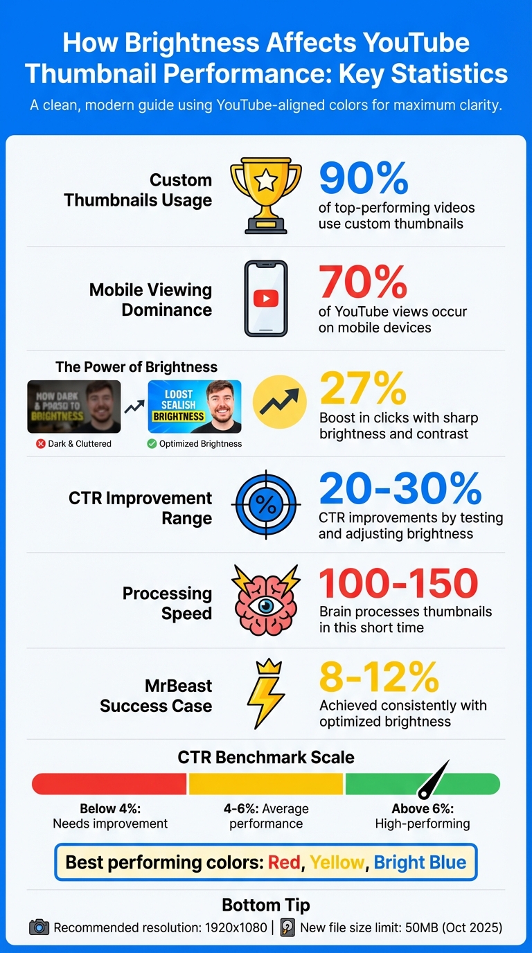
- 90% of top-performing videos use custom thumbnails.
- Brightness impacts how thumbnails appear across devices, especially on mobile, where 70% of YouTube views occur.
- Thumbnails with sharp brightness and contrast can boost clicks by 27%.
- Bright, high-contrast designs (red, yellow, blue) perform better on YouTube’s interface.
- Testing and adjusting brightness can lead to CTR improvements of 20–30%.
Use tools like YouTube Studio’s A/B testing or editing platforms like ThumbnailCreator to fine-tune brightness, contrast, and saturation. A well-lit, clear thumbnail ensures your video stands out in crowded feeds and drives more engagement.
YouTube Thumbnail Brightness Statistics and Performance Metrics
Boost COLORS and BRIGHTNESS in your THUMBNAILS - Canva Tutorial
sbb-itb-b59debf
How Brightness Affects Viewer Perception
In just 100 to 150 milliseconds, your brain processes thumbnails, picking up on elements like color contrast and standout shapes that grab attention instantly. This split-second scan determines which thumbnails you notice and which ones fade into the background.
"In roughly 100 to 150 milliseconds, your visual system scans the environment and flags salient features: colour contrast, faces, shapes that break the surrounding pattern. This happens before attention is directed, before evaluation begins." – Thumbnailr.io
If a thumbnail lacks sufficient brightness, it may fail to even register in this initial scan. It’s not that viewers consciously ignore your video - they simply don’t notice it. On the other hand, sharp, well-lit thumbnails see 27% more clicks compared to darker or lower-quality ones. This highlights how brightness plays a critical role in catching a viewer’s eye right from the start.
How Brightness Improves Visibility
Brightness helps your thumbnail stand out against YouTube’s white and gray background. When users scroll through countless thumbnails, high-contrast colors and strategic brightness make yours pop. Colors like red, yellow, and bright blue are particularly effective at grabbing attention on YouTube. But even more important than your color palette is the contrast between your subject and the background.
With 70% of YouTube views happening on mobile devices, your thumbnails need to remain clear and impactful even when scaled down. Testing how they look on smaller screens ensures that brightness and contrast stay effective across all platforms.
Brightness doesn’t just improve clarity - it also sets the tone emotionally, creating a connection that encourages clicks.
How Brightness Influences Emotions
Brightness triggers emotional responses that can lead to higher engagement. Colors like yellow and orange, which are naturally brighter, convey energy and approachability - qualities that work especially well for lifestyle and educational content. Meanwhile, red in high-contrast designs grabs attention quickly and conveys urgency, making it a favorite for gaming and entertainment thumbnails.
A great example of this is the MrBeast YouTube channel. In 2022, the team revamped their thumbnails with bold color contrasts and exaggerated facial expressions. This approach created visual tension and sparked curiosity, helping the channel achieve click-through rates of 8–12% consistently. By combining brightness with emotional cues, they turned casual scrollers into engaged viewers.
These factors show why brightness is such a key element in effective thumbnail design. It not only ensures visibility but also creates an emotional pull that drives clicks.
Finding the Right Brightness Level for Your Thumbnails
Getting the brightness just right is key to creating thumbnails that grab attention without losing important details. Successful creators know how to balance brightness, contrast, and saturation to make their thumbnails stand out.
One challenge is that YouTube compresses thumbnails, which can dull their details. To counter this, start with high-quality, well-lit images, and adjust contrast and saturation to ensure your design remains sharp and clear across all device screens. This combination helps your thumbnail retain its impact, even after compression.
Balancing Brightness with Contrast and Saturation
Brightness alone isn't enough - it needs to work seamlessly with contrast and saturation to make your thumbnail visually appealing and easy to read. High contrast is especially important for distinguishing key elements, like text and faces, from the background.
"Contrast is King: Use bold colors to separate foreground (text, faces) from background." – NearStream
Using vibrant colors can help your thumbnails stand out against YouTube's interface, whether viewers are browsing in light mode or dark mode. To test if your thumbnail remains clear at smaller sizes, resize it to 150px wide and check if the text or subject is still legible.
Because YouTube's compression can blur intricate details, it's better to keep your design simple. Bold text and a clear focal point can help maintain clarity after upload. A resolution of 1920x1080 is recommended for better quality compared to 1280x720. And with YouTube increasing the thumbnail file size limit to 50MB in October 2025, you can now upload higher-resolution images without worrying about file size constraints.
Examples of Good Brightness Adjustments
Once you've balanced brightness, contrast, and saturation, test your settings in real-world scenarios. YouTube Studio's "Test & Compare" tool is a great way to experiment with different adjustments and find the settings that boost your click-through rates. This method allows you to make data-driven decisions.
Save your thumbnails as PNG files to preserve their clarity. PNG's lossless compression is better at maintaining the sharpness of bright text and logos compared to JPEG's lossy format.
"YouTube automatically compresses thumbnails to reduce file size for quicker loading times. This compression can reduce the quality of your image. To minimize this effect, make sure your image has high quality to begin with." – Eshgin Mammadli, Recommended Answer, Google Support
How to Adjust Brightness Using ThumbnailCreator
Fine-tuning brightness can make a big difference in how your thumbnails perform, especially when it comes to grabbing attention and boosting click-through rates. ThumbnailCreator simplifies this process with two standout tools: the Color Enhancer and the Auto-Optimize feature. Both are designed to help your thumbnails stand out, even at the small sizes viewers encounter on platforms like YouTube.
The Color Enhancer comes with six professional presets, including a High Contrast option that makes light and dark areas more distinct, perfect for making thumbnails pop in search results. For storytelling or dramatic content, the Dramatic preset adjusts shadows and highlights for a more cinematic feel. Each preset offers three intensity levels - Subtle, Medium, and Strong - so you can customize the effect.
When in doubt, go with the Strong setting. Subtle enhancements might not hold up when your thumbnail shrinks to YouTube's typical size of 160x90px. It's no wonder over 15,000 YouTube creators rely on these tools to keep their content visually striking across all devices.
Step-by-Step Guide to Brightness Adjustment
To use the Color Enhancer, follow these steps:
- Go to Utilities in the sidebar and select Color Enhancer.
- Upload your thumbnail image.
- Pick a preset - High Contrast is ideal for visibility, while Vibrant Pop works well for vlogs or lifestyle content.
- Choose your intensity level (Subtle, Medium, or Strong).
- Click Enhance Colors to apply the changes, and compare the original and enhanced versions side-by-side.
- Download your updated thumbnail. Each enhancement uses 1 credit.
If you prefer a faster option, try the Auto-Optimize tool:
- Open your thumbnail in the Editor.
- Click Auto-Optimize to let the AI handle adjustments to contrast, color vibrancy, and foreground-background separation.
- This tool ensures your thumbnail looks great on both light and dark YouTube backgrounds while preserving essential elements like timestamps. Like the Color Enhancer, Auto-Optimize costs 1 credit per use.
Both tools work seamlessly together, ensuring your thumbnails are fully optimized for maximum impact.
Features for Brightness Optimization
ThumbnailCreator's tools are designed specifically for YouTube thumbnails, keeping readability and visibility in mind, even at smaller scales. For example, the platform tests clarity at 120px wide to make sure faces and text stay sharp on mobile screens. A recommended editing sequence includes starting with the Background Remover to isolate your subject, then applying the Color Enhancer to boost brightness and contrast, and finally using Auto-Optimize for a finishing touch.
Creators have reported 20–30% increases in click-through rates after making brightness adjustments. Properly lit thumbnails - neither too dark nor overexposed - stand out in crowded feeds and capture attention in under a second. ThumbnailCreator also offers pre-designed templates for different content types:
- Vlogs: Bright backgrounds with +20–40 brightness for faces.
- Tutorials: Balanced shadows with +30 for clarity.
- Reviews: High contrast with 100% highlights.
These templates also include complementary colors and bold fonts, ensuring your thumbnails are visually appealing and easy to read at the recommended 1280×720 resolution for both TV and mobile screens.
| Feature | Best For | Primary Effect |
|---|---|---|
| High Contrast Preset | Search result visibility | Enhances light-dark differentiation for standout thumbnails |
| Auto-Optimize | Quick adjustments, mobile visibility | Balances contrast, vibrancy, and UI-safe zones |
| Dramatic Preset | Storytelling content | Deepens shadows and brightens highlights for cinematic appeal |
| Vibrant Pop | Vlogs, travel, and lifestyle content | Amplifies color saturation while keeping tones natural |
Measuring How Brightness Affects Click-Through Rates
Tracking CTR Before and After Adjustments
To see how brightness impacts your click-through rates (CTR), approach the process methodically. Start by calculating the average CTR of your last 20 video thumbnails in YouTube Studio. You can find this data under YouTube Studio > Content > Analytics > Reach. For a more hands-on approach, try manual A/B testing. Here's how: first, upload your original thumbnail (Version A) and let it gather about 1,000 impressions. Record the CTR, then replace it with a brightness-adjusted version (Version B) and allow it to collect another 1,000 impressions. This way, brightness becomes the only variable, giving you a clear picture of its impact.
As a benchmark, high-performing thumbnails often achieve CTRs above 6%, while average ones range between 4% and 6%. Even a small boost - from 4% to 6% - can make a noticeable difference. For instance, if a video gets 50,000 monthly impressions, that increase could mean an extra 1,000 views every month! To maximize results, focus on your top 10 highest-traffic videos. These are the ones where even slight improvements can lead to significant gains. Since viewers process thumbnails in just 0.5 seconds, ensuring your image is bright and clear is crucial for grabbing attention and avoiding common thumbnail mistakes that hurt performance. Once you've tested, use your findings to fine-tune your brightness settings.
Using Data to Improve Brightness Settings
Now that you have your CTR data, use it to adjust your brightness settings for better results. These insights build on earlier tips to keep your thumbnails engaging. Dive into YouTube Studio Analytics to review device-specific data, and preview your thumbnail at 168×94 pixels to see how it looks at smaller sizes. If most of your viewers are on mobile devices - where screens are typically around 375px wide - consider increasing brightness and contrast to make your thumbnails stand out.
Research also shows that bright, saturated colors like yellow, orange, red, and electric blue tend to attract more clicks than darker or muted tones. Use this information to tweak your thumbnails and, over time, create a master template for your channel that consistently performs well.
Conclusion
Brightness isn’t just a minor tweak - it plays a big role in how your YouTube content stands out. By fine-tuning the brightness in your thumbnails, you make it easier for viewers to spot your videos in a busy feed and quickly pick up on key visuals like facial expressions.
Striking the right balance is key. High-contrast colors and proper saturation help your thumbnails pop on mobile screens without appearing washed out or overly bright. Since most YouTube views happen on smaller devices, this extra visual appeal and proper thumbnail dimensions can make a big difference.
Experiment with brightness adjustments using A/B testing in YouTube Studio to see what resonates best with your audience. Your click-through rate (CTR) data will guide you toward the most effective settings.
For a simpler approach, tools like ThumbnailCreator can help. They offer AI-powered design features and built-in templates, making it easy to create thumbnails that grab attention across all devices - even if you’re not a design pro. Investing time in brightness optimization can lead to more clicks, better algorithm performance, and steady channel growth.
Your thumbnails are your first chance to grab attention - get the brightness right, and you’ll see the results in your CTR.
FAQs
How do I know if my thumbnail is too dark or too bright?
When evaluating your thumbnail’s brightness, focus on its contrast and readability, particularly on smaller screens like mobile devices. Thumbnails with high-contrast designs and clear text tend to grab attention and perform better. A good practice is to preview your thumbnail at a reduced size (like 168×94 pixels) to make sure it remains visually appealing and easy to read. Steer clear of designs that are too dark, overly dull, or excessively bright, as these can hurt visibility or make the thumbnail uncomfortable to look at.
What brightness settings work best for mobile viewers?
For mobile users, keep thumbnails straightforward with a clear focus. Use bold, easy-to-read text, and make sure there's strong contrast between the text and background for better visibility. A simple, clean design ensures thumbnails grab attention on smaller screens.
How can I A/B test thumbnail brightness without skewing results?
When testing how thumbnail brightness affects performance, it's crucial to isolate brightness as the sole variable. Here's how to do it effectively:
- Create two thumbnails that are identical in every aspect except brightness. This ensures you're only testing the impact of brightness, not other design elements.
- Run the A/B test for a period of 7 to 14 days. This timeframe allows you to gather enough data for reliable results.
- Aim for each thumbnail version to receive between 1,000 and 5,000 impressions. This sample size helps ensure your findings are statistically meaningful.
By keeping every other design element consistent, you can confidently determine how brightness influences viewer engagement without introducing unnecessary bias.