

Why Consistent Thumbnails Boost YouTube Growth
Consistent thumbnails are a game-changer for YouTube growth. They help viewers instantly recognize your content, build trust, and make your channel look professional. Channels with consistent thumbnail designs see 15–25% higher click-through rates from returning viewers and are 80% more likely to gain subscribers. Here's why it works:
- Instant Recognition: Consistent colors, fonts, and layouts make your videos stand out in crowded feeds.
- Trust Building: Familiar visuals signal quality, encouraging viewers to click again.
- Professional Appeal: A cohesive look shows your channel is reliable and worth subscribing to.
This AI Creates Perfect YouTube Thumbnails in 30 Seconds (Same Consistent Style Every Time)
sbb-itb-b59debf
How Inconsistent Thumbnails Slow Channel Growth
Many creators pour their energy into producing high-quality videos and sticking to upload schedules, but they often overlook one key detail: their thumbnails. Inconsistent thumbnails can seriously hold back a channel’s growth, affecting both its visual identity and the trust viewers place in it.
No Clear Visual Identity
Think of your channel page as a storefront. If every "window display" - in this case, your thumbnails - looks completely different, viewers won’t instantly recognize your content or understand what you offer. Consistent visual elements like a set color palette, specific fonts, or a recurring layout help build recognition. When these elements vary too much, it creates what some call visual drift, making your channel look scattered and unorganized.
"If your thumbnails all look different, your channel feels forgettable." - Jay Kim, Writer, Miraflow
Without a consistent visual identity, it’s harder for viewers to form a connection with your brand. This lack of recognition can lead to lower click-through rates and fewer returning viewers.
How Inconsistent Visuals Reduce Trust and Clicks
It’s not just about recognition - thumbnail inconsistency also chips away at viewer trust. When someone enjoys one of your videos, they subconsciously associate that positive experience with your channel’s overall look. If your thumbnails are all over the place, that trust doesn’t carry over to your new uploads. Instead, each video has to fight for attention as if it’s coming from an unfamiliar source.
Even something as small as inconsistent fonts can make a channel seem unpolished and unprofessional. This amateur vibe can turn viewers away, especially when they’re comparing your channel to others with more cohesive branding.
"Random, mismatched thumbnails make your channel look amateur and forgettable. In 2026, creators who win are the ones who treat their channels like real brands." - DailyTopAI
Without a recognizable style, even your most loyal fans might overlook your latest videos in a crowded feed. A lack of cohesion doesn’t just hurt first impressions; it can also erode long-term viewer engagement.
How Consistent Thumbnails Build Recognition and Trust
Building a Recognizable Brand
Thumbnails are processed incredibly fast - visuals register up to 60,000 times quicker than text. This means that the look and feel of your thumbnails - colors, fonts, and layout - can create an instant connection with viewers. When these elements remain consistent, they spark immediate recognition, signaling familiarity before someone even reads the title.
And here's the kicker: that familiarity builds trust. If viewers have had positive experiences with your content before, they begin to associate your thumbnail style with quality. So, the next time they see your signature colors or fonts in their feed, they're more likely to click - not just because of the topic, but because they trust the source. Over time, this consistency can lead to stronger engagement and steady subscriber growth.
"The viewer recognizes the look before they read anything. It is the visual equivalent of a familiar voice." - Jason Clark, YouTube Creator
For newer channels, success often hinges on topic relevance alone. But established, branded channels enjoy a dual advantage: relevance and recognition. In a crowded feed, this edge not only builds trust but also ensures your thumbnails are effective across every device.
Better Performance Across Devices
Consistency in thumbnail design isn’t just about branding - it’s also about functionality. With over 70% of YouTube views happening on mobile devices, and many others on large TV screens, thumbnails must work across a wide range of screen sizes. On these devices, thumbnails are often the main navigation tool, while text plays a secondary role.
Designing thumbnails with high-contrast colors and bold, legible fonts ensures they remain clear and engaging, no matter the size. A simple test? Shrink your thumbnail to about 160x90 pixels - the size it appears in mobile search results. If the text and subject are still easy to understand, you’re good to go. If not, it’s time to tweak the design before publishing.
Take channels like Tony Robbins, for example. His consistent use of purple across all thumbnails creates instant recognition, regardless of screen size. Even smaller channels can benefit from sticking to 2–3 signature colors that stand out against YouTube’s interface, paired with 1–2 bold fonts for every video. This approach ensures your thumbnails not only look great but also perform effectively, no matter where they’re seen.
Which Thumbnail Elements to Keep Consistent

Consistent vs. Inconsistent YouTube Thumbnails: Key Stats & Impact
Core Design Elements to Lock In
Certain thumbnail elements should remain steady to create instant familiarity for your audience. These are the subtle details that viewers recognize almost automatically, helping your channel stand out at a glance.
Start with a consistent color palette of 2–3 signature colors. Use these in your text, borders, or background accents, ensuring they contrast well with YouTube's interface for better visibility. Typography is another key factor - stick to 1–2 bold, sans-serif fonts like Montserrat or Bebas Neue. These fonts dominate 78% of high-performing thumbnails because they’re easier to read quickly.
Your layout should also follow a fixed structure. Keep the placement of your subject, text, and cropping consistent. Even details like color grading or background style - whether blurred, gradient, or solid - should follow a visual style. These elements create a subconscious "brand feel" that viewers begin to associate with your channel.
"I redesigned all my thumbnails to use the same 3 colors and font. My returning viewer CTR went up 22% in the first month. New viewer CTR stayed about the same." - r/NewTubers creator
Channels that maintain consistent thumbnail branding often experience a 15–25% boost in click-through rates from returning viewers.
Elements You Can Adjust Per Video
While core elements should stay the same, some parts of your thumbnail can - and should - be tailored to highlight each video's unique focus. Consistency doesn’t mean every thumbnail has to look identical. In fact, too much uniformity can make your content blend together, causing viewers to skip over it.
Focus on tweaking elements that convey the video’s specific message. For example, change the main subject or person, the background scene, the text hook (aim for 3–5 words), and even the facial expression. While your face should stay in the same position, the emotion you show - whether it’s surprise, excitement, or concern - should match the video’s theme.
Think of your thumbnail as having two layers:
- Recognition layer: Fixed brand elements like colors, fonts, and layout.
- Topic layer: Customizable elements like the subject, text, and background.
Here’s a breakdown of what to keep consistent and what to modify:
| Element | Keep Consistent | Adjust Per Video |
|---|---|---|
| Colors | Use 2–3 signature colors | Add variable accent colors for hooks |
| Text | Font style, weight, and placement | Change the specific 3–5 word message |
| Subject | Maintain framing and crop logic | Highlight a different person or object |
| Background | Stick to a general style (blurred, gradient, etc.) | Update the scene or environment |
| Composition | Keep face position and logo placement | Adjust facial expressions and icons |
A good rule of thumb is to apply your established template to about 80% of your videos. Use the other 20% for "pattern breaks", like milestone videos or special collaborations. This balance keeps your channel recognizable while allowing for creative flexibility.
Next, we’ll explore how using template systems can help maintain this balance between consistency and variety.
Using Templates to Keep Thumbnails Consistent
How to Build a Simple Template System
Earlier, we discussed what elements of thumbnails should stay consistent. Now it’s time to create a system that ensures this consistency - one that reflects your brand identity while supporting your growth strategies.
Start by analyzing your best-performing thumbnails. Look for patterns in layout, color placement, and subject positioning. These recurring elements will form the backbone of your template system. Next, create a 1280x720 pixel base canvas, incorporating your brand’s colors and fonts. Add labeled layers (such as "HEADLINE TEXT" and "FACE PHOTO") to make swapping elements quick and easy.
Create 3–5 template variations tailored to different video types, such as tutorials or vlogs. This approach keeps your channel visually cohesive while avoiding repetitive designs. Plus, it’s a time-saver - this method can save anywhere from 78 to 182 hours annually. Each variation should maintain a consistent structure but allow flexibility with background designs or accent colors. This strikes a balance between uniformity and creativity, as discussed earlier.
Before finalizing your templates, shrink the design to 168x94 pixels, the size thumbnails appear in mobile search results. This ensures your text and visuals remain clear and impactful. If details become unreadable at this size, simplify the design.
"The mobile test is the only quality gate that matters. If a detail is invisible at mobile size, it should not be in the thumbnail." - ThumbMentor
Once your templates are ready, consider using specialized tools to streamline the process even further.
How ThumbnailCreator Makes This Easier
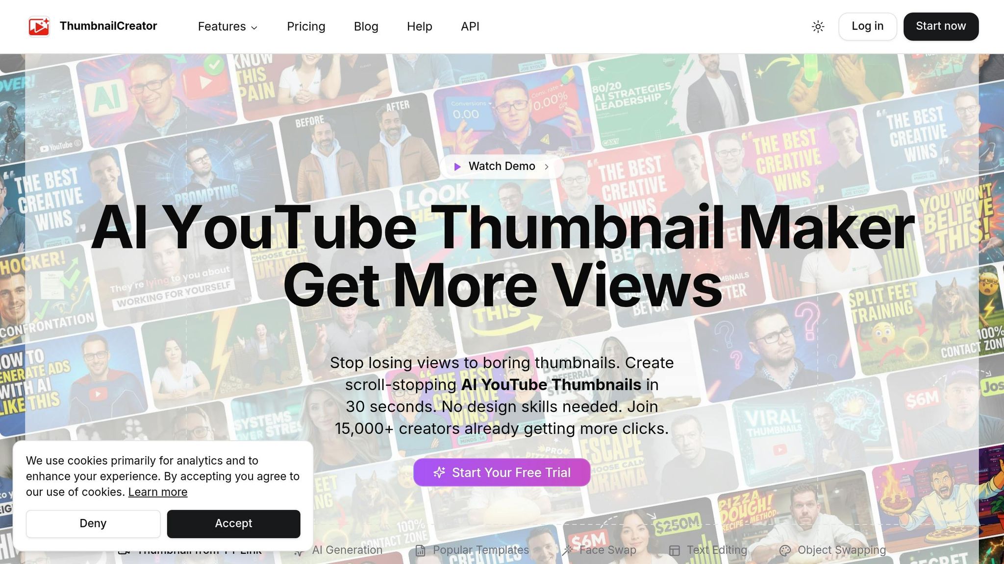
While manually creating templates ensures consistency, ThumbnailCreator takes it to the next level by automating much of the process. Building templates by hand can be tedious, but ThumbnailCreator eliminates the hassle with tools designed for efficiency and scalability.
The Brand Kit feature stores your hex codes, logos, and brand assets all in one place. You can upload these manually or let the tool auto-import them from your website. Once the kit is set up, the AI incorporates these elements into every design, so you won’t need to re-upload files or memorize color codes. With Design Rules, you can input instructions like “always use #1E40AF,” and the AI will follow these guidelines automatically.
For those looking to replicate successful designs, the Style Cloning feature analyzes the composition, typography, and color palette of any existing thumbnail or YouTube URL. This information is then converted into a reusable style profile. Combine that with the pre-built template library, which includes layouts for various video genres, and you can go from concept to a polished thumbnail in under a minute. Currently, over 15,000 YouTube creators use ThumbnailCreator, highlighting its effectiveness in simplifying workflows.
| Feature | What It Does |
|---|---|
| Brand Kit | Stores colors, logos, and assets for automatic use in every design |
| Style Cloning | Analyzes and replicates the visual style of any thumbnail or URL |
| Templates | Offers pre-built layouts for different video types, speeding up production |
| Design Rules | Ensures AI adheres to specific branding instructions every time |
How to Improve Your Thumbnails Without Losing Consistency
Using Performance Data to Guide Changes
Once your thumbnail template is in place, the next challenge is improving it over time without sacrificing the brand recognition you've worked to establish.
Start by conducting a 20-video audit: divide your last 20 uploads into three groups - high, average, and low click-through rate (CTR) performers. Look for patterns in each group, such as specific color schemes, text density, facial expressions, or layout choices. The trends in your top-performing thumbnails reveal what’s already working. Focus on optimizing the top 20% of your videos, as refreshing thumbnails for this small group alone can drive 78% of your channel’s overall growth.
When you identify a potential improvement, test it using YouTube’s "Test & Compare" tool. Keep in mind that this tool prioritizes watch-time share over raw clicks. A thumbnail that attracts clicks but fails to retain viewers for at least 30 seconds can hurt your performance, as YouTube’s algorithm may penalize it. In other words, a great thumbnail doesn’t just grab attention - it pulls in viewers who are genuinely interested in your content.
"The biggest hurdle to get over with thumbnails is not making them pretty, but making them clickable... This is not graphic design. It is marketing." - NerdCrave, r/NewTubers
For accurate results, wait until a thumbnail has at least 1,000 impressions before drawing conclusions, and allow up to 2 weeks for the data to stabilize. This methodical approach helps you make smarter, incremental improvements using YouTube thumbnail guides tailored to your niche.
Making Small Updates Without Breaking Your Style
Using the insights from your performance data, focus on making small, deliberate changes that keep your brand identity intact. The safest way to do this is to adjust one variable at a time, such as the background color, facial expression, or text hook - never overhaul the entire design at once.
Stick to your established template system, which likely includes two layers: locked elements (like brand colors, fonts, and layout structure) and variable elements (such as the image, text, or background tone). When testing, only tweak the variable layer to maintain consistency while improving results. For example, replacing a neutral expression with a more engaging one can increase CTR by 12–18% without altering the overall look viewers associate with your channel.
If you’re considering a broader refresh, introduce changes gradually. For instance, adjust one color or font variant at a time and monitor the impact over 4–6 weeks before making additional updates. A sudden, drastic redesign can alienate loyal viewers who recognize and trust your established style. As one creator explained:
"My audience knows my style, and the style matters more than what's actually on the thumbnail." - elanesse100, r/PartneredYoutube
Before finalizing any new thumbnail, run a quick "squint test" by reducing the design to 10% of its original size. If the main focal point doesn’t immediately stand out, increase the contrast between the subject and the background. This simple step can help avoid unnecessary drops in clicks.
Conclusion: Make Consistency Part of Your Growth Plan
Consistent thumbnails are more than just a nice touch - they’re a powerful tool for building brand recognition, trust, and efficiency. In fact, sticking to a consistent style can increase return viewer click-through rates (CTR) by up to 25% on YouTube. While newer channels focus solely on topic relevance, established branded channels gain an edge by combining relevance with recognition and trust.
Switching to a template-based system is a game-changer for efficiency and quality. As ThumbMentor explains:
"The difference is not talent or tools - it is a system. A template-based workflow... produces better results faster than starting from scratch every time." - ThumbMentor
The good news? You don’t need advanced design skills to make this work. Tools like ThumbnailCreator simplify the process by letting you save your brand’s colors, fonts, and other elements. These tools can automatically apply your branding to new templates, ensuring every upload visually aligns with your channel. Plus, users of AI-powered tools like ThumbnailCreator report an average 73% boost in CTR, with thumbnails created in as little as 30 seconds.
Here’s the simple formula for success: lock in your brand’s core elements, adjust only what’s necessary, and audit regularly. A good rule of thumb is the 80/20 approach - keep 80% of your thumbnails strictly on-brand, and use the remaining 20% for intentional variations, like celebrating milestones or highlighting special collaborations. Every few months, take a moment to scroll through your recent uploads to spot and correct any shifts in your visual identity before they undermine the recognition you’ve worked hard to build.
FAQs
How do I choose my 2–3 brand colors?
Start by defining your channel’s personality with three descriptive words that capture its essence. For example, is your channel fun, professional, or adventurous? These words will guide your overall design and tone.
Next, choose a primary color to set the mood and represent your brand. Add a secondary color for contrast and a neutral tone to tie everything together. Make sure your color choices work well in both YouTube’s light and dark modes, ensuring they remain vibrant and readable.
Consider using color psychology to align your palette with your channel’s message. For example, blue can evoke trust and calmness, while red creates a sense of energy or urgency. Lastly, test your color scheme on mobile screens to ensure it’s visually appealing and easy to read across devices.
How can I tell if my thumbnails work on mobile?
Preview your thumbnails at a smaller size - around 150x90 pixels - to ensure they remain clear and readable. Stick to bold fonts, use high-contrast colors, and keep text concise (ideally 3–5 words). Avoid placing important elements in the bottom-right corner, as timestamps often cover this area. Make sure any faces are prominent enough to be easily recognized. Tools like ThumbnailCreator can assist in optimizing designs for mobile screens, ensuring they stand out and remain visually effective.
When should I break my thumbnail template?
Stick to the 80/20 rule when tweaking your thumbnail template: stick with your standard design for 80% of your content, and use the remaining 20% for special moments like big announcements, major milestones, unique partnerships, or series finales. Don’t overhaul the entire design - retain at least one consistent element, like your logo placement, typography, or color scheme. This keeps your branding recognizable while still letting your special content shine.