
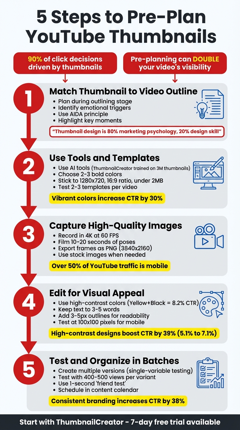
5 Steps to Pre-Plan YouTube Thumbnails
Your thumbnail is the first thing viewers see, and it plays a huge role in whether they click on your video. With 90% of click decisions driven by thumbnails, planning them ahead can save time and improve your video’s performance. Here’s a quick breakdown of the 5 steps to pre-plan your YouTube thumbnails:
-
Match Your Thumbnail to Your Video Outline
Plan your thumbnail during the video outlining stage. Identify key emotional triggers and moments that create curiosity. Use props, facial expressions, or visuals to highlight the main hook. -
Use Tools and Templates for Speed
Tools like ThumbnailCreator simplify the process. Use templates that align with your brand, stick to 2–3 bold colors, and ensure text is readable on mobile. -
Capture High-Quality Images During Filming
Record thumbnail poses in 4K video while filming. Export sharp frames later for better quality. Use stock images when needed but ensure they fit your video’s theme. -
Edit for Visual Appeal and Brand Consistency
Use bold colors, high contrast, and clear layouts. Keep text short (3–5 words) and test your thumbnail at small sizes to ensure it’s clear on mobile. -
Test and Organize Thumbnails in Batches
Create multiple versions and test them using YouTube’s tools. Review thumbnails with a checklist to ensure quality, and schedule them alongside your videos.
Why It Matters
A well-planned thumbnail can boost your click-through rate (CTR), doubling your video’s visibility. Start planning thumbnails early to save time and improve results.
5 Steps to Pre-Plan YouTube Thumbnails for Better CTR
How I make my YouTube thumbnails for the 2026 algorithm
sbb-itb-b59debf
Step 1: Match Thumbnail Ideas to Your Video Outline
Think about your thumbnail before you start filming - it's more than just an image; it's a core part of your video's marketing strategy. The best creators make thumbnail planning a part of their pre-production routine. By pinpointing your hook in advance, you can craft a script that aligns perfectly with the promise your thumbnail makes. This approach helps you highlight key moments and emotional triggers that strengthen your thumbnail design.
Find Key Moments and Emotional Triggers
A great thumbnail taps into curiosity - something your video is uniquely positioned to satisfy. This is often called the curiosity gap, where your thumbnail bridges what viewers already know and what they’re eager to discover. While reviewing your video outline, ask yourself: What’s the single most intriguing question or problem this video addresses?
"Your thumbnail's #1 job, which it shares with your title, is to put a burning question in the mind of your viewer." - Thomas Frank
Focus on moments that evoke strong emotions, like surprise, excitement, or curiosity. Use the AIDA principle (Attention, Interest, Desire, Action) to zero in on the most compelling parts of your content. For example, Thomas Frank discovered that the term "spaced repetition" wasn't engaging enough, so he reframed it with a more relatable hook: "The Most Powerful Way to Remember What You Study." Similarly, creator Michelle captured her audience’s attention by using "What's it really like?" to tease an inside look at Marine boot camp - her most successful video to date.
Facial expressions are helpful, but they’re not the only tool in your arsenal. Think about props or visual elements that instantly convey your topic. For instance, a tech review might include an iPad, while a movie breakdown could feature a well-known character. These visual shortcuts help viewers understand your video's value in just 1.3 seconds.
Draw Simple Thumbnail Layouts
Once you’ve nailed down your video’s emotional hooks, translate those ideas into visual concepts. Start by sketching thumbnail layouts - either on paper or digitally. These rough drafts act as a guide for your final design, helping you decide where to place key elements like your face, text, and props. Using tools like ThumbnailCreator becomes much easier when you’ve already mapped out your ideas.
Apply the Rule of Thirds to your layout by dividing your thumbnail into a 3×3 grid. Position important elements along the intersecting lines to create a visually dynamic composition. Keep the design clean and limit text to just 3–5 words. If your thumbnail looks cluttered or unclear at smaller sizes, simplify it further. The goal is to make your video's value instantly recognizable.
"Thumbnail design is 80% marketing psychology, and only 20% design skill." - Thomas Frank
Step 2: Pick Tools and Templates to Work Faster
Once you’ve sketched out your layouts, the next step is to use tools and templates to bring your ideas to life quickly and efficiently. With modern tools like ThumbnailCreator, you don’t need to be a design expert or invest in pricey software. These tools, many powered by AI, can help you create eye-catching designs in just seconds - perfect for keeping up with today’s fast-paced content creation demands.
Use AI Tools Like ThumbnailCreator
ThumbnailCreator is a game-changer for creators, offering AI-driven features that simplify the design process. Trained on 3 million successful thumbnails and trusted by over 15,000 creators, this tool allows you to generate multiple thumbnail options from a simple text description of your video concept. It even includes a face-aware feature that automatically integrates your headshot into the design.
If you’re inspired by a particular style, the style cloning feature can replicate it for your content. Another handy option: paste a YouTube link, and the AI will analyze the video to generate designs tailored to its theme. For batch creation, tools like object swapping and text editing make it easy to tweak elements without starting from scratch. ThumbnailCreator offers a free tier and a 7-day trial so you can explore its AI capabilities risk-free.
Once you’ve generated variations, the next step is to choose templates that align with your channel’s branding.
Choose Templates That Match Your Brand
Templates save time by providing pre-designed layouts that meet YouTube’s technical specs (1,280 x 720, 16:9 ratio, and under 2MB). But the real power of templates lies in how they reinforce your brand identity. When viewers scroll through their feed, consistent branding makes your content instantly recognizable.
Start by selecting 2–3 bold, high-contrast colors that represent your brand. Research shows that vibrant colors like red, yellow, and blue can increase visibility and click-through rates by up to 30%. Choose templates that incorporate these colors and allow for easy customization. Fonts are another key element - go for bold sans-serif options like Arial, Impact, or Bebas, ensuring they’re at least 30pt in size for readability. Templates should also keep text away from faces and offer features like outlines or drop shadows to improve visibility on mobile devices, which account for over half of YouTube traffic.
To find the best-performing designs, test 2–3 templates per video using YouTube Analytics. Simple designs tend to work best: focus on a single visual element, keep text to under four words, and use clean backgrounds with blurred, gradient, or solid colors. Thumbnails with more than three visual elements often see a 23% drop in click-through rates. Prioritize templates that deliver a clean, uncluttered look - especially since most viewers will see them on smaller phone screens.
Step 3: Prepare High-Quality Images Before You Need Them
The ideal moment to capture thumbnail assets is during filming when the setup is perfect. Waiting until later often means trying to recreate the scene, which wastes time and rarely matches the original quality. With mobile viewing dominating, it's crucial to ensure your images stay sharp at smaller sizes - blurry or low-resolution thumbnails can scream "unprofessional" before viewers even click. By planning ahead and integrating top-notch visuals into your thumbnails, you boost their appeal and strengthen your content strategy.
Take Photos During Video Filming
Instead of snapping still photos, consider recording video of your thumbnail poses. This approach allows you to capture candid, natural expressions without the stiffness of posed shots. As creator Thomas Frank explains:
"I'm not taking photos. Instead, I'm filming myself – and later on, I'll go through and find the best frames for thumbnail poses."
For the best results, shoot in 4K resolution at 60 FPS. Frank highlights why this matters:
"60 FPS is what matters most. 24 or 30 FPS video doesn't look blurry when you're playing it, but individual frames will often look blurry."
Film 10–20 seconds of different expressions to build a versatile library of poses. This method ties back to your earlier thumbnail sketches, ensuring your visuals stay consistent from initial concept to final edit. During post-production, export the sharpest frames as PNG files using Premiere Pro's Still Exporter. Then, batch color-grade them in Lightroom by applying "Paste Edit Settings." Keep your exports at 3840 x 2160 pixels and ensure they stay under 2 MB for mobile uploads or 50 MB for desktop.
Use Stock Images When Needed
Sometimes, custom shots aren't an option. In those cases, carefully selected stock images can fill the gap. Choose stock visuals that align with your video's theme to build trust and keep your audience engaged. Always opt for high-resolution files (at least 1280 x 720 pixels) to avoid pixelation on larger screens.
If a stock image feels too cluttered, you can simplify it by desaturating the colors and applying an overlay with about 80% opacity. This creates a cleaner, more polished appearance. Resources like Artlist, Epidemic Sound, and Storyblocks offer royalty-free images that won’t trigger Content ID issues. For something more distinctive, some creators turn to AI tools like Midjourney to generate custom visuals.
Before finalizing any stock-based design, shrink your thumbnail to roughly 100 x 100 pixels. If the main subject doesn't stand out at that size, it likely won't grab attention in mobile feeds. These high-quality images seamlessly integrate into your pre-planning tools and templates, rounding out your workflow.
Step 4: Edit Designs for Visual Appeal and Brand Consistency
After gathering high-quality images, the next step is to refine them into thumbnails that not only grab attention but also align with your brand identity. This combination of eye-catching visuals and brand alignment helps your content stand out in crowded feeds while building trust with your audience over time.
Apply Color Psychology and Contrast
Color plays a critical role in drawing attention. Between July 2025 and January 2026, the NoteLM Team analyzed 1,247 videos from 20 YouTube channels (with subscriber counts ranging from 10,000 to 1 million). They found that using high-contrast color schemes boosted the average click-through rate (CTR) by 39%, increasing it from 5.1% to 7.1%. The most effective color pairing was "Yellow + Black", achieving an 8.2% CTR, followed by "Red + White" at 7.6%.
Stick to 2–3 main colors for a clean and cohesive design. Vibrant colors outperform muted tones by 40%, particularly on mobile devices, where thumbnails are displayed at just 168x94 pixels. Make sure your thumbnail contrasts with YouTube's interface - whether it's white in light mode or dark gray in dark mode. Avoid pure white backgrounds, as they can blend into the platform's design.
Choose colors that match the emotional tone of your video. For example:
- Red conveys urgency or excitement.
- Blue suggests trust and professionalism.
- Green works well for topics like finance or health.
Test your thumbnails in both light and dark modes before publishing, and use contrast-checking tools that follow WCAG guidelines to ensure text remains legible against the background.
Once your color scheme is set, focus on layout and text placement to maximize impact.
Position Text and Images Effectively
After selecting your colors, the next step is to arrange text and images in a way that captures attention and encourages clicks. Since viewers often decide within 1.5 seconds, clarity is more important than cleverness. Use bold or extra-bold fonts (weight 700+), such as Anton, Bebas Neue, or Montserrat, since thinner or script fonts can become illegible at smaller sizes.
Position key elements slightly off-center for better visual balance. High-performing layouts often include:
- A face on the left third of the thumbnail with text on the right third.
- Split-screen designs that divide the image into distinct sections.
Enhance text readability by adding 3–5px contrasting outlines or drop shadows to separate it from busy backgrounds.
Run a mobile test by shrinking your thumbnail to 100x100 pixels. If the text becomes unreadable or the focal point unclear, simplify the design. Use visual cues like size contrast, arrows, or circles to guide viewers' eyes toward the most important element.
Add Branding Elements
Consistent branding is another powerful way to boost performance. Studies show that maintaining consistent branding can increase CTR by up to 38% and even improve revenue by 33%.
Start by reinforcing your brand identity with a set of visual markers. Stick to 2–3 primary brand colors and no more than two fonts to create a recognizable and cohesive look. Place your channel logo or branding mark in the same spot on every thumbnail, ensuring it takes up 5–10% of the thumbnail area. This subtle but consistent placement helps build recognition without overwhelming the design.
Follow the 60-30-10 rule:
- 60% of the thumbnail should focus on content-related visuals.
- 30% should include brand accents.
- 10% should feature your logo or direct branding.
To keep things fresh while maintaining consistency, develop 2–3 core layout templates and rotate between them. This approach ensures your thumbnails remain visually aligned with your brand while still allowing room for creativity. Remember, your branding should complement the design, not make it look like a traditional ad.
Step 5: Review and Organize Thumbnails in Batches
Now it’s time to review and organize your thumbnails to ensure they’re ready for publishing. This step builds on your earlier design and editing work, helping you maximize the effectiveness of each thumbnail.
Make Multiple Versions for Testing
To find out which thumbnail design performs best, create multiple variations and test them. Focus on single-variable testing, where you tweak just one element at a time - like changing the background color, facial expression, or text phrase.
Using templates can make this process quicker. By toggling layers (such as text or background images), you can produce up to 10 variations in about 15 minutes. Be sure to name each version systematically (e.g., Version A, Version B, etc.) to stay organized during testing.
YouTube offers a "Test & Compare" tool, which lets you test up to three thumbnail variations. To get reliable results, aim for 400–500 views per variant. YouTube evaluates thumbnails based on both click-through rate (CTR) and watch time share, helping you choose a design that not only attracts clicks but also keeps viewers engaged. Testing typically takes about seven days to gather enough data.
Review Thumbnails with a Quality Checklist
Before finalizing your thumbnails, run them through a thorough quality check. Start with the technical basics: the file should be 1280×720 pixels with a 16:9 aspect ratio, under 2MB, and saved as JPG or PNG.
Next, test visibility. Perform a squint test by shrinking the thumbnail to 10–15% of its size. If the subject and text aren’t clear at this scale, the design may struggle on mobile devices.
Try the 1-second "friend test": show the thumbnail to someone for just a second and ask them what the video is about. If they can’t guess quickly, the design might be too complicated.
Also, check that no vital elements fall into YouTube’s overlay zones (like the bottom-right corner or the bottom 10 pixels). Finally, view the thumbnail in both Light Mode and Dark Mode (e.g., against a dark background like #212121) to ensure it’s readable and visually balanced in different settings.
Add Thumbnails to Your Content Calendar
Once your thumbnails pass testing and quality checks, schedule them in your content calendar alongside the corresponding videos. This helps streamline your workflow and ensures consistency. Make sure each thumbnail delivers on the video’s promise - whether it’s a result, a secret, or an emotional takeaway. Avoid common thumbnail mistakes like clickbait at all costs; your goal is to support high viewer retention during those critical first 30 seconds.
Batch production becomes much easier when you stick to a channel-specific template. Use one primary font, one or two text-safe zones, a limited color palette (two to three colors), and consistent masking styles for key subjects. This creates a cohesive look across your channel while leaving room for creativity.
Conclusion
Review of the 5 Steps
This guide lays out a straightforward process to ensure your thumbnail designs consistently support your video's content and promise. By pre-planning thumbnails, you can streamline your workflow and improve video performance. The five steps outlined - aligning thumbnail ideas with your video outline, choosing tools and templates to save time, preparing high-quality images in advance, editing for visual appeal and brand consistency, and batch reviewing thumbnails before publishing - offer a practical roadmap.
Following these steps helps create thumbnails that are not only visually cohesive but also optimized for performance. When your design highlights the emotional essence of your video, incorporates consistent branding, and is tested for mobile readability, you set the stage for better click-through rates. Thoughtful, pre-planned thumbnails can boost visibility significantly, with the potential to double your video's reach.
Now, it’s time to put these strategies into action.
Start Using Tools Like ThumbnailCreator
You can implement this process with tools like ThumbnailCreator, an AI-powered platform designed to simplify thumbnail creation. These tools enable you to craft professional designs quickly, even if you're not a design expert. With ThumbnailCreator’s 7-day free trial, you can experiment with the platform risk-free to see how it fits into your workflow.
Start by applying these steps to an upcoming video. Test your thumbnail design at a small size, like 100×100 pixels, to ensure readability, and verify it meets YouTube's technical requirements (1280×720 pixels, under 2MB). Aim for concise text (3–5 words) and use high-contrast colors for maximum impact. Once you’ve created a few thumbnails using this approach, you’ll likely notice a faster, more consistent process - and your click-through rate data should reflect the improvement.
FAQs
How do I pick the best thumbnail idea from my outline?
To pick the right thumbnail, aim for visuals that catch the eye and stir curiosity or emotions. Plan your thumbnail design before you start filming to ensure it aligns perfectly with your video's theme and emotional tone. Experiment with at least three different versions to find the most striking option. Focus on thumbnails that:
- Clearly emphasize the core message or emotion
- Spark curiosity in viewers
- Feature bold colors and a clear, attention-grabbing focal point.
What makes a thumbnail readable on mobile?
When designing a thumbnail that's easy to read on mobile devices, focus on high-contrast colors, a clear focal point, and bold, easy-to-read text. Use large sans-serif fonts with just 3-5 words, ensuring the text stands out against the background. Keep essential elements within the "safe zone" to prevent them from being obscured by interface overlays. Bright colors like red or yellow grab attention effectively. To check clarity, test your thumbnail at smaller sizes, such as 168x94 pixels.
How do I A/B test thumbnails on YouTube?
YouTube makes it easier to test thumbnails with its "Test & Compare" feature in YouTube Studio. This tool allows you to upload up to three different thumbnail variations and measure their performance based on metrics like clicks and watch time.
If you're looking for more control, you can take a manual approach. Create multiple versions of your thumbnail and track metrics such as click-through rate (CTR) and watch time over a period of 7–14 days. To get accurate insights, tweak just one element at a time - whether it's the text, colors, or imagery - so you can pinpoint what grabs viewers' attention.