
Avoid 5 Common Thumbnail Design Errors
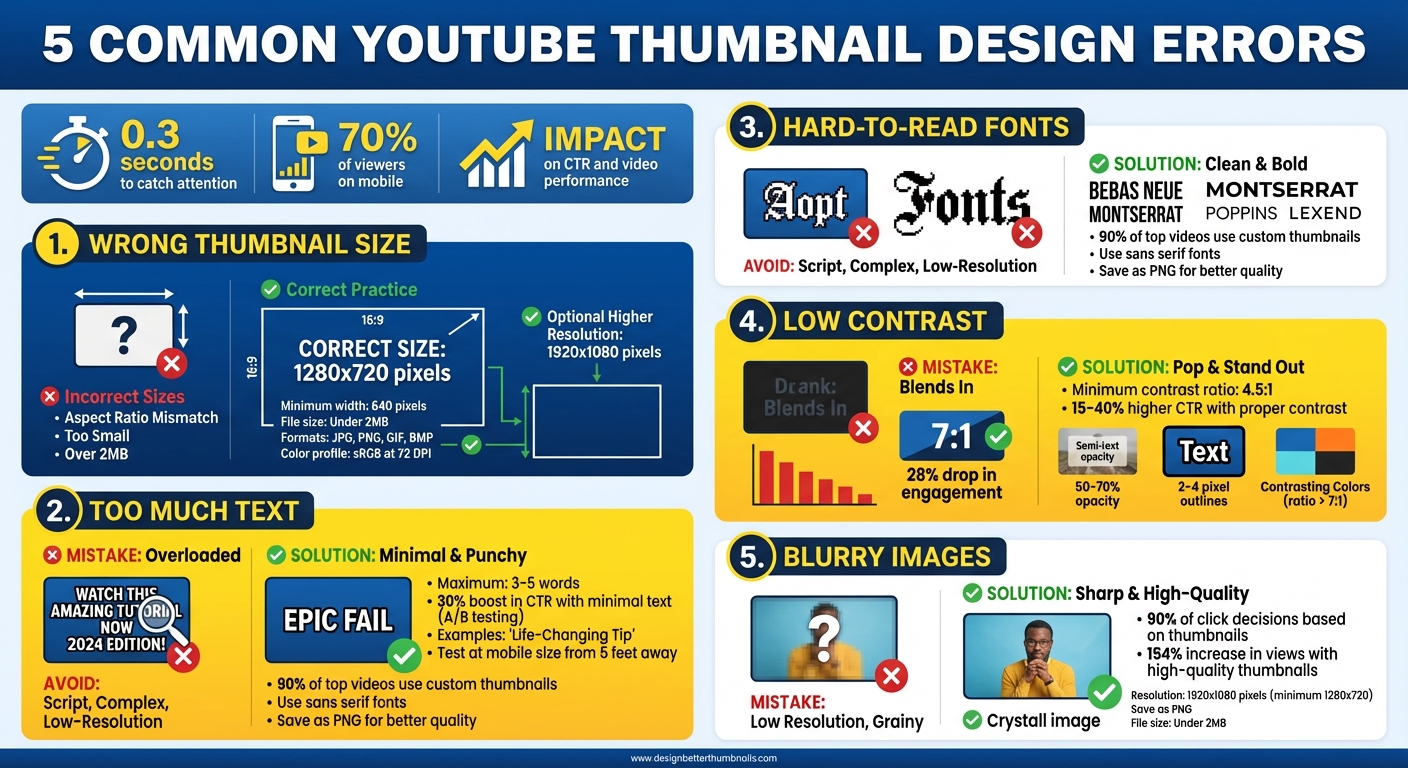
Your YouTube thumbnail can make or break your video's success. It has just 0.3 seconds to catch attention, and with 70% of viewers on mobile, poor design choices can hurt your click-through rate (CTR) and video performance. Here's what to avoid:
- Wrong Thumbnail Size: Stick to 1280x720 pixels to prevent blurriness or cropping issues.
- Too Much Text: Use 3-5 words max - keep it simple and impactful.
- Hard-to-Read Fonts: Choose bold, clear fonts like Bebas Neue or Montserrat.
- Low Contrast: Ensure text and background colors stand out for better readability.
- Blurry Images: Use high-resolution visuals (1920x1080 pixels) and save as PNG for sharpness.
Avoid these mistakes to create thumbnails that grab attention, boost clicks, and help your channel grow.
5 Common YouTube Thumbnail Design Mistakes to Avoid
10 Thumbnail Mistakes 90% of YouTubers Make & How to Avoid Them
sbb-itb-b59debf
Error 1: Using the Wrong Thumbnail Size
Getting your thumbnail dimensions wrong can instantly hurt its visual appeal. If the image you upload doesn’t match YouTube’s specifications, the platform will stretch or crop it to fit. This often leads to pixelation, cut-off elements, or unreadable text - giving viewers the impression that your content might not be worth their time.
YouTube's Thumbnail Requirements
To ensure your thumbnail looks its best, follow YouTube's specific guidelines:
- Resolution: 1,280 x 720 pixels (16:9 aspect ratio) is recommended. This matches YouTube's player and preview displays, though Shorts thumbnails follow different rules.
- Minimum Width: 640 pixels. Anything smaller will be stretched, reducing quality.
- File Size: Keep it under 2 MB.
- Accepted Formats: JPG, PNG, GIF, or BMP.
- Color Profile: Use sRGB at 72 DPI. Higher DPI settings only increase file size without improving on-screen quality.
While 1,280 x 720 pixels is the standard, higher resolutions like 1,920 x 1,080 pixels can enhance clarity for viewers using 4K monitors or TV apps. However, sticking to these guidelines ensures your thumbnail looks sharp and professional across all devices.
What Happens with Incorrect Sizing
Uploading a thumbnail with the wrong size or aspect ratio can severely impact its appearance. For example:
- Small Images: Thumbnails smaller than 640 pixels wide will be stretched, resulting in blurry, pixelated visuals that look unprofessional.
- Wrong Aspect Ratio: Using formats like 4:3 or 1:1 can lead to cropping or letterboxing. This might cut off important elements like faces, text, or branding.
To avoid these issues, keep critical elements within the central 1,100 x 620 pixels of your design. Also, steer clear of the bottom-right corner, as this area is reserved for the video duration overlay.
Error 2: Overloading with Too Much Text
Once you've nailed the sizing, the next step is avoiding text overload. Overstuffing your thumbnail with words can instantly reduce its effectiveness. Viewers make split-second decisions about whether to click on your video. If your thumbnail bombards them with too much text, they won’t have time to process it and are likely to scroll past.
Why Too Much Text Is a Problem
Overloading your thumbnail with text creates unnecessary clutter, making it harder for viewers to focus. It can also make your design appear sloppy. Just like sticking to the right dimensions matters, keeping your text minimal is equally important. When thumbnails are crammed with more than five competing elements, research shows engagement rates take a nosedive.
This issue becomes even more glaring when considering mobile thumbnail optimization. What might look fine on a desktop screen often shrinks down to unreadable on a phone, where most people consume content. Studies reveal that thumbnails with minimal text can boost click-through rates by up to 30% in A/B testing compared to their text-heavy counterparts.
Making Text Work for You
Stick to 3–5 impactful words for your thumbnail text. Use short, emotional phrases like "Epic Fail" or "Life-Changing Tip" that draw curiosity without overloading the viewer. Your thumbnail text should complement the video title by adding a fresh angle. For instance, if your video is titled "How to Bake a Cake", your thumbnail text could say "Secret Ingredient" to spark intrigue without repeating the title.
To test your design, print your thumbnail at mobile size (1,280 × 720 pixels, scaled down) and view it from about 5 feet away. If the text isn’t clear, simplify it. Focus on punchy, eye-catching words and remove anything that doesn’t add immediate value.
Error 3: Choosing Fancy or Hard-to-Read Fonts
Even if your thumbnail text is the right size and minimal, the font itself plays a huge role in grabbing attention. Sure, fancy fonts might look stylish, but they can make your text harder to read - and that means fewer clicks. Your thumbnail only has a split second to catch someone’s eye. If your text isn’t instantly clear, viewers will scroll right past it.
Why Font Readability Matters
Complicated fonts slow down how quickly people can process what they’re reading. Studies show that the average American adult reads at a 7th to 9th grade level, so keeping your text simple and easy to read is key to reaching more viewers. This is especially true on mobile devices, where intricate fonts can blend into the background and become unreadable.
"Make sure your thumbnail text is large, clear, and easy to read - especially on mobile. Avoid thin or overly decorative fonts that might disappear into the background." - Figma
Data from YouTube thumbnail guides backs this up: 90% of the platform's top-performing videos use custom thumbnails. Successful creators stick to clean, bold fonts because they’re easier to read, even when YouTube’s compression lowers image quality. On the flip side, thin serifs, script fonts, or overly decorative fonts can hurt your thumbnail’s performance.
How to Choose the Right Fonts
Sans serif fonts are a safe bet for digital screens because they stay crisp and clear at any size. Fonts like Bebas Neue, Montserrat, and Poppins are popular for their bold, eye-catching designs. Another great option is Lexend, which is designed with wider spacing and clean lines to improve readability.
To make sure your thumbnail text is easy to read, test it on different devices - phones, tablets, desktops - and see how it looks. After uploading, check YouTube’s Video Manager to see how compression affects the text. For better quality, save your thumbnail as a PNG instead of a JPEG, since PNG uses lossless compression. You can easily manage these file formats using free thumbnail tools. While YouTube requires a minimum width of 640 pixels, uploading at 1920x1080 ensures your text stays sharp even after compression.
Once you’ve nailed the font, the next step is boosting contrast to make your thumbnail even more attention-grabbing.
Error 4: Ignoring Contrast and Readability
Low contrast can ruin your thumbnail's effectiveness in seconds. If your text blends into the background, people won’t be able to read it. And if they can’t read it, they’re not clicking. According to experts from TubeBuddy and VidIQ, thumbnails with a contrast ratio of 4.5:1 or higher enjoy 15-40% higher click-through rates. On the other hand, low-contrast designs tend to underperform, with an average drop of 28% in engagement. That’s a massive disadvantage, especially when you’re vying for attention in YouTube’s crowded feed.
Common Contrast Mistakes
One of the biggest errors is pairing similar shades - for example, light text on a light background or dark text on a dark background. Imagine white text on a pastel yellow background - it might look soft, but it’s almost unreadable on a phone. Another common issue is using overlapping colors, like muted blue text against a blue sky. This can reduce visibility by 40%.
Busy backgrounds add to the problem, making text harder to distinguish. Without clear separation, your thumbnail becomes cluttered, lowering engagement by up to 25%. These issues are even more pronounced in dimly lit conditions, like when viewers are scrolling in bed at night.
How to Improve Contrast
Here are a few ways to boost contrast and readability:
- Add semi-transparent text boxes behind your text. Use a black or white rectangle with 50-70% opacity, extending 10-20 pixels beyond the text edges. This creates a clean backdrop, ensuring your text stands out, even on complex images.
- Choose contrasting color combinations that work across all devices. Bright yellow text (#FFFF00) on deep purple (#4B0082) or white text on black with a contrast ratio above 7:1 are excellent options. MrBeast’s thumbnails are a great example - his bold orange text on blue skies grabs attention every time.
- Apply 2-4 pixel outlines in white or black around your text, or use subtle drop shadows (offset 2 pixels, blur 4 pixels, 30% opacity). This technique separates text from busy backgrounds and can improve legibility by 35% on mobile screens.
These adjustments not only improve readability but also make your thumbnails more visually appealing. Tools like ThumbnailCreator include these features, helping you design professional, high-contrast thumbnails with ease.
Error 5: Using Low-Quality or Blurry Images
A blurry or pixelated thumbnail screams low effort and can instantly turn viewers away. People decide whether to click your video in just 2–3 seconds, and thumbnails play a role in 90% of click-through decisions. If your thumbnail looks unpolished, your video might never get the attention it deserves.
How Image Quality Impacts Clicks
Low-quality thumbnails send a negative message - they suggest a lack of professionalism and can erode viewer trust. On the flip side, a crisp, high-quality thumbnail creates a strong first impression, showing viewers that you’ve put effort into your content. The stats don’t lie: high-quality thumbnails can boost video views by up to 154%. That’s the difference between a video going viral and one fading into obscurity.
This issue becomes even more critical on mobile devices, where 70% of YouTube viewing happens. When thumbnails are resized for smaller screens, low-resolution images can look distorted, costing you clicks from the majority of your audience.
Tips for Maintaining High Image Quality
To avoid this mistake, stick to these guidelines for creating sharp and appealing thumbnails: (or use AI thumbnail generation for professional results)
- Use high-resolution images, ideally 1920×1080 pixels (and never go below 1280×720 pixels).
- Save your thumbnail as a PNG file for graphics and text to ensure clean edges and avoid compression issues.
- Keep your file size under 2MB to prevent upload problems.
Steer clear of overused stock photos, which can look generic or low-quality. If you’re incorporating blur effects, use them purposefully - blur the background to highlight your subject, but never let your focal point appear out of focus. And one final tip: test your thumbnail on a mobile device before uploading. This simple step ensures your thumbnail looks great where most of your audience will see it.
How ThumbnailCreator Helps You Avoid These Errors
Creating error-free thumbnails can feel daunting, especially if you lack a design background. That’s where ThumbnailCreator steps in. It simplifies the process, ensuring every element - from size to clarity - aligns with YouTube’s guidelines. This tool, powered by AI, takes care of the technical details so you can focus on producing great content.
AI-Powered Thumbnail Creation
ThumbnailCreator automatically generates thumbnails in YouTube’s recommended dimensions of 1,280 x 720 pixels. This means no more worrying about stretched or pixelated images. Plus, its AI upscaling feature transforms lower-resolution visuals into sharp, high-quality thumbnails, ensuring they look great even on mobile devices.
The AI also selects the clearest and most impactful moments from your video for visually striking results. You can export these thumbnails in 4K or HD using PNG format, which preserves quality without introducing compression artifacts or blurry edges.
By handling resolution and clarity automatically, ThumbnailCreator tackles the common sizing and quality issues that often plague thumbnails.
Customization Tools for Professional Thumbnails
In addition to automation, ThumbnailCreator offers tools to customize your designs while steering clear of common mistakes. Its text editing features help you craft concise, readable messages, and the face and object swapping options let you create attention-grabbing visuals. You can also tweak focus, lighting, and color to improve the quality of your original images or video stills.
The platform includes pre-designed templates that follow best practices for contrast, font readability, and text placement. These templates provide a solid starting point, even for beginners. With AI-generated thumbnails showing an average 50% boost in click-through rates and cutting design costs by 90% compared to traditional methods, ThumbnailCreator delivers professional results without breaking the bank.
Conclusion
Your thumbnail is your one shot to grab attention and convince viewers to click. The five mistakes we’ve discussed - improper sizing, overcrowded text, hard-to-read fonts, high or low contrast, and low-quality images - can quietly hurt your click-through rates and slow down your channel's growth.
These errors don’t just ruin your video’s first impression; they also impact its overall performance. Thumbnails that clearly showcase value and look polished are more likely to attract clicks. And more clicks signal to YouTube’s algorithm that your content deserves to be seen by a wider audience. Plus, well-designed thumbnails build trust with viewers, making them more likely to return for future videos.
"You could have the best video in the world, but if your thumbnail sucks… no one clicks."
This is why nailing the basics is so important.
ThumbnailCreator makes it easy to design professional thumbnails by taking care of the technical details and offering quick customization options. Whether you’re a beginner or just short on time, it helps you dodge common mistakes and consistently deliver polished results.
Test your thumbnails at mobile sizes, keep your design clean and focused, and aim for high-quality visuals. Your click-through rates will thank you.
FAQs
What should I put in the “safe area” so nothing gets cropped?
When designing a YouTube thumbnail, make sure to place key elements like important text and main subjects in the “safe area.” This helps prevent cropping or obstruction on various devices. Avoid the bottom-right corner since that's where timestamps appear. Also, steer clear of placing critical visuals near the edges, as they might get cut off on different screen sizes. For the best visibility, position essential content toward the center or top-left.
How do I check if my thumbnail is readable on a phone?
To make sure your thumbnail works well on a phone screen, test its clarity at 168×94 pixels - this is the standard mobile thumbnail size. Shrink your design to this size and check if the text remains easy to read. Avoid using small fonts or colors that don’t stand out against each other.
Also, pay attention to YouTube overlays. For example, the bottom-right corner often gets covered by timestamps or other elements, so keep key visuals away from that area. Testing your thumbnail at smaller sizes is an effective way to ensure it’s clear and readable for mobile viewers.
When should I use PNG vs JPG for thumbnails?
When deciding on an image format, go with PNG for thumbnails if you need crisp details or transparent backgrounds. On the other hand, choose JPG when smaller file sizes and quicker loading speeds - especially for mobile users - are your top priorities. Each format serves a different purpose, so pick the one that aligns with your goals.