

Case Study: High-CTR Thumbnails with Balanced Design
Most high-CTR thumbnails win for one simple reason: people get the point in under a second.
When I strip a thumbnail down to one main subject, short text, and strong contrast, click-through rate tends to improve. The article’s case studies show the same pattern across finance, education, lifestyle, and how-to content: clutter hurts, while balance helps. In many tests, background color shifts changed CTR by 18–25%, and stronger facial emotion often moved results too.
Here’s the short version:
- Use one focal point so the eye knows where to look first
- Keep text to 2–5 words so the promise is fast to read
- Stick to 2–3 main colors so the frame stays clean
- Avoid the bottom-right because the timestamp can block text
- Test one change at a time for at least 48 hours
- Aim for balance, not empty and not crowded
A few numbers stand out:
- Thumbnails with faces averaged 6.8% CTR vs. 4.1% without faces
- Busy thumbnails with too many elements can see CTR drop by about 23%
- Balanced versions often land around 5–7% CTR, with stronger ones reaching 8–9%
- In one test, a shocked face beat a neutral face: 8.3% vs. 5.1% CTR
FREE YouTube Thumbnail Workshop - How to Make Better Thumbnails for Higher CTR
sbb-itb-b59debf
Quick Comparison
| Style | What it looks like | Common result |
|---|---|---|
| Minimal | Very little text, very little context | Can fall under 3–4% CTR if the hook is weak |
| Busy | Too many props, colors, or text blocks | Often underperforms by about 23% |
| Balanced | One subject, short text, high contrast, limited colors | Often performs best, around 5–7% CTR or more |
If I had to sum up the whole article in one line, it would be this: <u>make the click decision easy</u>. For more data-driven tips, check out our YouTube thumbnail guides.
The Design Rules Behind High-CTR Balanced Thumbnails
Across high-performing thumbnails, the same three rules keep showing up: one clear focal point, short text, and strong contrast. Those choices shape whether someone can understand the image fast enough to click. The next two rules make that setup easy to read at a glance.
Single Focal Point, Short Text, Strong Contrast
A single dominant subject - often an expressive face or one main object - should take up about 40–60% of the thumbnail’s visual area. A 1,000-thumbnail analysis found that thumbnails with a human face averaged 6.8% CTR compared with 4.1% CTR for thumbnails without one. But just adding a face isn’t enough. The expression matters. In large-channel analyses, close-up emotional faces delivered about 35% higher CTR on average.
Text works best when it stays short: 2–5 words, large, bold, and placed so it doesn’t fight with the face for attention. Hooks with clear numbers or stakes - like $1,000 mistake or 30% more views - often beat vague phrases because the payoff is clear right away. Placement matters too. Text in the top-left quadrant is read 34% more often than text in other spots. And when text sits on the opposite side of the frame from a face, the composition is 19% more balanced. One area to avoid: the bottom-right corner. The timestamp overlay cuts readability by 45%.
Contrast is what makes the whole thing readable at small sizes. A simple grayscale test helps here: if the main subject and text still stand out in black and white, the contrast is doing its job. If the face and main phrase stay clear at 120×67 pixels, the design works.
How Color Limits and Hierarchy Cut Clutter
Once the focal point is set, color should support it, not fight it. Keeping a thumbnail to two or three main colors - plus neutrals like black, white, or gray - helps the design feel clean without losing detail. The structure is simple: one main focal point, one supporting text block, and only small details around the edges.
Finance case studies often lean on a dark background with one high-contrast accent color: serious face on one side, bold text on the other. Lifestyle and how-to thumbnails often go the other way, using a light background with one bright accent while keeping the background desaturated so the person and text stay front and center.
In A/B tests, changing background color is the highest-impact variable, with an average CTR change of 18–25% - much more than small layout tweaks, which usually shift results by less than 3%.
Using ThumbnailCreator to Apply These Rules Faster
These rules get much easier to repeat when the layout stays fixed. ThumbnailCreator sets the focal area, text placement, and color structure through templates. It also includes face swapping, object swapping, and text presets built for contrast, so the hook stays readable at small sizes. That makes iteration faster and A/B testing simpler, since you can change one variable at a time without rebuilding the whole design.
Case Studies: 3 Patterns Behind Better CTR
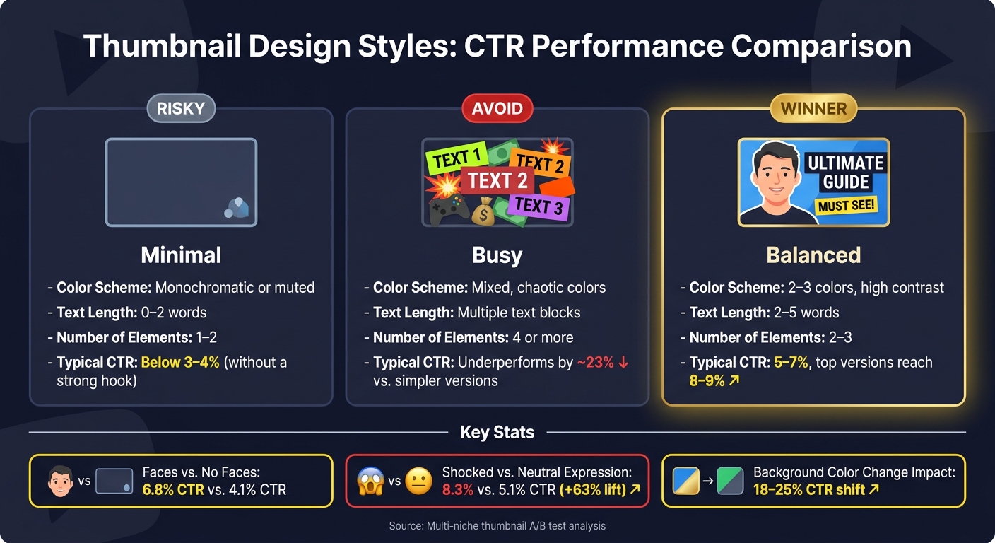
Thumbnail Design Styles: CTR Performance Comparison
These case studies point to the same three moves again and again: one focal point, one proof cue, and enough contrast to make the image easy to read at a glance. The pattern stays the same, but the way it shows up changes by niche.
Pattern 1: Finance and Education Thumbnails with Contrast and Proof Cues
In finance and education, thumbnails tend to work best when they keep the frame simple: one face or one object, plus one proof point like a chart, percentage, or dollar figure. That makes the promise feel specific right away.
Color does a lot of the heavy lifting here too. High-contrast pairings such as yellow + black or red + white have been reported at around 8.2% CTR and 7.6% CTR, which puts them above the usual 4–6% range.
Pattern 2: Lifestyle and How-To Thumbnails That Remove Background Noise
Lifestyle and how-to thumbnails usually do better when they cut things back. Remove extra props, soften or blur the background, and keep the shot centered on one person plus one object tied to the main promise. The goal is simple: the viewer should understand the frame in one quick look.
When thumbnails pile on more than three visual elements - extra props, added logos, stacked text blocks - CTR drops by about 23% compared to simpler versions. The background doesn't have to vanish. It just can't fight the subject for attention. That same idea shows up in A/B tests too.
Pattern 3: A/B-Tested Thumbnail Variants That Find the Middle Ground
A lot of creators assume the cleanest design will win. Others go in the opposite direction and pack the frame with detail. In practice, neither end usually comes out on top.
The best CTR often comes from a balanced design: a clear focal point, enough context to explain the topic, short text, and strong contrast. Systematic thumbnail testing has been shown to improve CTR by 30–110%, and many of the winning versions keep one clear subject while trimming away the extra stuff.
The table below shows how three common variant types compare across the main design variables:
| Variant | Color Scheme | Text Length | Number of Elements | Typical CTR Outcome |
|---|---|---|---|---|
| Minimal | Monochromatic or muted | 0–2 words | 1–2 | Often falls below 3–4% without a strong hook. |
| Busy | Mixed colors | Multiple text blocks | 4 or more | Usually underperforms simpler versions by about 23%. |
| Balanced | 2–3 colors, high contrast | 2–5 words | 2–3 | Usually wins; often lands at 5–7%, with top versions reaching 8–9%. |
One documented test makes this even clearer. A shocked-expression thumbnail was compared with a neutral version that used a similar layout. The shocked version reached 8.3% CTR versus 5.1% for the neutral design, a 63% relative lift.
The edge came from clearer visual hierarchy and a stronger emotional cue at the center. Those same ideas become a repeatable testing framework in the next section.
What the Case Studies Show in Practice
Before-and-After Changes That Usually Improve Click Appeal
You can turn these patterns into a simple weekly thumbnail checklist. The same few changes show up again and again across gaming, vlogs, tutorials, reviews, and small business content. That’s why the next three subsections work well as a repeatable system.
Start with placement. Move text away from the timestamp, and put it on the opposite side of the main face. After that, tweak the background color and facial expression first. Those two changes tend to move CTR the most.
| Thumbnail Aspect | Before | After | Impact |
|---|---|---|---|
| Background | Muted or busy | High-contrast color shift | 18–25% CTR change |
| Facial expression | Neutral | Strong emotion | 12–18% CTR change |
| Text placement | Bottom-right corner | Top-left quadrant | 34% more often read |
| Text length | Long descriptive phrase | 1–3 bold words | +27% visual impact |
A gaming channel might replace a full gameplay screenshot with a close-up character face and a two-word hook. A small business channel might swap a cluttered storefront image for one product shot and one clear offer.
Those are the first things worth testing. You can also check for common thumbnail mistakes that might be holding back your performance.
A Simple Framework Creators Can Reuse Every Week
A simple setup works best: one anchor subject, one proof cue, 2–4 words, and 2–3 colors.
- Anchor subject: face for vlogs, product for reviews, key object for tutorials
- Proof cue: chart, dollar amount, rating badge, or "Before/After" split
- Text: "Fix It Fast", "Worth It?", or "New Meta"
- Color: dark base, light text, and one accent color
Keep the layout steady so people start to recognize your channel at a glance. Then use that same structure as the starting point for each new test.
How to Build and Test Variants Efficiently
Start by finding two or three older thumbnails that beat your channel average by 10–20% on similar impression levels. Then look for overlap. Did they use the same subject position? Similar text size and placement? The same color palette? Some kind of proof cue?
Those shared traits become your base template. In plain English, you build one repeatable structure and swap in new content each week instead of starting from zero every time.
When you test variants, change one variable at a time. You might try different text wording, like "Fix Audio" vs. "Audio Fixed." Or test a tighter face crop. Or switch the accent color. Let each test run for at least 48 hours before you decide what won.
ThumbnailCreator fits neatly into this process. Its templates and variant tools make it easy to swap expressions, text, and objects in minutes, even if design isn’t your thing. That makes weekly testing much easier.
Use the winner as next week’s baseline.
Conclusion: Balanced Design Makes the Click Decision Easy
Across these case studies, balanced thumbnails land in the middle ground between bare-bones and overloaded. They show enough detail to prove the video is worth a click, but not so much that the image turns messy. That same pattern shows up again and again.
Clear hierarchy beats clutter. One main subject, short text, and strong contrast make the message obvious at a glance.
Balanced design also helps pull in the right viewers because the thumbnail lines up with the video’s promise.
That’s why advanced thumbnail optimization through weekly testing is pretty simple: change one variable, test it, and keep the winner. ThumbnailCreator helps speed up that process by generating variants in minutes.
Balanced thumbnails make the click decision easy. For your next upload, build one balanced thumbnail, then test one simpler version.
FAQs
What makes a thumbnail feel balanced?
A thumbnail feels balanced when it’s simple and easy to scan. One clear focal point should stand out at the right scale, with 40% to 60% negative space so the image doesn’t feel crowded.
Use a clear visual hierarchy so the eye hits the main subject first, then moves to short text placed in a supporting spot. High-contrast colors, clean separation between elements, and a softened background help the thumbnail stay readable on mobile.
How do I test thumbnails without skewing results?
Use YouTube Studio’s Test & Compare and change just one thumbnail element at a time. That could be the text, the face, or the background. Leave the title as-is, and upload up to three variants.
Then let the test run for 7–14 days so it picks up normal weekday and weekend patterns. Try to get 1,000–2,000 impressions per variant before judging the result. When you review performance, don’t look at CTR alone. Check watch time or average view duration too.
Why does that matter? A thumbnail can win more clicks and still bring in the wrong viewers. If CTR goes up but watch time drops, that’s usually a sign the thumbnail made a promise the video didn’t fully deliver on.
When should I use a face instead of an object?
Use a face when you want an instant emotional hook and a human connection. This works best when the face is easy to see and shows a strong expression that fits the topic. Neutral expressions usually don't do as well.
Use an object when viewers are mainly looking for a specific item or outcome. Keep the thumbnail clean, with one main subject. If you add text, place it opposite the face to keep the layout balanced.