
Color and Font Tips for Thumbnail Consistency
Thumbnails are the first thing viewers notice, and a consistent design can boost your channel's click-through rate (CTR) by 15–25% from returning viewers. Here's how to create thumbnails that stand out and build recognition:
- Stick to a Simple Color Palette: Use 2–3 colors - one dominant, one accent, and one neutral - to make thumbnails instantly recognizable.
- Choose Bold, Readable Fonts: Sans-serif fonts like Bebas Neue or Impact work best, especially on mobile where thumbnails are small.
- Use Repeatable Layouts: Keep key elements (e.g., faces, text, logos) in consistent positions across all thumbnails.
- Test for Mobile Readability: Ensure text and visuals are clear at small sizes (120 pixels wide).
Consistency builds trust and recognition, helping your channel grow faster over time. Tools like ThumbnailCreator can save your design settings to streamline the process.
Creating Thumbnails For YouTube - Tips for consistency
sbb-itb-b59debf
Define Your Channel's Visual Identity
Your channel’s visual identity is the first thing viewers notice - it’s your instant recognition tool in a crowded feed. Colors and fonts play a huge role here. In fact, the human brain processes color about 60 milliseconds faster than text. That means your visual choices leave an impression even before someone reads your video title.
Clarify Your Brand's Tone and Style
Start by analyzing your top 10 performing thumbnails. Look for patterns - are there recurring colors, font styles, or consistent placements for subjects? These unintentional trends are already connecting with your audience and can provide a solid foundation for your visual strategy.
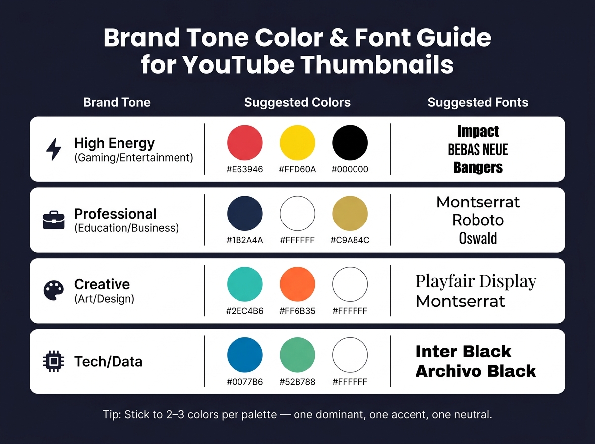
Once you’ve identified these patterns, match them to your channel’s emotional tone using this guide:
| Brand Tone | Suggested Colors | Suggested Fonts |
|---|---|---|
| High Energy (Gaming/Entertainment) | Red, Yellow, Black | Impact, Bebas Neue, Bangers |
| Professional (Education/Business) | Navy, White, Gold | Montserrat, Roboto, Oswald |
| Creative (Art/Design) | Teal, Orange, White | Playfair Display, Montserrat |
| Tech/Data | Blue, Green, White | Inter Black, Archivo Black |
From here, build a simple branding toolkit. Choose 2–3 primary HEX colors, a headline font, and a consistent logo or watermark placement. This toolkit will be your go-to for every thumbnail, ensuring your visuals stay cohesive.
Set Differentiation Rules for Playlists
Once your core identity is set, create variety within your playlists while staying true to your brand. Thumbnails don’t need to look identical, but they should all share key elements like your primary colors, headline font, and logo placement. Think of this as a “locked layer” of consistent elements.
For differentiation, add a “flexible layer.” This could include secondary accent colors or unique border treatments for each playlist. For instance, WIRED uses a solid green background for its "Autocomplete Interview" series and blue for "Tech Support", making it easy for viewers to recognize different formats at a glance. Follow the 80/20 rule: dedicate 80% of the thumbnail to core branding and 20% to playlist-specific tweaks.
"consistency builds recognition; monotony kills performance." - TubeAI Learn
Use ThumbnailCreator for Branding
Defining your visual identity is one thing; applying it consistently is another. Tools like ThumbnailCreator simplify this process. You can save your HEX codes, fonts, and layout guides as presets, so you’re not starting from scratch with every upload. Plus, it allows you to test different design options quickly, helping you find what resonates with your audience before finalizing your approach. This is where thumbnail A/B testing becomes essential for data-driven decisions.
Build a Consistent Color Palette
Brand Tone Color & Font Guide for YouTube Thumbnails
A consistent color palette is a key part of your channel's visual identity. It helps viewers instantly recognize your content and works hand-in-hand with thumbnail templates. In fact, channels with cohesive branding can experience up to 45% faster subscriber growth and see click-through rates improve by as much as 30% compared to those with inconsistent visuals. You don’t need a rainbow of options - just 2–3 well-chosen colors can make a big difference.
Choose a Limited Palette
Stick to 2 or 3 colors. Limiting your palette reduces clutter and ensures your channel is easy to recognize at a glance. Here’s a simple formula:
- One dominant color to set the overall tone.
- One accent color for text and highlights.
- One neutral color for backgrounds or secondary details.
Also, think about how your colors interact with YouTube’s interface. Avoid using thumbnails that are all white or dark gray, as they can blend into YouTube’s light and dark modes. If your thumbnail background is very light, consider adding a thin colored border to help it stand out in the feed.
Assign Colors to Thumbnail Elements
Every color in your palette should have a specific purpose. For example:
- Use your dominant color for the background or main subject.
- Use your accent color for text or call-out features.
- Use your neutral color to fill in supporting areas.
Document your HEX codes for each role to keep things consistent. A quick way to check your branding? Look at your last 12 thumbnails side by side. If they don’t visually connect, it might be time to refine your color assignments.
Test for Contrast and Readability
Thumbnails often appear as small as 120 pixels wide on mobile devices. If your design lacks contrast, critical elements like text or visuals can become unreadable.
To test contrast, convert your thumbnail to grayscale and squint at it. Key elements, like text and focal points, should still stand out. If they don’t, it’s time to adjust.
"If people cannot read your thumbnail text in the first 300 ms, they will not click." - ClickyApps Team
For text on busy backgrounds, try these fixes:
- Add a 2–4 px dark stroke or a soft shadow (30–60% opacity) to make the text pop.
- Use a semi-opaque dark rectangle (20–40% opacity) behind the text to improve legibility.
Once your colors are locked in, you’ll be ready to move on to choosing fonts that complement your branding while staying readable.
Choose Fonts for Clarity and Branding
With your color palette in place, it’s time to select fonts that complement your branding and enhance readability. The right typography does more than just ensure legibility - it also conveys your channel’s personality, even before viewers read a single word.
"Typography is one of the most underrated brand signals in thumbnails. A distinctive font becomes a visual fingerprint. Viewers associate it with you." - Hooksnap Blog
Pick a Primary Font and a Backup
Start with one primary font for your thumbnail headlines. This font becomes a key part of your channel's identity. Research shows that consistent typography can boost recognition clicks by up to 30%.
Bold sans-serif fonts are the go-to choice for thumbnails. Options like Impact, Bebas Neue, Montserrat Black, and Oswald are popular because they’re bold, condensed, and maintain clarity even when scaled down. In contrast, thin, script, or serif fonts often lose their sharpness at smaller sizes and only appear in about 4% of top-performing videos.
You can also choose a secondary font for supporting text or occasional highlights, but use it sparingly. A clear hierarchy between fonts ensures your thumbnails remain visually organized. Once selected, apply your fonts consistently to reinforce your branding.
Prioritize Readability at Small Sizes
Thumbnails often appear tiny on mobile devices, so font legibility is non-negotiable. The best fonts for thumbnails share common traits: a high x-height, wide apertures, and minimal stroke contrast. Fonts like Bebas Neue, Montserrat Bold, and Impact check all these boxes.
To maximize clarity, keep text short - 2 to 4 words is ideal - and use bold weights in all-caps. Enhancing text with a 2–4px stroke or a subtle drop shadow can improve readability by up to 40%.
"The decision to click happens in under 200 milliseconds, which means your thumbnail must communicate through instinct, not intellect." - Viral Finder
Save Font Choices in ThumbnailCreator
Consistency is key when it comes to font usage. Tools like ThumbnailCreator allow you to save your font settings - including weight, stroke thickness, and shadow effects - in reusable templates and Brand Profiles. You can even set rules, such as "Bebas Neue for headlines and Montserrat for subtext", to guide the AI in maintaining your branding across all designs.
This setup simplifies batch-designing thumbnails for playlists. Instead of manually adjusting font settings for each video, your saved preferences are automatically applied to every template. This not only saves time but also ensures your branding stays consistent across your channel.
Build Repeatable Layouts for Playlists
Once you've settled on your colors and fonts, it’s time to create a repeatable layout for your playlist thumbnails. This approach eliminates guesswork and ensures a cohesive look across all videos. The key is to establish consistent layout patterns and styles that structure your thumbnails effectively.
Set Fixed Layout Patterns
Think of your layout as a blueprint that helps viewers recognize your content at a glance - even before they read the title. To achieve this, decide on fixed positions for key elements: for example, keep the face always on the left or right, reserve a specific area for text (like the top-left corner), place your logo consistently in one corner, and maintain a uniform background style.
A good rule of thumb is the 80/20 split: stick to your established layout for about 80% of thumbnails, while allowing 20% to break the mold for special content such as collaborations or milestones. Channels that follow consistent branding in their thumbnails often see a 15–25% boost in click-through rates from returning viewers.
To test your design’s effectiveness, use the Stamp Test. Shrink your thumbnail to 120 pixels - if the main elements become unclear, simplify the design. Also, avoid placing important elements in the bottom-right corner, as they’ll overlap with the video timestamp.
Standardize Overlays and Text Placement
Overlays are a great way to tie your layout together visually. Whether you prefer color blocks, gradients, or glow effects, keeping the overlay style consistent - along with the direction of gradients and the placement of text - helps viewers quickly associate thumbnails with your channel. Striking a balance between fixed elements and some variation keeps your thumbnails engaging without losing your brand identity.
Stick to a maximum of three overlay elements. Overcrowding your design can hurt click-through rates, with studies showing a drop of 23% when overlays are overused. Typically, one text block, one clear focal image, and a consistent background treatment are enough to create an effective thumbnail.
Use ThumbnailCreator for Layout Systems
To simplify this process, you can use tools like ThumbnailCreator. Its Design Rules feature allows you to set firm guidelines for your thumbnails, such as “always place the person on the right” or “leave the lower-right corner empty.” These rules ensure the AI follows your preferences across all designs. As the ThumbnailCreator Help Center explains, "Design Rules let you define permanent constraints that your AI always follows - no matter what prompt you use or what style you pick".
For channels with multiple series, the Multi-Brand Profiles feature is particularly useful. It lets you save separate color palettes, logos, and layout rules for each playlist. Additionally, the Style Cloning feature can extract the design structure of a successful thumbnail and turn it into a reusable template for future videos. Batch designing becomes a breeze with asset swapping - replace faces, backgrounds, and text while keeping the layout intact for a polished, consistent look.
Keep Thumbnails Consistent Over Time
Keeping your thumbnails consistent is essential as your channel grows and your video library expands. This approach builds on the idea of creating a unified visual identity, helping viewers instantly recognize your content and improving your channel's performance over time.
Write a Thumbnail Style Guide
A style guide is a simple but powerful tool to maintain consistency. It should include details like your hex codes, font choices, logo placement, and designated layout areas.
"A style guide isn't a nice-to-have. It's the foundation that makes everything else work. Without it, you're back to random outputs every time." - CreatorSkills Team
By documenting these design elements, you turn thumbnail creation into a repeatable process. This consistency can significantly impact your channel's performance, with studies showing that recognizable branding can boost click-through rates by 2–3x and increase recognition clicks by 25%. To keep your style guide relevant, conduct a bi-annual review of your last 20 thumbnails to ensure they align with your evolving brand.
Once your style guide is in place, you can take efficiency to the next level by implementing batch-design practices.
Batch-Design Thumbnails for Playlists
Creating thumbnails one at a time can lead to inconsistencies. Small changes, like adjusting font weights or colors on the fly, can dilute your brand identity. Batch-designing thumbnails solves this issue by allowing you to design multiple thumbnails in one session, ensuring a cohesive look across your content.
By gathering your assets and designing thumbnails for the next 7–14 days, you can maintain a unified visual style. Creators who adopt batch-design practices save an estimated 8–12 hours weekly. Dan Kim, Founder of Hooksnap, highlights the importance of this approach:
"The creators growing fastest in 2026 do it differently. They batch. They treat thumbnails as a system, not a task." - Dan Kim, Founder, Hooksnap
Treating thumbnails as part of a larger visual series not only strengthens your branding but also streamlines your workflow.
Use ThumbnailCreator for Future Updates
Once you've standardized your designs through batch creation, maintaining consistency becomes easier with the right tools. ThumbnailCreator is specifically designed to help with this. Its Style Cloning feature allows you to replicate the visual elements of a successful thumbnail - like colors, typography, and composition - and apply them to new designs instantly.
For channels looking to update older content, the Channel Makeover feature enables bulk-redesigning of thumbnails to match your current branding. Additionally, shared Design Rules across your account ensure that every new thumbnail adheres to your established guidelines. This makes staying consistent a seamless part of your design process as your channel grows.
Conclusion: Key Takeaways for Thumbnail Consistency
Creating a recognizable thumbnail style hinges on consistently using key visual elements. Colors, fonts, and layouts each play a unique role: colors convey mood, fonts reflect your channel's personality, and layouts offer a familiar structure for viewers. When these elements are aligned, they create a powerful, unified effect.
Channels with consistent thumbnail branding experience a 15–25% higher click-through rate (CTR) from returning viewers compared to those with inconsistent designs. Over time, this boost adds up as viewers learn to associate your thumbnails with your content. To achieve this, follow a simple formula: limit your color palette to 2–3 shades, stick to 1–2 bold and readable fonts, and establish fixed layout zones to make your designs look intentional rather than random. Use the 80/20 rule - keep 80% of your thumbnails consistent with your branding and leave 20% for unique occasions like milestones or collaborations. Tools like ThumbnailCreator can streamline this process, ensuring your branding choices are applied consistently across all uploads.
"A great one-off thumbnail can win a click. A recognizable system can build a channel." - GrabThumbs Editorial Team
Consistency also means regular check-ins. Every six months, review your thumbnails and make gradual updates to refine your style. This ensures your channel evolves while maintaining a cohesive look. By following these thumbnail guides, you can transform your channel from a mix of random videos into a trusted, recognizable brand.
FAQs
How do I pick 2–3 brand colors that still look good in YouTube’s dark mode?
When selecting colors for YouTube’s dark mode, high-contrast combinations are your best friend. These ensure your design pops against the platform's dark gray background. Aim for a palette of 2–3 colors:
- A dominant color to set the mood.
- An accent color to create contrast.
- A neutral tone to balance the design.
For example, pairings like yellow and black or blue and orange work well. Steer clear of pure white or muted grays, as they can either overpower or fade into the background. Always test your design on both light and dark modes to ensure it’s easy to read and visually appealing.
What’s the fastest way to check if my thumbnail text is readable on a phone?
To quickly assess how readable your thumbnail design is on mobile, zoom out your design to around 120 pixels wide. This gives you a sense of how it will appear on a phone screen. Another approach is to use the squint test or the one-second test to check if the text and visuals are clear. If they’re not, consider making adjustments like increasing the font size, boosting contrast, or simplifying the overall design. Tools like ThumbnailCreator can make tweaking these elements much easier.
How can I keep playlists distinct without breaking my overall thumbnail style?
To create visually cohesive yet distinct playlists, try using 2–3 template variations. Stick to a unified layout, font, and color scheme to maintain your brand identity, but tweak these templates slightly for different content types. For example:
- Use one variation for collaborations, incorporating design elements that highlight guest appearances.
- Reserve another for seasonal series, adding festive touches or color accents to align with the theme.
This approach lets special content stand out while keeping key branding elements - like logo placement or consistent fonts - intact. That way, your thumbnails stay recognizable and reliable across all playlists.