

5 Steps to Analyze Competitor Thumbnails
If I want more clicks, I don’t guess - I study what viewers are already choosing. This process comes down to five steps: pick the right competitor videos, review thumbnails side by side, score repeat visual traits, match those traits to performance signals, and turn what I learn into simple testing rules and tools.
Here’s the short version:
- I start with my own impressions and CTR
- I review only videos with the same topic, format, and viewer intent
- I gather 15–20 thumbnails in one place
- I score things like subject clarity, face use, text length, contrast, and layout
- I compare those patterns with view outliers and my own high-CTR videos
- I test one thumbnail change at a time
A simple CTR formula sits behind all of this:
- CTR = clicks ÷ impressions × 100
- Example: 520 clicks ÷ 10,000 impressions = 5.2%
That matters because a thumbnail has one job: turn impressions into clicks. If I see high impressions + low CTR, the thumbnail may be weak. If I see high CTR + low impressions, the topic or distribution may be the issue. In many niches, 4%–7% is solid, while 12%+ is rare.
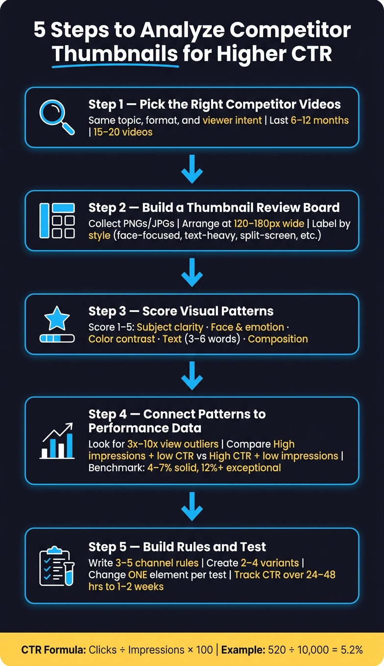
5 Steps to Analyze Competitor Thumbnails for Higher CTR
How I consistently get 15%+ CTR on all my thumbnails (NO B*S GUIDE)
sbb-itb-b59debf
Quick Comparison
| Step | What I do | What I’m looking for |
|---|---|---|
| 1 | Pick competitor videos | Same topic, format, and intent |
| 2 | Build a thumbnail board | Visual patterns at feed size |
| 3 | Score each thumbnail | Clarity, emotion, contrast, text, layout |
| 4 | Check performance clues | View outliers, CTR, impressions |
| 5 | Build rules and test your thumbnails | 2–4 versions, one change per test |
In short: I’m not copying thumbnails. I’m finding repeat patterns, cutting weak choices, and building a simple system I can test on my own channel.
Step 1: Choose the Right Competitor Videos to Review
Now that you’ve set your baseline, narrow the field to your actual competitors. Keep the sample tight and focused on thumbnails competing for the same click.
Here’s the key idea: a thumbnail only matters when it sits next to videos a viewer might pick instead.
Search by Topic, Format, and Viewer Intent
Start by searching the exact topic you plan to cover. Then match the format and the viewer intent.
If your video is an explainer, compare it against other explainer-style videos on that same topic. If someone is searching for a beginner tutorial, they’re looking for something different than a person searching for a review. That difference shows up in thumbnail style too. So before you add any video to your list, make sure all three line up:
- Topic
- Format
- Viewer intent
Focus first on videos published in the last 6 to 12 months. Older videos can still help as reference points, but they shouldn’t make up most of your sample. It also helps to include smaller channels that have pulled in high view counts compared with their subscriber count. Those videos can point to thumbnail styles that are working well. They also help you identify common thumbnail mistakes to avoid in your own niche.
After you filter by topic, format, intent, and date, log only the thumbnails that fit your comparison set.
Log a Small Comparison Set
Aim for 15 to 20 videos. For each one, record the title, publish date in MM/DD/YYYY format, view count, channel subscriber count, and a short note explaining why it belongs in the sample. Add a format label too - like tutorial, review, or explainer - so patterns stand out fast.
| Field | What to Record |
|---|---|
| Title | Full video title |
| Publish Date | MM/DD/YYYY format |
| Views | Total views at time of review |
| Subscribers | Subscriber count |
| Format | Tutorial, review, vlog, explainer, etc. |
| Notes | Why this video is relevant to your topic |
A simple rule works well here: if a video could compete with yours in search results, include it. If it’s aimed at a different audience or serves a clearly different intent, leave it out.
Once your set is logged, pull the thumbnails together for side-by-side review.
Step 2: Collect Thumbnails and Arrange Them for Side-by-Side Review
Once you've logged your comparison set, bring those thumbnails into one place so you can review them side by side.
That's where patterns start to jump out.
When you're flipping between tabs, it's easy to miss the stuff that keeps repeating. Put everything on one board, though, and those patterns get a lot easier to spot.
Build a Simple Review Board
Grab each thumbnail from the same place a viewer would see it: search results, the Home feed, or Suggested. Save every image as a PNG or JPG, and use a file name that tells you what you're looking at, like ChannelName_Topic_Style.jpg.
Keep all of them in one folder so the set stays easy to sort, scan, and come back to later.
Then open a slide deck or digital whiteboard and drop in all the thumbnails. Resize each one to about 120 to 180 pixels wide so your board matches how thumbnails look in an actual feed. Place them in a simple grid on a neutral background, like white or dark gray, so color from the canvas doesn't sway your read.
This board doesn't need to look pretty. It needs to be easy to scan.
One rule matters more than most creators think: don't judge a thumbnail only at full size. Zoom out to around 50% to 75% and check three things:
- Can you still tell what the subject is?
- Can you read the text?
- Can you feel the emotion?
If the answer is no, the thumbnail is likely weak at feed size, even if it looks sharp up close.
Once the board is set, you're ready to score the patterns that show up again and again.
Label Each Thumbnail by Style and Layout
After your grid is ready, tag each thumbnail with a simple style label. This cuts down on gut-feel decisions and makes the next step less fuzzy.
Use clear categories like these:
| Label | What It Means |
|---|---|
| Face-focused | A person's face is the dominant element |
| Product-focused | An object or physical item takes center stage |
| Text-heavy | Multiple words or large text blocks fill the frame |
| Before-and-after | Compare before/after vs single image thumbnails to see which drives more clicks |
| Split-screen | Two distinct scenes divided by a clear visual line |
| Single-subject | One clear person or object, no competing elements |
Add the label right below each thumbnail on your board. If the same label keeps showing up across top videos, that's a pattern worth testing.
Those tags also make the scoring step faster and less subjective.
Use ThumbnailCreator to Build Test-Ready Versions
Once you find a pattern worth testing - maybe a face on one side, bold short text on the other, and a high-contrast color band - you don't have to build from zero.
ThumbnailCreator helps you recreate that setup fast and turn it into original versions, so you can make several test-ready options in minutes.
From there, you can compare which visual patterns show up most often and score them against performance.
Step 3: Score the Visual Patterns That Appear Most Often
Use the labels on your board to score each pattern and turn it into a side-by-side comparison you can use.
Check Subject Clarity, Faces, and Emotion
Start with the most basic question: does each thumbnail have one clear focal point?
Score it at the size people see in the feed, not zoomed in. Give it the one-glance test: can you tell what the main subject is in a single look?
Then check whether a face appears, how much of the frame it takes up, and how strong the expression feels. A large face with a clear expression will often pull more attention than a neutral headshot or no face at all. Score face presence, size, expression strength, and topic fit on a 1–5 scale.
One note here: only score face strength when it actually fits the topic. A dramatic expression can help, but only if it makes sense for what the thumbnail is trying to say.
Review Color Contrast, Text Length, and Layout
After you score the face and subject, move to the design details. Score each factor from 1 to 5.
| Factor | What to Look For |
|---|---|
| Subject clarity | One recognizable focal point, no visual clutter |
| Emotional impact | Face presence, size, expression strength, topic fit |
| Color contrast | Foreground vs. background separation, text visibility |
| Text readability | Word count (aim for 3–6 words), font weight, legibility at small sizes |
| Overall composition | Clean visual hierarchy, clear eye path, balanced spacing |
For color contrast, check whether the subject and text stand out right away. White text on dark blue, for example, reads cleanly on a phone screen. Low contrast tends to blur together, and people scroll past it.
For text, shorter almost always wins. Bold, sans-serif fonts with 3–6 words are usually easier to read than long descriptive phrases, especially when thumbnails show up smaller in a busy feed. If a competitor keeps using a few punchy words with strong emphasis, mark that as a pattern in your scoring.
Add each thumbnail’s total score to your comparison sheet. You’re not chasing perfection here. You’re trying to spot which combinations score highest across the full set. Flag those top-scoring patterns for Step 4.
Step 4: Connect Thumbnail Patterns to Performance Data
Your scoring sheet from Step 3 shows what looks strong on the page. Now it’s time to tie those patterns to performance data, so you’re making calls based on proof instead of instinct.
Identify Likely High Performers
You can’t see a competitor’s CTR directly, so lean on public signals instead: views compared to channel size and early view velocity. A good place to start is videos getting about 3x a channel’s usual views. If something is pulling 5x to 10x, that’s a clear outlier.
Focus on videos covering topics close to your own. If a video beats the channel’s usual numbers on a shared topic, that’s a clue the thumbnail and title are connecting with the same audience you want. Mark those thumbnails in your comparison set, then line up their visual traits with the scores from Step 3. If the thumbnails that scored highest also show up as view outliers, you’re not guessing anymore - you’re seeing a pattern. This aligns with broader YouTube thumbnail trends across your specific niche.
Then take one more step: check whether those same traits appear in your own higher-CTR videos.
Compare Against Your Own CTR and Impressions
Once you’ve marked the outliers, compare them with your own numbers in YouTube Studio → Analytics → Reach.
A simple way to read the data:
- High impressions + low CTR: YouTube is giving the video a shot, but the thumbnail isn’t getting enough clicks.
- High CTR + low impressions: The thumbnail and title are doing their job, but the topic fit or early momentum may be holding the video back.
- Both rising together: That’s what you want.
As a rough benchmark, 4% to 7% is solid, and 12%+ is exceptional, though results vary by niche.
Build a simple comparison table using your own videos that line up with the competitor topics you’ve been studying:
| Video Topic | Thumbnail Traits | Impressions | CTR | Notes |
|---|---|---|---|---|
| Premiere Pro Shorts Tutorial | Close-up face, shocked expression, 4-word bold text, red/black contrast | 95,000 | 7.2% | Emotion and contrast likely drove clicks |
| How to Color Grade iPhone Footage | Product-focused, muted colors, 10+ words of small text | 120,000 | 3.1% | High impressions, weak CTR; text-heavy design may be hurting performance |
| YouTube Thumbnail Design Tips | Face + UI screenshot, 6-word headline, yellow accent | 40,000 | 5.8% | Above-average CTR; topic may be more niche |
Now compare the Thumbnail Traits column with the patterns you scored in Step 3. If a competitor’s high-view outliers share traits with your own high-CTR videos, that’s a strong sign those elements are worth repeating. If your low-CTR videos look a lot like competitor thumbnails that aren’t outliers, that matters too. It shows you what to stop leaning on.
Step 5: Turn Your Findings Into a Repeatable Thumbnail System
Now take those patterns and CTR clues and turn them into a thumbnail system you can use again and again.
Write 3 to 5 Thumbnail Rules for Your Channel
Look at the traits that showed up most often in top competitor thumbnails. Then turn them into 3 to 5 clear rules for your channel.
The key is to make each rule specific enough to use without guessing. For example:
- One dominant subject: One face or product fills 40–60% of the frame.
- Text limit: 3–4 short words.
- High contrast: Subject and text stand out clearly.
- Consistent placement: Faces appear on the right side, text anchored to the left.
- One recurring brand element: A small logo, color strip, or frame makes your thumbnails recognizable across uploads.
You’re not copying layouts. You’re turning repeated winning traits into channel rules. That’s the difference. The idea is to spot what works in your niche, then use it in your own style.
Build Variations and Test One Change at a Time
Once your rules are set, start testing them - one variable at a time.
Create 2 to 4 thumbnail variants and change only one element in each test. If you’re testing facial expression, keep the background color, text, and layout the same across every version. That way, the result is clean and easy to read: Version A uses a calm expression, Version B uses a surprised one, and everything else stays put.
YouTube’s native Test & Compare feature splits impressions and shows whether a variant produced a winner, tie, or inconclusive result. If your channel doesn’t have access yet, rotate thumbnails manually every 24–48 hours and track CTR in YouTube Studio → Analytics → Reach.
Either way, give each variant enough time to collect impressions. That usually means several days to 1–2 weeks, especially for smaller channels, before you decide which one won. When you do find a winner, fold that lesson back into your rules and use it going forward.
ThumbnailCreator can make this easier day to day. Its templates, face swapping, and text and object swapping help you build rule-based variants fast, so you can change one element at a time without rebuilding the whole thumbnail.
Conclusion: Keep the Process Simple, Measurable, and Repeatable
The workflow is straightforward: pick competitors, collect thumbnails, score repeated patterns, connect those patterns to performance, then turn the winners into rules and test one change at a time.
FAQs
How often should I review thumbnails in my niche?
Review thumbnails on a regular schedule.
- Quarterly: do a full audit of competitor trends and your own performance
- Monthly: do a quick check-in and review your latest 10–20 thumbnails
- Every 8–10 videos: refresh your designs so your audience doesn’t get tired of seeing the same thing
For A/B tests, run them for 7–14 days. If your channel gets fewer than 10,000 impressions per week, let the test run for as long as 1 month.
What if my niche rarely uses faces or text?
Focus on the visual cues that seem to drive clicks for top creators in your niche. There isn’t a single formula that works for everyone, so look at the top 20 videos and pay close attention to the visual patterns they share.
Maybe they lean on clear focal objects, bold high-contrast colors, or a more cinematic look. Then use ThumbnailCreator to test those ideas one variable at a time and see what connects with your audience.
How many impressions do I need before judging a thumbnail test?
Aim for at least 1,000 impressions per variant. That gives you a decent sample to work with.
If you want more confidence in the result, shoot for 2,000–5,000 impressions per variant. More data usually makes the call a lot easier.
You’ll also want to give the test enough time to breathe. In most cases, 7–14 days works well because it helps smooth out normal traffic swings from one day to the next.
If your channel gets fewer than 10,000 impressions per week, stretch the test to a full month. That extra time can give you data you can actually use instead of making a call too early.