

CTR Optimization: Thumbnail Text vs. No Text
Most YouTube creators don’t need a fixed rule. They need the right fit: use short thumbnail text when the image alone is not clear, and use no text when the image tells the story at a glance.
Here’s the short answer:
- Text often wins for tutorials, finance, tech, and news
- No text often wins for travel, food, vlogs, and reaction-style content
- 3–5 words is usually the best range for thumbnail text
- Text that goes past 7 words can hurt CTR by about 8% per extra word
- In some tests, readable text overlays improved CTR by 25%–40%
- But no-text thumbnails can still win when the image is clear right away
What I’d do:
- I’d use text if the topic is abstract or info-heavy
- I’d skip text if one image can explain the video in under a second
- I’d test both versions for at least 48 hours
- I’d judge the result with CTR, retention, and watch time, not clicks alone
Text vs. No Text on Thumbnails: Which Gets Views?
sbb-itb-b59debf
Quick Comparison
| Factor | Thumbnail Text | No Text |
|---|---|---|
| Best for | Tutorials, explainers, finance, tech, news (see our educational thumbnail guide) | Travel, food, vlogs, reactions, visual content |
| Main strength | Adds context fast | Stops the scroll with a clean image |
| Main risk | Too many words, poor mobile readability | Image may feel vague |
| Best length | 2–5 words | None |
| Mobile fit | Works if bold and short | Often easier to scan |
| Best traffic source | Search | Browse and Suggested |
Bottom line: I wouldn’t ask, “Should every thumbnail have text?” I’d ask, “Can the image sell the click by itself?” If not, a few bold words can help. If yes, text may just add clutter.
Thumbnail Text vs. No Text: A Direct CTR Comparison
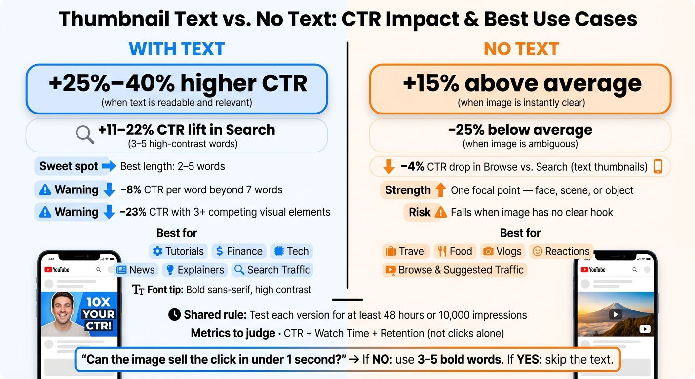
Thumbnail Text vs. No Text: CTR Data & Best Use Cases
Neither format wins on its own. The winner is the one that gets the hook across FASTEST. So the test is pretty simple: which version tells people what the video is about in less time?
The data points in that direction. Thumbnails with readable text overlays can see about 25–40% higher CTR than no-text versions, but only if the text is easy to read. No-text thumbnails are less steady. They can perform 15% above average when the image is instantly clear, or fall 25% below average when it isn't.
| Factor | Thumbnails With Text | Thumbnails Without Text | Likely CTR Effect |
|---|---|---|---|
| Clarity | High when 3–5 words clarify the hook | Varies; depends fully on how strong the image is | Text tends to be steadier for complex topics |
| Speed of Understanding | Fast when the message is obvious | Fast only when the image is instantly clear | 3–5 words outperform other lengths by 28% |
| Mobile Readability | Drops hard beyond 7 words | Strong; no tiny text or extra elements to read | −8% CTR for every word over 7 |
| Performance Risk | More steady | Less steady | Can range from +15% to −25% |
When Text Thumbnails Usually Win
Text earns its spot when the image by itself doesn't explain the video well enough. This shows up a lot in tutorials, explainers, analysis, rankings, and other info-heavy topics where viewers need a quick signal that the video solves a clear problem. In those cases, a short overlay cuts confusion and helps people decide faster.
The sweet spot is usually 2–5 words, set in a large font with strong contrast. And the text should add something the title doesn't already say. Overlays like I Was Wrong or $0 to $10K create tension or point to an outcome. That gives the viewer a reason to click that the title alone may not provide. If the thumbnail just repeats the title word for word, it wastes space and slows people down.
When No-Text Thumbnails Usually Win
When the image tells the story right away, words can get in the way. Travel scenery, food close-ups, dramatic before-and-after shots, and strong reaction images fit here. The visual does the job faster than an overlay can.
No-text thumbnails also often stand out in browse and suggested feeds, where people scan at high speed. A clean image with one main subject, strong contrast, and a clear emotional cue can stop the scroll without asking the viewer to read anything. One clear subject matters a lot here. Mobile viewers won't sort through tiny details.
Common CTR Mistakes on Both Sides
The most common mistake with text thumbnails is stuffing in too much. Thumbnails packed with 3 or more competing objects or details show about a 23% lower CTR than simpler designs. Small fonts, weak contrast, and fancy type choices make the problem worse. If someone has to squint, they're probably gone.
The most common mistake with no-text thumbnails is assuming that an interesting image is also a clear image. It isn't always. If a viewer can't tell what the video is about in one glance, they may keep scrolling because the thumbnail doesn't spark enough curiosity or match what they care about. No-text thumbnails tend to miss when the image has no single focal point or when mobile users have to sort through too many small details.
Still, the format by itself doesn't decide the winner. Audience, niche, and traffic source all shape the result.
What Actually Decides the Winner: Audience, Niche, and Traffic Source
The winner comes down to viewer intent, creator familiarity, and traffic source. The exact same thumbnail can flop with one group and win with another. That’s why audience and traffic source are the main things to look at.
Which Format Fits Which Content Category
In instructional niches like finance, tech reviews, tutorials, coding, and news breakdowns, people usually show up with a clear question. They’re not casually browsing. They’re looking for the video that matches the problem in their head. Short, benefit-led text like "Pay Off Debt Fast" or "Budget Template" helps them spot the match fast. Without that cue, a generic image can feel vague.
Visual or experience-led niches tend to work differently. Travel, food, lifestyle vlogs, fitness, and beauty content lean on instant visual appeal. A plated dish, a dramatic view, or an expressive face often says enough on its own. In those cases, text can get in the way. It adds clutter and slows down the gut reaction that often drives the click.
Deciding between text-heavy vs minimal text thumbnails depends on whether the image can explain the point on its own.
| Scenario | Text Thumbnail | No-Text Thumbnail | Expected CTR Impact |
|---|---|---|---|
| Finance tutorial in search | Short outcome text like "Save $500/Month" signals clear value | A generic image lacks specificity | In search, 3–5 high-contrast words can lift CTR by 11–22% |
| Tech review in suggested | Device name or key benefit ("Battery Test") reduces ambiguity | Strong product shot with bold colors can stand out | No-text works better in suggested; short text is more useful in search |
| Lifestyle vlog in browse | Minimal text ("Day in NYC") or none; words can clutter the frame | Expressive face + strong scene drives emotional click | No-text thumbnails improve CTR in browse |
| Travel montage after similar content | Short label ("Hawaii") only if the location isn't obvious | Iconic scenery or a landmark communicates instantly | No-text is preferred when the image is self-explanatory |
| Cooking recipe in search vs. browse | Bold short phrase ("5-Minute Pasta") clarifies the payoff | Dish close-up alone works well in browse | Text helps in search; no-text performs better in browse |
Which Format Fits Which Traffic Source
Search traffic brings in viewers who are looking for something specific. A thumbnail with 2–4 words that mirror the query - "Credit Score Mistake" or "Meal Prep Plan" - can strengthen relevance right when the viewer is deciding. In search, 3–5 high-contrast words can lift CTR by 11–22%.
Browse and suggested work differently. People are scrolling, not searching. What helps in search can hurt in browse, with one study showing about a 4% CTR drop in browse settings. In that environment, a strong face, a clear emotional signal, and bold colors usually do more than words. No text - or very little text - helps the visual pop among a crowded feed.
Designing for Mobile-First U.S. Audiences
Thumbnails show up at about 130–150 pixels wide in the feed. That’s small. Thin fonts blur. Long phrases wrap or shrink until no one can read them. Busy layouts just look messy.
For mobile-first U.S. audiences, keep it tight:
- Use bold sans-serif fonts
- Stick to 2–4 words
- Build around one focal point, like a face or one key object
That’s the version worth testing against a no-text thumbnail.
ThumbnailCreator helps you make both versions fast with templates, text editing, face swapping, and object swapping.
How to Test Thumbnail Text vs. No Text Without Guessing
Run a real A/B test vs. gut feeling. Change only the text on the thumbnail. Leave the image, colors, and composition alone. That way, you’re testing one thing instead of a messy mix of changes.
Use the audience and traffic source from the last section to pick the first video to test.
How to Set Up a Clean A/B Test
Keep the base design identical: same image, same layout, same colors. The only difference should be whether the thumbnail has text.
Start with a video that already gets steady impressions from Browse or Suggested traffic. Then make two versions from the same design:
- one with text
- one without text
Let each version run for at least 48 hours before you make any calls. If your channel grows at a slower pace, stretch the test to 5–7 days per variant. Also set a floor for data quality: wait until each version gets at least 10,000 impressions before you pick a winner.
| Test Type | Variable Changed | Recommended Duration | Primary Metrics |
|---|---|---|---|
| Text vs. No Text | Presence of text on thumbnail | 48–72 hours (mid-size channels) | CTR, impressions, source mix |
After that, judge the result by retention, not clicks alone. This helps you determine if you are hitting thumbnail CTR benchmarks for your specific niche.
Which Metrics to Watch Beyond CTR
CTR tells you how many people clicked. But a high CTR doesn’t mean much if watch time falls apart right after the click.
Watch these metrics alongside CTR:
- Impressions, so you can check that both versions reached similar audiences
- Source mix, because a text thumbnail may do better in Search and worse in Suggested
- Average view duration
- Percentage viewed
Here’s the simple gut-check: if the text version gets more clicks but viewers leave in the first 30 seconds, the text may be promising more than the video delivers. In that case, rewrite the text so it matches the video more closely, or test a milder version.
YouTube's Test & Compare weighs CTR and watch-time share. That points to the same rule: the right clicks matter more than extra clicks.
Using ThumbnailCreator to Build Test Variants Faster
Use ThumbnailCreator to make two matched versions fast: one with short, high-contrast text and one with no text. That keeps the test clean and makes the winner easier to spot.
Conclusion: Pick the Format That Matches Your Viewer's First Impression
After testing, the answer is usually pretty simple: ask one question - can the image explain the value in under a second? If the answer is no, use 3–5 bold words.
Use text for abstract, information-heavy topics like education, finance, tech, and news. Go with no text for visual, emotion-led content like entertainment, lifestyle, vlogs, travel, and reactions.
The gap in results can be sharp. 3–5 words tend to beat longer text, while no-text thumbnails can swing up or down based on how clear the image is. Personal preference is a weak signal.
That means the next step isn't opinion. It's testing. Treat each thumbnail like a test. Use ThumbnailCreator to build matched variants fast, then let CTR, watch time, and retention make the call.
Design for the viewer's first impression. The right format is the one that answers the question and delivers on the promise.
FAQs
How do I know if my image is clear enough without text?
Look at the visual first. Do the facial expression, framing, or color contrast tell the story or hint at the emotion on their own? A thumbnail without text should still make someone pause because the image itself creates curiosity.
Then shrink it down to mobile size - about 168×94 pixels. If the silhouette stays clear, the subject is easy to spot, and the main idea comes across at a glance, the image can stand on its own without text.
Should I use different thumbnail styles for Search and Browse?
Yes. Match your thumbnail style to where the view is coming from.
For Search, clear thumbnails with a bit of text often do well, especially for tutorials or how-to content. People there usually have a specific goal, so the thumbnail should help them grasp the topic fast.
For Browse, bold visuals and emotion tend to do more of the work. Dramatic scenes, strong contrast, or expressive faces can spark curiosity and stop the scroll without leaning too much on text.
What if higher CTR leads to lower watch time?
A higher CTR on its own isn't enough. YouTube's recommendation system doesn't judge thumbnails by clicks alone. Its Test and Compare tools mainly look at total watch time share.
That means a thumbnail can win more clicks and still hurt the video if people bounce right away. If the click creates the wrong expectation, YouTube may deprioritize the video.
Tools like ThumbnailCreator can help you test designs that better match the video itself and bring in viewers who are more likely to keep watching.