

Face vs. No Face: Thumbnail CTR Comparison
There is no one winner. Across YouTube, face thumbnails often help on personality-driven channels, while no-face thumbnails often do just as well - or better - when viewers care more about the topic, product, or result.
Here’s the short version:
- Faces tend to help in vlogs, reactions, commentary, entertainment, and lifestyle.
- No-face thumbnails tend to work well in tutorials, tech, product reviews, education, and software demos.
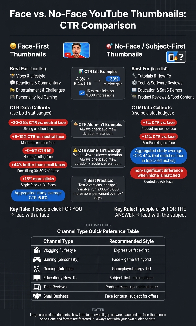
- A move from 4.8% to 6.4% CTR means a 33% relative gain - or about 16 more clicks per 1,000 impressions.
- But CTR alone is not enough. If the thumbnail pulls in the wrong viewer, retention can drop.
- Big cross-channel data shows little to no overall gap between face and no-face thumbnails once niche and format are factored in.
- On some channels, expression, layout, contrast, and topic clarity matter more than face presence by itself.
If I had to boil it down to one rule, it would be this: if people click for you, test a face first; if they click for the answer, test the subject first.
Face vs. No-Face YouTube Thumbnails: CTR Data & Best Use Cases
The Thumbnail Experiment: Using Science to Boost CTR
sbb-itb-b59debf
Quick Comparison
| Thumbnail style | Often works best for | Main upside | Main risk |
|---|---|---|---|
| Face-first | Vlogs, reactions, commentary, lifestyle, entertainment | Fast emotional pull and creator recognition | Can look weak if the face is neutral, small, or off-topic |
| No-face / subject-first | Tutorials, tech, reviews, education, SaaS demos | Shows the result or topic fast | May get less attention if the design is plain |
| Face + subject mix | Gaming, creator-led how-to, small business | Balances personality with topic clarity | Can get cluttered if too much is on screen |
A few data points stand out. Some studies found face thumbnails averaging 6.8% CTR vs. 4.1% for no-face. But other large datasets found no meaningful overall difference. In some niches, no-face thumbnails even came out ahead, such as product reviews (+8%) and food content (+14%).
So I wouldn’t treat “use a face” as a rule. I’d treat it as an A/B testing vs gut feeling test.
The best move is simple: make two versions, change one variable, give each version enough impressions, and compare CTR, traffic source, average view duration, and retention.
Face Thumbnails: When They Tend to Raise CTR
Content Types That Work Well With Faces
Face thumbnails usually do best in personality-led formats - vlogs, lifestyle, reactions, commentary, entertainment, challenges, and music - where people click for the topic and the person behind it. In these formats, recognition often matters almost as much as topic clarity.
Why Expression and Face Size Matter
A face alone doesn't do much. Expression is what moves CTR.
Research shows a pretty clear pattern. Neutral or resting expressions offer little to no CTR lift over faceless thumbnails, usually around 0–5% at best. Moderate emotion - like a raised eyebrow or visible concern - tends to lift CTR by about 8–15%. Strong, easy-to-read emotions such as surprise, excitement, or curiosity can drive CTR 20–35% higher than a neutral face, especially in entertainment and reaction content.
Size matters too. Faces that fill about 30–50% of the frame tend to do about 44% better than smaller faces that are harder to read. And one clear face usually beats a crowd. One analysis found that single-face thumbnails got around 15% more clicks than thumbnails with three or more faces. On mobile, that simple setup tends to read best.
| Factor | Typical CTR Effect | Best-Performing Niches |
|---|---|---|
| Face thumbnails (strong emotion) | +20–35% vs. neutral face | Vlogs, reaction, commentary, entertainment, lifestyle |
| Face thumbnails (neutral expression) | ~0–5% vs. no face | Limited across most niches |
| No-face / object-first thumbnails | Baseline; can match or beat faces in some information-first niches | Tutorials, tech reviews, education |
When Face Thumbnails Stop Helping
That edge fades fast when the face is unclear, generic, or disconnected from the video.
The biggest problem is a neutral or low-energy expression. It puts a face in the frame, but it doesn't give the viewer much to react to, so it rarely beats a clean design built around the topic.
Clutter is another common issue. If the face has to fight with heavy text, multiple objects, or a busy background, the emotional cue gets buried. Research keeps pointing the same way: one focal face plus minimal text beats a crowded layout.
Then there's mismatch. If a thumbnail uses an extreme shock or fear expression for a calm, ordinary video, viewers can start to feel misled by clickbait vs authentic thumbnails. Over time, that can weaken trust and hurt long-term performance because the thumbnail promises more than the video delivers. More recent commentary also suggests that exaggerated "YouTube face" reactions may be losing their punch, with audiences responding better to emotion that feels genuine instead of staged.
This makes testing pretty simple: compare a strong expression against a neutral one on the same layout. If the creator signal isn't doing much, object-first thumbnails often step in. And when the topic matters more than the person, no-face thumbnails can narrow the gap.
No-Face Thumbnails: When They Match or Beat Face Designs
Channels Where the Topic Matters More Than the Creator
No-face thumbnails can work very well in niches where people care most about the result. That’s often the case with tutorials, software walkthroughs, SaaS/app demos, product reviews, and technical explainers. In those cases, the thumbnail has to show the payoff fast.
If you show the interface, the end result, or the product itself, viewers can often understand the value in a split second. That can be more direct than relying on a facial expression alone.
Strengths of Object-First and Text-Led Thumbnails
When the topic is the main hook, clarity usually beats emotion. No-face thumbnails often make that easier. A single focal point, like a UI element, a device, or a chart, paired with a short text overlay, gives the eye one clear place to land.
This style also makes sense for multi-host channels and brand-led channels. In those setups, viewers are clicking for the lesson, tool, or product, not just for one person on screen.
| Factor | Typical CTR Effect | Best-Performing Niches |
|---|---|---|
| No-face / object-first thumbnails | Can match or beat face designs when the topic itself is the main click trigger | Tutorials, tech reviews, education, SaaS demos |
| No-face / text-led thumbnails | Competitive when short text adds clarity and the visual stays simple | How-to, programming, tool walkthroughs, product reviews |
| Face thumbnails | Often stronger when emotion, personality, or storytelling is the hook | Vlogs, reaction, commentary, entertainment, lifestyle |
Trade-Offs of Skipping Faces
The biggest downside is simple: in a crowded recommendation feed, faces often grab attention faster. So if you skip the face, the thumbnail has to do more work with contrast, icons, and short text.
There’s also the connection piece. On creator-led channels, people often click because they know the person behind the video. Take that face away, and you may lose some of that familiarity that helps drive repeat clicks.
So the better option depends on the niche and the style of the channel.
Face vs. No-Face: CTR, Engagement, and Why Results Differ
Results vary because studies often blend different niches, audiences, and testing styles. At the core, this comes down to two things: viewer intent and how the data was measured.
For example, one aggregated study of 1,000 thumbnails found an average CTR of 6.8% for face thumbnails and 4.1% for no-face thumbnails. But larger cross-niche datasets show that face and no-face thumbnails can perform about the same on average once format and topic are taken into account. So those averages are tied to the sample. They are not a rule that works everywhere.
How Niche and Channel Style Change the Outcome
On personality-led channels like vlogs, entertainment, and reaction content, faces often help CTR because the creator is part of the draw. People are clicking for that person's reaction, opinion, or energy. A strong facial expression can send that message in a split second.
Topic-led channels play by different rules. In tutorials, technical education, and product-focused videos, the viewer usually wants to learn something or check out a product. In that case, a face may not answer the viewer's question as fast as showing the tool, interface, or end result would.
That pattern shows up in niche data too:
- In product review content, no-face thumbnails have outperformed face-based designs by about 8%.
- In food channels, removing faces has been tied to roughly a 14% CTR lift.
Still, niche by itself doesn't explain the whole gap.
Why Published Findings Do Not Always Agree
A big part of the disagreement is method. Large observational datasets - including analyses of 25,000+ thumbnails across many niches - often point to a broad face advantage. But those studies also mix many formats and audiences, which can tilt the averages.
Controlled A/B tests on a single channel often tell a different story. When creators test face vs. no-face with their own audience, other thumbnail elements can matter more, like background contrast, curiosity gaps, and color palettes. One controlled study on expression and face presence found a non-significant relationship between having a face in the thumbnail and engagement, which suggests the effect does not hold steady across channels.
| Thumbnail Type Favored | Approximate CTR Difference | Context/Notes |
|---|---|---|
| No-face (product review) | +8% vs. face | Viewers prioritize seeing the product over the creator |
| No-face (food/cooking) | +14% vs. face | Visual appeal of the subject outperforms creator recognition |
| Face vs. no-face (controlled study) | Non-significant difference | Engagement not meaningfully linked to face presence alone |
That’s why channel-level testing tends to be more useful than broad averages. What works in one niche - or even on one channel - may flop somewhere else. The next move is to test both versions with your own audience.
Applying the Data to Your Channel
A Simple Starting Point by Channel Type
Niche affects the outcome, and channel style does too. If people watch because of you, lead with a face. If they click for the answer, lead with the subject. That split gives you a solid first test.
| Channel Type | Recommended Starting Style |
|---|---|
| Vlogging / Lifestyle | Expressive face-first |
| Gaming (personality-led) | Face + game art hybrid |
| Gaming (tutorials/guides) | Gameplay- or strategy-led |
| Education / How-To | Subject-first, minimal face |
| Tech Reviews | Product close-up, minimal face |
| Small Business | Face for trust, subject-first for offers |
From there, test one variable at a time. That’s the only way to tell whether the thumbnail changed the result.
How to Test Face vs. No-Face Thumbnails Efficiently
Make two strong thumbnail versions for the same video: one face-focused and one subject-first. Keep the title, topic, and upload timing the same. If you change too many things at once, you won’t know what actually made the difference.
Run one version first, then switch to the other after you have enough impressions to compare them. A good target is at least 2,000–10,000 impressions per variant and 5–7 days for each version under steady conditions.
When you review the results, don’t stop at overall CTR. Look at CTR by traffic source:
- Search
- Suggested
- Browse
That extra layer matters. The same thumbnail can do well in one source and fall flat in another. Also watch average view duration and audience retention. More clicks sound nice, but not if people leave right away.
A thumbnail that gets the click but brings in the wrong viewer can hurt more than it helps.
ThumbnailCreator can help you make both versions faster, which makes testing a lot less of a chore.
Conclusion: Let Audience Data Guide Your Choice
After a few tests, the patterns on your own channel matter more than broad averages. Use your channel data - not averages - to decide between face-first and subject-first thumbnails.
FAQs
How do I know if my channel is personality-led or topic-led?
Look at your niche and pay attention to what your audience clicks on most. Personality-led channels often do well with face-first thumbnails, strong reactions, and aspirational visuals. Topic-led channels usually get better results with product-focused, minimalist, or diagram-heavy thumbnails.
You can also test both styles with ThumbnailCreator and see which one gets a higher click-through rate with your audience.
How long should I test each thumbnail version before deciding?
Test each thumbnail for at least 48 hours, but pay closer attention to impression volume than the clock.
A good baseline is 500–1,000 impressions per version. If you can get 2,000–5,000 impressions, your read on the data will be more reliable. Bigger channels may get steady results in 24–48 hours. Smaller channels often need 1–2 weeks to gather enough data.
Only pick a winner once both versions have reached similar impression volume. If one thumbnail has had far more chances to appear than the other, the comparison isn't apples to apples.
What if a higher CTR lowers retention?
A high CTR with low retention usually means the thumbnail promises one thing, but the video delivers another. Clicks matter, of course. But YouTube also leans toward videos that hold attention.
If people drop off in the first 10 to 30 seconds, that’s a strong sign the thumbnail and the content aren’t lining up. The goal isn’t just to get the click. It’s to pair CTR with retention, so the thumbnail works as an honest preview of what viewers are about to watch.