
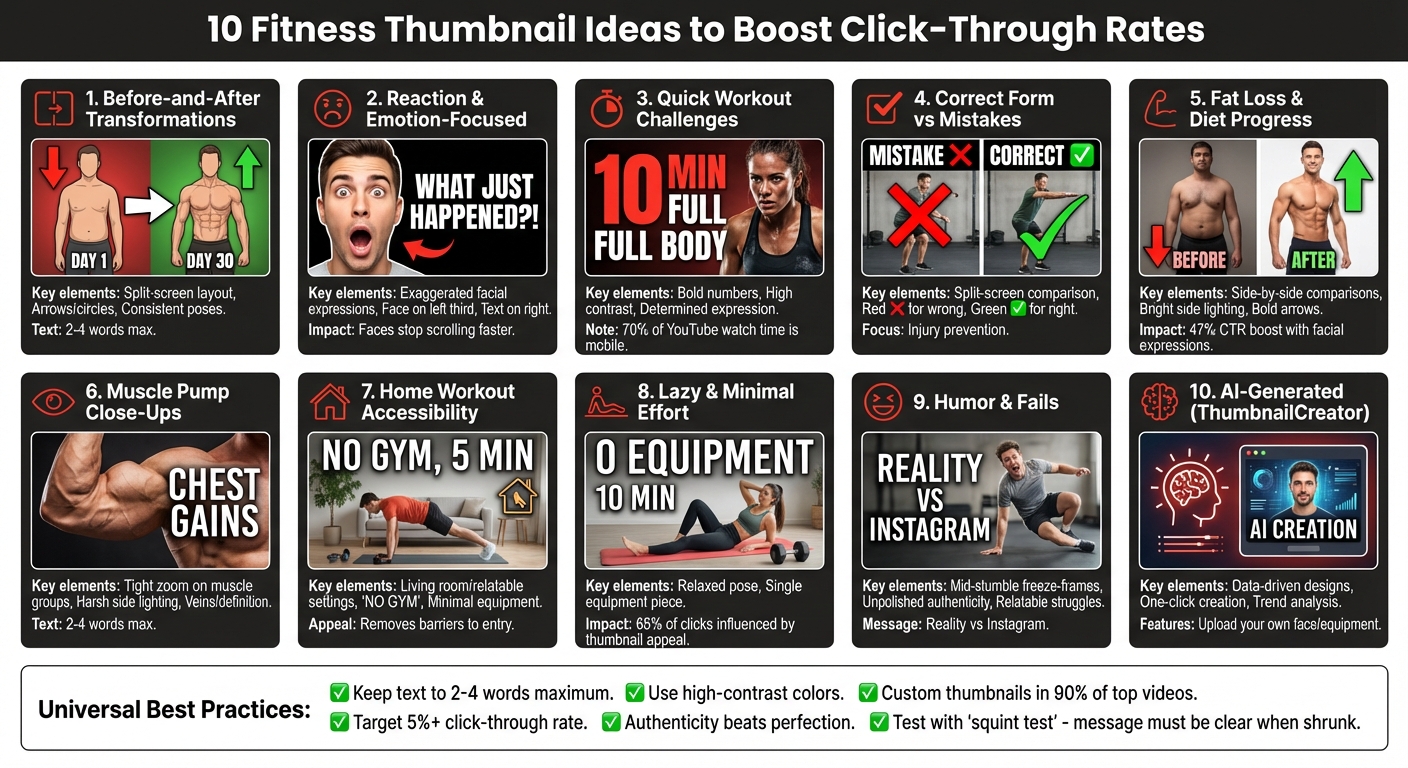
10 Fitness Thumbnail Ideas for YouTube
In the crowded fitness niche on YouTube, thumbnails are your first impression - they determine whether someone clicks on your video. A great thumbnail grabs attention, sparks curiosity, and promises value. Here’s a breakdown of 10 effective fitness thumbnail ideas to help boost your click-through rates:
- Before-and-After Transformations: Showcase progress with split-screen contrasts (e.g., "Day 1 vs Day 30"). Use simple cues like arrows or circles to highlight changes.
- Reaction and Emotion-Focused Shots: Use exaggerated facial expressions (shock, strain) to connect emotionally and stand out.
- Quick Workout Challenges: Highlight numbers like "10 MIN" or "100 Push-Ups" to set clear expectations.
- Correct Form vs Mistakes: Use split screens with "Wrong vs Right" visuals and bold symbols (red ❌, green ✓).
- Fat Loss and Diet Progress: Side-by-side comparisons with clear transformations and emotional hooks.
- Muscle Pump Close-Ups: Zoom in on defined muscles with dramatic lighting for high-impact visuals.
- Home Workout Accessibility: Show relatable settings like living rooms to make workouts feel approachable.
- Lazy and Minimal Effort Workouts: Highlight simplicity with minimal equipment and short routines (e.g., "5 MIN").
- Humor and Fails: Use real, unpolished moments like workout blunders to connect with viewers.
- AI-Generated Thumbnails: Use tools like ThumbnailCreator for fast, data-driven designs tailored to fitness trends.
The key? Create fitness thumbnails that are simple, bold, and clear. Use 2–4 impactful words, high-contrast visuals, and relatable imagery to stop the scroll. Whether it’s transformations, emotions, or humor, your thumbnail should promise value and deliver on it.
10 High-Converting Fitness Thumbnail Styles for YouTube
How i design viral fitness and workout thumbnails
sbb-itb-b59debf
1. Before-and-After Transformation Thumbnails
In fitness content, a well-crafted before-and-after thumbnail does more than just show progress - it promises results that feel within reach.
Visual Appeal and Clarity
Before-and-after thumbnails work because they tap into our natural draw to contrast. A split-screen layout with a sharp dividing line and concise text (like "Day 1 vs Day 30") effectively showcases the transformation.
Consistency is key. Keeping poses, backgrounds, and outfits the same in both shots helps emphasize the change. For example, a "before" photo showing snug-fitting clothes and an "after" photo with looser clothing or a flatter stomach directs attention to the progress. Stick to minimal text (2–4 words) to avoid clutter, and use lighting to your advantage - side lighting can make muscles pop and highlight definition better than softer, overhead lighting.
This straightforward approach not only grabs attention but also sets up a powerful emotional story.
Emotional Engagement
Beyond the visuals, these thumbnails tell a story that resonates emotionally. They hint at a journey - a struggle followed by success. This narrative sparks curiosity and inspires hope, making viewers more likely to click. Seeing a real transformation, like a shift from a less defined to a sculpted physique, provides proof that change is possible.
Authenticity matters here. A slightly grainy, real photo of your own progress often connects more with viewers than a polished stock image. Genuine results feel relatable and trustworthy, while overly perfect images can come across as staged or unattainable.
Ability to Drive Click-Through Rates
These thumbnails work because they deliver instant proof of results, which is exactly what many fitness viewers are searching for. If the transformation isn’t obvious at first glance, you risk losing their attention. Use simple cues like arrows or circles to highlight key areas of change.
Think of your thumbnail as a visual "pause button" in a fast-moving feed. It needs to stand out enough to make someone stop scrolling and take notice. A clear, eye-catching transformation can make all the difference in driving clicks.
2. Reaction and Emotion-Focused Thumbnails
A mid-grimace during a heavy squat or a wide-eyed look of shock when stepping on a scale can instantly grab attention. Why? Because humans are wired to read and react to facial expressions. These visuals not only catch the eye but also set the tone for emotional engagement.
Visual Appeal and Clarity
To make sure your expression stands out, try this layout: place your face on the left third of the thumbnail and text on the right. This creates balance and ensures your message is clear. Over 15,000 YouTube creators rely on advanced editing tools to sharpen their visual storytelling and improve click-through rates. Tools with AI-powered layer splitting, for instance, can help you isolate your face from a cluttered gym background. This way, you can tweak brightness or add an outline to make your expression pop. Some tools even let you use face swap features to craft the perfect shocked or strained look for your fitness thumbnail ideas.
Once your thumbnail is visually clear, it's time to focus on the emotional punch.
Emotional Engagement
"Faces stop the scroll faster than anything else. Your brain is trained to read expressions, and emotion pre-sells the result before anyone reads a word." - 1of10.com
Exaggerated expressions work better than subtle ones, especially at thumbnail size. A natural smile might not grab attention, but a "pain face" with an open mouth and visible strain can. For workout content, show the intensity of effort. For physique reveals or surprising results, a shocked expression works wonders. If you're focusing on diet content, a regretful or disgusted look - perhaps while holding junk food - can immediately communicate the video's theme.
Ability to Drive Click-Through Rates
These emotional cues act like visual cliffhangers, sparking curiosity and encouraging clicks. Your expression teases the outcome without giving away the setup, making viewers want to dive into the video to learn more. Pair these emotions with simple symbols - like a red "X" for mistakes or a green checkmark for success - to reinforce the video's message. Keep text short and snappy (just 2–4 words) and ensure your thumbnail has high contrast so it stands out in both YouTube’s light and dark modes.
"If your face tells a story, people will click to hear it." - 1of10.com
3. Quick Workout Challenge Thumbnails
A bold "10 MIN" or "100 Push-Ups" instantly tells viewers what they’re signing up for. This directness eliminates hesitation and sets clear expectations before they even click. Pairing these numbers with a bold, contrasting color scheme helps your thumbnail stand out on YouTube’s busy interface. Keep your text short - 2 to 4 words max - so it’s easy to read, especially on mobile devices, where over 70% of YouTube watch time happens.
Just like transformation or reaction thumbnails, quick workout challenge thumbnails hook viewers by offering clear, enticing promises.
Visual Appeal and Clarity
This style not only highlights the workout’s specifics but also signals its intensity at a glance. A balanced design - your face on one side and text on the other - creates a layout that’s easy to scan on any screen size. A determined, effort-filled expression helps convey the intensity of the challenge. These visuals act as proof that the workout delivers results. If you’re showcasing a home workout, include relatable props like a yoga mat or a cozy living room to eliminate the “gym barrier” for viewers.
"Keep your text to 2-4 words max. If your thumbnail needs a paragraph, it's doing too much. Short and punchy wins every time." - 1of10
This visual simplicity sets the stage for stronger engagement, which ties directly to click-through performance.
Ability to Drive Click-Through Rates
Custom thumbnails dominate in 90% of the top-performing YouTube videos, and quick challenges promise fast results with minimal time investment. If your thumbnail’s click-through rate dips below 5%, consider tightening the title to offer a clearer promise and simplifying the design. Use bold sans-serif fonts like Impact or Montserrat, and apply the “squint test”: shrink your thumbnail and squint - if the main message isn’t immediately clear, it’s time to simplify.
"When you reduce time and effort upfront, clicks go up." - 1of10
4. Correct Form vs Mistakes Thumbnails
Using a split-screen layout to compare proper techniques against common mistakes is a straightforward way to communicate solutions. A "Wrong vs Right" image format, paired with a red ❌ for errors and a green ✓ for correct form, delivers the message clearly without needing additional text.
Understanding different thumbnail use cases can help you choose the right strategy for your video type. Now, let's focus on refining the visuals for maximum impact.
Visual Appeal and Clarity
To make the message stand out, highlight key risk areas - like a rounded back during deadlifts or knees collapsing inward during squats - by using red circles or arrows. Consistent lighting and a uniform background on both sides of the split-screen help maintain a polished look while drawing attention to the form correction. Ensure the mistakes are unmistakable; subtle differences can dilute the message. Adding elements like "STOP Doing This" text or a clear STOP hand gesture further reinforces the error.
Relevance to Fitness Content
This approach positions you as a trusted resource for fitness advice, addressing common concerns about proper technique and injury prevention. It’s especially effective for search-driven content, where viewers are actively seeking exercise tips and are naturally drawn to videos offering clear, actionable corrections.
Ability to Drive Click-Through Rates
These thumbnails play on the fear of injury or doing exercises incorrectly. Bold colors and striking symbols serve as visual triggers, grabbing attention and encouraging viewers to click. By instantly showcasing both the mistake and its fix, these thumbnails are highly effective at boosting click-through rates.
5. Fat Loss and Diet Progress Thumbnails
Side-by-side weight loss comparisons are a powerful way to grab attention. This thumbnail style hones in on the broader idea of transformation, catering specifically to viewers interested in weight loss and diet progress. A "Day 1 vs. Day 30" split or a before-and-after photo works wonders because our brains are naturally drawn to spot changes. This sparks curiosity and hope, encouraging viewers to click and learn more. To succeed, these thumbnails must instantly showcase transformation to drive engagement.
Visual Appeal and Clarity
Make the differences between the "before" and "after" shots as striking as possible - subtle changes won’t stop a viewer from scrolling. Consistency in pose and lighting is key to emphasizing the transformation. Bright side lighting can enhance muscle definition and make the results stand out. To further draw attention, use bold arrows or circles to highlight specific changes, and keep text short and impactful - 2–4 words max (e.g., "DAY 1 VS DAY 30"), in bold, high-contrast colors.
Emotional Engagement
Facial expressions play a huge role in catching attention. Exaggerated reactions - like a shocked face next to a scale reading - can create an emotional hook that makes viewers curious. For example, pairing a confused expression with a caption like "Why You're Not Losing Fat" can spark intrigue. In fact, thumbnails with distinct facial expressions can boost click-through rates (CTR) by as much as 47% according to YouTube thumbnail insights. However, it's important to celebrate progress rather than resort to shame-based tactics. Building trust through positivity helps create a loyal audience.
"Transformation thumbnails work because your brain can't ignore contrast. It's wired to spot differences." - 1of10
Ability to Drive Click-Through Rates
These progress thumbnails tell a mini-story in a single image, showcasing both the problem and the solution. In the fat loss niche, viewers crave instant, clear results. High-contrast transformation shots act as visual speed bumps, stopping users from scrolling past generic content. Raw, unpolished before-and-after photos often feel more genuine than overly polished studio images. Remember, most viewers are on mobile devices - where over 70% of YouTube watch time happens - so ensure your visuals are easy to read even on smaller screens.
6. Muscle Pump and Aesthetic Close-Ups
When it comes to showcasing transformation, nothing grabs attention quite like close-up shots of a muscle pump. These images highlight the detailed results of hard work - whether it’s flexed biceps, chiseled abs, or veins that seem ready to burst.
Focusing tightly on one muscle group eliminates distractions and pulls viewers in, offering a clear and powerful visual of the physique they aspire to achieve.
Visual Appeal and Clarity
Lighting is everything here. Harsh side lighting creates deep shadows and sharp contours, making every muscle pop. On the other hand, soft overhead lighting can flatten the details, so it’s best to avoid it. Zoom in on sweat, veins, or defined abs to deliver an instant, high-impact image. Keep accompanying text super minimal - just 2–4 words like "CHEST GAINS" - to make sure the focus stays on the body, not the words.
Emotional Engagement
These visuals do more than show muscles - they evoke feelings. A subtle smirk or a grimace mid-rep adds intensity and makes the image relatable. Unpolished moments, like a shirt drenched in sweat after a tough set, feel raw and genuine, helping to build trust and authenticity.
Ability to Drive Click-Through Rates
Close-up, high-contrast muscle shots are like visual speed bumps - they make people stop scrolling. Macro shots of defined muscles suggest achievable results, and the bold simplicity of these images works especially well on mobile screens, drawing viewers in and encouraging them to engage further.
7. Home Workout Accessibility Thumbnails
Home workout thumbnails tackle one of the most common excuses for skipping exercise: not having the right equipment or enough space. By showcasing relatable settings - like a living room with a coffee table pushed aside or a cozy corner with just a resistance band - they make workouts feel doable. These visuals encourage viewers to take action right away by highlighting how fitness can fit into their everyday environments. Using a fitness thumbnail generator can help you quickly visualize these relatable home settings.
Visual Appeal and Clarity
These thumbnails address a key challenge in fitness by featuring familiar, everyday settings. A coffee table in the background or a simple household item signals that the workout is designed for home spaces. Keep text short and bold, using just 2–4 words like "NO GYM" or "5 MIN", to quickly convey the workout's promise. High-contrast backgrounds grab attention in crowded mobile feeds, acting as a visual "pause" for scrolling viewers.
Emotional Engagement
Authenticity is key to building trust. Thumbnails showing someone mid-workout in a bedroom or adjusting a resistance band in a hallway feel real and relatable. These images reflect the viewer's own environment, making the workout appear approachable and realistic.
Ability to Drive Click-Through Rates
Convenience is a strong motivator. Phrases like "BODYWEIGHT ONLY" or "SMALL SPACE" emphasize that these workouts are quick, equipment-free, and hassle-free. This clear and simple messaging appeals to viewers looking for easy ways to stay active without overcomplicating things.
8. Lazy and Minimal Effort Thumbnails
Not every fitness enthusiast is chasing an intense workout. Lazy and minimal effort thumbnails tap into this mindset, offering a promise of simplicity and ease. These visuals convey that you can achieve results without a grueling routine. For instance, a relaxed pose on a yoga mat paired with minimal equipment - like a single dumbbell or just the mat itself - signals a low-intensity, approachable workout.
This style thrives on simplicity, targeting viewers who want effective results with minimal hassle.
Visual Appeal and Clarity
When it comes to text, less is more. Stick to 2–4 bold words that pack a punch, such as "5 MIN" instead of a lengthy "Quick Five Minute Routine". The focus should be on a single, central element - like one piece of equipment or a bold number - rather than a cluttered gym scene. High-contrast colors also play a big role in grabbing attention. Staying updated on YouTube thumbnail trends can help you identify which color palettes are currently performing best. Research into thumbnail psychology shows that visual appeal influences about 65% of initial clicks.
While bold visuals catch the eye, authentic imagery keeps viewers interested and engaged.
Emotional Engagement
Authenticity is key to connecting with viewers. A candid image of a cluttered living room, with furniture pushed aside for a workout, feels far more relatable than a pristine studio setup. These "real-life" visuals make it easier for viewers to see themselves jumping into the workout, no matter their current setup. This unpolished, everyday aesthetic builds trust and sets the tone for a no-pressure routine.
Ability to Drive Click-Through Rates
The idea of an easy, no-fuss workout is incredibly appealing. Thumbnails featuring relatable home settings and minimal equipment send a clear message: this workout is simple and accessible. Phrases like "0 EQUIPMENT" or "10 MIN" immediately lower the barrier to entry, removing common excuses and encouraging clicks. This approach complements other thumbnail strategies by catering to those who prefer a relaxed, approachable fitness vibe.
9. Relatable Humor and Fail Thumbnails
Humor and fail thumbnails bring a fresh, approachable twist to fitness content. By showcasing real workout blunders or relatable struggles, these visuals highlight the unpolished side of fitness - think tripping on a jump rope, struggling to stand after leg day, or the sweaty chaos of a home workout. Rather than striving for perfect, curated shots, these thumbnails lean into the raw, unfiltered moments that fitness enthusiasts know all too well but rarely see in their feeds.
Visual Appeal and Clarity
The key to making these thumbnails pop is to focus on genuine, eye-catching moments. Consider mid-stumble freeze-frames or clever "Reality vs. Instagram" comparisons, where a flexed pose is humorously contrasted with a relaxed, everyday stance. Strong shadows from harsh lighting can add depth and drama, while keeping any text minimal - just 2–4 words - to ensure the image remains the focal point.
"Exaggeration beats realism. A natural smile won't cut it. Go bigger. If it feels over the top, you're probably in the right zone." - 1of10.com
Emotional Engagement
Real, imperfect moments create a sense of trust that polished content often lacks. Whether it’s someone hobbling around after an intense leg day or a living room transformed into a makeshift gym, these snippets resonate with viewers on a personal level. That "I’ve been there" feeling fosters a connection that aspirational, flawless imagery just can’t replicate.
"Authenticity beats perfection. Polished thumbnails feel like ads. Real moments feel like content worth watching." - 1of10.com
This genuine approach draws viewers in and keeps them coming back. By embracing humor and authenticity, you’re not just entertaining your audience - you’re building a community.
Ability to Drive Click-Through Rates
Humor and fail thumbnails excel at grabbing attention and encouraging clicks. They tap into shared experiences like the awkwardness of a first gym visit or the exhaustion of a tough workout, making the content feel approachable rather than intimidating. Importantly, avoid misleading visuals - stick to clear, humorous subjects that reflect the actual content. This honesty builds trust and boosts both credibility and watch time. Use uncluttered backgrounds, steer clear of generic stock images, and let the authenticity of your imagery do the heavy lifting.
10. AI-Generated Fitness Thumbnails with ThumbnailCreator
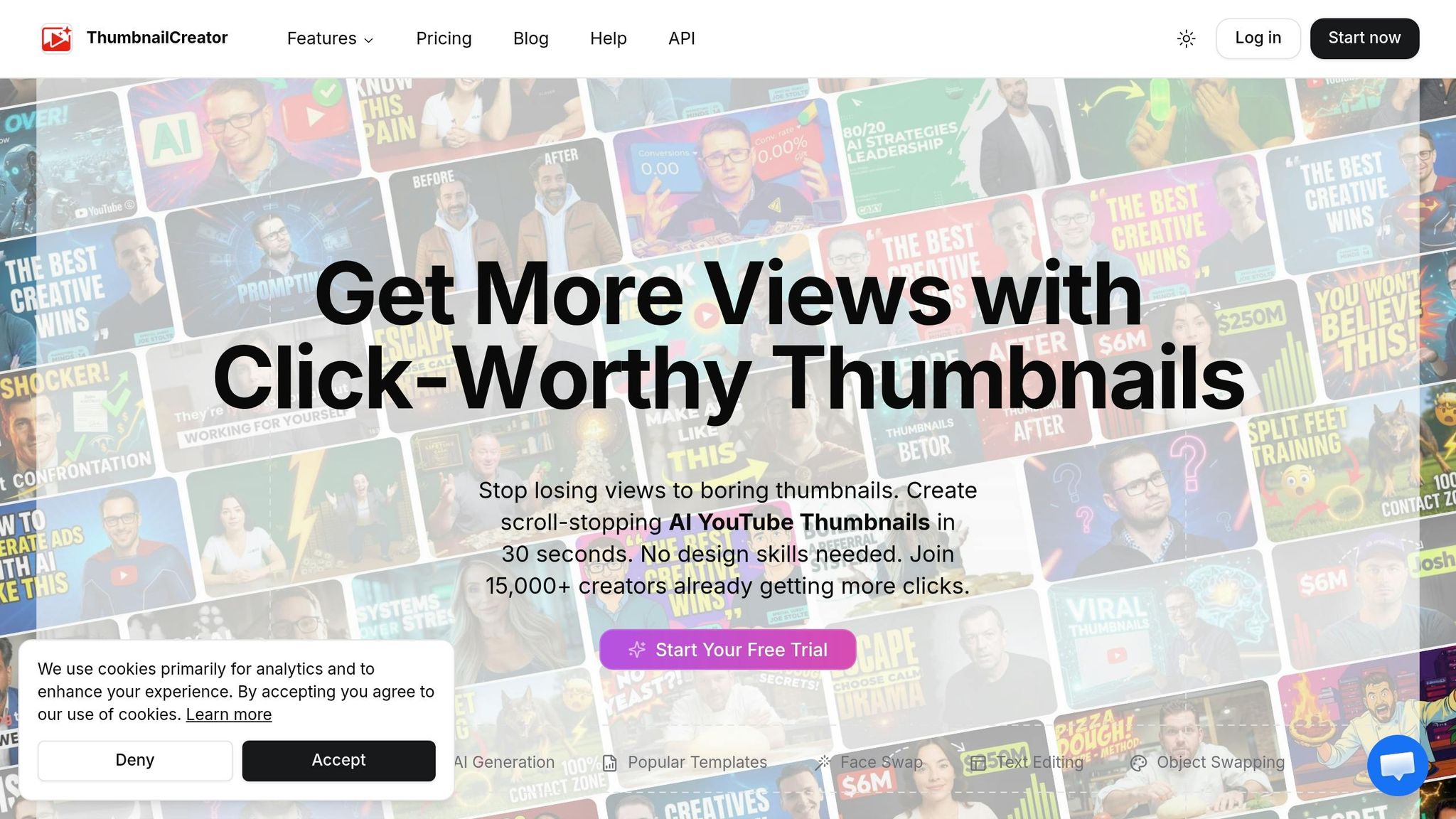
AI tools are transforming how fitness thumbnails are designed, making the process faster and more precise while maintaining professional quality. ThumbnailCreator is one such tool that uses artificial intelligence to simplify the creation of thumbnails tailored for the fitness niche. By analyzing successful design trends, it generates thumbnails that are visually appealing and designed to perform well. With just one click, you can create layouts and compositions, even uploading your own face or gym equipment to make the design more personal and aligned with your content. This automation not only saves time but also ensures your thumbnails stay relevant to fitness trends.
Visual Appeal and Clarity
ThumbnailCreator focuses on creating thumbnails with a clean, high-contrast design that grabs attention immediately. Instead of cluttered gym shots, it highlights key elements like muscle definition, dramatic transformations, or intense workouts. You can further tweak the AI-generated designs by adjusting or removing text elements to keep the thumbnail focused and visually appealing. The tool also studies successful fitness channels to replicate design strategies that are proven to work, giving your thumbnails a competitive edge.
Relevance to Fitness Content
This tool is specifically designed with fitness creators in mind. It uses elements like red "X" marks for bad form or green checkmarks for proper technique, helping viewers instantly understand the message. If you upload reference photos with dramatic side lighting, the AI enhances muscle shadows and definition to create a striking and authentic look that resonates with fitness enthusiasts. Incorporating your own images ensures the thumbnails feel genuine, avoiding the overly polished, artificial look that can alienate viewers. Plus, the tool ensures hard contrast, making key details pop even on smaller mobile screens.
Ability to Drive Click-Through Rates
AI-generated thumbnails are excellent at converting impressions into views by drawing on data from top-performing videos. The tool often suggests using exaggerated facial expressions, like shock or pride, instead of subtle smiles, as these tend to grab attention more effectively in the fitness niche. Keeping text short - just 2–4 bold words - enhances clarity and reinforces the visual hook, especially on mobile devices. By incorporating your own physique or gym equipment into the design, you can maintain an authentic connection with your audience while boosting engagement in a highly competitive space.
Conclusion
The best fitness thumbnails grab attention and make viewers pause long enough to click. High contrast visuals spark curiosity, emotional expressions forge quick connections, and clear, concise messaging ensures your audience instantly understands what they’ll gain. Whether you’re highlighting jaw-dropping transformations, relatable workout mishaps, or tips for proper form, the aim is always the same: make the reward feel within reach.
In the fitness world, realness beats perfection. A slightly grainy image showing genuine progress can often outperform a polished studio shot with no story behind it. Stick to 2–4 impactful words, use bold side lighting to emphasize muscle tone, and incorporate visual cues like red "X"s or green checkmarks to replace lengthy text. These techniques - rooted in contrast, authenticity, and clarity - are the foundation of every effective thumbnail mentioned earlier.
For those who find design intimidating, advanced tools can make the process easier. If you're just starting out, a YouTube thumbnail beginners guide can help you master the basics. ThumbnailCreator, for instance, simplifies thumbnail creation with just one click. The tool uses AI to analyze top-performing fitness videos and generates layouts designed to drive clicks. You can even upload your own images to keep your designs personal and relatable. By taking the guesswork out of design, tools like this help creators stay competitive while focusing on their content.
"Click-worthy isn't clickbait: There's a massive difference between a thumbnail that makes someone curious and one that lies." - 1of10
The takeaway? Strive for click-worthy thumbnails that deliver on their promise. When your visuals align with the value of your video, you earn your audience’s trust - and that trust is the foundation for long-term growth in the fitness space.
FAQs
What makes a fitness thumbnail get more clicks?
Fitness thumbnails tend to grab more attention when they feature bold visuals - think bright colors, expressive facial expressions, and a clear focal point. Adding short, easy-to-read text (ideally 3-6 words) and transformation images, like before-and-after photos, can spark curiosity and boost engagement. Designs that are custom-made, visually striking, and include emotional expressions while maintaining consistent branding help create a sense of urgency, making viewers more likely to click.
How can I make my thumbnail easy to read on a phone?
To make sure your thumbnail grabs attention on a phone, stick to bold, sans-serif fonts with just 3–5 words. Adding outlines or shadows can help text pop against the background. Keep things clean by focusing on one clear subject or face and steering clear of clutter. Use bright, high-contrast colors to ensure it stands out on smaller screens. Finally, test its readability by shrinking it down to about 150 pixels to see how it holds up.
When should I use AI to generate my fitness thumbnails?
Creating fitness thumbnails can be time-consuming, but AI tools can make the process faster and more efficient. These tools handle tasks like editing layers and generating backgrounds, allowing you to design professional, attention-grabbing thumbnails in no time. They're perfect for producing bold, high-contrast visuals that stand out and drive engagement - even if you're not a design expert. Plus, they let you experiment with different designs to find what works best for your audience.