

How Fonts Influence YouTube Thumbnail Performance
Most people decide on a thumbnail in under a second, so your font needs to read fast or it gets ignored.
If I had to boil this down, I’d say it like this: use bold sans-serif text, keep it short, make it large, and push contrast hard. The article points to the same pattern again and again. Thin or fancy fonts fall apart on phones. Short text beats long text. And small design changes can shift click-through rate in a big way.
Here’s the short version:
- Bold and extra-bold fonts tend to work best on YouTube thumbnails
- Sans-serif fonts usually hold up better than serif or script fonts on small screens
- Primary text around 100–200 px on a 1,280 × 720 canvas is the safer range
- High contrast matters; white text with a dark stroke is a common setup
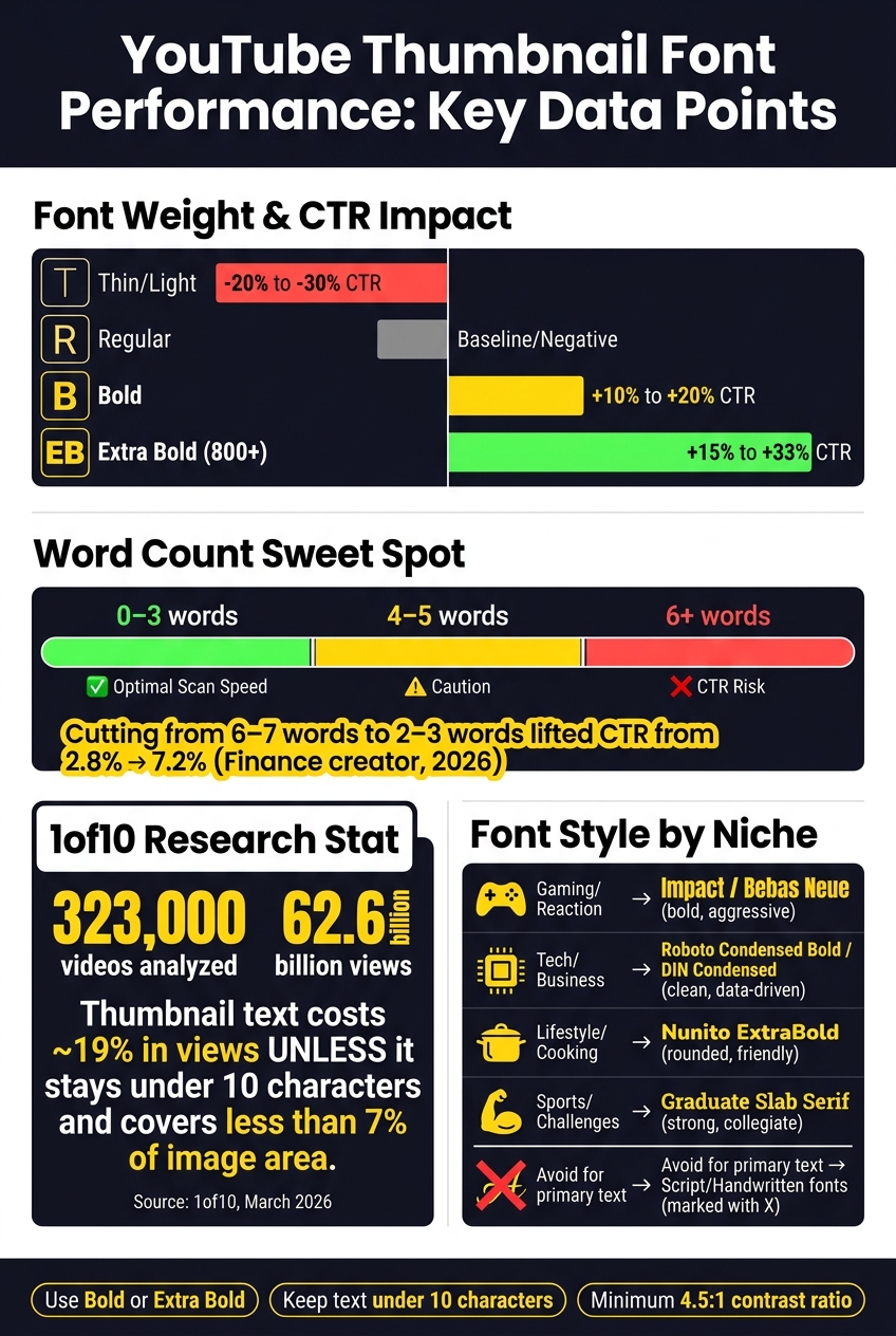
- 0–3 words is often the best range for scan speed
- One test showed CTR moving from 2.8% to 7.2% after cutting text from 6–7 words to 2–3 words
- A 2026 data set from 1of10 found thumbnail text can cost about 19% in views unless it stays under 10 characters and under 7% of image area
- If I’m testing fonts, I’d change one variable at a time and let each version get 7–14 days and about 10,000 impressions
What I like about this article is that it separates why fonts work from what creator tests showed. That makes the advice easier to use: first make the text readable on mobile, then match the font style to the niche, then test small changes to see what gets more clicks.
This is the part most creators miss: a thumbnail font is not there to look nice at full size. It has to survive being shrunk to phone size and still get the point across fast.
The Best Thumbnail Fonts for High CTR!
sbb-itb-b59debf
What Research Says About Legibility at Thumbnail Size
At thumbnail size, legibility comes first. A font that looks sharp on a big desktop screen can fall apart once the thumbnail gets squeezed down on mobile. After the text passes that basic read test, style starts to shape how people read the message.
Sans serif, bold weight, and larger text hold up better at small sizes
Sans-serif fonts tend to read better on screens because small serif details often disappear at low resolution. On a phone, a thumbnail may show up at about 168 × 94 pixels. At that size, those tiny strokes can drop out and leave letters looking fuzzy instead of clear.
Font weight matters just as much as the font itself. Heavier weights like Bold and Extra Bold are far more likely to stay readable after resizing. Regular and light weights, by contrast, often blur into a mess on mobile. For primary text, use 100–200px. Below that, text often fails the shrink test.
A simple way to check your design: shrink the thumbnail to 120–160 pixels wide before you finish it.
How contrast and word count affect scan speed and clarity
High contrast isn't just about looks. It's a basic readability rule. A minimum 4.5:1 contrast ratio under WCAG 2.0 Level AA is the suggested floor for keeping text readable across screens and lighting conditions. One common setup is white text with a 2–4px black stroke plus a drop shadow.
Word count plays a big part too. Thumbnails with 0–3 words tend to do best because people can process them faster while scrolling. And the penalty for adding more text can be steep. In March 2026, the 1of10 team looked at 323,000 videos and 62.6 billion views. They found that text on thumbnails costs creators an average of 19% in views unless it stays under 10 characters and takes up less than 7% of the image area.
Table: Font weight, size range, mobile clarity, and reported CTR impact
| Font Weight | Size Range (px on 1,280×720 canvas) | Mobile clarity | CTR effect |
|---|---|---|---|
| Thin / Light | Below 80px | Illegible; disappears or blurs | −20% to −30% vs. no text |
| Regular | 80–100px | Marginal; fails the shrink test | Baseline or negative |
| Bold | 100–150px | Good; letter shapes hold | +10% to +20% vs. no text |
| Extra Bold (800+) | 150–200px | Excellent; instant recognition | +15% to +33% median uplift |
The takeaway is pretty straightforward: heavier weights and bigger text make thumbnail copy work at the size people actually see. First, the text has to be readable. Then style can do its job.
How Font Style Shapes Viewer Perception Before the Click
Readability comes first. Perception comes right after.
Once a font is easy to read, it starts sending signals about tone. The shape of the letters can hint at the video's genre before someone even reads the words. And those signals play a big part in whether the thumbnail feels relevant enough to click.
What serif, sans serif, and display fonts signal to viewers
Sans-serif fonts dominate YouTube thumbnails because they feel modern, clear, and authoritative. Serif fonts lean more editorial and old-school, but they show up in just 4% of top-performing thumbnails and that share keeps dropping.
If you want some of that serif tone without hurting legibility, a heavy slab serif like Graduate is usually a safer bet. Its thicker strokes hold up much better after compression and resizing.
Display and decorative fonts can add personality. But at thumbnail size, they can also become a mess fast. That's why decorative and script styles work best as accents, not as your main text.
Matching font tone to U.S. YouTube niches and audience expectations
Font choice should match what viewers expect from the niche.
Gaming and reaction channels often lean on Impact because it feels raw and aggressive. This is also common in commentary YouTube thumbnails where bold text drives engagement. At the same time, Bebas Neue is taking its place more often because it gives a cleaner, more controlled look. Tech and business channels usually go with fonts like Roboto Condensed Bold or DIN Condensed Bold, which signal a data-driven, no-nonsense style. Lifestyle, cooking, and family content often lands better with rounded sans-serifs like Nunito ExtraBold, which feel more friendly and less intense.
Weight matters too. An extra-bold style signals importance and urgency no matter which typeface you use. A thin weight often does the opposite - it can fade into the background and fail to register much of any signal at all.
The patterns below show how typeface choice shapes viewer expectations.
Table: Typeface category, perceived traits, and thumbnail suitability
| Typeface Category | Perceived Traits | Small-Size Clarity | Thumbnail Suitability |
|---|---|---|---|
| Bold Sans-Serif (e.g., Bebas Neue, Anton) | Modern, clear, authoritative, urgent | High | Excellent; the go-to for most niches |
| Rounded Sans-Serif (e.g., Nunito) | Friendly, approachable, playful | High | Great for lifestyle, kids, and cooking content |
| Slab Serif (e.g., Graduate) | Strong, collegiate, industrial | Moderate to High | Good for sports, challenges, or technical content |
| High-Contrast Serif (e.g., Bodoni) | Elegant, formal, editorial | Low | Poor; thin strokes disappear on mobile |
| Script / Handwritten (e.g., Pacifico) | Personal, artistic, human | Very Low | Avoid for primary text; use only as a single-word accent |
What Empirical Tests and Creator Data Show About Fonts and CTR
YouTube Thumbnail Font Guide: What Works and What Doesn't
Perception signals matter, but tests show where font choices can change click-through rate.
Font patterns that appear in higher-CTR thumbnails
Creator data keeps pointing in the same direction: bold sans-serif fonts tend to win more often. In one data set, 78% of top-performing thumbnails used bold sans-serif fonts. Another found that 84.2% of viral thumbnails - defined here as videos with more than 1 million views - used bold text overlays.
Text length shows a similar pattern. Thumbnails with 0–3 words keep beating longer text across most niches. That makes sense. People scan thumbnails in a split second, often on a phone, so extra words can get in the way.
Readability tweaks show up here too. A 2–4 px black outline improves legibility, and drop shadows can add engagement. Put simply, the same things that make text easier to read also tend to appear in CTR tests.
A/B test findings on font weight, size, and contrast changes
One controlled test gives a clear look at how much text length can matter. In early 2026, a finance creator tested thumbnails with 6–7 words against versions with 2–3 words, while keeping the title and video content the same. CTR jumped from 2.8% to 7.2%.
For size, keep primary text around 150–200 px on a 1,280 × 720 canvas. Going below 100 px is not advised.
Of course, that kind of jump won’t happen in every niche. Tutorial and educational videos often need a bit more text to make the value clear. Still, the test shows how extra wording can slow that first glance.
Another pattern tied to better phone performance is the minimal layout approach: less text, bigger type, and heavy negative space. Moving to that style has been linked to a 15–20% increase in mobile CTR.
The table below separates broad patterns from changes you can test.
Table: Font-related thumbnail changes and CTR before vs. after
| Font-Related Change | Channel/Niche Context | CTR Before | CTR After | Limitations |
|---|---|---|---|---|
| Reduced word count (6–7 words → 2–3 words) | Finance creator, early 2026 | 2.8% | 7.2% | Niche-specific |
| Added text outlines/strokes | Cross-niche | Baseline | +40% readability | Can look too bold in premium or editorial niches |
| Added drop shadow effects | Cross-niche | Baseline | +12% engagement | Can look dated if shadow offset is too heavy |
| Switched to minimal layout | Cross-niche | Baseline | +15–20% mobile CTR | Needs strong focal imagery |
| Consistent brand elements, including a signature font and color | Cross-niche | Baseline | +25% brand-recognition clicks | Best after 20–30 uploads |
A Research Framework for Testing Fonts in Your Own Thumbnails
How to isolate one typography variable at a time
Once you've spotted the font patterns that seem to win, the next move is simple: run controlled tests.
Change one typography variable at a time. Keep the font family, size, color, word count, and layout the same. Then adjust only one thing in each test, like weight, contrast, or typeface. When you isolate the variable, it's much easier to see what changed and why.
You also need enough data to tell the difference between a real pattern and random noise. Run each test for 7 to 14 days and aim for at least 10,000 impressions per variant. Since YouTube's Test & Compare looks at watch-time share, read the result through that lens.
Start with font weight and contrast first. Those two have a big effect on mobile legibility, and mobile is where a lot of thumbnail views happen. Once those are dialed in, you have a steady baseline for the rest of your tests.
Using ThumbnailCreator to run faster font experiments
ThumbnailCreator helps you make variants from one template while keeping the background, layout, and imagery locked. That means you can test only the font change, whether it's weight, color, or typeface, without rebuilding the thumbnail every time.
That makes side-by-side comparison much cleaner. You're not guessing whether a new image changed the result. You're looking at the font change and the font change alone.
Conclusion: The clearest font wins attention, understanding, and clicks
The clearest font usually wins because viewers can read it faster. And when people can read faster, they can decide faster.
Test one variable at a time, and make sure each version gets enough impressions before you call a winner.
FAQs
How many fonts should I use in one thumbnail?
Use no more than two fonts per thumbnail. That small limit cuts visual clutter and makes the design look clean, polished, and easy to read at a glance.
A common setup is a bold sans-serif font for the main headline, paired with a simpler font for supporting text. Keeping your font choices tight also helps build clear visual hierarchy and makes your thumbnails feel more consistent from video to video.
Do thumbnails always need text to perform well?
No. Thumbnails don't always need text to do well.
Text can add context, but the research points to a simple idea: it's a choice, not a must-have.
If the image creates enough intrigue on its own, a thumbnail without text can still work. And when you do add text, less is usually more. Keeping it short - ideally 3 to 5 words - matters, because too much text can hurt click-through rates.
How often should I retest my thumbnail fonts?
Stick with your chosen font and text styling for at least 20 to 30 uploads. That kind of consistency helps build your brand and makes your thumbnails easier to spot.
Once you’ve picked a primary font, you can use ThumbnailCreator to save typography presets and A/B test design options before you lock in your direction.