

Multi-Language Thumbnails: Best Practices
If you want more clicks from viewers who use YouTube in other languages, your thumbnail has to match their language too. The short version: keep one brand look, upload a default fallback thumbnail, add one thumbnail per language in YouTube Studio, and make sure each version is easy to read on mobile.
Here’s what matters most:
- YouTube shows localized thumbnails by language preference, not location
- The default thumbnail is your fallback for everyone else
- Thumbnail text should stay at 3–5 words
- Leave about 20% extra space for text growth in translation
- Mobile thumbnails can shrink to about 120 px wide, so large bold text matters
- Keep key text inside safe margins of 40–60 px
- Some languages grow by 15–40%, while RTL scripts may need a mirrored layout
- Top-left text often gets read more, and very short centered text can work too
- Check symbols, gestures, colors, and props before publishing in each market
- Use a fixed template and swap text and a few image details instead of rebuilding every version
I’d sum it up like this: fix the layout first, localize the message second, then test readability and audience fit before upload. This is a great time to A/B test your thumbnails to see which language version performs best. That keeps the process simple and helps each thumbnail match the rest of the viewer experience.
How to Set Up Multi-Language Thumbnails in YouTube Studio
This workflow is desktop-only for now, so start in YouTube Studio on a computer browser. And use the languages you found in Analytics first.
Step-by-Step Workflow in YouTube Studio
Once you've picked your target languages, upload each thumbnail in Studio.
Open the video in Details. Upload the default thumbnail first. Then open Languages or Localization, add the video language and any text translations, and upload one thumbnail for each language row.
On the Details page, click Upload thumbnail and add your default thumbnail. This is the fallback image YouTube shows when a viewer's language doesn't have its own localized thumbnail.
Next, open the Languages or Localization area in the video details screen. If you don't see the localization table right away, click More options or Show more. That opens a table with columns for Language, Audio, Subtitles, Title and description, and Thumbnail.
Set the Video language first. Then add any title and description translations you want. For each language row, click Thumbnail > Add and upload the matching localized thumbnail. Do this for each target language. Keep the layout the same, and change the text and visual cues for that audience. When you're done, click Update or Save to apply the changes.
Treat the thumbnail in Details as the global fallback.
Common Setup Mistakes to Avoid
One of the biggest thumbnail mistakes is using a translated image as the default thumbnail. Since the default thumbnail is the global fallback, viewers without a matching language version may still see that translated image. And that can hurt click-through rate and make the thumbnail harder to understand.
Another easy miss: upload the language row before you upload its thumbnail. Localized thumbnails are tied to the video's localization layer, so YouTube won't reliably serve that image unless the language row already exists.
Also, don't mix languages inside the same localization row. A Spanish title with an English-only thumbnail can throw viewers off and make the video look messy.
sbb-itb-b59debf
How to Write and Translate Thumbnail Text for Readability
Thumbnail text has ONE job: earn the click in 100–150 milliseconds. That’s the tiny scan window before someone slows down and reads anything else. For multi-language thumbnails, the rule stays the same. Each version needs to be easy to read at a glance, especially on mobile.
Keep it to one main phrase with 3–5 words. That gives you room to use a larger font, which helps on small screens. It also forces you to boil the message down to the strongest hook instead of stuffing in extra words. And that matters: thumbnails with 3–5 words of text outperform other lengths by an average of 28%.
The phrase should also do a job the title doesn’t do. If your title is Beginner's Guide to Multi-Language YouTube Thumbnails, your thumbnail text shouldn’t just repeat it. It should add a new angle. For example:
- One Design, Every Language leans into speed and ease
- No Designer Needed speaks to a pain point right away
The title handles search and context. The thumbnail handles feeling and curiosity.
Keep Text Short and Plan for Expansion
Short text helps, but translation changes the shape of that text. Leave about 20% of the text box open for expansion. Spanish, French, Portuguese, and German often grow by 15–40%, while Japanese and Chinese use denser text that still has to stay clear. Arabic and Hebrew run right-to-left, so you may need to flip parts of the layout.
A smart way to test this is simple: try one language that tends to expand, like German, and one dense script, like Japanese or Hindi, before you lock the template. You can also use AI thumbnail generation to quickly iterate on these layout variations. If the phrase still fits in the toughest case, you’re in good shape for the next round of font and script checks.
Localize the Message, Not Just the Words
Getting the text to fit is only half the job. The meaning has to land too.
Literal translation often falls flat. A phrase meant to feel urgent, easy, or life-changing in English can sound stiff or odd when copied word for word. Give translators a short note on the intended payoff, then let a native speaker phrase it in a way that sounds natural in that market, even if it ends up looking pretty different from the English line.
The thumbnail text also needs to match the translated title. If the thumbnail promises one thing and the title points somewhere else, people notice fast, and trust drops. A short brief for each language helps keep things lined up by tying the thumbnail phrase back to the translated title, so the whole package tells the same story.
Do a quick spot-check for plain mismatches. If a thumbnail promises Free Templates in Spanish but the video only talks about paid options, that disconnect can quietly chip away at watch time in that market.
Fonts and Layouts That Work Across Multiple Scripts
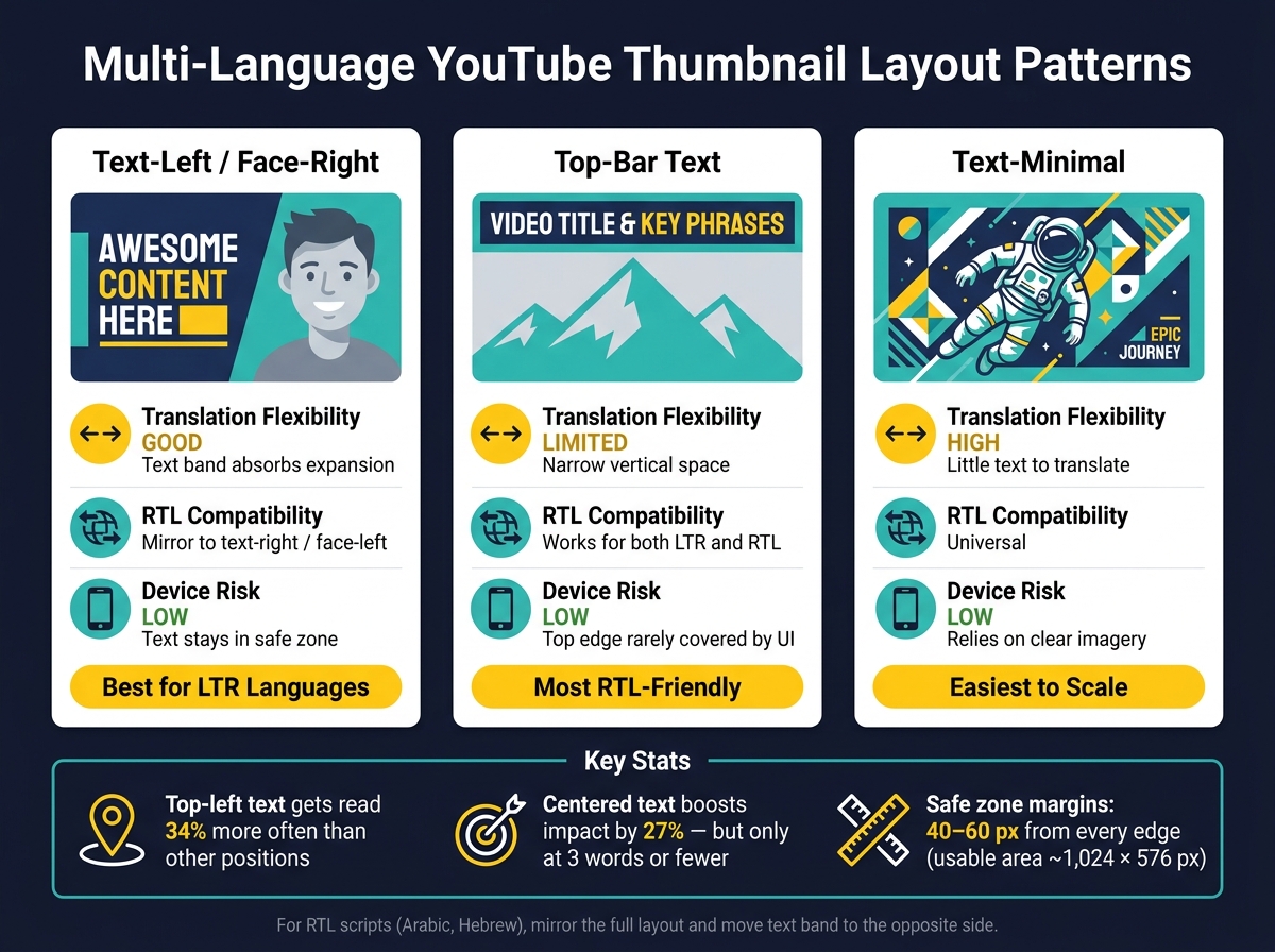
Multi-Language YouTube Thumbnail Layout Patterns Compared
Font Support, Script Coverage, and Legibility Checks
Once the message is translated, the next test is simple: can people still read it at thumbnail size? Font choice isn't just about looks. It's about whether the text survives on a small phone screen.
On mobile, thumbnails shrink to about 120 px wide, so bold sans-serif fonts with simple letterforms tend to hold up best.
On a 1,280 × 720 canvas, start main text at 120–180 px and secondary text at 70–110 px. Drop below about 80 px, and mobile readability usually falls apart.
Line spacing matters too. For all-caps fonts like Impact or Bebas Neue, keep line height tight at 90–110%. For Montserrat Extra Bold or Oswald, give it a bit more air at 110–120% so stacked lines don't blur together on smaller screens.
Weight alone won't save a font. Open letter shapes matter just as much. If the counters are too tight, they blur fast at thumbnail size.
Then comes the harder part: script coverage. A font may look fine in English and fail the moment you switch to Arabic, Hindi, or Thai. That's why it's smart to pair your display font with a broad-coverage fallback. Otherwise, non-Latin scripts can drop into random system fonts and throw off the whole thumbnail.
For a headline around 150 px, a 4–8 px outline or drop shadow is usually enough to pull text off the background. Push it too far, though, and you get halos that make compressed previews harder to read.
After script coverage, placement becomes the next thing that can make or break readability.
Layouts, Safe Zones, and Translation-Friendly Structure
Font size solves only part of the problem. Text also needs to sit in a spot where it won't get cropped, covered, or brushed aside.
On a 1,280 × 720 thumbnail, keep key text inside a central safe frame with 40–60 px margins from every edge. That buffer helps avoid the YouTube timecode overlay in the bottom-right corner, playlist badges, and the mobile center-crop that can trim 8–10% off the left and right sides. In plain terms, your usable area is about 1,024 × 576 px.
Inside that safe frame, a fixed text zone that takes up about 35–45% of the canvas width works well. Anchor it to either the left or right side so you have a predictable block across languages. Leave extra room in that band, because translations often run longer than the source copy.
For RTL scripts, mirror the layout and move the text band to the other side. If the thumbnail features a face, put the text on the opposite side to keep the frame balanced. The proportions stay the same. Only the reading direction shifts.
The table below compares three common layout patterns for multi-language thumbnails:
| Layout | Translation Flexibility | RTL Compatibility | Device Risk |
|---|---|---|---|
| Text-left / Face-right | Good - the text band absorbs expansion | Mirror to text-right / face-left for RTL | Low - text stays in the safe zone |
| Top-bar text | Limited - narrow vertical space restricts word count | Works for both LTR and RTL | Low - the top edge is rarely covered by UI |
| Text-minimal | High - little text to translate | Works universally | Low - it relies more on visually clear imagery |
Placement patterns also affect attention. Text in the top-left quadrant gets read 34% more often than text in other positions, which makes it the strongest area for a main headline in LTR layouts. Centered text can get a 27% impact boost, but only when it's 3 words or fewer. Go past that, and the lift disappears.
Once the layout works across scripts, the next step is color and image choices for each audience.
Adjust Visuals for Different Audiences and Build a Repeatable Workflow
Color, Symbols, and Image Choices Across Audiences
Layout and font choices do most of the heavy lifting. But before you publish in more than one market, the visual itself still needs a second pass.
Once the text is easy to read, check whether the image fits local expectations. U.S. audiences often respond well to clean, high-contrast thumbnails with a limited color palette and one clear focal point. Start with that as your default for U.S. viewers. Then add more visual density only where it fits local norms.
In East Asian and South Asian markets, slightly busier designs with brighter accent colors and more text are common in entertainment and variety content. That doesn't mean you should rebuild everything from scratch each time. A better move is to define your brand palette once and reuse it across variants. Also, document one approved visual version per market instead of making random edits on the fly.
After color and density, review the thumbnail for sensitive visual cues. This is where teams often slip up. The bigger risk isn't bad design. It's using one image everywhere without checking what it means in each place.
Gestures, props, and clothing can mean very different things across markets. A thumbs-up may signal approval in the U.S. but be offensive in parts of the Middle East, and the OK sign can carry similar baggage. Props like alcohol, religious symbols, or certain foods can also trigger negative reactions or moderation issues in some markets.
A short review pass before publishing each master thumbnail helps keep this under control:
- Colors and local connotations
- Hand gestures and body language
- Props with political or religious meaning
- Clothing and symbol use
If you publish often in Japan, India, or Brazil, it helps to have a local contact do a quick review of new master thumbnails before localization. That kind of check can catch repeat issues early and gives you something concrete to add to your brand guidelines.
Use ThumbnailCreator to Scale Localized Thumbnail Production
Once the review rules are in place, production gets much simpler. At that point, you're mostly swapping text and a few key visual elements instead of rebuilding the whole thumbnail every time.
Use ThumbnailCreator to lock brand rules, then swap localized text and key visual elements across language versions. ThumbnailCreator's Design Rules let you lock non-negotiable brand elements - specific hex codes, subject placement, and safe zones - so the AI respects them across language versions. Pair that with saved Prompt Snippets for common localization tasks, and you can move through language variants without retyping the same instructions every time.
The workflow is simple: fixed brand elements, flexible local details. That's what makes scale possible.
Conclusion: Fix the Layout, Localize the Message, Test Readability
Fix the layout, localize the message, then check readability and cultural fit.
With a master template and a repeatable production workflow, localized thumbnails stop feeling like one-off work. They become part of your normal publishing process.
FAQs
How do I choose which languages to localize first?
Start with YouTube Analytics to spot your top-performing regions. Focus on languages in markets where you already get strong viewership. That gives you the best place to test first.
Next, make regional thumbnail variants and watch your click-through rate (CTR). Tweak things like text, facial expressions, and layout so they fit local tastes. ThumbnailCreator can help you make those changes fast.
What should I do if a translation makes the thumbnail text too long?
Cut words before you shrink the font. Keep text to the main idea, and aim for 2–5 words when you can.
If it’s still tough to read, switch to a bold sans-serif font, make sure contrast is at least 4.5:1, and add a 4–8 px outline, drop shadow, or semi-opaque background panel.
Do I need a different thumbnail layout for right-to-left languages?
Yes. Changing your layout is a smart move because people often scan visuals based on how they read.
In Western markets, thumbnails often work best with left-to-right eye movement, so the main text usually does well on the left or top-left area. That said, design tastes and performance can change from one region to another, so it’s worth testing a few compositions.
ThumbnailCreator can help you quickly adjust layouts, expressions, and text placement while keeping your brand identity consistent.