

YouTube Shorts Thumbnail Size Guide 2026
If your Shorts thumbnail is blurry, cut off, or hard to read, the fix is simple: use 1080 x 1920 pixels, keep it at 9:16, export as JPG or PNG, and stay under 2 MB.
I’d sum up the whole article like this: size matters, but layout matters just as much. Shorts thumbnails may look fine full-size, then fall apart when YouTube shrinks them to about 130 x 231 pixels on mobile. That means small text, edge-to-edge faces, and busy layouts often stop working fast.
Here’s the short version:
- Use 1080 x 1920 px for Shorts
- Use 9:16 vertical format
- Do not use 1280 x 720 unless the video is a standard horizontal upload
- Export in JPG or PNG
- Keep the file under 2 MB
- Use one main subject
- Keep text short: 1 to 3 words
- Leave space around the edges
- Check the thumbnail at phone size before upload to avoid common thumbnail mistakes
How to Change Thumbnails on YouTube Shorts
If you're new to the platform, our YouTube thumbnail beginners guide covers the fundamentals of creating high-quality visuals.
sbb-itb-b59debf
Quick Comparison
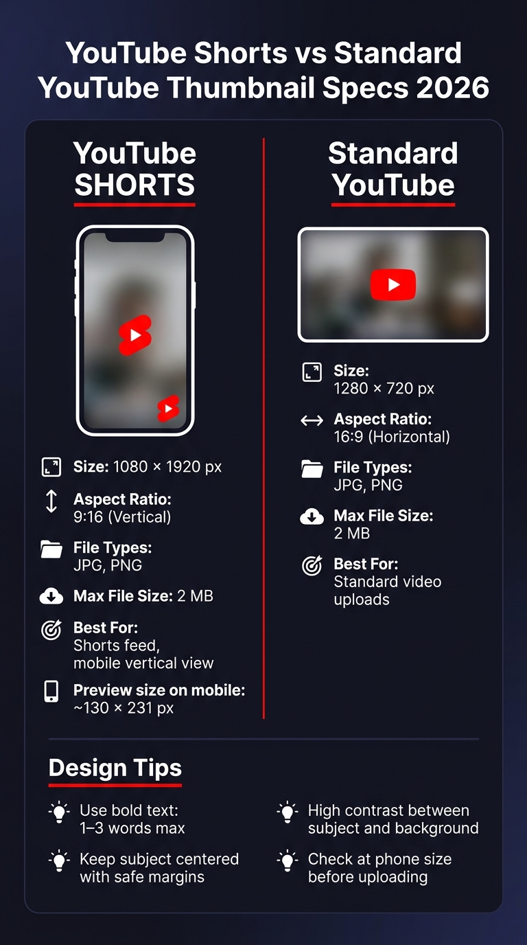
YouTube Shorts vs Standard Thumbnail Specs 2026
| Item | YouTube Shorts Thumbnail | Standard YouTube Thumbnail |
|---|---|---|
| Size | 1080 x 1920 px | 1280 x 720 px |
| Shape | 9:16 vertical | 16:9 horizontal |
| File types | JPG, PNG | JPG, PNG |
| Max file size | 2 MB | 2 MB |
| Best use | Shorts | Standard videos |
Put simply: make it vertical, keep it light, and design for a small phone screen. That’s the core idea behind the full guide.
YouTube Shorts thumbnail specs for 2026
Use these settings before you design or export a Shorts thumbnail using YouTube thumbnail guides.
| Spec | Shorts Thumbnail | Standard YouTube Thumbnail |
|---|---|---|
| Recommended size | 1080 × 1920 px | 1280 × 720 px |
| Aspect ratio | 9:16 (vertical) | 16:9 (landscape) |
| Max file size | 2 MB | 2 MB |
| Recommended formats | JPG, PNG | JPG, PNG |
1080 x 1920 vs. 1280 x 720: when each size applies
Use 1080 × 1920 for Shorts. Use 1280 × 720 only for standard horizontal videos. That’s the main rule.
If you upload a landscape image for a Short, YouTube may crop it or add letterboxing. And on a phone screen, that can make your thumbnail much harder to read. Text, faces, and small design details need to stay clear at a glance, so the vertical format matters. Choosing the right YouTube thumbnail styles can help maintain this clarity.
Once you have the canvas size dialed in, export settings shape how clean the thumbnail looks after upload.
Supported file types and file size limits
Use JPG for photo-based thumbnails. Use PNG for text-heavy or graphic layouts. Both formats can look sharp on mobile, but the file still needs to stay under 2 MB.
A good rule of thumb: use the smallest file that still looks crisp on a phone. If the image looks soft, muddy, or compressed, it’s probably time to tweak the export settings.
With the file type picked, the next step is exporting the thumbnail without losing clarity.
How to set up and export a Shorts thumbnail
Set up the canvas with the right dimensions
Start with a 1080 × 1920 px, 9:16 RGB canvas. That’s the right setup for a YouTube Shorts thumbnail. If you also plan to use the same video in a standard YouTube spot, make a second canvas at 1280 × 720 px (16:9).
Export settings that keep quality high without large file sizes
Use JPG for photo-based thumbnails. Use PNG when the design has a lot of text. In both cases, check that the final export is still 1080 × 1920 px and under 2 MB before you upload it.
That keeps the file sharp on mobile without making it too heavy.
Use ThumbnailCreator to speed up the process
If you want to move faster, ThumbnailCreator can take care of the canvas and export steps. It includes ready-made 9:16 layouts, AI generation that turns a short prompt into a thumbnail concept, and face and object swapping so you can test different looks without rebuilding the whole design.
Design a Shorts thumbnail that reads well on mobile
With the canvas size locked in, the next job is simple: make sure the thumbnail still works at phone size. On the mobile Shorts shelf, thumbnails can shrink to 130 × 231 pixels, so people need to understand the image in a split second.
Use one focal subject, high contrast, and short text
Stick with one main subject - a face, product, or object - and crop in close so it still reads after the image shrinks. If you pack in multiple mini-scenes, tiny logos, or lots of small details, the whole thing gets muddy on mobile.
Text should work like a headline, not a paragraph. In most cases, one or two words is the safest move: WIN, FIXED, EASY, or SALE. Use large, bold text with a stroke or drop shadow so it stays readable against the background. Thin or decorative fonts tend to blur at small sizes.
Strong contrast matters too. The subject should stand apart from the background, and the text should stand apart from both. If those elements blend together, the thumbnail loses impact fast.
If the layout feels crowded or pushes too close to the edges, it probably won’t hold up on a phone screen.
Keep text and faces inside safe areas
After the subject and text are clear, keep them inside the crop-safe center. Search, channel pages, and the Shorts feed can crop thumbnails in different ways, and interface overlays may cover the edges.
Keep faces, text, logos, and other key details inside a centered zone with comfortable margins on every side. Give the edges extra space, especially at the bottom. Before you upload, shrink the thumbnail down and check it at phone size. If the subject still stands out and the text still reads at that reduced size, you’re in good shape.
Fix common YouTube Shorts thumbnail problems
Blurry thumbnails, black bars, and cropped text
If your Shorts thumbnail still looks off after export, don't guess. Match the problem to the fix and clean it up fast.
Blurry thumbnails usually happen when the source image is too small or the export settings are too compressed.
Black bars usually show up when the thumbnail was made in the wrong shape.
Cropped text usually means your main text, face, or subject sits too close to the edge.
| Problem | Likely cause | Fix |
|---|---|---|
| Blurry image | Low-resolution source or exported too small | Export at 1080 × 1920 px with a high-res source |
| Black bars | 16:9 landscape image used in a 9:16 Shorts canvas | Use YouTube thumbnail templates on a vertical 1080 × 1920 px canvas |
| Cropped text or faces | Important elements placed too close to the edges | Move key content toward the center and add padding |
| Upload rejected | File exceeds 2 MB or uses an unsupported format | Export as JPG or PNG, and keep the file under 2 MB |
| Unreadable text | Font is too small, too thin, or lacks contrast | Use bold text, 1–3 words max, and add a stroke or shadow |
Conclusion: The size settings that matter most
For a Shorts-first design, start with 1080 × 1920 px. That's the right canvas size for vertical thumbnails. Then export as JPG or PNG and keep the file under 2 MB.
Also, keep your subject, face, and text away from the edges. A centered layout gives you more room for error if the preview cuts things off. Right before you upload, shrink the thumbnail to phone size and check one thing: can you still tell what it's about in a second or two? If you're unsure, you can A/B test thumbnails to see which version performs best.
ThumbnailCreator can help speed up vertical thumbnail creation.
FAQs
Can I use the same thumbnail for Shorts and regular videos?
It’s usually better not to. YouTube Shorts and regular videos use different formats: regular videos are 16:9 (1280 x 720), while Shorts are 9:16 (1080 x 1920).
If you use a landscape thumbnail for a Short, YouTube may crop it or add letterboxing. That can make the thumbnail look a bit sloppy. ThumbnailCreator can help you make thumbnails sized for each format.
Why does my Shorts thumbnail look different on mobile?
Your YouTube Shorts thumbnail can look different on mobile because it shows up much smaller in the Shorts feed, at about 130 by 231 pixels. At that size, fine details can disappear fast, and small text often becomes hard to read.
Mobile viewing can also crop parts of the top and bottom. On top of that, YouTube may place overlays on the thumbnail, like the video duration. That means a design that looks clean on desktop can feel cramped on a phone.
To keep things clear, stick with a 1080 by 1920 vertical format, use bold, simple visuals, and place any key text in the center third of the frame.
How do I make text readable on a Shorts thumbnail?
Keep text short and bold. Stick to 3–5 words, and place it away from the bottom-right corner, where YouTube’s timestamp can get in the way.
For visibility, use high-contrast colors like yellow on black or white on dark backgrounds. Add a 2–8 pixel stroke or drop shadow so the text stands out.
Then do the squint test. If you can still read it on a small mobile screen, you’re in good shape.