

10 Thumbnail Design Tips for Consistent Branding
Your thumbnail brand should stay the same even when the video topic changes. I’d lock four things on every thumbnail - colors, fonts, logo spot, and text position - then change the subject, background, expression, and short hook based on the video.
Here’s the short version:
- I use 1,280 × 720 px in a 16:9 ratio
- I keep text short at 3–5 words
- I check thumbnails at 120–160 px wide for mobile readability
- I keep normal text at 4.5:1 contrast and large text at 3:1
- I avoid the bottom-right corner because the time stamp sits there
- I build category templates instead of forcing one layout on every video
- I review new thumbnails next to 6–12 recent uploads before publishing
This comes down to one idea: repeat the brand, change the story. If viewers can spot your channel in a second, your system is working.
Quick Comparison
| What I keep fixed | What I change by video |
|---|---|
| Brand colors | Subject |
| Headline font | Background |
| Logo placement | Expression or pose |
| Text zone | Topic hook |
| Image treatment | Supporting detail |
If I want steady branding without making every thumbnail look the same, these 10 tips are the system I’d follow.
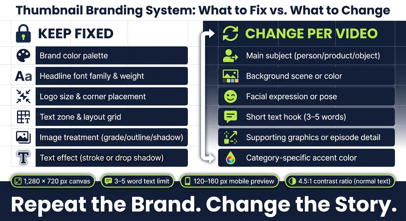
Thumbnail Branding: Fixed vs. Variable Elements at a Glance
How To Create Great Branded YouTube Thumbnail Designs to get more subscribers
sbb-itb-b59debf
What Consistent Thumbnail Branding Actually Means
Before you lock in colors and fonts, decide what stays the same and what changes. Consistent thumbnail branding is a repeatable system: some brand elements stay fixed, while video-level elements shift from one upload to the next.
Fixed brand elements vs. variable video elements
A simple way to think about your thumbnail system is in two columns.
The fixed column includes the parts that signal your channel right away: your approved color palette, your headline font, weight, and capitalization rules, the set areas where your subject and text appear, logo size and corner placement, and your image style, such as a steady color grade, outline, or background treatment.
The variable column includes the parts that tell viewers what this video is about: the featured person, product, or object; the short text hook; the facial expression or pose; and any supporting imagery.
Take a cooking channel. It might keep a cream background, an orange accent bar, and a bold sans-serif font in the same places every time. Then it swaps in the featured dish and changes the text from "3 EASY DINNERS" to "BEST BBQ SIDES."
Why consistency helps recognition and saves time
Repeated visual cues make it easier for viewers to spot related videos. A familiar color mix, type style, or framing pattern can register before someone even reads your channel name, whether they’re scrolling through search results, recommendations, or their subscription feed. YouTube recommends adding branding and descriptive text while keeping the font easy to read across different devices.
There’s also a plain practical upside: it saves time. Instead of picking a new font, color scheme, and layout for every upload, you start with a locked template and swap only the subject and message. If you publish weekly, or even more often, that cuts decision fatigue and helps keep quality steady across a growing video library.
What consistency should not look like
Consistency falls apart when every thumbnail starts to look like the exact same thumbnail. That’s the trap.
A better approach is to use a small set of category templates instead of one layout for everything. Keep the same brand colors, fonts, and logo rules. Then vary the composition by category, so the channel feels connected without feeling copy-pasted.
With the system defined, the first fixed choice is your thumbnail color palette.
1. Define a Fixed Brand Color Palette
Choose a set palette and stick with it: one primary brand color, one or two supporting colors, one accent color, and your neutrals. Write down each HEX code and note how it should be used in thumbnails - background block, headline text, border, badge, or subject accent. That little bit of documentation goes a long way. It keeps your thumbnails easy to spot and gives every designer the same playbook. Color sends the brand signal; typography handles readability.
A solid place to start is the 60-30-10 rule: about 60% primary color, 30% secondary, and 10% accent. Treat 60-30-10 as a guide, not something rigid.
Keep the main brand color and accent the same across thumbnails, but let the secondary color shift based on the topic. That way, the brand cue stays steady while the support color gives each topic its own feel.
Before you publish, check text contrast. WCAG guidance recommends at least a 4.5:1 contrast ratio for normal-sized text and 3:1 for large text against its background. If a photo makes the text tough to read, place a solid color block, shadow, or translucent overlay behind it. Then preview the thumbnail at 120–160 px wide to make sure the text still reads clearly.
It also helps to review your recent thumbnails in a grid. You’ll spot palette drift fast that way. If one thumbnail looks out of place, tighten the palette rules before the set starts to feel all over the map. Once the palette is fixed, standardize typography.
2. Standardize Thumbnail Typography
Typography should stay the same across every thumbnail. Treat it like a locked brand asset: pick one bold headline font, add one optional support font, and keep the weights, capitalization, and effects the same every time. If you swap fonts from video to video, the channel starts to look all over the place.
After you pick your fonts, document the full setup. That means:
- approved weights
- approved capitalization style
- text color
- the exact outline or shadow treatment you’ll use
Store those rules in a master template with locked text styles so the system stays in place.
Hierarchy matters just as much as font choice. Make primary text 2–3x larger than supporting text, keep hooks to three to five words, and skip thin strokes or script fonts that fall apart at thumbnail size.
It also helps to review recent thumbnails side by side, then preview them at mobile versus desktop sizes. That’s often where drift shows up first, whether it’s weight, stroke width, or spacing.
The wording and emphasis can change from thumbnail to thumbnail. But the font family, weight, effects, and placement should stay locked. With typography set, you can carry that same system into a repeatable layout.
3. Create a Repeatable Layout System
Once your typography is set, the next move is to place each element into the same visual pattern. Your layout system is the backbone of the thumbnail. It sets the subject zone, text zone, spacing, and hierarchy.
Start with a 1,280 × 720-pixel canvas. Then add guides for margins, focal points, text areas, and safe margins. A simple way to do this is with a two-column base: give about one-third to half of the frame to text, and use the rest for the subject. After that, anchor the composition with a rule-of-thirds grid. When that grid stays fixed, you can swap other parts without losing recognition.
Next, build a master template with locked brand elements and clearly labeled editable layers for:
- Subject
- Headline
- Background
- Accent
It also helps to keep the same alignment system each time. In plain English, recurring elements should land in roughly the same spots from one thumbnail to the next. That could mean fixed anchor points, the same text margin, or both.
That said, the layout still needs room to bend a little. A face-forward video might use a large portrait on the right. A product demo might put the product in the center or slightly off-center. The parts that should stay steady are the grid, spacing, image treatment, and overall visual hierarchy. If subject direction or crop changes, use mirrored templates.
To avoid clutter, focus on one primary subject and one short headline. The thumbnail should make sense at a glance: subject first, text second, accents last. That order helps people recognize the channel even when the subject changes. Also, keep key content away from the bottom-right corner, since YouTube places the video-duration badge there.
A simple check can save you from weak layouts: review six to twelve recent thumbnails side by side, then shrink them to around 160 × 90 pixels. At that size, the focal point should still stand out, the text should still read well, and the channel should still look familiar.
4. Keep Logo Placement Consistent
Once the layout is set, place the logo in one spot and leave it there. The logo is a supporting brand cue, not the main event in the thumbnail. Pick one default corner - top-left or top-right both work - and lock it into your master template with fixed pixel coordinates. On a 1,280 × 720-pixel canvas, a 32-pixel inset from the top and the chosen side edge gives you the same anchor point every time. Keep the logo position fixed. The only thing that should change is the color version. That way, the logo stays present without taking over.
Set logo width to 5–10% of thumbnail width, or about 64–128 pixels wide on a 1,280-pixel-wide canvas. At that size, people can spot it, but it won't fight with the main subject. Keep it away from both the subject and the headline.
It also helps to check thumbnails in a grid instead of one by one. Small issues jump out fast that way. Look at size, contrast, and alignment. Are the logos about the same size? Do they sit in the same spot? Do they stay visible on both light and dark backgrounds? If something feels off, fix the template - not just the single thumbnail. This ensures your YouTube thumbnail styles remain consistent across your entire channel.
Only let the logo color or format change. Keep the corner, size, and clear space locked. If a layout conflict comes up, document one fallback position and use it only when the default corner is blocked.
Use these rules to standardize the logo across every template.
| Logo element | Fixed | Can flex |
|---|---|---|
| Corner position | ✓ | Only with a documented fallback |
| Proportional size | ✓ | - |
| Clear space / inset | ✓ | - |
| Light/dark version | - | Light or dark based on background |
| Wordmark vs. icon | - | Simplify when space is limited |
| Outline or badge | - | Use only for contrast |
5. Use a Signature Visual Treatment
Your color, typography, and logo placement are already set. Now lock in one more repeatable cue: your signature visual treatment.
This is the visual pattern people start to recognize across your thumbnails. It’s the part that makes someone think, “Yep, that looks like one of yours,” even before they read the title.
Choose one text effect, either a stroke or a drop shadow, and use it the same way every time. Keep the contrast high so the text stays easy to read at small sizes. Also, keep thumbnail text short: 3–5 words is the sweet spot.
The key here is consistency. Even if the topic, face, or image changes from video to video, the text effect should stay the same.
Check the thumbnail at mobile size before you publish. If the effect makes the text harder to read, trim it down.
Let the expression, text hook, and imagery shift based on the video. What stays locked is the effect style and how you apply it.
Use the table below to separate what stays fixed from what can change by video.
| Element | Fixed | Can Flex |
|---|---|---|
| Text effect (stroke or shadow) | ✓ | - |
| Brand color palette | ✓ | - |
| Subject expression / imagery | - | Changes per video |
| Text hook style | - | Video-specific |
6. Build Templates for Each Content Category
Use one universal template only when your channel leans hard on a single format. If you publish different types of videos, build a separate template for each category instead.
Start by listing your main content formats. Then create a master file for each one in a 16:9 thumbnail format. Lock in the layout, duplicate the template, and swap only the video-specific parts.
Here’s the idea: keep the same brand system across every category. Change only the subject, background, and category accent within those set rules. That way, your thumbnails can still feel like they belong to the same channel, even when the topics shift.
After that, zoom out and test your thumbnails at scale. Does each template still look like your channel?
Also, test every template at 150–168 px wide. If the logo, category label, or text starts to blur or fall apart, the layout is doing too much. Strip it back.
Use this table to pick the right setup:
| Template approach | Best use |
|---|---|
| One universal template | Small channels with one dominant format |
| Category-specific templates | Channels publishing tutorials, reviews, interviews, or news |
| AI-assisted variations | High-volume channels and teams |
If you're putting out a lot of thumbnails, ThumbnailCreator can help you generate variations fast while keeping your approved brand rules in place.
7. Make the Subject the Primary Focal Point
Once your template zones are locked in, the subject should take over the main visual space. In every thumbnail, the first thing people notice should be the subject: a face, a product, a finished result, or another key object. Everything else should back it up, not fight for attention.
The goal is to standardize how you treat the subject, not to make every subject look the same. Use one main subject large enough to read on a phone screen. Place it near a rule-of-thirds point and keep it separate from the background. YouTube recommends keeping thumbnail designs simple and using branding and descriptive text as overlays. For tutorials and transformation videos, a clear outcome, like a finished dish or a before-and-after result, tends to work better than a generic portrait.
Give the subject top billing through size, contrast, and a clean background. If the background, logo, and text all feel equally loud, dial back the secondary elements until the viewing order is obvious. A simple gut check helps: cover the logo and text for a moment. The subject should still tell the story of the video on its own.
Before you publish, do a one-second glance test. Look at the thumbnail fast and notice where your eye goes first. If it doesn't land on the subject, something else is stealing the spotlight. Also check that no repeat brand element, whether that's a logo, category label, or text block, sits on top of the subject's face, hands, or key product detail. Set a fixed safe zone in the template so this doesn't happen by accident.
The subject should stay dominant, with text and brand cues in a support role. One thumbnail might use a tight crop, while another uses a wider frame. That's fine. What matters is that the subject still leads, the contrast stays steady, and the brand elements remain in their usual spots. That also makes it easier to keep text short and secondary.
8. Set Consistent Text Placement and Length
Typography is already locked in. This part is about where the text goes and how much it says.
Thumbnail text should add context without pulling attention away from the subject. To keep your branding steady, set a few fixed rules: keep thumbnails to 3–5 words, align the text with your locked type system, and use your current text treatment so it stays readable.
Let the subject lead the layout. Put the text in the open space, ideally on the opposite side of the subject. Keep it away from the main subject and any key visual detail. The core rule is simple: text should not cover the primary subject or any important visual detail.
As the composition shifts, move the text with it. But keep the word count and contrast the same. That way, the thumbnail can flex without looking like it came from a different channel.
Before you publish, check for common thumbnail mistakes at mobile size. If the text feels cramped, cut words first. Shorter usually wins here. And instead of repeating the video title word-for-word, use an action word or a number for a sharper hook.
Next, match these text rules to the video topic. For more granular control, explore advanced thumbnail optimization to refine your CTR.
9. Align Brand Rules with Video Content
Your brand system should set the frame for the video, not fight for attention. The main idea is simple: keep the brand cues fixed, but let the video's main idea lead. Before you open a design file, write one sentence that states the video's main promise. Then cut anything that doesn't support that promise. From there, accuracy and authenticity become the next filters.
Keep brand cues fixed, and let the video-specific parts change.
Once the brand frame is locked in, shape it around the subject. An interview thumbnail may need a different layout than a product review or a screen-based tutorial. Keep your strongest recognition cues in place - the font, the logo position, and one signature color - but let the composition match the content.
Before you publish, run a quick four-question check against the final design:
| Check | What to confirm |
|---|---|
| On-brand? | Fixed elements - font, logo, colors - are correctly placed |
| Accurate? | The subject, result, or setting genuinely appears in the video; if not, swap the imagery first |
| Readable at 120 px? | Subject and text are clear at roughly 120 pixels wide |
| Distinct from recent uploads? | This thumbnail stands out from recent uploads on the channel grid |
Use this check before reviewing the quick-reference tables.
10. Review the Thumbnail System Before Publishing
Treat the thumbnail as part of a system, not just a one-off image. Once your brand system is locked, do one final pass to make sure each thumbnail still fits it.
Start with the fixed elements. Check that your main locked pieces are in place: the approved color palette, font family and text treatment, logo size and position, layout structure, and any signature visual treatment such as a stroke or shadow style. Keep those fixed unless the thumbnail falls under an approved series rule. Then review the video-specific parts - the subject, headline wording, background, and expression - and make sure they match what the video actually delivers. A thumbnail that hints at a dramatic before-and-after result should only be used when the video does include that comparison.
Next, run a mobile-size preview. Shrink the design to about 120–160 pixels wide to mimic how it shows up in a mobile feed. At that size, contrast problems, clutter, and weak text become obvious fast. Also check the bottom-right corner. YouTube’s duration overlay sits there, and it can cover text or key visual details that looked fine at full size.
After that, compare the new thumbnail with your recent uploads. Put it next to six to twelve recent thumbnails in a channel-grid view. The goal isn’t to make every design look the same. You’re checking whether the new one feels like it belongs to the same visual family. If it looks much louder, darker, or more crowded than the rest, adjust it unless that difference is on purpose for a special series.
| Review pass | What to check |
|---|---|
| Brand | Palette, typography, logo, layout, visual treatment |
| Message | Clear subject, short text, accurate promise |
| Small-screen | Mobile preview, contrast, focal point, duration-overlay safety |
| Technical | 1,280 × 720 px, 16:9 ratio, JPG or PNG |
| Channel grid | Visual family consistency across recent uploads |
If a creative choice still needs proof, use Test & Compare to A/B test thumbnails and check approved versions by watch time. If a thumbnail only works because it breaks the rules, fix the template instead of patching the design. And if the result still feels off, adjust the template rules before making more versions.
Quick Reference Tables and Checklists
Use these tables and checklists as a last look before upload. The goal is simple: you should be able to scan a thumbnail in seconds before export and know whether it fits the system.
Color palette comparison table
| Approach | Recognition | Readability | Visual clutter |
|---|---|---|---|
| Controlled palette | Repeated colors make the channel easier to identify in search results and on the channel page | Preselected high-contrast combinations make text and labels easier to read | Limited colors create a cleaner hierarchy |
| Inconsistent color choices | Each thumbnail may look unrelated to the others | Contrast and legibility must be solved from scratch every time | Too many unrelated colors can compete with the subject and text |
| Core palette with category accents | Preserves the core brand while distinguishing content series | Consistent text and background rules with a recognizable accent per category | Moderate if the number of accent colors stays limited |
Give each color a clear job: background, headline, accent, border, or category label. Use at least 4.5:1 contrast for normal text and 3:1 for large text and graphics.
Typography checklist
- [ ] Font family and weight stay within the approved brand system
- [ ] Primary text is large enough to read at a mobile preview size
- [ ] Text-to-background contrast meets at least 4.5:1 for normal text; 3:1 minimum for large text
- [ ] Capitalization, outline, and shadow treatments are consistent with previous thumbnails
- [ ] Copy stays at 3–5 words and adds new information
- [ ] Text sits within the approved layout zone and does not cover the subject's key features
Logo placement comparison table
Pick one default logo treatment, then stick with it across every series.
| Logo treatment | Visibility | Recognition | Clutter risk | Best use |
|---|---|---|---|---|
| Subtle, fixed placement | Moderate | Strong cumulative recognition across a series | Low when size and spacing are controlled | Best default for most recurring videos |
| No logo | None | Relies on colors, typography, and layout | No logo distraction | When other brand elements are highly recognizable or the design is already dense |
Fixed vs. variable elements table
Use this table to decide what stays locked in every template and what changes from video to video.
| Keep fixed across the channel | Adapt for each video |
|---|---|
| Core brand colors and approved contrast combinations | Topic-specific headline |
| Primary font family and approved weights | Main subject image or video still (see our thumbnail photography guide) |
| Logo treatment and safe-area rules | Facial expression, product, location, or result shown |
| General layout zones and spacing | Supporting graphics that explain the episode |
| Outline, shadow, border, or signature visual effect | Category-specific details and episode number |
| Video-specific hook or promise |
Pre-publishing thumbnail checklist
- [ ] The main subject is clear at 120–160 pixels wide
- [ ] The primary text is readable at a small mobile size
- [ ] The text uses the approved font, weight, color, capitalization, and placement
- [ ] The thumbnail uses the approved brand palette
- [ ] The logo is present, correctly sized, and in its standard position
- [ ] Key elements stay clear of the lower-right duration-badge area
- [ ] The design has one focal point
- [ ] The thumbnail accurately reflects the video and complements its title
- [ ] The thumbnail matches the channel's recent uploads
- [ ] The export is sharp and in the correct format
Once the checklist passes, use the same rules to build category variations without breaking the system.
Using Templates Without Losing Variety
Once your beginner's checklist is done, use those same brand rules to make controlled variations. The goal is simple: build recognition without making every thumbnail look the same.
Set template rules before designing variations
Before you touch a single design, write down what cannot change. That usually includes your brand color palette, approved font pairings, text-safe zones, subject placement, logo treatment, and any recurring visual style like a border or shadow.
Treat these as fixed brand rules, then sort each element into one of three buckets:
- Fixed
- Limited
- Variable
That setup gives each content category room to shift while still keeping your channel identity intact. You can also study successful creators to see how they balance category variety with brand consistency.
Create category templates with room for new subjects
Build a separate template for each recurring category, but keep the same brand rules across all of them. Inside each category template, block out clear areas for the main subject, headline, and any supporting visual cue.
Those areas need enough flexibility to handle a new person, product, or location without wrecking the layout. A simple test helps here: swap in different subjects. If the design falls apart, your flexible zones are too tight, so widen them.
When an AI thumbnail tool can help
If you publish often, ThumbnailCreator can speed up approved variations with AI generation, templates, face swapping, text editing, and object swapping. Use the approved template, make the edits, then export.
AI speeds up production. Brand rules keep it consistent.
Conclusion
Repeat the brand, change the story. A strong thumbnail system works best when the fixed signals stay put and the main subject shifts from video to video.
For example, a personal-finance channel might stick with navy and lime green, a bold sans-serif font, a fixed upper-left logo, and a diagonal color block. Then it can switch in a new portrait, a different dollar amount, and a short headline like Cut Monthly Bills or Invest $500. Even with those changes, the design still needs to work at mobile size.
Preview each thumbnail at 120–200 pixels wide. Keep key details out of the lower-right corner. Then step back and review the full grid, not just a single image, or browse trending thumbnails for inspiration.
Look at the channel grid as a whole. The thumbnails should feel visually related, not copied. Compare different design styles to see how various strategies maintain this balance. That’s what makes a channel easy to spot while still giving each new video space to stand out.
FAQs
How do I keep thumbnails consistent without making them look repetitive?
Use a template system that keeps fixed brand elements separate from the parts you change each time. That means your core identity stays steady with the same 2–3 signature colors, 1–2 bold sans-serif fonts, and a fixed logo placement.
Then switch up the background scene, text hook, and facial expressions to match each video. You can also rotate between 2–3 core layout templates so your channel feels fresh without losing that familiar look people start to recognize.
Which thumbnail elements should stay fixed?
Keep your core brand elements consistent:
- 2–3 signature colors
- bold, sans-serif fonts
- logo placement
- subject framing, position, and cropping
With ThumbnailCreator, you can save these as presets or design rules. Then, for each video, you only need to change the background and text hook.
How can I test if my thumbnails work on mobile?
Shrink your thumbnail to about 160x90 pixels, or scale it down to 10%–15% of its original size, to mimic how it looks on mobile. A quick squint test helps too.
If the text gets hard to read, the main subject isn’t clear, or the logo fades away, clean up the design, bump up the contrast, or switch to larger, bolder text. ThumbnailCreator can also help you preview how it appears on mobile.