
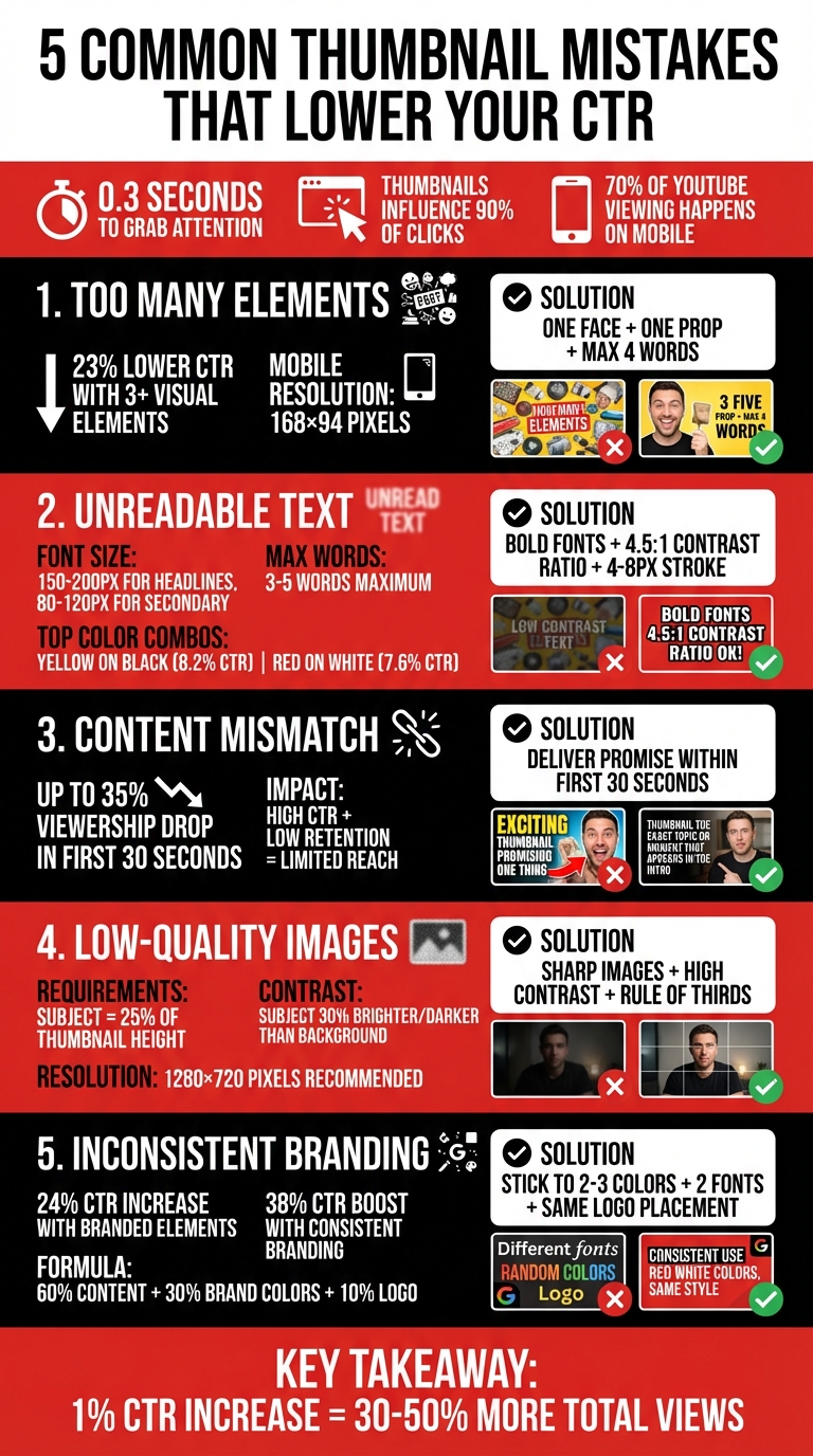
Common Thumbnail Mistakes That Lower CTR
Your YouTube thumbnail has 0.3 seconds to grab attention. If it fails, your content gets skipped. Thumbnails influence 90% of clicks, and poor designs can hurt your video’s performance and algorithm reach. Here’s what to avoid and fix: For a deeper dive into best practices, check out our YouTube thumbnail guides.
- Too Many Elements: Overcrowded thumbnails confuse viewers. Stick to one face, one prop, and short text (max 4 words).
- Unreadable Text: Small fonts and low contrast make text hard to read, especially on mobile. Use bold, sans-serif fonts and high-contrast colors.
- Mismatch with Content: Misleading thumbnails lead to low retention, signaling poor quality to YouTube.
- Low-Quality Images: Blurry or poorly framed visuals look unprofessional. Use sharp images and clear focal points.
- Inconsistent Branding: A lack of visual identity confuses viewers. Maintain consistent colors, fonts, and layouts.
Fix these issues by simplifying designs, testing readability on mobile, and aligning thumbnails with your video content. Tools like ThumbnailCreator can help streamline this process, ensuring your designs are sharp, clear, and effective.
5 YouTube Thumbnail Mistakes That Lower CTR: Statistics and Solutions
16 YouTube Thumbnail Mistakes That Kill CTR
sbb-itb-b59debf
Mistake 1: Too Many Elements in One Thumbnail
Overloading a thumbnail with multiple elements leads to visual chaos. When viewers scroll through their feeds, they're making lightning-fast decisions. A cluttered thumbnail forces their brain to work harder, often causing them to skip right past it.
The stats paint a clear picture: thumbnails with more than three distinct visual elements experience a 23% lower click-through rate (CTR) compared to simpler designs. The issue is even more pronounced on mobile devices. At mobile resolutions - as small as 168x94 pixels - all those extra details blur into an unrecognizable mess. Text becomes illegible, facial expressions lose their impact, and the entire design fails to grab attention.
Why Simple Designs Perform Better
A clean, simple thumbnail sends a clear message. When you cram in too many elements - like multiple faces, products, or emojis - the core message gets lost. Viewers can’t immediately figure out what your video is about, so they move on.
"The rule: One subject, one message, one second to understand." - Alici.AI
Thumbnails with a single focus stand out because they guide the viewer’s eye to a clear focal point. The brain processes the "promise" of the video instantly. Top-performing thumbnails stick to this "one idea" principle, often featuring one expressive face, one prop, and a short text phrase - nothing extra.
How to Fix It
Use the "Blur Squint" Test to evaluate your thumbnail. Blur it by 10px or squint at it. If you can’t instantly identify the main subject, it’s too cluttered. This quick check ensures your design works even at smaller mobile sizes.
Here’s a simple formula: stick to one face, one prop, and one short text element. Opt for a plain background and limit text to four words or fewer for better readability on small screens.
Another helpful trick is running a grayscale contrast check. View your thumbnail in black and white. If the subject fades into the background, increase the contrast to create better separation. Tools like ThumbnailCreator’s AI can simplify this process by generating designs with bold contrast and streamlined layouts, saving you time and effort. These small adjustments can make a big difference in creating thumbnails that consistently perform well.
Mistake 2: Text That's Hard to Read
Hard-to-read text can tank your click-through rate (CTR) before viewers even register your message. This issue is especially critical on mobile devices, where 70% of all YouTube viewing takes place. On mobile, thumbnails shrink dramatically - sometimes as small as 168×94 pixels - making text clarity non-negotiable.
Viewers make their decision to click in just 0.3 seconds. If your text is too small or lacks contrast, they'll keep scrolling. Using more than five words forces you to shrink the font so much that it becomes unreadable on mobile screens. Thin or decorative fonts blur when scaled down, and busy backgrounds make text harder to process quickly.
"If your thumbnail doesn't grab attention in a split second, the algorithm won't even bother testing your content's quality." - Alex Rivera, Content Creator
Let’s explore what makes text easy to read and how you can optimize it for better performance.
What Makes Text Readable
Readable text boils down to three key factors: bold weight, high contrast, and short phrases. At 1280×720 resolution, aim for font sizes between 150–200px for main headlines and 80–120px for secondary text. Keep it concise - 3-5 words maximum - to ensure legibility on smaller screens.
Font choice plays a huge role. Bold, sans-serif fonts like Impact, Bebas Neue, Montserrat Extra Bold, or Anton hold up well when scaled down. Use a font weight of 700 or heavier to prevent thin strokes from disappearing on high-resolution mobile displays. Contrast is just as important. Aim for a contrast ratio of at least 4.5:1 between text and background. Some high-performing combinations include Yellow on Black (8.2% average CTR) and Red on White (7.6% average CTR).
How to Design Better Text
To test your thumbnail's clarity, shrink it to 168×94 pixels and view it in grayscale. If the text isn’t clear, adjust the font size or increase the contrast.
Use the 60-30-10 color rule to balance your design: dedicate 60% to the background, 30% to secondary elements, and 10% to accent colors for text or highlights. Add a 4-8px stroke (outline) around your text to make it pop against busy backgrounds. Strokes work better than drop shadows for clarity on small screens. Also, position text in the "safe zones", like the left or right thirds, to avoid overlapping with faces or the timestamp in the bottom right corner.
These adjustments make a measurable difference. Bold, clear text with just 3-5 words can boost CTR by 44%. High-contrast color combinations improve CTR by 39%, and adding a text outline or shadow increases CTR by 23%. By refining these details, you turn unreadable thumbnails into attention-grabbing designs that perform well across all devices.
Mistake 3: Thumbnails That Don't Match the Video
After addressing visual clutter and unreadable text, another common misstep is creating thumbnails that don't align with the actual content of your video. This disconnect can frustrate viewers and hurt your channel's performance.
Misleading thumbnails might grab attention initially, but they often lead to disappointment when the promised content isn't delivered. This results in a sharp drop in viewer retention within the first 30 seconds, which can negatively impact how YouTube's algorithm recommends your videos. While clickbait may give you a temporary boost in clicks, the long-term consequences - like reduced reach and limited recommendations - aren't worth it.
YouTube's algorithm balances Click-Through Rate (CTR) with viewer retention. If high clicks are paired with low engagement, your video's reach will shrink. When viewers quickly abandon your video, it signals that your content isn't meeting their expectations, further reducing your channel's visibility.
Why Clickbait Can Backfire
Using misleading thumbnails can cause viewership to drop by up to 35% within the first 30 seconds, which significantly affects your video's completion rates.
"Misleading thumbnails don't just erode viewer trust - they directly limit how widely your content gets distributed."
– Alex Rivera, Content Creator Tools Expert
The algorithm doesn't just care about clicks; it also tracks how long viewers stay. High CTR with poor retention sends a red flag, creating a downward spiral that can severely limit your channel's growth.
Tips for Honest and Effective Thumbnails
To avoid this pitfall, make sure your thumbnail delivers on its promise within the first 30 seconds of your video. For example, a tech review channel found success by aligning their thumbnail content with the actual video. Although their CTR dipped slightly, they saw a 79% increase in overall reach thanks to improved watch times. Instead of vague promises, focus on specific outcomes - like showcasing a clear benefit or result. For instance, a video about tax savings could highlight the exact amount saved.
Here are some practical tips for creating thumbnails that resonate:
- Test for clarity: Zoom out to 25% or view your thumbnail on a mobile screen to ensure it remains legible at smaller sizes.
- Follow the 3-Element Rule: Include one clear face, one focal object, and a short text element of four words or fewer.
- Prioritize retention over CTR: When A/B testing thumbnails, choose the version that maintains higher 30-second retention and average view duration rather than focusing solely on clicks.
Mistake 4: Low-Quality Images and Bad Framing
Even the most compelling text can't save blurry or poorly framed images from looking amateurish. Viewers make snap decisions in just 0.3 seconds, and a pixelated or "soft" thumbnail screams low-effort production. Since 70% of YouTube viewing happens on mobile devices, where thumbnails shrink to about 280×157 pixels, any lack of clarity or poor framing becomes a dealbreaker. These issues turn your thumbnail into visual clutter that viewers instinctively scroll past.
Bad framing is another culprit. It can cause your subject to blend into the background, making your thumbnail look chaotic - especially on smaller screens. What might seem acceptable on a desktop can degrade into an unrecognizable blur on mobile. The result? Your click-through rate (CTR) takes a hit, no matter how great your video content is.
What Makes a High-Quality Thumbnail Image
Sharpness is non-negotiable. AI-generated images often have soft edges, which viewers associate with amateur production. To fix this, use an upscaler to sharpen your images and give them a polished, professional look. Ensure your main subject takes up at least 25% of the thumbnail height so that expressions and details remain clear, even on smaller screens.
Lighting and contrast are also critical. These elements help separate your subject from the background. Aim for your main subject to be 30% brighter or darker than the background. High-contrast color combinations, like yellow and blue or magenta and teal, can make your thumbnail pop against YouTube's interface. A simple test: convert your thumbnail to grayscale. If your subject doesn’t stand out without color, your lighting and contrast need adjustment.
Composition plays a huge role in catching the viewer's eye. Instead of centering everything, apply the rule of thirds by placing critical elements at the intersections of a 3×3 grid. Also, avoid placing key details in the bottom-right corner, where YouTube’s video timestamp will cover them. These tweaks not only make your thumbnail visually appealing but also ensure it works across all devices.
Tools to Improve Image Quality
Once you understand what makes a great thumbnail, the right tools can help you achieve it. ThumbnailCreator simplifies the process, handling technical details like upscaling, lighting adjustments, and composition optimization for mobile screens. Its AI-powered features can sharpen edges, enhance saturation, and even isolate subjects with clean background removal. Need to tweak expressions or focal points? Face-swapping and object-editing tools make it easy to refine your thumbnail for maximum impact.
For an extra boost, manually increase face saturation by 10–15% to improve visibility on mobile devices. ThumbnailCreator automates this step, ensuring your thumbnails meet YouTube’s recommended 1280×720 pixel resolution. Plus, its templates are built on proven design principles, giving you a strong starting point - even if you’re new to thumbnail creation.
Mistake 5: Inconsistent Branding and Bad Element Placement
Even if your thumbnails look fantastic individually, inconsistent branding forces viewers to "relearn" your channel with every upload. This not only confuses your audience but also makes it harder for YouTube's algorithm to identify your content as part of a cohesive channel. The result? A lower click-through rate (CTR).
On top of that, poor element placement can make things worse. Misaligned text, key details that get obscured, or subjects crammed into the edges create a chaotic look. Research shows viewers decide whether to click in just 0.3 seconds. If your thumbnail feels cluttered or disorganized, it’s likely to be skipped. And since over 70% of YouTube watch time happens on mobile devices, where thumbnails can shrink to just 168×94 pixels, precise design is even more critical.
"Your channel's success hangs on split-second decisions... the difference between viral content and obscurity often comes down to one thing: whether people recognize your brand instantly." - Sacha Dumay, Founder of DataFuel
A consistent visual identity can make a huge difference. Research shows that branded elements can increase CTR by 24%, while overall branding consistency can boost it by up to 38%. This also correlates with a potential 33% increase in revenue. A recognizable design not only builds trust but also signals quality to both viewers and YouTube's algorithm. When people can spot your content instantly in a crowded feed, they’re more likely to click.
Building a Consistent Brand Look
Start by defining a signature style for your channel. Stick to 2–3 primary colors and choose two fonts - one bold for impact (like Montserrat Extra Bold or Impact) and one simple for readability. This creates a visual "bookmark" that makes your content instantly recognizable. Fun fact: the human brain processes visuals 60,000 times faster than text.
Use the 60-30-10 rule for your thumbnails:
- 60%: Content-focused visuals (like faces or key subjects)
- 30%: Branded elements (your chosen colors and fonts)
- 10%: Direct branding (like a logo)
For logos, consistency is key. Always place your logo in the same corner and make it 5–10% of the thumbnail space. For example, Tony Robbins uses a specific shade of purple in all his thumbnails for instant brand recognition.
Create at least three thumbnail templates:
- A standard template for regular uploads
- A special template for series or collaborations
- A seasonal template for trending topics
WIRED, for instance, uses solid green backgrounds for its "Autocomplete Interview" series and blue for "Tech Support", making each easily identifiable. You can adopt a similar strategy by assigning unique colors or icons to different types of content.
Once your branding is locked in, focus on where to place each element to maximize clarity and impact.
Where to Place Thumbnail Elements
Avoid the "dead zone" - the bottom-right corner of your thumbnail - where the video timestamp often blocks important details. Keep all critical text, faces, and graphics at least 8–12% inside the edges of your 1280×720 canvas to ensure nothing gets cut off.
Follow the rule of thirds to guide your layout:
- The main subject should occupy 40–50% of the frame.
- Text should take up 20–30%.
- Supporting graphics should fill 10–20%.
Here’s an example: In November 2025, a personal finance creator analyzed by Alex Rivera switched from topic-focused thumbnails ("Tax Savings Tips") to outcome-focused ones ("I Cut $8,400 Off My Taxes") with better element placement. This boosted their CTR from 4.1% to 7.8%, resulting in 150,000 additional views and an extra $1,200–$2,000 in revenue.
For text, keep it left-aligned or centered to avoid interference from YouTube’s "Watch Later" or "Add to Queue" icons, which appear on the right side. Adding a 4–8 pixel stroke or outer glow can help text stand out against busy backgrounds. Before finalizing, try the grayscale test: convert your thumbnail to grayscale and check if the text and subject still pop. If they blend in, your contrast is too low, especially for mobile viewers.
By refining your element placement, your thumbnails will maintain their impact across all devices. Here’s a quick summary of layout principles:
| Element | Recommended Size/Placement | Purpose |
|---|---|---|
| Main Subject | 40–50% of canvas / Rule of Thirds | Primary focal point |
| Text Overlay | 20–30% of canvas / Left-aligned | Conveys the immediate value |
| Face Size | At least 25% of thumbnail height | Establishes an emotional connection |
| Safe Area | 8–12% inside all edges | Prevents overlap with UI elements |
How ThumbnailCreator Fixes These Mistakes
From cluttered designs to inconsistent branding, creating effective thumbnails can feel overwhelming. That’s where ThumbnailCreator steps in. This AI-powered tool is built to help YouTube creators design professional thumbnails without needing advanced design skills or spending hours tweaking in Photoshop. By automating key design steps, it lets creators focus on their content while the platform handles the technical heavy lifting.
ThumbnailCreator directly addresses common problems. Its AI-driven subject isolation can cleanly extract faces or key props, removing distracting backgrounds to ensure a clear and focused message. You’re in control of every detail - background, emotions, text - giving you the power to craft a clean, uncluttered design. This level of precision ensures that every element works together seamlessly.
For text readability, the platform limits overlays to 2–4 words, automatically choosing bold, mobile-friendly fonts. Text takes up at least 30% of the negative space, with bold strokes added to improve visibility. Built-in tools like grayscale and blur tests help verify that your text remains clear on smaller screens.
Maintaining branding consistency is effortless thanks to saved brand presets. Once you lock in your fonts, colors, and framing rules, ThumbnailCreator applies them to every new thumbnail. This kind of consistency can boost recognition and even improve click-through rates (CTR) by up to 38%. The platform also avoids common pitfalls like covering key elements with YouTube timestamps in the bottom-right corner. Plus, its mobile-first vs desktop-first optimization allows you to check clarity at 25% zoom.
"The tool is only as honestly impressive as the hand holding it." - Jamie Chen
Take TechBit as an example. In early 2026, this tech review channel switched from generic AI thumbnails to ThumbnailCreator’s emotion-optimized designs. Their CTR jumped from 4.2% to 7%, and monthly views more than doubled within 90 days. Similarly, GrowEasy Agency used the platform to maintain consistent branding across 20 channels, cutting thumbnail production time by 85% - down to just 10 minutes per thumbnail - and achieving a 4.7× return on investment over six months.
Main Features of ThumbnailCreator
AI-Powered Generation: ThumbnailCreator generates thumbnails from scratch based on your video’s topic and desired tone. You control key elements like backgrounds, facial expressions, and overall mood. The platform also analyzes current trends in bold colors and viral designs to keep your thumbnails competitive.
Clarity-Focused Templates: Designed to avoid clutter, these templates follow the 3-element rule: one clear face, one key prop, and one short text element (max 4 words). This structure ensures your thumbnail has a single focal point that viewers can process in under a second.
Face and Object Swapping: Replace or enhance facial expressions to evoke emotions like shock, joy, or curiosity. Since emotive faces can boost CTR by about 38%, this feature is a game-changer. You can also enhance AI-generated faces by increasing vibrance by 10–15% to make them pop on small screens. Once the visuals are set, the tool’s text editing features ensure your message is clear.
Text Editing Tools: These tools optimize text for readability on all devices. ThumbnailCreator guides you toward high-contrast palettes - one background color, one accent, and one neutral - to make your subject stand out. The "squint test" helps simplify designs: if the main subject isn’t clear when blurred, it’s time to refine.
Brand Preset Saving: Save your channel’s specific colors, fonts, and layout rules once, and every new thumbnail will automatically match your branding. This consistency signals quality to viewers and YouTube’s algorithm.
Mobile-First Preview: With 70% of YouTube views happening on mobile devices, this feature ensures thumbnails remain legible at smaller sizes. You can preview designs at 25% zoom or see how they’d appear on a phone lock screen.
Pricing Plans and What You Get
ThumbnailCreator offers flexible plans tailored to different needs. Whether you’re a beginner or managing multiple channels, there’s an option for you.
| Plan | Price | Best For | Key Features |
|---|---|---|---|
| Free Plan | $0 | Beginners testing the platform | Access to basic templates, AI generation, limited thumbnails per month |
| Pro Plan | Starting at $XX/month | Individual creators and growing channels | Full access to all templates, advanced AI features, unlimited thumbnails, face/object swapping, brand preset saving |
| Agency Plan | Starting at $XX/month | Agencies managing multiple channels | All Pro features, team collaboration tools, priority support, bulk thumbnail creation |
The Pro Plan is perfect for creators looking to improve CTR with unlimited access to advanced features. For agencies or teams managing multiple channels, the Agency Plan adds collaboration tools and bulk creation capabilities - ideal for achieving consistent branding, as GrowEasy Agency demonstrated with their 4.7× ROI.
With 72% of YouTubers already using AI-edited thumbnails, the real question isn’t whether to use AI - it’s how to use it effectively. ThumbnailCreator gives you the tools to sidestep common mistakes, boost efficiency, and create thumbnails that stand out in crowded feeds.
Testing and Improving Your Thumbnails
A/B testing can uncover small tweaks that lead to big results. For example, increasing your click-through rate (CTR) from 4% to 7% could mean thousands of extra views each month.
How A/B Testing Works
YouTube offers a built-in "Test & Compare" tool, allowing creators to upload up to three thumbnail variations for the same video. This tool doesn’t just track CTR - it evaluates watch time share, which reflects how much total watch time each thumbnail generates. This ensures your thumbnail is not only eye-catching but also aligns with your content.
For accurate results, aim for 1,000 to 2,000 impressions per thumbnail and let the test run for about two weeks. A full two-week cycle helps capture both weekday and weekend viewing habits. In January 2026, the NoteLM Team analyzed 127 A/B tests across 15 YouTube channels (with subscriber counts ranging from 5,000 to 500,000). Their findings? 70% of tests identified a clear winner, with average CTR gains of 37%. In one standout case, a tech tutorial channel increased CTR by 74% just by swapping a neutral facial expression for a surprised one.
When testing, focus on one major element at a time - like a facial expression, text hook, or background color. Testing too many changes at once makes it impossible to pinpoint what caused the improvement. Start with "Tier 1" elements such as faces, text hooks, and color schemes, as these have the biggest impact. Once you identify a winning design, use it as your baseline for testing other elements.
| Testing Tier | Element to Change | Impact Level |
|---|---|---|
| Tier 1 | Face expression, text hook, color scheme, face presence | Highest |
| Tier 2 | Text placement, background style, arrows/cues | Medium |
| Tier 3 | Font style, logo placement, borders/outlines | Lower |
By following this tier-based approach and avoiding common thumbnail mistakes, you can create thumbnails that consistently perform better.
Making Small Changes Over Time
Once you’ve identified a winning thumbnail, don’t stop there. Sequential testing - where you test one new variation against your best design - can help you build on your success. For instance, you could try changing the background color or tweaking text placement. Over time, these small adjustments can lead to noticeable gains. Creators who regularly use A/B testing for thumbnails report average CTR improvements of 23%.
Before launching a test, preview your thumbnail at 25% zoom or on a mobile device. Since 70% of YouTube views happen on mobile, thumbnails often appear as small as 280×157 pixels. Use the grayscale test to check if the main subject remains clear when reduced. If it’s hard to identify, you may need to refine your design.
AI tools like ThumbnailCreator can speed up the process by generating multiple variations in seconds. You can quickly experiment with different facial expressions, backgrounds, or text hooks, feeding more options into your A/B testing pipeline. For example, in November 2025, a personal finance creator shifted from a topic-focused text ("Tax Savings Tips") to an outcome-driven one ("I Cut $8,400 Off My Taxes"). This simple change boosted their CTR from 4.1% to 7.8%, resulting in roughly 150,000 additional views and an extra $1,200 to $2,000 in revenue.
"If your thumbnail doesn't grab attention in a split second, the algorithm won't even bother testing your content's quality." - Alex Rivera, Content Creator
Conclusion
Your thumbnail has just 0.3 seconds to grab a viewer’s attention and encourage them to click. Steering clear of common pitfalls like overcrowded visuals, unreadable text, mismatched promises, poor-quality images, and inconsistent branding can significantly impact your channel's growth. For instance, switching from a topic-focused to an outcome-focused design can lift your CTR from 4.1% to 7.8%, potentially leading to thousands of extra views and higher revenue.
A well-crafted thumbnail does more than attract clicks - it sets expectations for your audience. When your thumbnail aligns with your video content, it not only helps maintain viewer interest but also works in harmony with YouTube’s algorithm. With thumbnails influencing 90% of click decisions, even a small 1% increase in CTR can result in 30% to 50% more total views. Every design choice matters.
ThumbnailCreator streamlines this process by offering AI-driven tools for thumbnail creation. Features like emotion control, built-in upscaling, mobile optimization, and trend-aware design make it easier to create high-CTR thumbnails in minutes, without the hassle of complex software. Tools for face swapping and text editing also allow for quick experimentation and A/B testing vs gut feeling.
Whether you’re a new creator or managing multiple channels, combining consistent testing with smart tools can drastically improve your results. Take the TechBit channel, for example - it increased its CTR from 4.2% to 7% and more than doubled its monthly views in just 90 days. Your thumbnail is your first impression - make it count.
FAQs
What’s a “good” YouTube CTR?
A "good" YouTube CTR usually ranges from 4% to 10%, while a CTR of 2-4% is seen as average. If your CTR exceeds 10%, that's considered outstanding. However, these numbers can shift depending on factors such as the type of content you create and how engaged your audience is.
How do I know my thumbnail works on mobile?
To make sure your thumbnail looks good on mobile, focus on mobile-first design principles and test it on smaller screens. Keep all crucial elements within the safe zone, ensuring they’re easy to spot. Opt for high-contrast colors, limit text to fewer than 12 characters, and include expressive faces to grab attention. Check its readability and clarity directly on a mobile device, and use A/B testing combined with performance analysis to evaluate how well it works.
Should I pick the thumbnail with higher CTR or better retention?
To grab attention right away, aim for a thumbnail with a high CTR (click-through rate). This is your first chance to pull viewers in. But getting them to click is just half the battle - keeping them engaged is equally critical. Strong retention metrics ensure that once viewers are in, they stay and interact with your content. Balancing these two elements is key to boosting your video's overall performance and maintaining audience interest.