

Comparing Thumbnail Styles Across Niches
I start with one clear subject - not one thumbnail style for every niche. Before designing, I review 20 top-performing videos in the category, then compare four choices: focal point, color, faces, and text.
The goal is simple: help viewers see what your video offers on a phone screen. A beauty tutorial may lead with the finished look; a finance video may lead with one readable number.
Quick Comparison
| Niche | Main focus | Color approach | Role of faces | Text use |
|---|---|---|---|---|
| Beauty, fashion, and lifestyle | Look, product, or creator | Match the look; separate the subject | Personal connection or showing the result | Brief promise, product name, or labels |
| Gaming and entertainment | Action, reaction, or challenge | Strong contrast; often saturated | Point toward the action or show a reaction | Topic or challenge cue |
| Education, science, and technology | Concept, device, or experiment | Limited colors that keep details clear | Support the lesson | Short concept or problem label |
| Finance, business, and news | Event, presenter, or key figure | Restrained colors with strong contrast | Support trust without overstated emotion | Claim, date, scope, or uncertainty |
| Food, travel, and DIY | Finished result or experience | Warm, natural, or clean colors | Guide attention to the subject | Short task or outcome cue |
I keep important faces and text away from the lower-right duration stamp and check that the image matches the video. Then I test one meaningful change at a time, tracking impressions, CTR, average view duration, watch time, and traffic source.
<u>A click is only part of the result.</u> I also check whether viewers keep watching before choosing a winner.
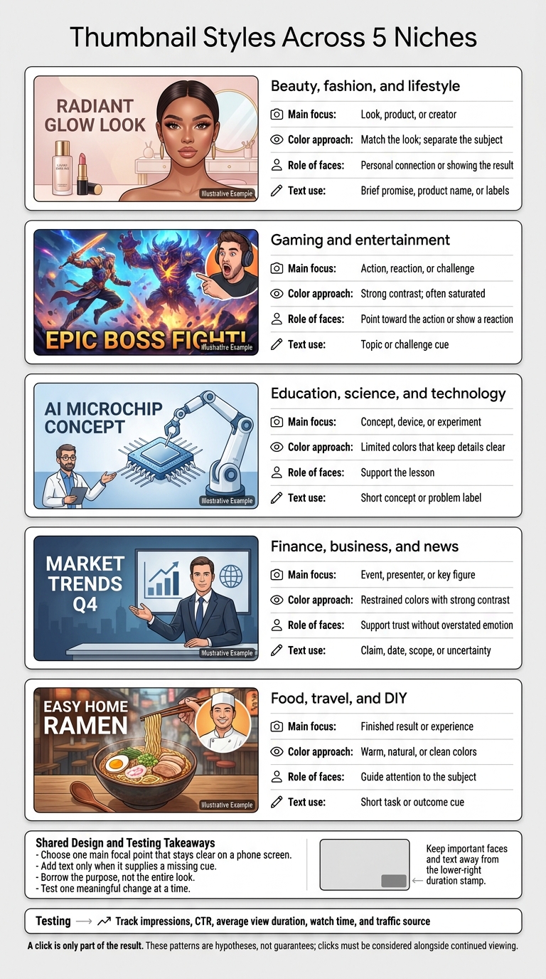
Thumbnail Styles Across 5 Niches
1. Beauty, Fashion, and Lifestyle
Beauty, fashion, and lifestyle content sells a result, a person, or a transformation at a glance. Unlike information-heavy niches, it relies more on immediate visual appeal than detailed explanations.
Visual Hierarchy
Put what viewers want to see front and center: the finished look in a beauty tutorial, the product in a review, the outfit in a fashion transformation, or the creator in a lifestyle vlog. Give that subject more space than supporting details. Use before/after vs single image thumbnails only when they prove the result.
Color and Contrast
Once you’ve chosen the main subject, use color to help it stand out. Pick a background that keeps it easy to see, and follow the palette patterns of your sub-niche. Match the background color and number of faces to the format, whether it’s a product review, tutorial, or vlog.
Faces and Emotional Appeal
In lifestyle vlogs, the creator’s face builds the personal connection. In reviews and tutorials, it should support the product or result - not compete with it.
Text and Context
Let the face and result earn the click. Use text only to fill in missing meaning. Tutorials may need a short promise, while reviews need the product name or claim. Transformations usually need just before-and-after labels. Keep vlog overlays brief and sparse.
sbb-itb-b59debf
2. Gaming and Entertainment
Gaming thumbnails sell action, stakes, or payoff at a glance.
Visual Hierarchy
Pick a focal point that fits the video: a recognizable character or action scene for gameplay, the topic’s subject for commentary, or the challenge prompt for challenge-driven videos. Use the recurring layouts, number of faces, and text length in your gaming sub-niche as a starting point.
Color and Contrast
Use strong contrast to make the main character, action, or challenge prompt stand out from the background. Not every element needs equal attention. Judge contrast by what works for your audience, rather than borrowing styles from unrelated niches.
Faces and Emotional Appeal
Angle the subject’s eyes toward the hook. Position the face to guide viewers toward the action or outcome.
Text and Context
If the image already shows the moment, let the text take a back seat. Gameplay should carry the action. For commentary, add just enough context to identify the topic. For challenges, make the challenge label clear. Keep overlays sparse and easy to read on mobile.
When testing, track CTR, average view duration, and traffic source.
3. Education, Science, and Technology
These niches favor clarity over spectacle. The thumbnail should make the topic clear at a glance.
Visual Hierarchy
Put the concept first. Give the experiment, diagram, device, formula, or chart enough room for viewers to recognize the topic. Tech review thumbnails should balance faces and objects differently from podcasts or vlogs. Use that comparison to check whether your niche favors presenter-led or object-led thumbnails. You can also A/B test these styles to see which drives higher engagement.
Color and Contrast
Choose background colors based on what works in your niche - not gaming trends. An analysis of more than 50,000 thumbnails found that gaming colors can underperform in educational and professional niches. Use contrast to help the teaching material stand out from the background.
Faces and Presenter Placement
Make the subject clear before adding the presenter to support the lesson. Keep faces and labels away from the lower-right corner, where the duration stamp can cover them.
Text and Context
Use text to name the concept, formula, or device. Keep it short, and don't overstate the claim.
4. Finance, Business, and News
This niche runs on proof and urgency, not spectacle.
Visual Hierarchy
Unlike education thumbnails, finance and news thumbnails need to show what’s at stake fast. Include people, charts, and financial figures only when they support the point. Position faces to guide attention toward the key figure or headline. Make numbers readable on mobile, and let one clear data point carry the thumbnail. This focus is a core part of advanced thumbnail optimization for high-stakes niches.
Color and Contrast
Use high contrast so the thumbnail stands out, but skip palettes that look playful or promotional.
Faces and Emotional Appeal
Keep expressions restrained. Being believable matters more than showing strong emotion.
Text and Context
Choose text carefully. Don’t suggest guaranteed returns or present old news as breaking news. When testing urgency cues, measure retention - not just CTR vs. clickbait.
5. Food, Travel, and DIY
These niches focus on results in tutorials and experiences in vlogs. Outcomes matter more than entertainment’s spectacle, education’s explanations, or finance’s urgency.
Visual Hierarchy
In tutorials, put the finished dish or completed project front and center. In vlogs, feature the dish, destination, or experience. Keep the main subject fully visible, with no clutter competing for attention.
Color and Contrast
Choose warm tones for food, natural tones for travel, and clean, high-contrast palettes for DIY. Make sure the main subject stands out from the background.
Faces and Emotional Appeal
Include a face only if it draws attention to the main object. Position it so the person’s gaze clearly guides viewers toward that object.
Text and Context
If the image already shows the result, use text only to clarify the task or outcome. Keep tutorial labels short and vlog overlays minimal.
Comparing 4 Thumbnail Design Choices
Four choices shape most thumbnail differences across these niches: focal point, color, faces, and text. The tables below summarize the niche patterns covered above.
Visual Hierarchy: Focus, Placement, and Detail
Choose one main focal point that stays clear on a phone screen. Keep key details out of the lower-right corner.
Start with these patterns, then test them against your own niche data.
| Niche | Primary Focal Point | Best-Fit Composition | Small-screen risk |
|---|---|---|---|
| Beauty, fashion, and lifestyle | Creator, look, or product | Person-led vlogs; beauty thumbnails centered on a product or look, with little setting detail | Product details become too small |
| Gaming and entertainment | Main action or reaction | One main subject, supported by game context or another participant | Multiple characters compete for attention |
| Education, science, and technology | Problem, tool, or result | Lead with the problem and enlarge the key detail; use an expert or label for support | Screenshots and diagrams lose clarity |
| Finance, business, and news | Presenter, event, or key data | Lead with the presenter’s analysis or the data, with one supporting figure or label | Dense charts hide the point |
| Food, travel, and DIY | Outcome or experience | Center tutorials on the outcome and vlogs on the scene; keep only needed context | Small process details are easy to miss |
Color and Contrast: Palettes and Subject Separation
Match the palette to the niche. Colors that work for gaming may fall flat in finance.
| Niche | Common Palette | Contrast Strategy | Accuracy Concern |
|---|---|---|---|
| Beauty, fashion, and lifestyle | Restrained, guided by the overall look | Separate the subject from the setting | Edits can alter skin tones or product shades |
| Gaming and entertainment | Saturated, high-energy | Separate the action from busy scenery | Edited effects can misrepresent gameplay |
| Education, science, and technology | Controlled, limited colors | Highlight one tool or result | Highlighting can change the meaning of data |
| Finance, business, and news | Restrained base with strong contrast | Emphasize one figure or subject | Dramatic colors can suggest unsupported urgency |
| Food, travel, and DIY | Natural or guided by the materials shown | Keep the subject’s edges clear | Edits can misrepresent food, scenery, or finishes |
Faces and Emotion: Recognition, Trust, and Reactions
Use a face when it helps viewers recognize someone, builds trust, or shows a reaction.
| Niche | Face Role and Emotional Appeal | Strong Alternative to a Face | Overstatement Risk |
|---|---|---|---|
| Beauty, fashion, and lifestyle | Build recognition, personal connection, and aspiration | Product or finished look | Edits exaggerate the transformation |
| Gaming and entertainment | Show a participant’s surprise or enthusiasm | Key gameplay moment | Reaction exceeds the actual event |
| Education, science, and technology | Identify the expert; build trust and curiosity | Experiment or visible result | Shock replaces explanation |
| Finance, business, and news | Identify the analyst or speaker; convey confidence or concern | Relevant data or event | Fear implies certainty |
| Food, travel, and DIY | Connect the creator to satisfaction or discovery | Dish, landmark, or completed project | Expression oversells the experience |
Text and Context: Wording and Readability
Add text only when it supplies a missing cue.
| Niche | Text Role Alongside the Title | Useful Context Cue | Common Readability Mistake |
|---|---|---|---|
| Beauty, fashion, and lifestyle | Clarify without repeating the full title | Occasion or result | Long overlays cover the look |
| Gaming and entertainment | Specify the challenge | Rule or constraint | Stylized lettering becomes illegible |
| Education, science, and technology | Label the detail being taught | Problem or outcome | Too many labels at small sizes |
| Finance, business, and news | Clarify the claim while keeping the title’s qualifications | Date, scope, or uncertainty | Tiny caveats beneath a bold claim |
| Food, travel, and DIY | Add information the image cannot show | Task or experience | Text competes with the result |
Strengths and Risks of Each Thumbnail Style
Each style promises something different: polish, intensity, or clarity. Problems start when the video doesn’t deliver on that promise.
The trade-offs come down to four choices: focal point, color, faces, and text. This table shows each niche’s strongest cue, main risk, and when to adjust the style.
| Niche | Main Advantages | Main Disadvantages | When to Adapt the Style |
|---|---|---|---|
| Beauty, fashion, and lifestyle | A polished look feels aspirational and builds a personal connection. | Overly idealized images can set unrealistic expectations; too much text weakens vlog thumbnails. | Use this style for personality-led videos; keep tutorial labels brief. |
| Gaming and entertainment | High-intensity colors help videos stand out in crowded feeds. | Competing elements create clutter, and key details can disappear on mobile. | Keep the action easy to read and the lower-right corner clear. |
| Education, science, and technology | Clear information helps viewers spot a useful solution right away. | Explaining too much leaves little reason to click. | Show the problem without giving away the whole answer. |
| Finance, business, and news | Urgency and authority make timely analysis feel relevant now. | Overstated urgency can earn clicks but weaken trust and retention. | Save urgency for timely coverage, and use a restrained, professional color palette. |
| Food, travel, and DIY | Showing the result makes the payoff easy to understand. | Without a hint of the process, the result can seem out of reach or misleading. | Add a process cue when the method matters as much as the outcome. |
Borrow the purpose, not the entire look. Reviewing trending YouTube thumbnails can help identify which cues are currently resonating with audiences. A lifestyle tutorial may need more explanation than a vlog. A hands-on tutorial may need to show how someone achieved the result, rather than just the finished image. Match the thumbnail to the viewer’s reason for watching - not only the channel’s category.
Track changes using impressions, CTR, average view duration, and traffic source.
Conclusion: Choose a Style and Test Results
The patterns above matter only if they help viewers click and keep watching. Choose a thumbnail style that matches viewer intent, with one clear focal point, text that’s easy to read on mobile, and accurate imagery. Keep your visual identity consistent, but adjust layouts to fit your niche.
Look for visual patterns in comparable videos, then check them against your own data. Public view counts don’t tell you a thumbnail’s CTR, watch time, or how its audience differs from yours.
Treat those patterns as hypotheses, not guarantees. Test one meaningful change at a time. Compare CTR, watch time, and average view duration. Use thumbnail CTR benchmarks to see how your performance stacks up against your niche. Track shifts in your audience and traffic sources, and wait for enough impressions before naming a winner.
ThumbnailCreator can help you draft result-led, face-led, and comparison-led layouts. You can then swap text, faces, or objects while keeping the core image accurate.
FAQs
How should I design thumbnails for videos that span multiple niches?
Identify each video’s primary niche, then study the top 20 performing thumbnails in that niche. Look at their colors, faces, and text styles. Focus on clarity and what the audience expects - not a one-size-fits-all template. Use ThumbnailCreator to generate niche-specific drafts.
Give each thumbnail one clear focal point, use 3–5 words of bold text, and keep contrast high. Leave the bottom-right corner clear of key visuals and text so the timestamp doesn’t cover them. A/B test within each niche, changing just one variable at a time.
How many impressions do I need before choosing a thumbnail winner?
Give your thumbnail time before judging its performance. Wait until your video has at least 500 to 1,000 impressions. For greater confidence in your results, aim for 2,000 to 5,000 impressions per variant.
Track metrics for 7 to 14 days to account for audience behavior [2]. Look at click-through rate alongside watch time to check that your thumbnail matches what viewers get from the video [3][4].
What if my thumbnail raises CTR but lowers retention?
Your thumbnail might promise more than your video delivers. When the content doesn’t match those expectations, viewers may leave early, which could hurt your future reach.
Make sure your thumbnail matches the video. Use ThumbnailCreator to test one design change at a time, such as a facial expression or text hook. Aim to spark curiosity without misleading viewers. Track both click-through rate (CTR) and watch time to check whether you’re attracting the right audience.