

Why Thumbnails Matter for LinkedIn Engagement
If you want more LinkedIn clicks and engagement, your thumbnail can change the result before anyone reads a word.
From what I see in the data, the pattern is simple: image posts beat text-only posts, carousel posts often beat single images, and link posts depend heavily on the preview image. Research in the article points to numbers like 3.10% median engagement for image posts vs. 1.70% for text-only posts, plus 6.60% average engagement for multi-image posts in one 2026 benchmark.
Here’s the short version:
- Use visuals if you want more interaction
- Keep thumbnails simple so people get the point fast
- Use 3–5 words max on the image
- Use high contrast vs low contrast designs so text reads on mobile
- Focus on one main subject, not several
- Watch CTR, impressions, and engagement rate to judge what works
- Test one change at a time, like background color, face, or text
For traffic posts, the preview image does a lot of the work. A cluttered thumbnail can hurt clicks. A clean one with one subject, short text, and high contrast is more likely to stop the scroll.
Quick comparison
| Format | Attention | Click potential | Interaction |
|---|---|---|---|
| Text-only | Lower | Lower | Lower on average |
| Single image | High | Medium | Higher than text-only |
| Multi-image / carousel | High | Medium | Often highest |
| Link post with thumbnail | Depends on thumbnail | Highest for traffic | Lower than image/carousel in many cases |
My takeaway is simple: on LinkedIn, the thumbnail is often the first test your post has to pass. If people can’t read it, spot the subject, or tell what it’s about in a split second, performance can drop fast.
sbb-itb-b59debf
What Studies Show About Image Posts on LinkedIn
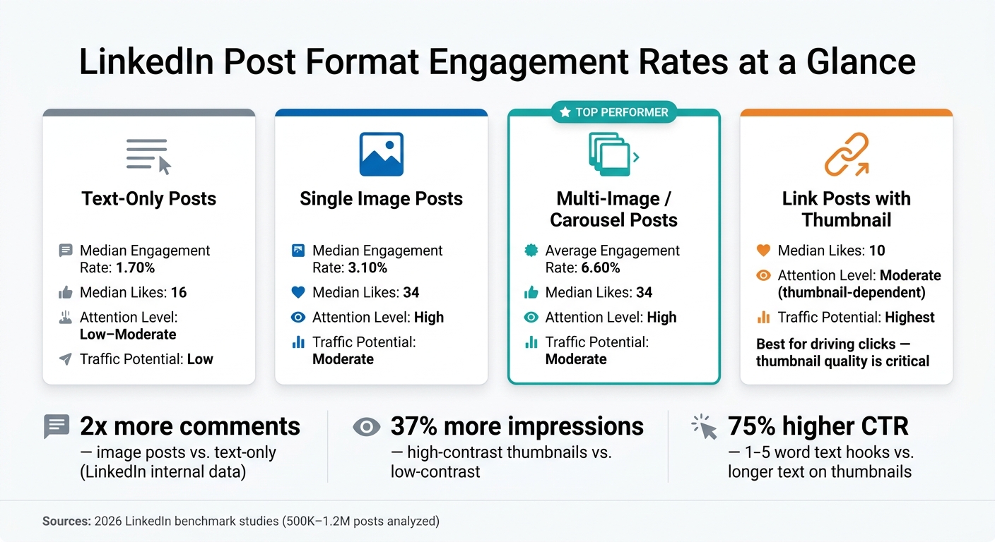
LinkedIn Post Format Engagement Rates Compared
Data Points That Support Visuals Driving More Engagement
The data points in the same direction: image posts tend to beat text-only posts on LinkedIn engagement. The exact lift changes from study to study, but the pattern stays pretty clear.
LinkedIn’s own guidance says posts with at least one image usually get 2x more comments than posts without images. A 2026 analysis of nearly 500,000 posts found image posts had a 3.10% median engagement rate, compared with 1.70% for text-only posts. Another 2026 review of 1.2 million posts found that image and carousel posts tied at 34 median likes, while text-only posts had 16 and link posts had 10.
Multi-image and carousel posts often come out on top. One 2026 benchmark reported 6.60% average engagement for multi-image posts, compared with 6.05% for single-image posts and 4.10% for text-only posts. Another dataset showed a similar gap: 2.43% median engagement for multi-image posts, versus 2.13% for single images and 1.54% for text-only posts.
There’s one catch, though: more engagement doesn’t always mean more reach. And when the goal is click-through traffic, that gap matters. In those cases, the preview thumbnail often does the heavy lifting.
Post Format Comparison Table for Engagement Signals
The table below breaks out the three signals that matter most: attention, traffic, and interaction.
| Post Format | Attention | Traffic | Interaction Rate (Likes, Comments, Shares) |
|---|---|---|---|
| Image posts | High - visuals stand out in a text-heavy feed | Moderate | High - LinkedIn says image posts typically get 2x more comments, and one 2026 dataset found 3.10% median engagement vs. 1.70% for text-only |
| Multi-image / carousel posts | High - multiple frames can increase dwell time and impressions | Moderate - often driven by swipes between slides rather than external clicks | Highest - these formats often lead benchmark reports, including 6.60% average engagement in one 2026 report |
| Link posts with preview thumbnail | Moderate - results depend a lot on thumbnail quality | Strongest - link posts are built to drive traffic | Lower to moderate - one 2026 dataset found 10 median likes, below image, carousel, and even text-only posts |
| Text-only posts | Low to moderate - they can still work with a strong hook | Low | Lowest on average - one 2026 dataset found 16 median likes |
For creators and small brands, the biggest lever in a link post is the preview thumbnail. A clear subject, strong contrast, and low clutter make it easier to scan and more likely to earn the click. That’s the point where thumbnail clarity, contrast, and subject recognition matter most.
How Thumbnails Change Post Performance
Attention, Relevance, and Readability at Small Sizes
A thumbnail often decides whether someone stops for a second or keeps scrolling. On LinkedIn, that makes it a direct factor in engagement. When people understand the image fast, they’re more likely to pause, click, and interact.
Eye-tracking research shows that viewers lock onto the strongest contrast point in an image within 50 ms. That’s fast. At thumbnail size, readability becomes the main limit. If the image has one clear subject set against a simple background, people can figure out the topic in less than one second.
Another eye-tracking study found that the upper-left third of a small thumbnail drew 73% of first gaze fixations, and most early viewing time stayed there. So placement matters. A face, a bold keyword, or a familiar icon tends to work best when it appears where viewers can spot it right away.
Text is where many thumbnails fall apart. Research on thumbnail performance across platforms found that hooks with 1–5 words beat longer phrases by a 75% relative CTR difference. On LinkedIn, a short label like "2026 Hiring Trends" gets the point across much faster than a full sentence crammed into the image.
Contrast is the other thing you can’t ignore. Thumbnails with a foreground-to-background contrast ratio of 7:1 or higher see about 2.3x higher average CTR than low-contrast designs, and CTR drops hard below 4.5:1. A simple grayscale check is a good gut test: if the main subject disappears without color, the thumbnail probably needs work.
Why Professional Feeds Favor Simple Visuals
The numbers point in the same direction: simple, high-contrast visuals tend to win. High-contrast thumbnails with simple compositions get an average of 37% more impressions than low-contrast designs. Posts with a human face can lift CTR by up to 45%, but only if the face is still easy to see at a small size.
On LinkedIn, overly stylized thumbnails can feel off. Clean visuals, easy-to-read text, and one clear focal point fit better with what B2B readers and decision-makers expect to see.
For small brands, the takeaway is pretty plain:
- Use one subject
- Add one short text line
- Pick a solid or low-complexity background
- Make sure the contrast is strong enough to read on a phone
That kind of thumbnail tends to work better across both LinkedIn desktop and mobile feeds. Those patterns lead straight into a few advanced thumbnail optimization strategies for LinkedIn sharing.
Research-Backed Thumbnail Principles for LinkedIn Sharing
Text, Contrast, and Subject Clarity
Use these rules to turn the research into a LinkedIn-ready thumbnail. Three things tend to split thumbnails people click from thumbnails they skip: 3–5 words, strong contrast, and one clear subject.
For text, keep overlays to about 3–5 words. Phrases like Free Sales Playbook or Demo: New Reporting Tool tell people what they’ll get fast. That matters on LinkedIn, where attention is short and the feed moves fast.
Contrast matters just as much. A minimum 4.5:1 ratio between text and background helps keep copy readable across devices. If your text fades into the image, the safest fix is simple: put it over a solid or blurred color block. It’s not fancy, but it works.
Subject clarity is the third piece. One dominant element - a face, a product shot, or a bold phrase - makes the point of the thumbnail clear at a glance. If two or three things are fighting for attention, the image starts to feel noisy.
Adapting YouTube Thumbnails for LinkedIn
YouTube thumbnails are made for a platform where people are already browsing videos. LinkedIn works differently, so a thumbnail that performs well on YouTube can look crowded in the LinkedIn feed.
The fix is straightforward: strip it down. If you’re reusing a YouTube thumbnail for LinkedIn, remove secondary phrases, episode numbers, and extra visual clutter. Then ask one plain question: does the thumbnail still explain the main topic without help from the post caption? If not, it needs more trimming.
For a video lesson, one instructor face plus a short benefit phrase like Master Client Onboarding is usually enough. That’s often the sweet spot: clear, fast, and easy to read.
A quick legibility test can save you from posting a thumbnail that falls apart at smaller sizes. Shrink it to about 120×90 pixels and check whether the subject and text still read clearly. If parts blur or vanish, increase the font size, cut words, or simplify the background before you publish.
| Trait | Strong LinkedIn Thumbnail | Weak LinkedIn Thumbnail |
|---|---|---|
| Text length | 3–5 words, benefit-focused | Full sentences or multiple text lines |
| Contrast | 4.5:1 minimum, text on solid block | Low contrast, text over busy photo areas |
| Subject | One face or one product feature | Multiple elements competing for attention |
| Composition | Key elements in center 80% safe zone | Important details near edges, risk of cropping |
| Legibility | Readable at 120×90 px | Blurs or loses meaning at small sizes |
Using ThumbnailCreator to Make LinkedIn-Ready Variations Faster
ThumbnailCreator speeds up this edit cycle by letting creators swap text and objects, then export a cleaner LinkedIn version. It’s a simple way to make a few versions without starting from scratch each time.
Before posting, run the same three checks on each version: text, contrast, and subject. If those three hold up, the thumbnail is much more likely to work in the LinkedIn feed.
What the Research Means for Your LinkedIn Posting Strategy
Thumbnails shape whether your LinkedIn post gets noticed, understood, and clicked. If the thumbnail feels weak or sends the wrong signal, performance can slip even when the actual content is solid.
Start by looking at thumbnail results by post format. Document/carousel posts drove 39% more reach and 30% more engagement than average, while image posts delivered the biggest engagement lift among common formats at 1.33x. That difference matters. It helps you decide where your time is better spent when making thumbnails.
After you pick a format, check whether the thumbnail is turning attention into clicks. In LinkedIn analytics, watch impressions, engagement rate, and CTR. If bold, high-contrast thumbnails keep getting higher CTR at about the same impression levels, that usually means the visual is doing its job. If mobile results lag, look for common issues like text that’s too small, contrast that’s too low, or key parts getting cropped.
Once you’ve got baseline numbers, test one thumbnail element at a time. Keep each test tied to the earlier ideas around text, contrast, and subject clarity. Background color tends to move CTR the most at 18% to 25%, followed by facial expression at 12% to 18% and text changes at 8% to 15%. Small layout adjustments, on the other hand, usually lead to less than a 3% shift in performance.
FAQs
What makes a good LinkedIn thumbnail?
A good LinkedIn thumbnail should match what people expect to see and grab attention fast in a mobile-first feed. That usually means high-contrast visuals, a simple layout, and just 3–5 bold words of text.
Keep your main elements inside the center 80% safe zone so they don’t get cropped. ThumbnailCreator can help with this through AI generation, templates, and text editing.
Do thumbnails matter more on mobile?
Yes. Thumbnails matter even more on mobile, where over 70% of YouTube views happen and people often make a choice in less than a second.
On smaller screens, cluttered designs and tiny text are tough to read and can hurt click-through rates. Keep it simple: use high contrast, minimal text, and one clear focal point.
How often should I test thumbnail changes?
Test based on data volume, not just time. A good target is 500 to 1,000 impressions per variant. If you want more confidence in the result, push that to 2,000 to 5,000 impressions.
In most cases, tests should run for 7 to 14 days so you can catch weekly shifts in behavior. Also, give the test at least 48 hours before reading too much into the numbers, since early results can be noisy.
Keep it simple: test one variable at a time. If your channel is smaller and traffic comes in slowly, you may need to let the test run for up to one month.