

Regional Design Preferences for YouTube Thumbnails
The short version: the same thumbnail can get different click-through rates in the U.S., India, and China. The main shifts are usually color, text amount, face use, and layout.
If I were localizing thumbnails, I’d start here:
- U.S. viewers: darker images, fewer elements, short text, one clear subject
- China: brighter images, more centered layouts, moderate text, more scene context
- India: bold colors, larger text, more elements in one frame, stronger visual density
A few numbers stand out:
- Extreme facial expressions reached about 7.9% CTR in one study, vs. about 4%–5% for neutral or no-face designs
- In education, curious or calm expressions beat shock-style faces by 18%
- Background color had the biggest effect in some tests, moving CTR by about 18%–25%
My takeaway: don’t treat regional style patterns as fixed rules. Use them as a starting point, make 2–3 thumbnail versions, and check CTR by region in YouTube Analytics.
| Market | Best starting point |
|---|---|
| U.S. | Sparse layout, tight crop, short text |
| China | Brighter frame, centered subject, more context |
| India | High-contrast color, bigger text, more packed layout |
This article comes down to one idea: thumbnail style is not one-size-fits-all, and testing by region is the safest way to improve clicks.
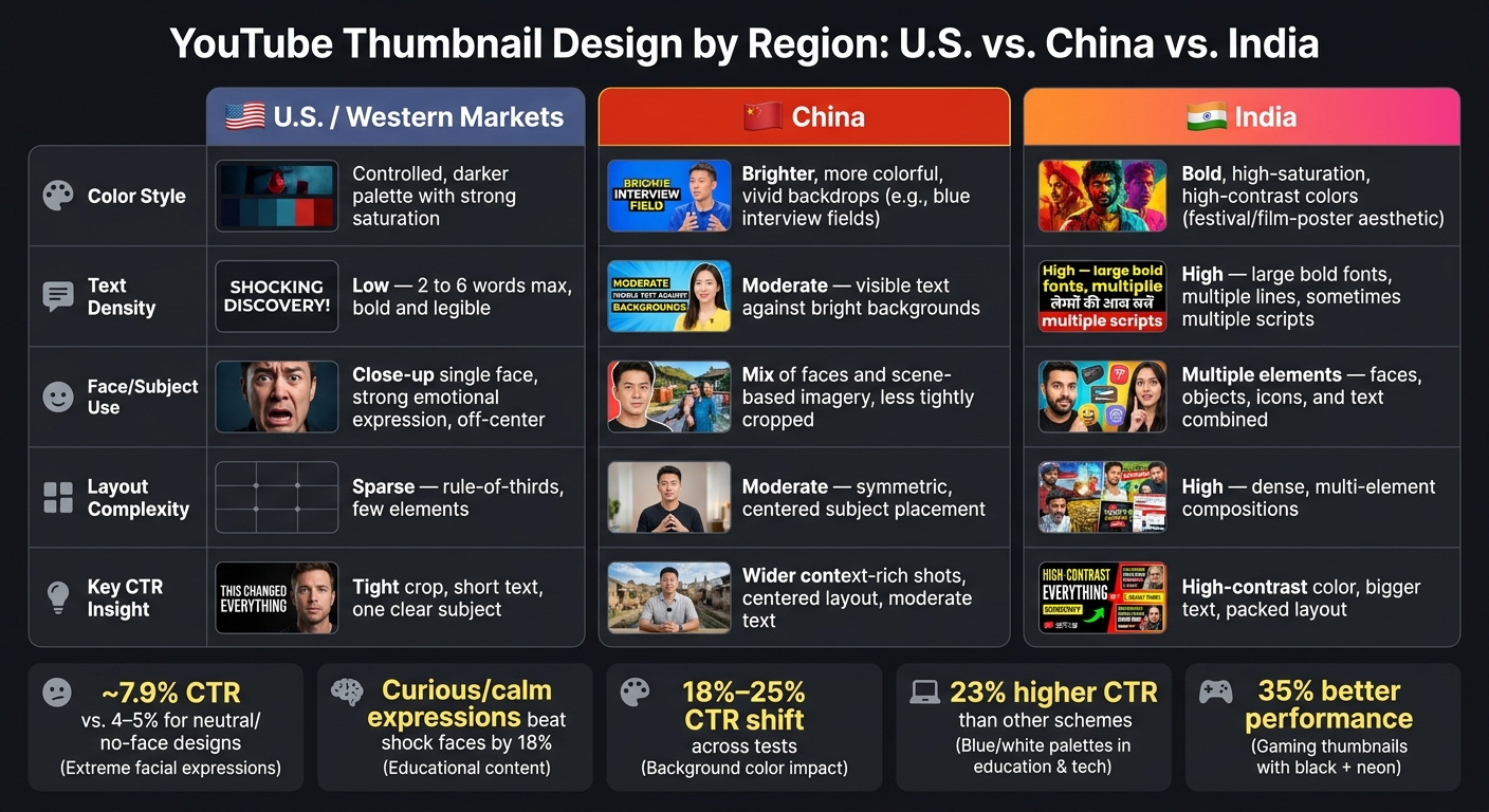
YouTube Thumbnail Design by Region: U.S. vs. China vs. India
How Thumbnail Style Differs Across Countries
A computational aesthetics study looked at 2,400 news-related thumbnails from U.S. and Chinese channels and measured visual traits like hue, saturation, luminance, symmetry, and sparseness. The gap wasn't just anecdotal. It showed up in the numbers: U.S. thumbnails were darker, sparser, and more tightly framed, while Chinese thumbnails were brighter, more symmetric, and more open.
At a high level, the pattern is pretty clear. U.S. thumbnails tend to pull back, while China and India lean into density and color. The biggest contrast shows up in how creators handle faces, text, and layout.
| Visual Attribute | U.S. / Western Markets | China | India |
|---|---|---|---|
| Color style | Controlled palette; darker overall with strong saturation | Brighter, more colorful, with vivid backdrops such as blue interview and press-conference fields | Bright, bold, high-saturation colors that echo festival, market-signage, and film-poster aesthetics |
| Text density | Low; short phrases, often just a few words | Moderate; visible text against bright backdrops | High; large bold fonts, multiple lines, and sometimes multiple scripts |
| Faces vs. objects | Face-forward; close-up portraits as a primary focal point | Mix of faces and scene-based imagery, often less formally staged | Multiple elements combined - faces, objects, icons, and text in one frame |
| Layout complexity | Sparse; fewer elements; rule-of-thirds composition | Moderately complex; less crowded than U.S. layouts | High; dense, multi-element compositions |
Thumbnail Patterns in the U.S. and Western Markets
U.S. thumbnails usually stick to controlled simplicity: darker, tighter, and more face-forward than Chinese thumbnails. In practice, that often means one subject - most often a face - set slightly off-center, with a clean or blurred background and very little text.
That said, faces aren't a magic button. They do not always beat non-face thumbnails across every category or audience. In technical or instructional content, a clean diagram or product shot can do better than a reaction face. So the minimalist approach works well as a default, but it isn't a fixed rule.
Thumbnail Patterns in China and India
Chinese thumbnails are brighter, more open, and more scene-driven than U.S. thumbnails. They often use bright, even color fields - like vivid blue backdrops in interviews and press conferences - to make both the subject and the text pop.
Indian thumbnails push much harder on density. Region-based analysis notes that thumbnails in some regions, like India, often include bold text, bright colors, and multiple elements, while thumbnails in other regions may focus more on facial expressions or minimal design. You can see that in the mix of layered faces, icons, big type, and strong saturation. It lines up with India's broader visual style, from festival colors and market signage to film posters. Strong contrast and large lettering also help keep thumbnails readable on small screens.
Those regional habits become easier to spot when you browse trending thumbnails to see how creators handle faces, text, and layout.
sbb-itb-b59debf
Faces, Text, and Layout: How Key Thumbnail Elements Vary by Region
At the element level, the biggest differences come down to faces, text, and layout.
How Faces and Emotional Expression Affect Viewer Response
A face in a thumbnail doesn't automatically make it work better. Across large dataset studies, thumbnails with faces and thumbnails without faces often perform about the same when you average results across categories. What matters more is how strong the expression is.
One multi-category study found CTR climbing from about 4–5% for neutral or faceless designs to 7.9% for extreme expressions. But there's a catch. In finance and education, cartoonish or fake-looking faces can hurt trust, and thumbnails that fit the video tend to beat shock-based expressions. For educational content, curious or thoughtful expressions lift conversion by 18% compared with shock expressions.
Single-face versus multi-face thumbnails follow a similar pattern. One large face often gives you a cleaner focal point. But multiple faces can beat single-face designs in reaction, collaboration, and entertainment formats, especially when each person shows a clearly different expression, like one shocked and one skeptical. The limit is readability. If you pack in too many small faces, they lose punch on mobile screens—one of several common thumbnail mistakes that hurt performance.
The same thing happens with text and layout: what looks good up close can fall apart fast on a phone.
Text Density, Typography, and Reading Patterns by Region
Text does not work the same way everywhere. For U.S. audiences, short, punchy copy in the 2–6 word range keeps beating denser text for Western viewers who scan mobile feeds fast.
Age changes the picture a bit. Younger U.S. viewers, especially teens and young adults, lean toward very little text plus strong visual cues. Viewers ages 35 and up are more open to a few extra words when the message spells out a plain, useful benefit. Studies on age-group differences in typography, layout, and composition back this up: text preferences shift even inside one country.
East Asian audiences are more open to text-heavy layouts, in part because denser information and compact scripts fit the format better. Even so, cluttered thumbnails still lose when the text gets too small to read on a phone. Creators in these markets often rely on:
- stacked text blocks
- bold keywords
- mixed font weights to stress urgency or outcomes while keeping the message readable
Across regions, the main rule stays the same: contrast, hierarchy, and readability do the heavy lifting. Bold sans-serif fonts, high-contrast color pairings with at least a 4.5:1 ratio, and a clean split between the face area and text area beat ornate or low-contrast type at mobile sizes.
Layout follows the same regional pattern as face and text choices. In Western left-to-right reading settings, putting the main subject a bit left of center and key text on the right lines up with natural eye movement and tends to improve initial fixation. In East Asian markets, centered subject placement with stacked text matches both YouTube norms and local preferences for symmetry. Those are good starting points, then it's smart to test region-based versions.
Why Regional Thumbnail Preferences Exist: Culture, Age, and Audience Norms
How Visual Norms Shape Recurring Aesthetic Patterns
Those differences in faces, text, and layout usually come from local visual habits, not random design taste.
People get used to what they see again and again in local media. Over time, certain thumbnail styles start to feel familiar, easy to scan, and more clickable.
Color is one of the clearest examples. Red typically signals urgency and excitement, while blue conveys trust and authority. That helps explain why educational and tech content using blue and white palettes sees a 23% higher click-through rate than other schemes in those categories. Gaming and entertainment thumbnails, on the other hand, perform 35% better with black backgrounds and neon accents. When viewers learn these color cues over time, some palettes feel native in one market and a bit out of place in another.
Some center-weighted layouts come from a practical issue too: cropping on other apps. So what looks like a regional style choice may sometimes be a platform constraint, not a cultural one.
Age and Audience Differences Within the Same Country
Platform constraints explain part of the picture. Audience norms explain the rest.
These habits also shift inside the same country, especially across age groups and content types. Age, platform behavior, and audience expectations all shape how people react to thumbnails, even when they live in the same market.
A/B testing vs gut feeling shows background color usually has the biggest effect, driving an 18% to 25% CTR shift, while expression and text matter less, and small layout tweaks matter least. Text is also very sensitive to content category, which often lines up with age and viewer intent. So even within one country, there isn't just one thumbnail preference.
Putting Regional Research Into Practice for Thumbnail Localization
Using Research Findings to Plan Region-Specific Thumbnail Variants
Once you spot these patterns, the next move is simple: turn them into thumbnail tests you can actually run. Treat each regional pattern like a test plan. Build separate thumbnail versions for each market, then test age and content format inside that market.
Use this as a working checklist, not a fixed playbook.
| Region/Audience Cluster | Color & Contrast | Text Density & Typography | Subject Treatment | Workflow Adjustment |
|---|---|---|---|---|
| U.S./Western (general) | Darker thumbnails with sparse compositions | Low density, usually just a few words; bold, legible fonts and left-to-right scanning | Close-up faces with clear emotional expressions | Prioritize facial framing and simpler text treatments |
| India (broad audience) | Bright, vibrant, saturated colors and bold combinations | High density with multiple text blocks and large, bold fonts | Faces often appear in multi-element layouts with objects and icons | Build text-heavy variants and make sure the copy remains readable at small sizes |
| China (news and informational channels) | More colorful, symmetric, and visually dense thumbnails | Moderate text in contextual layouts | Use wider, context-rich subject shots instead of tight headshots | Favor contextual, less cropped subject shots |
It also makes sense to test age differences inside each market. Younger viewers usually tolerate more varied text treatments, while older viewers tend to respond better to simpler, clearer typographic structures.
From there, build at least two region-specific variants. For example, you might test a bright, text-heavy version for India against a darker, face-centric version for U.S. viewers, then compare CTR by region in YouTube Analytics. Start with the variables that shift the most from market to market:
- color
- text density
- subject treatment
After that, you can fine-tune smaller layout details.
ThumbnailCreator can speed up variant creation with AI generation, templates, face swapping, text editing, and object swapping.
Conclusion: Key Takeaways and Where Creators Should Be Cautious
Regional thumbnail preferences are measurable, not just anecdotal. Differences in color intensity, text density, face usage, and layout line up with documented patterns tied to local visual norms.
Still, almost all of this evidence is correlational. So don't treat regional findings like a sure bet. Treat them like smart starting points. Test variants, track CTR by region in YouTube Analytics, and update your approach based on what your own audience does.
FAQs
How many thumbnail versions should I test per region?
There’s no fixed number to aim for. The goal is to run structured A/B tests that compare clearly different design elements, not to hit some magic total.
Focus on options that are meaningfully different from each other, such as:
- Background color
- Brightness
- Facial expressions
- Text layout
ThumbnailCreator can help you make multiple versions, and each test should run for at least 48 hours so you have enough data to judge the results.
Do regional thumbnail preferences vary by video category?
Yes. Thumbnail preferences can change based on both the type of video and where your audience lives.
For example, viewers in the United States may click more often on car-related visuals, while viewers in India may respond better to train-themed imagery.
Color meaning can shift too. In the U.S., red can signal urgency. In parts of Africa, that same color may be linked to mourning.
What should I check in YouTube Analytics by region?
Check regional data for CTR, impressions, and RPM by viewer location. That gives you a clear view of how your thumbnails land with different audiences.
Then look at local thumbnail trends too. Design tastes can shift from one region to another, so what works in the U.S. might fall flat somewhere else. Put those style differences next to your performance data and use both to fine-tune designs for the audience you want most. ThumbnailCreator can help you quickly adjust text, expressions, and layouts for different regional preferences.