

CTR Boost: Text Color Combinations That Work
If people can’t read your thumbnail text in a split second, they won’t click. The short version is simple: use high contrast, keep text to 3–6 words, and stick with color pairs that still read well on mobile and in both light and dark mode.
Here’s the main takeaway from what I found:
- Best for raw visibility: yellow on black and black on yellow
- Best for trust-heavy topics: white on dark blue
- Best for alerts or risk-based topics: red on white
- Best for calmer but still bold contrast: orange on muted blue/gray and green on white
- Best for standout style: purple on yellow
- Best for mixed tone: blue text with orange accents
A few rules matter more than everything else:
- Aim for at least a 4.5:1 contrast ratio
- Use bold sans-serif fonts
- Keep the design to 2–3 colors
- Add a light outline or shadow if the image is busy
- Test the thumbnail at phone size before you publish using free thumbnail tools
One data point stands out: an analysis of 93,421 YouTube videos found that thumbnails with more than three visual elements had 23% lower CTR, while complementary color pairings got 29% more clicks than single-color setups. So I’d keep the layout clean and let the text do the work.
👉 6 BEST THUMBNAIL COLORS For High Video Views And High Click Through Rate (CTR) on YouTube
sbb-itb-b59debf
Quick Comparison
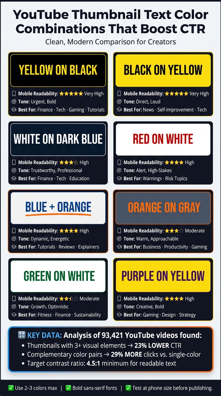
YouTube Thumbnail Color Combinations: CTR & Readability Guide
| Color Pair | Readability | Tone | Best Use |
|---|---|---|---|
| Yellow on Black | Very high | Urgent, bold | Finance, tech, gaming, tutorials |
| Red on White | High | Alert, high-stakes | Warnings, risk topics |
| White on Dark Blue | High | Calm, reliable | Finance, tech, education |
| Black on Yellow | Very high | Direct, loud | News, self-improvement, tech |
| Blue + Orange Accents | High | Balanced, active | Tutorials, reviews, explainers |
| Orange on Muted Blue/Gray | Moderate | Warm, clear | Business, productivity, gaming |
| Green on White | Moderate | Positive, growth-focused | Fitness, savings, sustainability |
| Purple on Yellow | High | Bold, offbeat | Gaming, design, strategy |
If I had to sum up the whole article in one line, it would be this: pick one high-contrast pair, use it with short bold text, and let your CTR data tell you what stays.
Why Text Color Directly Affects CTR
YouTube viewers make up their minds fast. If thumbnail text doesn’t pull away from the background right away, people skip past it. That’s why contrast and separation matter more than subtle color picks. The text needs to stand out from the image almost at a glance.
The numbers back this up. One analysis of 93,421 YouTube videos found that thumbnails with more than three visual elements had 23% lower CTR, while complementary color combinations got 29% more clicks than single-color schemes. The takeaway is pretty simple: cleaner, higher-contrast thumbnails are easier to recognize fast. And that speed matters even more on small screens.
On phones, thumbnails shrink, and low-contrast text can all but disappear. So it helps to aim for at least a 4.5:1 contrast ratio. In plain terms, white text on a dark background or black text on a bright background will usually beat combinations where the tones are too close.
Color also shapes how the thumbnail feels. Warm colors like red, orange, and yellow feel energetic. Blue signals trust. And if you keep using one text style, viewers can start to recognize your videos faster. Those are the three main filters to use when judging the color pairs below.
Basic Rules for Picking Thumbnail Text Colors
Use these rules to choose thumbnail text colors that stay readable and click-worthy on YouTube.
Start with contrast. Your text needs to stand apart from the image, even at small thumbnail size. On YouTube, that matters a lot. If the text blends into the background, people won't read it. Simple as that.
Font weight matters just as much as color. Bold or extra-bold sans-serif fonts like Impact or Bebas Neue hold up much better on mobile. Thin or decorative fonts tend to blur and lose sharpness fast. Keep your text short too - about 3–6 words. Phrases like "Save $500 This Month" or "Quit Sugar Fast" are far easier to scan than full sentences.
If the image is busy, add a simple stroke or a soft shadow. A dark outline around light text, or a white outline around dark text, helps the words stand apart from the background. Don't go overboard. One stroke, or a stroke plus a subtle shadow, is usually enough. Once that's in place, it's much easier to compare the color pairs below.
Color meaning can help when you're making a fast choice, but it should come second. Test at thumbnail size and resolution. If the text starts to fall apart, boost the contrast or make the font heavier. Now apply these rules to the first combination.
1. Yellow Text on Black
Yellow text on black has a high-urgency feel. It can drive more clicks when your message needs attention fast. The contrast is extreme, so the words stay easy to read even at thumbnail size.
Yellow is also one of the first colors people notice in a busy feed. That gives your text a better shot at getting seen before someone scrolls past.
This color pair suggests urgency, energy, and caution. That makes it a strong fit for finance, tech, gaming, productivity, and tutorial thumbnails, especially when the video leans on a warning, a fix, or a clear result. It usually works less well for wellness, luxury, or calm lifestyle channels, where a softer look is part of the brand.
If you're working with dark images, put the text on a black panel or a dark overlay using a typography guide. That keeps the words separate from the background instead of letting them blend in.
The main downside isn't readability. It's overuse. If every thumbnail uses yellow on black, the effect starts to wear off. Save this pair for videos that need a more urgent tone, then switch to another option when you want a different mood.
2. Red Text on White
Red text on white sends urgency right away, and it still reads well when people are scrolling fast. The red brings the alarm. The white keeps the words clean and easy to spot. Use this combo when the thumbnail should feel urgent, not neutral.
It works best for warnings, risks, and other high-stakes topics. In plain English: this pair hits hardest when the subject already carries tension.
There’s one catch. Pure red can get harder to read on white than darker reds. So go with a darker red, use a bold sans-serif font, and keep the text short - 2–3 words max.
If the background is busy, put the text inside a white box. Then add a thin dark outline or shadow so the words don’t get lost.
Skip this color pair for calm or premium brands. If you are building a professional business brand, stick to more conservative palettes. It can feel alarming instead of inviting. If you want the same clean look with less urgency, the next pair moves in a cooler direction.
3. White Text on Dark Blue
If the last color combo felt urgent, this one feels more grounded. White text on dark blue signals trust. It doesn’t scream for attention. It says, “This is solid. You can count on it.”
That makes it a better pick when the click depends on trust more than hype. White on navy works best when trust is the main reason someone clicks.
A deep navy like #000080 or #0A1628 gives white text strong legibility, well above the 4.5:1 contrast minimum for readable thumbnail text. It also creates clean separation from warm images, especially skin tones, orange, and yellow. That’s a big reason this combo tends to work better on informational thumbnails than emotional ones.
The feeling here is calm, trustworthy, and professional. So it fits topics like finance, tech, education, and tutorials - areas where people usually click because they want reliable information, not hype. Educational and tech thumbnails that used blue and white palettes saw a 23% higher CTR than other color schemes in those categories.
There is a tradeoff, though. If your channel leans hard into hype, drama, or high energy, this pairing can feel a bit too restrained. In that case, a warmer color combo will usually do more of the heavy lifting.
4. Black Text on Yellow
If white text on dark blue feels a bit too calm, black text on yellow goes the other way fast. It’s one of the easiest thumbnail color pairings to read, which is why you see it on warning signs and other high-visibility surfaces. On a crowded YouTube home feed, that matters. This is especially true for mobile-readability. The words hit almost at once.
This combo feels urgent and heavy on attention, so it works well for finance, tech, creator news, and self-improvement videos. It’s a strong match when the topic is an alert, a fix, or a fast win.
On busy backgrounds, place the text on a solid yellow badge. Keep the copy short - 3–5 words is a good range. Then pair it with a face or a chart so the thumbnail scans fast.
Use it with care. If every thumbnail uses the same high-alert style, people start to tune it out. If you want something cooler and more even, the next pair moves back toward calmer contrast.
5. Blue Text with Orange Accents
Blue and orange give you contrast without the same high-pressure feel as harsher color pairings. Since they sit opposite each other on the color wheel, they create fast visual separation with a balanced, attention-grabbing look. That’s useful when a click depends on clarity as much as attention.
Blue tends to signal trust, while orange brings energy. That mix works well for tech tutorials, software reviews, productivity videos, finance explainers, and educational content. In those niches, people usually want to feel informed and sure about what they’re clicking.
There is one catch: blue text on orange backgrounds sits close to the readability limit for small text. So keep the text bold, make it feel like a headline, and stick to 3 to 5 words. For the main text, darker blues like #0D47A1–#1976D2 tend to work best. Then use orange accents such as #FF9800–#FF6D00 to add brightness without taking over the whole design.
A simple setup usually wins here:
- Use blue for the main text
- Use orange only as an accent, like a badge, underline, one callout word, or an icon outline
- Keep the palette to 2–3 colors so the orange still feels like an accent
Use this color combo sparingly, then compare it with the next color set.
It’s best to skip this pairing on saturated blue or teal backgrounds, where the text can start to disappear. It also struggles on busy, multi-color images because the orange accent loses its punch. If the background already leans warm, place the text on a solid white or black panel.
6. Orange Text on Muted Blue or Gray
If blue feels a bit too strong, flip the setup and let orange do the heavy lifting. Orange text on a muted blue or gray background gives you fast contrast, but without the punch-you-in-the-face feel that yellow or red can bring.
The background makes or breaks this look. Bright, saturated blue tends to fight with orange, and that can make the thumbnail feel noisy. A muted navy, slate blue, charcoal gray, or soft steel gray gives orange room to stand out. Very light gray is usually weaker, especially if the orange is also on the lighter side. So the sweet spot is simple: use a warm, saturated orange against a darker or cooler background. That’s what makes this combo work well for categories that need attention without tipping into chaos, like tech tutorials, productivity, business, sports, gaming, and transformation videos.
Keep the text bold, short, and large. In most cases, 2 to 5 words is enough. If the background image has a lot going on, add a subtle dark shadow or a thin white outline so the letters stay crisp. The target is a 4.5:1 contrast ratio for normal-sized text.
Skip this pairing if the background already has warm tones, like skin, fire, food, autumn colors, or sunsets. In those cases, orange text can blend in instead of standing out. It’s also not a good fit for luxury or formal channels that lean on a restrained palette. This pairing works best when the background stays cool and the text clearly leads.
7. Green Text on White
After the warmer orange-and-gray combo, green on white gives the thumbnail a cleaner, more positive feel. It works best when you want to signal progress, approval, or savings right away.
There’s one catch: green on white gets hard to read fast unless the green is dark. Pure bright green like #00FF00 on white has a contrast ratio of just 1.4:1. So it’s better to use darker greens like #007A3D, #006400, or #0F9D58, which push the text closer to readable thumbnail contrast.
A simple fix helps a lot: place the text inside a white label or badge so the green looks crisp against the image. Also, keep that text away from faces and the timestamp. Those areas get crowded, and your message can get lost.
This color pairing works well for finance, productivity, fitness, and commentary YouTube thumbnail ideas. In those topics, people are often looking for a positive result. That makes green on white a good fit for messages tied to growth, savings, health, or approval.
It’s not the best pick for alarms or warnings. If the thumbnail needs more urgency, move to the next pair.
8. Purple Text on Yellow
Purple on yellow gets attention FAST, but it doesn’t lean on panic or urgency to do it. The pairing feels bold, sharp, and a little unexpected, which is why it tends to pop in a crowded feed. It’s a strong match for creative, strategy, and gaming thumbnails.
A deep purple like #4A148C on a muted yellow background can hit about an 8:1 contrast ratio, which clears WCAG AA and AAA standards. That matters at thumbnail size, where text has to stay clear even in small mobile previews. The shade of purple makes a big difference here. Keep it dark. Lighter tones like lavender or light violet lose edge definition and can look soft or blurry on backlit screens.
If you’re placing text over a busy photo, don’t try to force the combo directly onto the image. Put the text on a solid yellow block or banner instead. Add a thin outline only if the photo still competes with the text.
The color psychology is pretty straightforward. Purple suggests imagination, style, and a more high-end feel. Yellow adds attention and a sense of optimism. Put them together, and the result feels bold and slightly off the beaten path. That’s why this combo works so well for titles like Secret Strategy or Creative Hack.
This pairing tends to work best for:
- creative, design, gaming, lifestyle, education, and strategy-focused channels
- thumbnails that need strong contrast without a warning-sign vibe
- headline-led layouts where the text needs to stand out right away
It’s often a weaker match for serious finance, medical, or hard news content, where viewers usually expect a more subdued palette.
Keep the full thumbnail palette to 2–3 colors. Let purple on yellow do the heavy lifting, then add just one neutral accent if needed. Once extra bright colors start crowding the headline, readability drops fast. Use this combo when you want strong contrast with a creative edge; the table below shows where it fits best.
Color Combination Comparison Table: Which Pair Fits Your Channel?
All eight pairs can work. But they don’t do the same job.
Some are built for fast mobile readability. Others lean more into mood, tone, or niche fit. So if a few of these pairs seem almost identical at first glance, this table makes the differences easier to spot.
Use it to compare readability, tone, and channel fit. On mobile, contrast does a lot of the heavy lifting. A good target is at least a 4.5:1 contrast ratio for normal text and 3:1 for large text.
| Color Pair | Mobile Readability | Emotional Tone | Best For |
|---|---|---|---|
| Yellow on Black | Very High | Urgent, Bold | Finance, Tech, Gaming, Productivity, Tutorials |
| Red on White | High | Excited, Energetic | Warnings, Risks, High-Stakes Topics |
| White on Dark Blue | High | Trustworthy, Professional | Finance, Tech, Education |
| Black on Yellow | Very High | Attention-Grabbing, Direct | Finance, Tech, Creator News, Self-Improvement |
| Blue + Orange Accents | High | Dynamic, Energetic | Tech Tutorials, Software Reviews, Productivity, Finance Explainers, Education |
| Orange on Muted Blue/Gray | Moderate | Warm, Approachable | Tech Tutorials, Productivity, Business, Sports, Gaming, Transformation |
| Green on White | Moderate | Growth, Optimistic | Finance, Productivity, Fitness, Sustainability |
| Purple on Yellow | High | Creative, Bold | Creative, Design, Gaming, Lifestyle, Education, Strategy |
A lot of U.S. YouTube channels lean on bright colors vs. dark backgrounds with one bright accent. Why? Because that combo reads fast inside YouTube’s light interface. By contrast, orange on muted blue or gray and green on white feel less aggressive, which can be a better match if your brand is calmer or more approachable.
Use this chart to cut the list down to your top two, then test both against your actual CTR.
How to Use These Color Combinations Without Overloading Your Thumbnail
Once you’ve picked a strong color pair, the next move is simple: show some restraint.
Stick to 2–3 main colors in each thumbnail:
- one background color
- one main text color
- one accent color
That’s usually enough. Even strong color combos can fall apart when you pile on neon text, thick outlines, and a bunch of arrows at the same time.
It also helps to keep your headline color steady across your channel. That way, people can spot your videos faster. You can still switch up the background and accent details around it, but the main text color should feel familiar. If you want to add a second accent, use it for just one key word like FREE, NEW, or WARNING.
For high-saturation pairs like yellow on black or red on white, keep the background plain or slightly darkened. The goal is to let the text lead. A darkened or blurred background makes the words easier to read and stops the image underneath from competing for attention.
Before you publish, compare mobile-first vs desktop-first thumbnails by shrinking your design down to mobile size. This step matters more than people think. If the main word is hard to read, simplify the background or boost the contrast.
Color intensity should also match the topic. High-urgency combos fit dramatic or urgent content. Calmer tutorial-style videos usually work better with softer backgrounds. If every thumbnail looks like an emergency, people may stop trusting the message. Once your palette feels tight, test the strongest version in a thumbnail mockup tool.
Using ThumbnailCreator to Test Color Combinations Faster
Once you’ve narrowed down your palette, the next step is simple: make a few quick side-by-side versions and see which one reads best. ThumbnailCreator makes this part fast.
Start with 2–3 thumbnail versions that change only the text color. Leave everything else alone. For example:
- yellow text on black
- white text on dark blue
- red text on white
That way, you’re testing one thing at a time. If you swap the background, layout, and text color all at once, it gets messy fast. Change only the text color, then save each version as a separate draft.
Templates help when you want a strong-contrast starting point without building from scratch. They’re handy for previewing combinations like yellow on black or white on dark blue in a few clicks.
You can also use AI generation to draft a high-contrast layout, then fine-tune the text color from there. For instance, swapping yellow accents to orange or testing black text on a yellow panel is quick and easy.
A good workflow is to test background color first, then text color. After that, export the top 2–3 versions for YouTube testing and keep the winner.
Conclusion
Strong thumbnail text color comes down to three things: contrast, mobile readability, and fit with your channel. After that, the best option is the one that matches your niche and is easiest to read on a phone.
Color signals shape the click before anyone reads the words. Red feels urgent. Yellow feels energetic. Blue feels trustworthy. The eight pairs above help you avoid common thumbnail mistakes and give you a solid starting point, but your own channel data will show what works best.
Once you choose a pair, stick with it across your channel. Use one primary color pairing for most videos and keep one backup for special cases. Then watch CTR in YouTube Analytics and compare results. Start with a proven high-contrast pair, test it on actual videos, and adjust based on what the data says. Pick one, test it, and let CTR decide.
FAQs
How do I check contrast ratio fast?
Use browser-based tools like WebAIM Contrast Checker or Colour Contrast Analyser to plug in your hex or RGB colors and check WCAG compliance fast.
For a quick visual check, try a grayscale test or even the old squint test. If the text still reads well, you're probably in good shape. ThumbnailCreator can also help with templates and AI-powered features built for strong contrast, which matters a lot on mobile.
Which color pair should I test first?
Start with bright yellow text on a black background. With an average CTR of up to 11.2%, it gives you a strong starting point because the sharp contrast stands out across many content types.
If your content leans more professional or tech-focused, test blue and orange too. Then make a few versions in ThumbnailCreator and run A/B tests to see what clicks with your audience.
What if my brand colors have low contrast?
You don’t need to ditch your brand colors. Just use them as accents, and keep the main text in high-contrast, neutral colors so it stays easy to read.
For example, you can use your brand color for an outline or drop shadow. Then make sure the text still meets the 4.5:1 contrast ratio. If the background is busy, add a dark, semi-transparent overlay or a 4–8 pixel outline or shadow to help the text stand out.