
7 Tips for Layering Thumbnails
Want your YouTube thumbnails to stand out? Layering is the secret to creating depth and grabbing attention in just 1.2 seconds. By arranging elements in the background, midground, and foreground, you can guide the viewer’s focus and boost click-through rates. Here’s a quick rundown of the 7 key strategies:
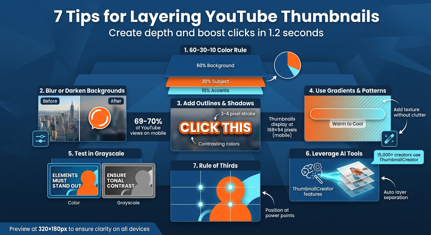
- Use the 60-30-10 Color Rule: Allocate 60% to the background, 30% to the subject, and 10% to accents for balance.
- Blur or Darken Backgrounds: Push less important elements back and make the subject pop.
- Add Outlines and Shadows: Highlight main elements with bold outlines and drop shadows for clarity.
- Incorporate Gradients and Patterns: Add texture and focus without overwhelming the design.
- Test Tonal Contrast in Grayscale: Ensure elements stand out even without color.
- Leverage AI Tools: Use tools like ThumbnailCreator for quick and precise layering.
- Follow the Rule of Thirds: Position key elements at intersections for a visually appealing layout.
Layering isn’t just about aesthetics - it directly influences performance, especially on mobile screens where thumbnails are tiny. Following a thumbnail size guide ensures your layers remain clear at any resolution. Let’s dive into how these tips can help you design thumbnails that demand clicks.
7 Essential Tips for Creating Layered YouTube Thumbnails
How I Create YouTube Thumbnails in Minutes with Figma!
sbb-itb-b59debf
1. Use the 60-30-10 Color Rule for Layer Separation
The 60-30-10 color rule is an easy-to-follow design principle that helps create a clear visual hierarchy. Here’s how it works: dedicate 60% of your design to the background, 30% to the main subject, and 10% to key accents. This approach ensures a balanced and striking composition.
For instance, imagine a design with a deep navy background (60%), neutral or skin tones for the subject (30%), and bright yellow accents for text (10%). Another example could be using a black background with bold red highlights - this contrast naturally draws attention to specific elements.
"A practical framework is the 60-30-10 rule: 60% of the frame is your dominant color (usually the background), 30% is a secondary color (your subject or overlay), and 10% is an accent (your text or highlight)." - Unkoa
To make sure your color balance works, try converting your thumbnail to grayscale. If the 10% accents remain distinct against the dominant background, you’ve nailed the tonal contrast. This is especially important for thumbnails, which shrink to 168×94 pixels on mobile screens.
For added precision, consider using AI-powered tools to split layers and tweak colors. This is a core feature of AI thumbnail generation workflows. Keep the background muted so your accents stand out effectively.
2. Blur or Darken Backgrounds to Push Elements Back
Blurring or darkening the background is a simple but effective way to add depth to your thumbnails. This technique works much like the depth-of-field effect in photography, where the subject stays sharp while the background softly fades away. The result? Your main element pops right off the screen.
Think of your thumbnail as having three layers: a blurred or muted background, a sharp subject in the midground, and text or graphics in the foreground. By clearly separating these layers, you create a sense of depth that naturally draws the viewer's eye to the most important part of the image.
"Even a simple blur on the background while keeping the subject sharp creates professional-looking depth." - ThumbGen
This approach is especially important for mobile devices, where 69% of YouTube views happen. On mobile, thumbnails are often displayed at just 120 pixels wide, so every design detail matters. A well-separated thumbnail ensures your image stands out against YouTube's white or bright vs dark interface, rather than blending into it.
If you're using ThumbnailCreator, the AI-powered Layer Split feature can make this process even easier. It automatically divides your thumbnail into layers, letting you blur or darken the background without compromising the clarity of your subject. You can even swap out the background entirely for a more striking look. This is a key step when experimenting with different thumbnail styles. For AI-generated thumbnails, try prompts like "blurred city background" or "out of focus scene" to create depth right from the start.
3. Add Outlines and Shadows to Main Images
Adding a bold outline and a drop shadow to your subject can make it pop against a blurred background, creating three clear layers: a soft background, a sharp midground, and foreground text or graphics.
"Add a thick outline or drop shadow to text so it stays readable regardless of what's behind it. A 3-4 pixel stroke in a contrasting color is usually enough." - thumbgen.yt
To maintain clarity and depth, use a 3–4 pixel stroke in a contrasting color. For larger elements, scale the stroke size to about 10–15% of the element's dimensions (e.g., a 100-point font would need a 10–15 point stroke). High-contrast color combinations are key - dark strokes work best for light text (like white or yellow), while light strokes are ideal for dark elements. This ensures your thumbnail stays legible even at smaller sizes, such as 168×94 pixels.
Here’s a quick test: convert your thumbnail to grayscale. If your subject still stands out clearly, your outlines and shadows are doing their job. If not, try thickening the stroke or adding a stronger drop shadow. This helps you avoid common thumbnail mistakes that can hurt your visibility. These small adjustments can make a big difference - sometimes the gap between a 3% and a 7% click-through rate comes down to these precise design choices. This technique works hand-in-hand with blurred backgrounds and careful composition to add depth and visual appeal.
4. Add Gradients and Patterns for Texture
Gradients can bring a fresh layer of texture to your thumbnails, going beyond simple color separation or shadow effects. They help create depth by distinguishing between the background, midground, and foreground. Plus, they’re a sleek alternative to cluttered backgrounds, making a single face or object pop while keeping the design visually engaging.
When choosing gradients, aim for ones that enhance your subject without overwhelming it. For instance, vibrant teal or coral gradients work nicely for vlogs and tech reviews, while muted pastels are great for product shots. You can even use color-coded gradients to make your content instantly recognizable to returning viewers - blue for tutorials, green for reviews, and red for challenges.
"Use warm tones on the positive or improved side and cooler or muted tones on the starting side." - Jay Kim, Writer, Miraflow AI
Gradients can also guide the viewer’s focus. For example, enhance text readability by placing it over a gradient background. A dark-to-light gradient (like navy fading into black) can make white or yellow fonts stand out without relying on heavy outlines. Want to highlight your main subject? Try a spotlight effect by brightening the area behind it, naturally drawing attention to the focal point. Just steer clear of overly intricate patterns - they tend to disappear when thumbnails are scaled down.
Always test your design at smaller sizes, around 150 pixels wide, to ensure the gradient still creates clear depth on smaller screens. You can also A/B test your thumbnails to see which gradient styles drive the most clicks. If the gradient transition looks too subtle, it might blur into a flat, muddy color. Keep in mind that about 70% of YouTube views happen on mobile devices, where thumbnails can shrink to as small as 168×94 pixels. If needed, boost the contrast or opt for bolder, simpler colors to maintain clarity.
5. Test Tonal Contrast in Grayscale
Converting your thumbnail to grayscale is a simple yet effective way to ensure that your foreground, text, and background remain visually distinct, even without color. This is especially important on YouTube, where thumbnails are displayed at various sizes - about 320×180 pixels on mobile and as small as 168×94 pixels in sidebars. At these reduced dimensions, tonal contrast can make or break the clarity of your design.
"A practical test: convert your thumbnail to grayscale. If the important elements still stand out, your contrast is strong enough." - ThumbGen
Grayscale conversion focuses on the brightness and darkness of each layer. Low-contrast combinations, like light gray on white or dark blue on black, can blend together and disappear at smaller sizes. On the other hand, high-contrast pairings - such as yellow text on a dark background or white text outlined in black - stay sharp and readable. This small step can significantly impact click-through rates, potentially boosting them from 3% to 7%. By using grayscale, you’re double-checking that your design remains effective even when scaled down.
If any part of your thumbnail fades into the background, adjust accordingly. Brighten the foreground elements or darken and blur the background to create better separation. Always preview your thumbnail at its actual display size to confirm that the tonal contrast holds up. Make it a habit to periodically test your designs in grayscale to maintain clarity and impact over time.
6. Use ThumbnailCreator for AI-Powered Layering
Manually creating layered thumbnails can eat up a lot of time, but ThumbnailCreator simplifies the process with AI. This tool is a favorite among over 15,000 YouTube creators [6,15], offering features that automatically separate images into distinct layers and adjust depth and shadows to enhance thumbnail designs.
The standout Layer Split feature breaks down any flat image into components like foreground, background, text, and objects [6,12]. This makes it easy to rearrange elements using straightforward z-index controls. For example, you can reposition your subject to the left third of the frame while keeping the background blurred to create instant depth. Want to swap out a boring background? The AI Layer Editing tool lets you do that with simple text commands like “replace background with cityscape,” all without disturbing the subject.
Taking it a step further, Face Swap and Object Swap integrate expressive faces or relevant props into your design. These features automatically adjust shadows, outlines, and other details for a polished look [6,15,16]. For instance, a gaming channel saw a 35% increase in views after using dynamic object swapping. The tool handles the tricky parts - like adding realistic shadows and maintaining proper layer alignment - so you can focus on creativity.
ThumbnailCreator also offers templates designed with professional layering structures, including blurred backgrounds, shadowed foregrounds, and gradient overlays. Users have reported a 20–30% improvement in visibility during A/B tests. Plus, everything is automatically scaled to 1280×720 pixels [12,16], ensuring your thumbnails look sharp no matter the screen size.
For new users, the platform provides free credits to get started, and the Pro plan, which offers unlimited AI generations and exports, starts at $9.99/month. With AI taking care of the technical details, you’ll have more time to focus on perfecting your thumbnail’s layout - something we’ll dive into in the next tip.
7. Position Elements Using the Rule of Thirds
Once you've layered your design, the next step is nailing the placement of your elements. A great way to do this is by using the rule of thirds. Imagine dividing your thumbnail into nine equal parts with two horizontal and two vertical lines. The four points where these lines intersect - known as "power points" - are perfect spots to position key elements. This technique, first noted by John Thomas Smith in 1797, remains a go-to strategy because it works.
Placing essential elements like faces, text, or objects on these intersections draws the viewer's eye and creates a sense of energy compared to just centering everything. Big players like Netflix and AppleTV rely on this approach in about 90% of their thumbnails to stand out in a crowded space. And it pays off - making intentional positioning choices like this can boost your click-through rate from 3% to 7%.
To make this easier, use grid overlays in your design software. For example, align a subject's eyes or the most striking part of your image with one of the intersection points for instant visual appeal. If you're featuring a person, try placing their body along a vertical line and their eyes along a horizontal one. Leave some space in the direction they're facing - this "lead room" gives the composition a natural, balanced feel rather than making it look cramped.
Avoid overloading the grid with too many focal points. Stick to one or two main elements at the power points and let the rest of the design complement them. For instance, if you're working with a landscape, align the horizon with the top or bottom horizontal line instead of centering it. This decision helps emphasize either the sky or the foreground, depending on your focus.
Before finalizing, preview your thumbnail at smaller sizes - like 320×180 pixels - to ensure the composition still looks balanced and effective on mobile screens. Remember, the rule of thirds is more of a guideline than a hard rule. But mastering it can give your thumbnails a polished, eye-catching quality that keeps viewers engaged and reinforces the depth from your layered design.
Conclusion
Layering takes flat thumbnails and turns them into eye-catching designs that encourage clicks. By structuring your design into clear visual layers, you create a sense of depth that works even when the thumbnail is as small as 50 pixels tall. From color strategies to thoughtful element placement, these techniques combine to produce thumbnails that grab attention and boost engagement.
"Flat thumbnails look amateur. Professional thumbnails create depth by layering elements at different visual depths." - ThumbGen
This guide covered key methods like using the 60-30-10 color rule, testing tonal contrast, and applying the rule of thirds to position elements effectively. Even small tweaks - such as adding a 3–4 pixel stroke to text or subtly blurring the background - can make a noticeable difference in the final design.
Try creating 3–4 thumbnail variations before settling on the best one. Use YouTube's "Test & Compare" feature or thumbnail testing at scale to identify what works best for your audience. And don't forget to preview your thumbnail at smaller sizes, like 320×180 pixels, to ensure that both the layering and text remain clear and impactful.
FAQs
How do I know my layering works on mobile?
To make sure your layering looks great on mobile devices, stick to clear, high-contrast visuals with bold, easy-to-read text and minimal distractions. Since most people view thumbnails on their phones, test how it looks at smaller sizes. Key elements - such as faces, text, or the main subject - should still be noticeable. Using a strong visual hierarchy and clearly defined layers can make your thumbnail pop and boost click-through rates.
What’s the fastest way to pick readable colors?
The fastest way to pick readable colors for thumbnails is to go for high-contrast combinations. Pairings like yellow and black, red and white, or blue and orange make text and visuals pop, improving visibility and increasing click-through rates. Choose colors that not only grab attention but also evoke the right emotions. Keep in mind that most viewers are on mobile devices, so the colors should be easy to distinguish on smaller screens. Experimenting with different combinations can help fine-tune readability and overall impact.
When should I use AI layering in ThumbnailCreator?
AI layering in ThumbnailCreator allows you to break a thumbnail into separate elements - such as the foreground, background, or text layers - so you can edit or reposition them individually. This feature is perfect for tasks like swapping out a background, tweaking placements, or fine-tuning specific areas without having to start from scratch.
All you need to do is upload or select a thumbnail. The AI will automatically divide it into layers. From there, you can drag, resize, or edit each layer directly on the canvas to create a polished and professional-looking result.